shape
carat
color
clarity

CAD Review for 4 ct stone in EW design

chrono

Super_Ideal_Rock
Premium
Joined
Apr 22, 2004
Messages
38,363
Disclaimer
Yes, this is a coloured stone and rightfully does not belong in RT. However, RT is frequented by so many experienced posters who have a good eye for design and I need any and all assistance on this project. Please allow this thread to stay. :halo:

I have the initial CAD ready and it is currently undergoing a second round, which might be ready tomorrow. I think it is lovely but I have a few hesitations. To level the playing field of biases, I will not share my concerns until I have read some of yours.
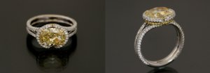
lm_original.jpg
 
I do not want an exact copy for copyright reasons and I don't want coloured diamonds in the design. I am also by nature rather understated in dress and personality, and although the original is breathtaking, I cannot envision wearing such a diamond studded ring even on the right hand.

My original request:
The stone is 10 x 8 mm to be set in an East / West orientation. The yellow diamond collar and prongs component are to be removed from this design. The diamond halo should be set at a slight angle (versus the traditional parallel to the wearer). The ring will only have a single row of pave throughout, unlike the 2 sided as shown. Half eternity for comfort reasons.

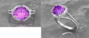
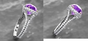
cad_9.jpg

cad_10.jpg

cad_11.jpg
 
This is really beautiful, Chrono -- can't wait to see photos of the finished product! :appl:
 
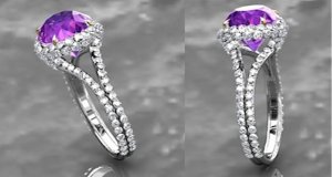
The halo has graduating diamond melees from 1.5 mm down to 1.1 mm. Per the CAD designer, the 2 sided halo was done due to the depth and size of the stone. To have a single row of pave per my original request would mean seeing more metal (structural struts and support) and perhaps too much of the stone.

Fulll cut melees of F/G colour and VS clarity which was advised over single cuts. The original quotation (single row) was for approximately 100 diamonds and 0.75 ctw. Obviously there's more diamonds and I think the total carat weight might have tipped into the 1 ctw range. :eek:

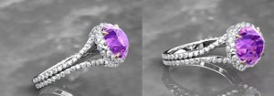
cad_12.jpg

cad_13.jpg

cad_14.jpg

cad_15.jpg
 
How would you feel since you said you liked things less blingy about doing a center diamond where the halo meets on each side vs having the melee merge together? I personally perfer it this way but if you want to make it look a bit less blingy it might be an option.

Anyhow I really like the ring. I think it is very classic looking and the changes you made from the orginal will make your center stone pop.
 
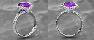
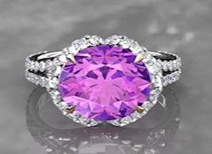
My apologies for the flood of pictures but I think the more I put out here, the better we can assess the design. Last picture so let the comments begin. The nitpickier the better. :praise:

cad_frontal_view.jpg
 
Msop04,
I am not committed to this vendor yet, nor this CAD particular design. I take it you like it as is?

SB,
I don't know in all honesty. Having the halo merged is less blingy but departures too much from what initially caught my eye upon seeing the original design. I feel that having it look like 2 separate pieces >< is more distinctive than a Y connection. To merge them would feel as though it is just a regular halo and that is something I definitely draw the line at for this stone.

I am still unsure about wearing a ring that looks as though it is literally dripping in diamonds. :lol: I love the look, don't get me wrong, but cannot imagine wearing it. Not sure how it remains classic looking when it is so diamond studded. Does the proportion look all right? The melees look rather large for the stone, does it not or it is just right?
 
actually, I prefer the CAD to the original Leon.
why?
the halo around the original seems to have a stone missing....to my eye.
in the CAD the halo is defined and flowing.
and I do like the prongs/claws.
yes, I prefer the CAD.
 
movie zombie|1374763726|3489928 said:
The halo around the original seems to have a stone missing....to my eye.
in the CAD the halo is defined and flowing. Yes, I prefer the CAD.

Good point. You made me take a second look and I can see this when the ring is viewed at that particular angle so I need to take this into consideration when making changes to the CAD. Thanks MZ.
 
Chrono|1374763643|3489924 said:
Msop04,

I am still unsure about wearing a ring that looks as though it is literally dripping in diamonds. :lol: I love the look, don't get me wrong, but cannot imagine wearing it. Not sure how it remains classic looking when it is so diamond studded. Does the proportion look all right? The melees look rather large for the stone, does it not or it is just right?

I think you will adjust beautiful and I totally agree with the Y merge vs the ><.
 
I don't post much at all. Forgive me if my nomenclature is not spot on!!

But am wondering if the shank could reach out a bit more to the decending halo. It looks from the side as if the halo arms are connecting straight down to a flat perpendicular shank.

Fwiw, I do like this setting a lot as the halo is unique, I love the way it reaches down to the shank. If you could see what it would look like if the shank reached or curved up just a bit to the halo, to further cement your vision--in either direction.

It will look great, you've a great eye!!
sarahb
 
Hi,

I don't think the melee in the halo are too big. I like the shank. I do think that the melee coming down in the center of the ring look bunched up and too crowded. It might not be so comfortable on the finger that way. Maybe 2 across, 2 across, one across. I think i counted 8 or 9 melees. . . This really is my humble opinion. I'm Not experienced at all in this.


Annette
 
From the side, the Y where the halo flows down is very nice & unique. My first thought on seeing both the Leon & this CAD was that from the top, it looks like a diamond is missing. In actual wearing, it might not look like that as your hand will be moving & the whole ring's design easily visible.

It's a stunning stunning ring, Chrono! It is blingy -- I'd love to own it, but if you aren't a big bling wearer, before you cough up for it, meditate on your comfort with it. I say that not because it isn't gorgeous, but because many posters say, "I loved it when I bought it but I find I'm not comfortable wearing it IRL." It certainly is beautiful!

--- Laurie
 
If I'm being honest, I STILL think that it looks like there's a stone missing from the top down view. I like the way it looks from the side, and I'm not sure how to maintain the "v" aesthetic from the side and alter the top down view.

It's a lovely ring, but definitely very blingy. When you say RHR, do you mean that you'll wear it occasionally? I know you have quite a collection, so if this becomes a special occasion RHR, I think you'll be fine. Can't wait to see the finished project!!
 
I like the size of the melee with the center stone. From the top down, not too blingy. From the side view it looks more blingy, but your side fingers will cover some of the melee so I don't think it's too much. I think Annette makes a good point about the melee looking a little bunched at the center. If it is too blingy for you perhaps that's an area you could streamline it? It is very pretty and makes the color of the center stone really pop.
 
Thank you so much for chiming in, old posters and those coming out of the woodwork alike.

Sarahb,
No apologies necessary. Often times, I'm not even sure if what I typed is understandable at all! I think you are referring to the Y look it now sports versus a >< of the original?

Annette,
I agree that it looks cluttered coming down the center of the ring. It doesn't look refined and defined. I don't think it will be uncomfortable though because my finger will not be making contact with this point, if I am referring to the part as you are. Do you mind elaborating?

JF,
I want to be able to see a notch from the top view but the fine line is that I don't want to see the setting and think "hey, a diamond is missing". I think I ought to be able to partially see a diamond which the CAD captured perfectly.

Yenny,
All right, comment accepted and still digesting. You see it as a stone missing. Got it! And yes, it is going to be difficult to alter one side with minimal effect from the top and vice-versa.

kgizo,
It is very important that the ring doesn't look too blingy top down so it's good that you agree with this. Yes, side view is very busy (to me). Do you think this is because the pictures are huge in comparison to a real ring?

I love to look at bling and I love to wear bling but have never owned anything this "busy". This will be my first ever 2 sided pave ring. Initially, I was not comfortable wearing stones larger than 6 mm but look at what I'm wearing now. Anything smaller than 8 mm feels tiny. :lol: All my coloured stones are RHR for the sake of putting a label on them. I wear them on both my right and left hand depending on the weather and swelling. I wear them to work and back, out for functions and sometimes just for any reason at all.
 
Chrono, I took another look and I have to say that I actually love this ring as is. yes, Ms I Don't Like Halo's, likes this one. I like that the pavilion is visible and I like that the spinel is still the obvious star of the show. while it is a definite BLING ring, the diamonds do not overpower the center stone. and I like the shank better than the Leon as well.

i'm curious as to what you are contemplating changing. its a much nicer ring that the inspiration, imo......

admittedly, i'm not an expert at ring design, especially very blingy ring design, but I know what I like and I think you did a super job with this.

eta: I don't think the side looks cluttered at all.
 
Here are the alterations I requested. Nitpicking is good and helpful.

Side connection (ref. curvier edit.jpg)
I think I would prefer that the two lines remain distinct, rather than appear to meld into a single line before splitting again into the split shank. I am unsure if this is possible although I do like how it curves inwards. What I don't like is that the 2 melees right in the middle look like a single giant melee. The 2 sections will still be connected for structural strength but look separate (only the sides touching with no curvature).

Connection to split shank (ref. curvature edit.jpg)
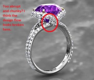
I think the flow of the design looks interrupted as though something is missing. If this portion could curve outwards just a touch before becoming the split shank, it would look seamless and help avoid that cluttered look.

curvier_edit.jpg

curvature_edit.jpg
 
Your 2nd picture is what I was trying to communicate with my comments--this exactly, in my mind, it looks 'abrupt', wondering if the
change would make it look softened a bit--

It will be gorgeous when finished!
sarahb
 
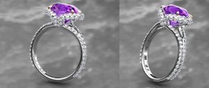
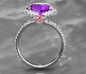
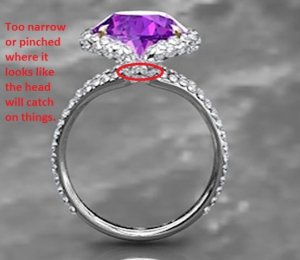
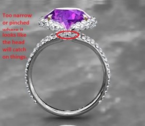
the full frontal side view is delicate to the point of looking flimsy. I would think the entire head could easily pop off especially as it looks designed to catch on things. I'd also feel better if the bifurcation of the shank were a little weightier . I dont mind there being so much empty space under the stone, it just looks frail.
 
MZ,
I am happy that you took the time to comment because I know you are well known in CS as "Ms I Don't Like Halos". :lol: I love staring at the profile of my stones and since this is a lavender blue to purple colour shifter, I think it important to have a more open setting. No drastic changes, just minor tweaking which probably will not even matter to most people. Thanks for your compliments.

Sarahb,
As they say, pictures speak a thousand words. As basic as my skills with MS Paint is, I still think it conveys my thoughts better than typed words.

VL,
I am all for thin and delicate but not to the point of flimsy or "ring pop" look. I think my latest suggestions to the CAD designer should take care of the pinched look. A slightly larger and more obvious curvature resolves this.
 
Definitely very blingy and beautiful! I'm not sure if I had just seen this design as it currently is that I would have immediately assumed it was yours, though.

Two things occur to me in looking at the magnified photos:

I think part of the reason that the c curves under the halo look muddled is that your first instinct was correct--the size of the melee is too large for super clean lines. Personally, I'd like to see how it looks with slightly smaller melee.

The other thing is that although I like the idea of how visible the pavilion of the spinel is, I really think there needs to be more of a swoop in. The straighter lines as they currently are shown, contribute to the lack of definition in the back-to-back c's under the halo.

I hope that makes sense?

This is going to be such a gorgeous ring!
 
Hi again.

This comment is expanding on the ri ng being possibly uncomfortable. First your fingers have joints that are used often. Make a fist, open and close and see the base of the ring finger move . The ring, along the bunched up portion, (lower) is quite clear on your last photos. Its going to rub the skin when you move your fingers, I think, maybe. I think that bottom stone is too low set. I don't know if it is covering up the metal.

Vapidlapid comments I would take seriously, but the thin shank style is so in, I have accepted that look in all the designs I see. I would never have a shank that thin, personally, but the delicate looks that you younger women like make this look into a beautiful ring.


Annette
 
Aoife,
I am impressed at your ability to express your ideas so succinctly with mere words. I understand you perfectly right away. Per the designer, the melee size is already reduced at the c curves. The halo has 1.5 mm melees and the curves has 1.1 mm melees. Which brings me to the second point you brought up; the swoop in. I agree that the straighter lines of the halo (profile view) is probably contributing to the lack of definition of the back to back c's under the halo AND muddled look. It would be very unfortunate if I have to enclose the pavilion further as a consequence.

Annette,
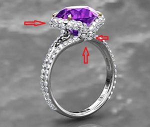
I like my rings to be extremely low set so your explanation made me sit up and rethink this. Are you referring to the area where the arrow is pointing to the right, pointing upwards or pointing to the left? Also, I don't think VL was commenting on the shank's thinness but the collar where it looks like one knock will shear the stone off. Having the shank made up of 2 bands provides additional strength.

bunched_up.jpg

too_thin.jpg
 
I wonder if you can get a view of the cad without the stones. I am wondering just what the structure looks like. since it is a custom I also wonder if it couldnt be more sinuously sculptural. I too am uncertain of nomenclature here so please forgive my clumsiness. The metal part that I will call the arrow pointing right, of which there are two, one on the east, the other one west, I have two questions about. Do they rise organically from the opposite shanks? I would like them to. Also I would like it if their physical volumes, their gauge if we think of them as wire, were thicker, more generous at the top, tapering slightly to where they become shank, and I would like a similar size tapering in the diamonds. Forgive me if I am completely off the mark. The stone is so lovely.
 
I am imagining the stone set a little lower with the metal around the stone rising more organically from the shank

toothin.jpg
 
I think VL is saying what I am thinking. It looks as though, if a stray piece of thread/yarn/string, caught under the stone/head, and it got just the right tug, the head and the stone would go popping off.

I kind of look at that center area and think "diamond vomit". I can't see single diamonds and it looks mushy there, for lack of a better term. Did you love the Leon as it was minus the gold/FCD collar because of the color or because of the actual design element? I think that the original collar serves two purposes - artistic but also structural. It makes it appear more dainty than it actually is because of the color difference.
 
Disclaimer. I didn't read all your comments. So feel free to ignore.

The second pave collar (the lower one), to me, is too prominent. I think it needs smaller melee and should be set "in" a bit more (tucked under).

Looks great though. And I think your post is fine on RT. The setting has diamonds in it. :wavey:
 
Also, one thing that makes the original work is that the pave on the shank is also 2 sided (or three sided, depending on how you look at it) so it has better flow. The CADs only have it on the head, so it further interrupts the flow of the ring.

EDIT: Why full cuts over single? I think single would compliment the stone better because it has bigger, flashier facets.
 
"It is very important that the ring doesn't look too blingy top down so it's good that you agree with this. Yes, side view is very busy (to me). Do you think this is because the pictures are huge in comparison to a real ring?"
To be clearer, I don't think the side side is too blingy. In the pics it looks blingier from the side, but your finger will cover up some of it so in real life it won't be too much. I was just pointing it out because when shopping I have thought a ring is overwhelming, but tried it on and discovered it looks good because you don't see the entire shank when wearing.
The only tweakI would suggest is in your curvier edit pic to get rid of the bottom 2 melee. To me that would make it look more like back to back Cs, which if I'm following right is what you want. The bottom 2 melees aren't a big change, but they seem to interrupt the flow by pulling the eye down and then out, vs just out like a C. It's hard to convey in just words so I hope this make sense. Again, it is very pretty so I think you are on the right track.
 
GET 3 FREE HCA RESULTS JOIN THE FORUM. ASK FOR HELP
Top