shape
carat
color
clarity

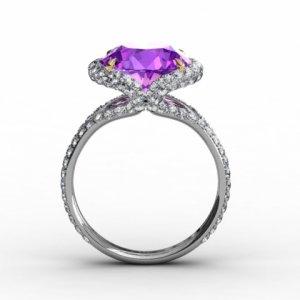
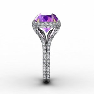
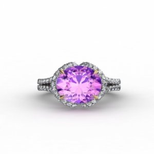
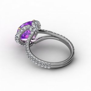
CAD Review for 4 ct stone in EW design

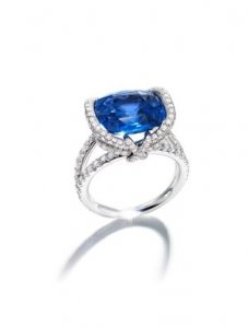
I just did a ruby engagement ring for a friend with a similar shaped setting. It was this setting from Stuller with a 9x7 east/west oval. http://www.stuller.com/products/121995/3657484/?groupId=113518
I liked how the Y shape which was broader than the one in your CAD looked from the side and the top. From the top you could tell what it would look like from the side. I think the main difference may be that it only one row of melee diamonds on top that turned out as it got to the sides so you only saw diamonds on the outside thirds of the “halo”. I hope that made sense. If not I can post a picture. lol I’m terrible at explaining things.
 
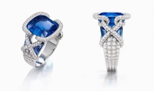
In the original LM ring, I like how the white diamond ring of melee acts like a collar around the center stone, and follows the girdle of the center stone.

In the new setting, I don't like how the collar has to bend down away from the girdle to meet the shank of the ring. Could you replace the line of yellow stones you removed with a thin oval of metal (no melee), and mount the stone as low as possible? I realize you might not want to have a metal ring without melee, and you purposely took out this ring with melee.
 
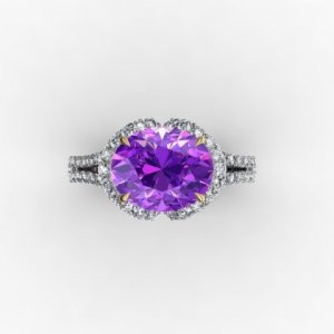
It's beautiful top down! Gorgeous

I take issue in the same place you do. The connection where the two sides of the shank meet before turning up.

The double pave collar is gorgeous around the stone, and love the way it swoops down and gently kisses the other side before doubling back to the shank. However, it just creates a jumbled mess of diamonds in that area. I'm wondering if an even more drastic downsize in the melee size is possible.

I'm also curios if you've thought of instead of a single row of diamonds up the shoulders, mimic the full pave look of the collar. It might help the flow feel more organic.
 
I had pretty much the same thoughts as everyone else.

The 2 rows of stones flowing around the 'Half bezels' of the centre stone don't transition well to single row in each side of the split shank. The transition point looks messy to me. I like the idea of continuing the 2 sided pave down into the split shanks, but that's adding even more diamonds and might push you over the bling limit :D

It is a beautiful design and if you can get the transition point looking smoother, it will be stunning.


Have you seen Chaumet's Liens collection? They have a couple of rings that have a somewhat similar concept, which might help crystallise some ideas for you.

_8288.jpg

_8289.jpg
 
Hi Chrono,

I didn't read thru all responses and have no idea if what I want to mention has already been said. Anyway, here goes:

1. The areas you circled don't look refined but you have already picked that up.

2. In the LM, the halo looks clean. In the CAD, the halo doesn't. While I love the V drip of diamonds, face up shows ribbon shape (round 1 time). Melee looks slightly scalloped (round another time). Overall, the oval shape is lost to me. As round appears too many times. I generally like scalloping but in this case, it doesn't look as nice though I can't quite put my finger on it.

Hope to see an updated CAD with all elements you like in it soon. :appl:
 
I am in a strange situation where I do not feel comfortable making to the vendor for too many changes or CADs without the stones. As such, I am afraid we will have to use our imagination or play around with the existing pictures.

VL,
Yes, the two portions are supposed to rise organically from the opposite shanks. Their thickness is also more generous at the top, tapering in thinness where they become the shank. And thank you for the very kind words about the spinel. It is one of my favourites.

Freke,
Love your honesty and I know I can count on it. :lol: The poor stone looks choked and one whack and it's off with her head. Diamond vomit is certainly more graphic than mush and I agree it looks chunky there. I am not into a lot of bling, hence the FDC collar is removed (too much diamonds and I don't want FCDs in my design). I am sure the collar is there for structural issues too which is why modification is required when I requested this element to be removed. I don't need it to be dainty but I want it to look refined. I am also firm in that I don't want a 2 sided pave shank.

Gypsy,
Hmmm...perhaps that second pave collar not being sufficiently tucked is what's making it appear too blingy.

Why full cuts over single? I don't know other than that all 4 vendors who quoted this project said full cuts are better than single cuts for this design, claiming it will be flashier. Out of the 4 vendors, 3 of them are able to source single cut melees easily.
 
kzigo,
I am hoping for the same effect; that once worn, it won't feel as though it is too blingy. Your experience is reassuring.

TGLady,
Thanks for chiming in. The thing is that I don't want a Y shape but a back to back C shape. Perhaps I do not fully understand what you wrote?

Pregcurious,
I have to walk the fine line of using Leon's ring as an inspiration and not an exact copy. I also suspect several reasons why the halo cannot follow the girdle of the stone, namely, the yellow FCD collar has been removed and without it, an important support structure has been removed and the design now has to be modified to support the stone. I think I'm all right with the sloping effect, giving me good profile view of the stone. Given that this is a colour changer / shifter, having light from the sides will allow the spinel to flash it's happy pink, blue and purple colours. Replacing it with a metal collar is certainly possible but you are correct that I do not want to see metal in this ring, hence it is dripping with diamonds. :lol:

Davi,
The jumbled mess is now fixed. :)) And yes, I am insistent on not wanting a 2 or 3 sided pave. As it is, it took a lot for me to accept a 2 sided halo, only because it hides the metal supports behind.
 
MAC-W,
You are so right in that having the 2 sided pave continue down into the split shanks will set off the bling alarm limit. :bigsmile: I have never seen Chaumet's Leins collection and they are beautiful. Diamond studded but beautiful nonetheless. In the last picture (rectangular cushion set EW) comes close to LM's original design and I noticed that it also has a diamond collar for additional support.

Ashleigh,
I don't understand your comments. Are you saying that the oval stone appears roundish?
 
Updated CADs arrived yesterday evening.

ccad1.jpg

ccad2.jpg
 
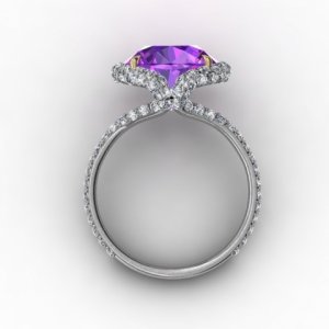
More CADs.

ccad3.jpg

ccad4.jpg
 
movie zombie|1374771527|3490017 said:
Chrono, I took another look and I have to say that I actually love this ring as is. yes, Ms I Don't Like Halo's, likes this one. I like that the pavilion is visible and I like that the spinel is still the obvious star of the show. while it is a definite BLING ring, the diamonds do not overpower the center stone. and I like the shank better than the Leon as well.

i'm curious as to what you are contemplating changing. its a much nicer ring that the inspiration, imo......

admittedly, i'm not an expert at ring design, especially very blingy ring design, but I know what I like and I think you did a super job with this.

eta: I don't think the side looks cluttered at all.

+1
I think this stone deserves a blingy setting. And I am a non-blingy sort myself. But I think this will be a breathtaking ring.

ETA: The new CADs look great. I really love the profile of the ring.
 
Last set of CADs.

ccad5.jpg

ccad6.jpg
 
Ah, this looks so much better, especially from the top-down view! I'm liking that view a lot.

The profile is vastly improved, too. So much better flow, much more cohesive and organic. Yes, yes!

Do you have a photo of the way the shank flows up to the head?

Never mind, now I see it.

How thick is each of the strands that support the head going to be? It still seems a tiny bit top-heavy to me--or is that just the angle of the CAD's ? 4th photo.
 
well the new cads help a lot in visualizing the form. until today I thought the east shoulder flowed down into the west shank. Now I see they turn almost 180º making that back to back "C" form. obviously I was imagining an "X" form. I think the "C" is going to be inherently problematic as it will always form a wasp-waist. The distance in height necessary for the metal to make that turn makes the stone sit 2 mm higher than otherwise. the little "band" that locks the "C"s together on each side with the muddy diamonds, is that the only connection between the east side and west? My concern is that it is lovely architecture that can't stand up to a 5 mph breeze.
 
This refinement looks great--I just looked at the first set of CADs, & this last version is perfect IMHO.

Can't wait to see it!
sarahb
 
Chrono, the new halo looks cleaner and the oval shape is more apparent. Yes, it does appear to sit lower and I suppose that's good for not knocking into things, and easier to put your hand into pockets.
 
Aoife,
I don't know how thick each "strand" support for the head is and I agree that although lowered slightly, it still looks top heavy.

VL,
Very interesting that you saw it as an X. How did you come about the 2 mm extra height as compared to X mm? As far as I can tell, yes, the two Cs on each side is the sole connection point. 5 mph breeze is a good one. :lol: Guess I'd better not sneeze.

Sarahb and Ashleigh,
Thanks for chiming in.

I have brought up my concerns to the vendor and he will double check this with....I have no idea who. :wacko: That said, it appears that this trial offer has come to an end and a decision needs to be made on my end. I do not feel comfortable with free work, which we all know isn't really free. Once I receive further details regarding the thickness of the connection, discussion will follow on its structural strength and wearability. Thank you to all those who've spent time studying the CADs and commented.
 
So the two sided diamond Cs come down and kiss each other, forming the only connection. Have you thought about having them "kiss" something else? I went back and looked at your other threads about a setting for this stone, and I saw the little pink diamonds. Could you put them on the N/S sides, and have the Cs meet and curve back at the pink? I don't know if you had used those for anything else, but I think it'd be cool, and break up the "diamond vomit" (lol, I should trademark that) and show the actual curving back that the bands do. Because the ring is so simple, and you can't really SEE whats going on in that area, which is the main design concept!

Also, I would not wear/use pockets with this ring, or try to stick your hand in your purse.
 
Ooh....very interesting take on adding surprise diamonds into this design. The pink FCDs are still available but will require a halo of rose gold to amp up their colouration. I'm not sure if this will end up looking busier since I already have a predominantly white metal look going on with (what looks like) yellow gold prongs for the spinel. Will it look odd to have 1.1 mm melees then suddenly a "giant" 2 mm halo breaking up the flow? I'll broach on this with the vendor too. Thanks, Freke.

I do not use purses so no worries there but I love my pockets. :tongue:
 
Bezel the pinks in rose gold and change the prongs to WG. TADA!!!!
 
Chrono, I absolutely love the second round of CADs. You did a great job explaining the tweaks to the vendor.

I love the idea of the pink diamonds, but personally I'd leave it as is as long as the vendor feels it is structurally sound. It's breathtaking as is.
 
the 2 mm is what I took away in the pic I photoshopped so the stone would sit lower and the shoulder would the flow more organically in to the shank, but I was then picturing that as an X not two Cs making out.
 
VapidLapid|1374880799|3491104 said:
the 2 mm is what I took away in the pic I photoshopped so the stone would sit lower and the shoulder would the flow more organically in to the shank, but I was then picturing that as an X not two Cs making out.
Lol. This is going to be Chrono's "kissing" and "making out" ring. :naughty: :naughty: :naughty: :naughty:
 
Then vomiting afterwards. :lol:
 
Looks better!

Much less diamond "barnacle" looking.
 
I have word from the vendor that the joint is safe enough for everyday wear. I am awaiting news on the ring height out of personal curiosity. More pics soon and responses to your comments at a later time.
 
Chrono you indicate that you are an understated person by nature. What is your ring size? What percentage of your finger will this ring cover? To me proportions of the ring to the hand can be just as important as the ring design on its own.
The transition between the head and the shank feels a bit bulky.
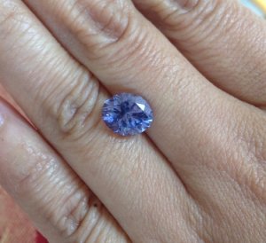
Having not seen the original stone I cannot say how I think color might play into things. Do you have photos of the stone? Any on your hand?
 
ive been trying to read this as much as i could, but its very involved so I am sure i missed some. Ill say i think it looks beautiful. One thought I had was i think I'd like to see it whereinstead of a V it would have a X chris cross shape where the head meets the shank
 
Have done one with Platinum or white gold prongs? I am not sure the yellow prongs actually flow with the rest of the ring....
 
My ring size is 4.5 on the left, 4.75 on the right. I believe there will be an almost full finger coverage. Colour wise, this stone is a shifter so it can range anywhere from purple to blue and all shades in between.

spinel_hand.jpg
 
GET 3 FREE HCA RESULTS JOIN THE FORUM. ASK FOR HELP
Top