shape
carat
color
clarity

CAD - yellow sapphire engagement ring

greenie09

Rough_Rock
Joined
Jan 19, 2013
Messages
9
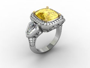
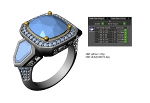
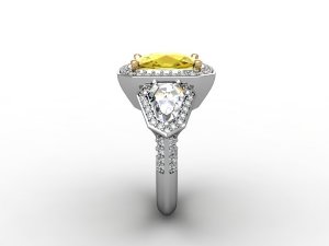
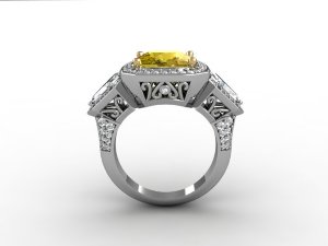
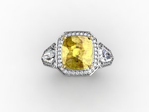
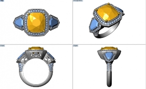
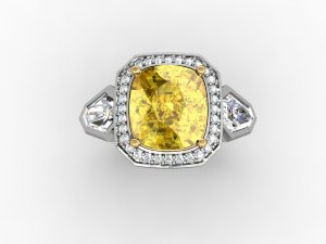
I just got the CAD in my email a few moments ago for my yellow sapphire engagement ring - I'd like any and all opinions, please!

I had originally told the designer that I did not care about the halo extending to the two side stones, but now I am thinking it doesn't look quite right.

--Specs --
Stones:
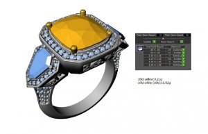
4.71 carat yellow sapphire (unheated), cushion-cut
~.50 carat shield-cut side stones - I forget the exact specs on these guys but they are amazing and give off a lot of fire
Metal:
Platinum
._7004_mary___sarah_2tt_r_r1_5.jpg_7004_mary___sarah_2tt_r_r1_7.jpg
 
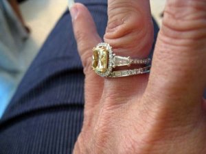
I guess it's all a matter of how much blingage you want. My ering is similar to yours but with diamonds around the side stones and I love it, but it also all blends together whereas the head of yours is not connected to the shoulders so I think you can get away with not having the diamonds on the side stones. I think it looks good the way it is. Gives it a little more texture.
 
Thank you for that perspective! This is going to be a hard decision.
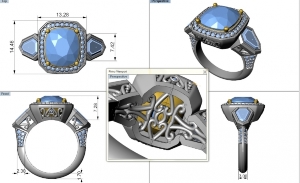
I'll include some more photos --

_7004_mary___sarah_2tt_r_stone_count_weight_0.jpg_7004_mary___sarah_2tt_r_5v-1_0.jpg
 
Can you ask for an alternative CAD with the shields being held in place by prongs instead?

If you want a big, bold ring then it's fine as it is. Have you checked that the ring won't give you too much finger coverage? Looking at the mm it looks like it will go right across the finger and possible extend slightly over your next fingers (only slightly).

If you want a slightly less blingy look, I'd be tempted to remove the pears altogether. The basket work on the central stone is absolutely beautiful (especially under the head) and I'd be tempted to have that at the sides as well if you remove the pears.
 
The way the ring currently looks in the CAD, the metal around the shields looks like too much. I see that the metal is flat next to the shields, then beveled out at an angle, then goes down. Can you ask for the amount of metal to be reduced? I don't think you want to emphasize the bezel around the shields. Your eye should go straight to the center/halo.

LD's idea of prong setting the shields also fixes the heavy bezel effect.
 
This reminds me of a ring that I currently have. Mine also covers my whole finger from side to side but it's one of the most comfortable rings I have. It also has a "heavy" gold look around the side stones but we had to design it that way to accomplish what I wanted so I don't mind. Your center stone and halo sit up taller than the side stones, while mine all follow the same rounded top line.

I really like the details on the profile of your ring and underneath the center stone. I love it when a ring is finished in places that you can't see when wearing it.
 
The way it is currently designed, the shields should not be halo-ed. If you want them to be halo-ed, I third the suggestion that they be prong set. This will streamline the design by reducing the bulkiness and also match the center stone design (prongs).
 
What sort of feel did you want from the ring OP? I think the cads look great but then I like more solid modern looking jewelry. I really like the mix of bezel and prongs and halo and no. I would ask for the shield bezels to be as fine as possible. I would also be tempted to the the metal under the sapphire in yellow gold like the prongs to bring out the color of the sapphire.
 
What sort of feel did you want from the ring OP? I think the cads look great but then I like more solid modern looking jewelry. I really like the mix of bezel and prongs and halo and no. I would ask for the shield bezels to be as fine as possible. I would also be tempted to the the metal under the sapphire in yellow gold like the prongs to bring out the color of the sapphire.
Can you share photos of the sapphire? I'd love to see what it's like.
 
It is a gorgeous ring design but I second LD in checking the overall width of the haloed sapphire plus the sidestones. In cad you also have a knife edge on the shank-- I would just be cautious about how comfortable it is. My E ring is a bit uncomfortable and therefore I don't wear it all the time, which makes me a bit sad....

I wear a size six and I think the top of my ring finger is about 16 mm across ? I was looking at a marquise stone just under 14 mm that I would set E W and one of the reasons I didn't purchase it was my fear of comfort..
 
I like the ring how it is. NICE center stone btw. The only tweak I would make is to put some metal around the tops of those shields. I don't prefer how the top of the diamond shield bumps into the halo whereas the rest of the shield is surrounded in metal.
 
Despite being the CAD image and knowing that the metal thickness is exaggerated, I also feel like there is too much metal on the top surface of the side shields. Hopefully they can adjust it to prongs with a halo if you want that extra bling, or at least shave down the metal.

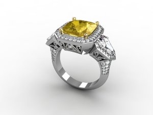
I *love* the bottom detail and gallery filigree!! So beautiful.
 
pregcurious|1360354112|3375488 said:
The way the ring currently looks in the CAD, the metal around the shields looks like too much. I see that the metal is flat next to the shields, then beveled out at an angle, then goes down. Can you ask for the amount of metal to be reduced? I don't think you want to emphasize the bezel around the shields. Your eye should go straight to the center/halo.

LD's idea of prong setting the shields also fixes the heavy bezel effect.

I don't know if its too late to respond to this thread, but I agree with the bolded. It feels to me that the side shields are enough as is. You say they are really sparkly and gorgeous. Then they can stand on their own. I agree that what I see is bulky on the sides and takes away from the gorgeous center. I agree that your eye should be drawn there. So, that said, I would dispense with the bezel and have the side stones set in prongs. That way they serve as gorgeous, blingy extensions to your gorgeous blingy halo and don't compete. If your heart is really set on a bezel, then I would make it much thinner and more delicate and take away the indent at the shoulders (do you know what I mean?) that causes a visual separation from the center and the sides.

You have a beautiful ring in the making. I love the detail on the gallery. Again, reiterating what others have already said, please make sure its not too big and is comfortable.
 
I agree with you! I just got new CAD images but I am replying as I read... I will post the update in just a minute.

There was an initial ring that I fell in love with, but it was ~$26,000. Ugh. It was by Michael Werdiger (real name Richard Werdiger), who is now sitting in federal prison for tax evasion. (http://www.idexonline.com/portal_FullNews.asp?id=36033). So unfortunately, I don't have a picture of the actual ring and I cannot provide a link to it. Dangit, Richard!!

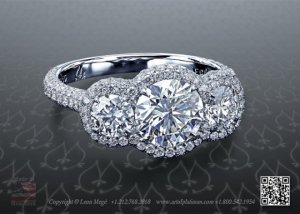
One of the things that made it so expensive was that it was a halo ring similar in design to this link you posted (http://www.stevenkirsch.com/engagement/three-stone/r0308.html), but it had tons of micro pave diamonds, which was too much for me. Also, when it comes to three-stone rings, I prefer a colored center stone.
 
Update

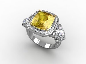
Here is the updated design.
_7004_mary___sarah_2tt_r2_r1_7.jpg_7004_mary___sarah_2tt_r2_r1_5.jpg_7004_mary___sarah_2tt_r2_r1_3.jpg_7004_mary___sarah_2tt_r2_r1_0.jpg_7004_mary___sarah_2tt_r2_r1.jpg_7004_mary___sarah_2tt_r2_stone_count_weight_7_0.jpg_7004_mary___sarah_2tt_r2_4v_1_0.jpg
 
Oh i do prefer it with the halo. I tbinm, however, i might even prefer it without any pave on the shanks
 
I think it looks big and clunky, like a yurman on steroids. But the I think the real solution to the original issue is to get rid of the halo altogether.
 
VapidLapid|1360889660|3380396 said:
I think it looks big and clunky, like a yurman on steroids. But the I think the real solution to the original issue is to get rid of the halo altogether.


I agree it looks a little over the top. If this was intended for an engagement ring, i think a simple three stone with some nice chubby traps would be a lot more flattering for everyday wear. BUT if this is meant to be something fancy for special occasions, than it does have that "special" feel too it :))
 
I tend to agree that it looks bulky, but my tastes are more streamlined. Some thoughts: what if you dispensed with the halo around the traps/shields and instead used milgraining - it would mimic the effect of haloing. I also wonder if its necessary to have the squared off edges of the haloing around the sapphire and the indentation around the shields (I'm sorry, I know I'm repeating myself on the last one!) - I believe it will look less clunky and more elegant if the halo has rounded edges like the sapphire.

The other thing I have to say is that just about all CADs look clunky to me to some extent and sometimes what reads as bulky in the CADs looks great in reality due to the comparatively crude rendering of the CAD.
 
I love big rings but it must also be elegant. This version has nice prongs but the halos make the shields look like shoulder pads. Would you consider doing away with the side stone halo? Prong set the shields, then a bit of pave going halfway down. The attention will now be focused on the sapphire instead of the "wings".
 
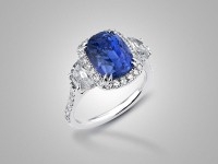
I feel like a couple of people are suggesting modifying it a bit so it has some of the effect of the Victor Canera's Alexia Halo?

213-183-4956.jpg
 
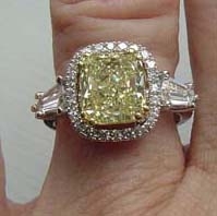
Maybe this will help visualize what I think some people are suggesting. The side stones have prongs and no halo thus no bulk and they flow instead of block the lines of the setting. Good luck! It's going to be a gorgeous ring.

_3715.jpg

_3716.jpg
 
Catmom,
Your ring is the perfect example of what I envisioned for the OP. Just perfect! Big but not bulky, with the focus on the center stone, elegant and flows well.

Greenie,
If you don't like prongs and want to bezel set the shields, that is fine but the bezel is eating into the stone. It needs to be much thinner than shown, barely covering the edge of the crown. The other thing that will make it more feminine is to round off the corner of the sapphire halo like Catmom's setting. The current straight edge of the corner adds to the bulk.
 
The center stone in both the Alexia and Catmom's ring is a bit more elevated than in the CAD for you ring-- it is such a gorgeous sapphire it needs to be the star. I am sure it will not darken too much, but if it were my ring, I would want my eyes to focus on the sapphire.
 
I hope we didn't scare greenie away with our comments... :blackeye: :(sad
 
I hope we didn't either but she did ask for any and all comments. If she loves the new CADS then I am happy for her and am sure it will be gorgeous. She has an amazingly stunning sapphire and this, at least to me, will be the showcase of a once in a lifetime rings so I think we all just want to try to help her work through the CAD process and get exactly what she wants.
 
^ Haha!! Not at all!! I agree with you!

I liked the look of shield side stones (in general) because I felt they had more visual interest than some other cuts. I like the side stones that I picked, but now that I see them in this context I get the shoulder pads feeling from them, too. I was rather shocked that my FI wanted me to have such a huge center stone. I think she has become a little bit too enthusiastic and this is the result.

Ugh, I don't know what to do!
 
I think Catmom's picture is a great example of how prong-set sidestones work with a halo. Could you ask for CADs with just prongs for the sidestones and see how you feel?

I think part of the heavy feeling in the cads come from the amount of metal that is in your design (like in the first CAD with the bezeled shields), and is also inherent in CADs. The rings by Leon Mege use very minimal metal, with stones set low to the finger. That is part of his signature look.
 
GET 3 FREE HCA RESULTS JOIN THE FORUM. ASK FOR HELP

Featured Topics

Top