shape
carat
color
clarity

Calling CAD experts please help me

meely

Brilliant_Rock
Premium
Joined
Jan 2, 2014
Messages
1,859
IMG_1613.jpg IMG_1616.jpg IMG_1617.jpg
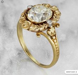
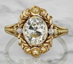
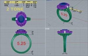
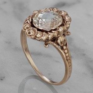
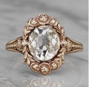
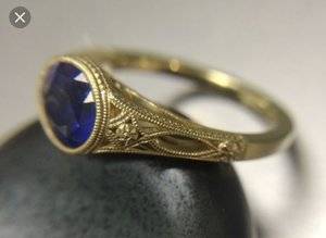
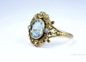
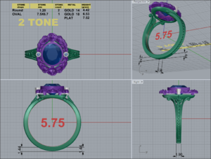
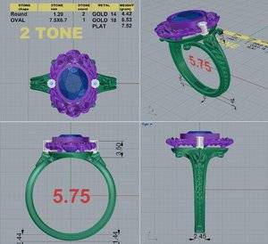
I am experiencing some frustrations with my cads. I'm trying to recreate as much as possible this setting which I saw and fell in love with! However the stone is a royal blue sapphire. It does darken up in certain lighting conditions which is having an influence on how high it is set not sure what it's gotten so much higher between cads though. I asked for the shank to be more curved in as per the blue line in the first cad but just got back the second cad.
How can I make myself clearer? Perhaps I tried to explain too much rather than letting the blue line speak! I'm starting to feel a little stressed as we had got to a certain point with only a few redesigns but this along with last but one revision (not included) feels like it's going backwards. I hate to waste DK time.
Kind thoughts welcome.
43610-QUAD.jpg 43610-quad.jpg
 
IMG_1618.jpg IMG_1619.jpg
There is also this 'version' after the original not so fine but more similar in shape to my stone. Should add the stone in the original one is around 9x8.
 
I love the inspiration ring! Erica of Love Affair Diamonds recently made a version of this ring and it turned out beautifully. I find DK great when it is something they have made before, but it seems with new designs, it can take many tries to get CADs right because they are kind of lacking a designer.

Is the second CAD on top? The round side bezels look way too high to me. I think the center bezel looks a little high, too. I don't think that height is going to make any difference in how dark the sapphire is because the bezel is around it no matter the height. I'd keep the heights similar to the top ring.

When you taper the shank more near the top, it will result in a thinner bottom. But they have the bottom at 2.45mm, and it could certainly go down to 1.9-2mm.
 
i am no expert, but I agree with you that something is off with the CAD. It doesn't seem to have the delicate flow of the inspiration piece. Can't quit put my finger on why. I was wondering about the gap between the halo/top part and the ring part , is that intentional to allow more light? If so it seems as though this could be finessed habit more. I think seeing the base/frame under the halo the way it currently is would be distracting and have an unfinished feeling.
 
Victor Barbone who had the ring (before she sold it) in your inspiration also makes the setting (Mira)
 
Victor Barbone who had the ring (before she sold it) in your inspiration also makes the setting (Mira)

I never liked his copy of this ring, sadly. I also didn’t love how he originally tore out the aquamarine to do weirdo semi bezels on an old oval he basically shoved in there. He realized that was a mistake and put a different one in- overall that rings been on a wild ride
 
A couple things that I notice:

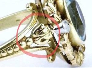
The flowers at the top of the shoulders should be smaller and have an air line around the sides and most of the top, only connected to the ring by the tip of the center petal and the ball below the base of the flower (see photo); on the CAD they appear to be connected to the shoulders and top.

8799F6AA-137E-4619-BE93-0AE3E057AC96.jpeg

The scrollwork that connects the shank to the top is too wide. If you look at the inspiration photos, they appear to only go out to the top of the second set of leaves; on the CAD they go out to the top of the third set of leaves. The scrollwork should be brought in and the entire shank should be trimmed up too.

Everything else looked pretty spot on to me. Perhaps he could provide a colored CAD for you to see, as though it was cast and assembled?

Oh, as for the height of your sapphire, my guess is the stone probably needs to be set that high due to its depth, so that the culet doesn’t rest on your finger.
 
I love the inspiration ring! Erica of Love Affair Diamonds recently made a version of this ring and it turned out beautifully. I find DK great when it is something they have made before, but it seems with new designs, it can take many tries to get CADs right because they are kind of lacking a designer.

Is the second CAD on top? The round side bezels look way too high to me. I think the center bezel looks a little high, too. I don't think that height is going to make any difference in how dark the sapphire is because the bezel is around it no matter the height. I'd keep the heights similar to the top ring.

When you taper the shank more near the top, it will result in a thinner bottom. But they have the bottom at 2.45mm, and it could certainly go down to 1.9-2mm.

Thanks for your feedback diamondseeker!
I didn't realise Erica had made a version I will go and have a look at that
I'm afraid I asked for the bezels to be raised they were flat to the roses before. I looked at the video on vb website and saw they were a lot higher?
I have asked about narrowing the shank no response to that particular question as yet I will ask again.
I assumed the bezel height was due to the sapphire I will ask
 
i am no expert, but I agree with you that something is off with the CAD. It doesn't seem to have the delicate flow of the inspiration piece. Can't quit put my finger on why. I was wondering about the gap between the halo/top part and the ring part , is that intentional to allow more light? If so it seems as though this could be finessed habit more. I think seeing the base/frame under the halo the way it currently is would be distracting and have an unfinished feeling.

Thanks for your thoughts Octo I was fearing what you said regarding the frame!
 
Victor Barbone who had the ring (before she sold it) in your inspiration also makes the setting (Mira)

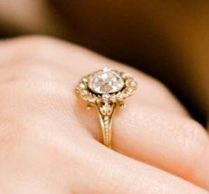
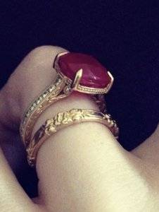
Yes that's where I got the photos from. The second lot of photos are of the copy setting somehow not as crisp as the original. David Klass has done two plain gold rings one with a sapphire and one with a ruby both of which I love that have a real delicacy to them which is what I want for this ring.
 
I never liked his copy of this ring, sadly. I also didn’t love how he originally tore out the aquamarine to do weirdo semi bezels on an old oval he basically shoved in there. He realized that was a mistake and put a different one in- overall that rings been on a wild ride

I didn't realise that I don't think I have seen the weirdo semi bezels version.
 
A couple things that I notice:

The flowers at the top of the shoulders should be smaller and have an air line around the sides and most of the top, only connected to the ring by the tip of the center petal and the ball below the base of the flower (see photo); on the CAD they appear to be connected to the shoulders and top.

8799F6AA-137E-4619-BE93-0AE3E057AC96.jpeg

The scrollwork that connects the shank to the top is too wide. If you look at the inspiration photos, they appear to only go out to the top of the second set of leaves; on the CAD they go out to the top of the third set of leaves. The scrollwork should be brought in and the entire shank should be trimmed up too.

Everything else looked pretty spot on to me. Perhaps he could provide a colored CAD for you to see, as though it was cast and assembled?

Oh, as for the height of your sapphire, my guess is the stone probably needs to be set that high due to its depth, so that the culet doesn’t rest on your finger.

Thanks - so you think the scrollwork looks right width wise in the blue line version? It's on the other one that it's been made a lot wider. Or too wide on both? Your flower comments are very helpful I was struggling with what was off there.
 
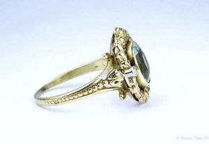
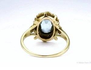
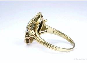
IMG_3222.jpg IMG_3223.jpg IMG_3224.jpg IMG_3225.jpg So is this ring the original and then the photos from vb show it with a diamond instead or is one a copy? They both claim to be antique.
 
Of course these photos showing underside were never shown on vb as it was in a box or on the finger. Looks pretty different to my version and better for it. Would this look be possible or is my sapphire likely too deep? Not sure of the depth
 
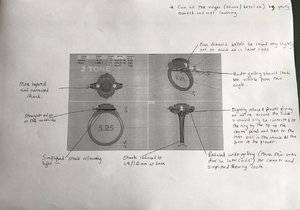
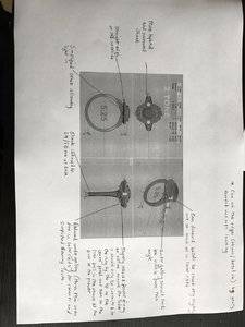
Ok so I have no computer and I can't put all the changes on the cad via my mobile way too fiddly. Is this readable and have I got everything on there and making sense? I will send over the useful photos of the aqua version of the ring too.
IMG_3238.JPG
 

Attachments

  • IMG_3238.JPG
    IMG_3238.JPG
    154.8 KB · Views: 59
IMG_3222.jpg IMG_3223.jpg IMG_3224.jpg IMG_3225.jpg So is this ring the original and then the photos from vb show it with a diamond instead or is one a copy? They both claim to be antique.

This is the original they popped that stone out and replaced t with a diamond.

The photos you’ve posted I believe are of the modern version they based the ring off of- to make multiple versions of this ring.
 
@ILikeShiny if you have a moment do you think my attachment is clear enough?
 
You know who could probably do this ring flawlessly.

https://www.instagram.com/cheyenneweiljewelry

Thanks Niel I've enjoyed looking at the instagram page and etsy shop, they certainly do beautiful work! As I have been working with DK for some time on this and he has invested a good deal of time not to mention that he has already made my engagement ring beautifully I will continue with him in this instance.
 
@ILikeShiny if you have a moment do you think my attachment is clear enough?
Hi Meely! I think it is, but it would certainly be helpful to DK if you provided the individual photos of the examples too (rounded edges, flower attachment, etc.)
 
Hi,
You can also ask David to cast this ring in wax and send it to you. I had him do this when he made my setting. This way you can see what the ring will look like and tweak it and also try it on.
The wax version he sent me is an exact replica of what I got, the only difference being that the wax version seemed thin. When I asked him about that he said the wax shrinks.
The actually ring I received was not thin at all and actually feels quite hefty which I like.

Thanks kayla I've actually had a wax through already! I agree they are helpful, mostly for overall proportions but as detail is lost on an intricate design I almost find the CADs better for that?!
 
43610-quad.png
I got some CADs back. I think they look a lot better. Grateful for opinions.
 
GET 3 FREE HCA RESULTS JOIN THE FORUM. ASK FOR HELP
Top