shape
carat
color
clarity

Calling CAD experts please help me

Looks good
 
In general it’s much better. He really did a nice job tweaking it.

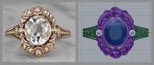
There’s only one thing that still catches my eye. The shape of the halo. In the original, the thickness of the halo tapers nicely towards the middle and then thickens at the ends; yours appears to be close to uniform in size. I mocked a comparison collage for you to hopefully see what I’m talking about.

Again, it’s slight, but I’m very detailed oriented so I noticed it.

9836CC1B-B840-4FC7-B002-47CEAF15DB58.jpeg

You may want to consider shrinking the entire halo mm size as well. It appears to be roughly the same size as the original but the original has a larger center stone; shrinking the halo would keep the same aesthetic balance.
See I see a distinct taper in the center near the bezel rounds compared to the flowers at the top.
 
In general it’s much better. He really did a nice job tweaking it.

There’s only one thing that still catches my eye. The shape of the halo. In the original, the thickness of the halo tapers nicely towards the middle and then thickens at the ends; yours appears to be close to uniform in size. I mocked a comparison collage for you to hopefully see what I’m talking about.

Again, it’s slight, but I’m very detailed oriented so I noticed it.

9836CC1B-B840-4FC7-B002-47CEAF15DB58.jpeg

You may want to consider shrinking the entire halo mm size as well. It appears to be roughly the same size as the original but the original has a larger center stone; shrinking the halo would keep the same aesthetic balance.

Thanks for he feedback! I see what you are saying but it is very slight, to my eyes I can still see a definite taper. Regarding reducing the overall size I'm not sure I want to lose the finger coverage in favour of it being exactly the same stone vs metal proportions. Hmmm. When I got the wax cast I liked the size and shape of it on my finger (this element hasn't changed). I intend to wear this ring quite a lot as a right hand ring and I want it to be smaller than my engagement ring (which is big) but not so small it looks dwarfed in comparison. However I don't want to totally drown out he sapphire with too much gold. I will think on it!
 
See I see a distinct taper in the center near the bezel rounds compared to the flowers at the top.

I'm in agreement on that one.
 
So my ring has been finished for a week but I'm holding things up by not making a decision. :roll
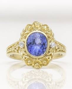
Its very gold which is what I asked for and it looks beautiful BUT David has asked whether I would like it to be oxidised.
Against
It takes away from the richness of the yellow gold. Two of my inspiration rings were all about the gold with rich centre stones and I love that look
For
It will look antique as it is a replica that's not a bad idea
It will highlight the detailing

I need to decide as I'm in the UK.

What do you think?
Could you share a pic of the current version?
 
IMG_7357.JPG IMG_4266.PNG
Sure. I think the one on the finger are probably more accurate in terms of color.
 
David has asked whether I would like it to be oxidised.

Have you considered matte gold rather than oxidised? I think it would be a good medium between the two options
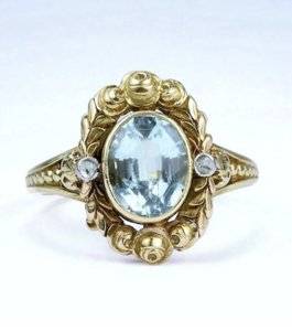
 
Have you considered matte gold rather than oxidised? I think it would be a good medium between the two options

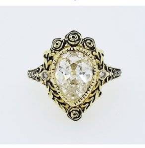
Thanks molecule for the suggestion. whilst I like matt gold I don't think it's what I am after here, bit too contemporary perhaps?
 
Well can we first say he did an amazing job on this because he really did. Much better than any other replica version I’ve seen attempted

Are you wearing it alone or with a band?

I feel like I want it oxidized
 
Actually looking at the old pictures now I don’t think I want it oxidized. I do t think the old pictures are they are just antique gold. I wouldn’t compare your finished ring to the antique one so much as I would comepare the look of LADs oxidized version to the new versions created without oxidation
 
E51B7021-DE17-4A49-AC12-03018F194493.jpeg ABDAE2DD-EFAB-4FA2-A928-C8989F85E6FA.jpeg
It’ll look like this - not the original
 
IMG_4344.jpg IMG_4346.jpg IMG_4345.jpg IMG_4296.jpg


@Niel see what you are saying. He said he could make the gold darker. Not sure what that means and he is yet to clarify. I'm not so keen on LADs look it's a bit heavy looking for me. I prefer the lighter look in the new VB version although that obviously isn't yellow gold.
 
Sorry missed that you had posted that already. I prefer the look as t is to the heavily oxidised version. I think he's done a great job it's just whether a vey light oxidation like the VB ring would bring out the details a bit more. If anyone else wants to chime in grateful for thoughts
 
I'd go with a very light oxidation. It will help the details pop. You might also consider strategic matte, not all over. More like painting to help show the details.
 
His lighting is also striking high. My gold rig I got from him looked stupid yellow in the photos he sent me. Would you be able to ship it to you to see it?
 
I'd go with a very light oxidation. It will help the details pop. You might also consider strategic matte, not all over. More like painting to help show the details.

Thanks rocky. Yes if he can do light oxidation I will go with that I think. If it will look heavy like the lad ring I will leave it. Interesting idea re matt I will see what he says.
 
His lighting is also striking high. My gold rig I got from him looked stupid yellow in the photos he sent me. Would you be able to ship it to you to see it?

Yes I realised that because my sapphire was so light hence the on finger shot. But it's blurry so hard to see what details are/aren't showing. No shipping isn't an option as I will end up paying 20% of the value twice and I'm not convinced I will be able to successfully claim it back.
 
Thanks @BlingObsession it already looks lovely as it is tbh very exciting. I will ask DK if it's possible to do it only lightly.
 
The ring looks fabulous! I would let that beautiful warm gold be. I know I am in the minority but I don't care for the dark look of the oxidation. I just want to clean it. I have had both from cvb and definitely prefer the plain.
 
@ceg that puts me in a quandary. I was set on oxidation and I the like cvb rings with it. I know what you are saying though I wonder with the lightest touch of it might be ok. I do like patina in my jewelery I always have to have bracelets made smaller and I always prefer them in their dirty state beforehand.:whistle: Do you like everything immaculate?
 
The ring looks fabulous!
Thanks the compliment by the way too bad I will have to wait until at least Xmas before I am allowed it!
 
@ceg that puts me in a quandary. I was set on oxidation and I the like cvb rings with it. I know what you are saying though I wonder with the lightest touch of it might be ok. I do like patina in my jewelery I always have to have bracelets made smaller and I always prefer them in their dirty state beforehand.:whistle: Do you like everything immaculate?

I am pretty weird about patina on metals. I use an antique set of sterling for nicer dinners and I polish off the patina -blasphemy for antique sterling! I realize the details show more but I just don't care for the black. Very, very light might be ok. Lol, don't ask me how I know but ammonia will take it off if you don't like it!!!!
 
I am pretty weird about patina on metals. I use an antique set of sterling for nicer dinners and I polish off the patina -blasphemy for antique sterling! I realize the details show more but I just don't care for the black. Very, very light might be ok. Lol, don't ask me how I know but ammonia will take it off if you don't like it!!!!

Ok so we probably have a slightly different outlook ha. But, I agree I don't care for the heavy dark black either. I think i need to talk some more with David to see how lightly he can tread. Thanks for the ammonia tip;-)
 
Well can we first say he did an amazing job on this because he really did. Much better than any other replica version I’ve seen attempted

Are you wearing it alone or with a band?

I feel like I want it oxidized

Niel I totally missed your first comment or I would have responded. Thanks for your kind words! I too think he did a great job. I showed the set of photos of the different versions that I posted to my two year old earlier (already a bling fan) and she was clear she preferred mama's ring best. She is much more decisive than me perhaps I should have asked her for her thoughts on oxidisation.
 
I am glad you are considering very light oxidation! I had an 18k carved band from CVB and I felt that it would really help show the details of the design better, but I do not like dark oxidation at all. I'd get the lightest amount possible. I agree with you that matte is not right for this design. Your ring is gorgeous! I have that antique ring pic saved because I liked it a lot, too!
 
I am glad you are considering very light oxidation! I had an 18k carved band from CVB and I felt that it would really help show the details of the design better, but I do not like dark oxidation at all. I'd get the lightest amount possible. I agree with you that matte is not right for this design. Your ring is gorgeous! I have that antique ring pic saved because I liked it a lot, too!

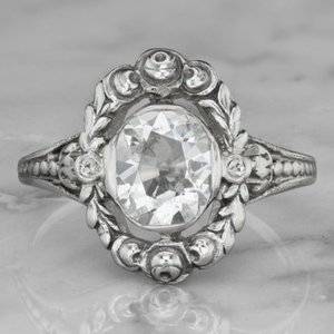
That's interesting DS if DK can do it seems like it will be the way to go. Yes it's gorgeous I saw the ring with the large oval diamond in it (I think Niel said earlier in the thread that they took the aqua out and put that in) anyway I just loved it and immediately thought blue sapphire as I really liked the idea of a sapphire for a right hand ring set in yellow gold :love:
 
GET 3 FREE HCA RESULTS JOIN THE FORUM. ASK FOR HELP
Top