shape
carat
color
clarity

Considering getting a Brian Gavin setting

nsiderbam

Rough_Rock
Joined
Sep 30, 2012
Messages
4
My girlfriend and I have talked about getting married, but we both feel that whenever that should happen, I should be the one to find and choose the engagement ring. Unfortunately, this makes it somewhat more difficult to find one that she'd definitely love, and as I'm kind of looking in secret right now I can't exactly go up to her and ask what types of rings she likes without giving myself away.

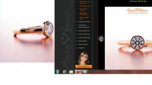
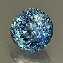
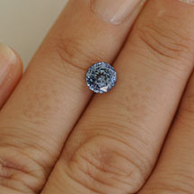
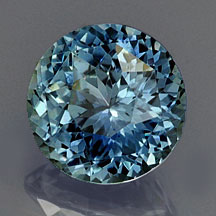
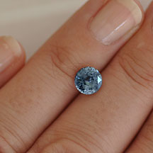
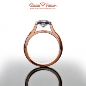
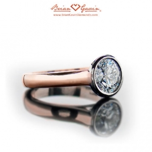
I'm currently looking for an engagement ring and am pretty sure I'll end using one of these two stones (this one or this one) -- either way, I'm dead set on a light-colored sapphire. I've looked around at a lot of settings from various vendors, and I think that this rose gold one is my favorite so far.
bgr1.jpg

bgr3.jpg

Both I and a close friend that's also looking for a ring for his gf think that it's a very simple, elegant design that she would love and that the sapphire (the 1.52 carat round one) would look really great in the rose gold. It would certainly be a very unique and beautiful ring. Her and I both lead very active lifestyles, so the full bezel would give us some ease of mind in regards to knocking out or hitting the stone on anything.

Anyway, just looking for advice from you guys (who are all much more knowledgeable than me).

Thanks!
 
Just checking out his website, the settings look beautiful but they are CADs and heavily photoshopped. I would ask to see a real life picture of the setting that hasn't been enhanced before I purchased.

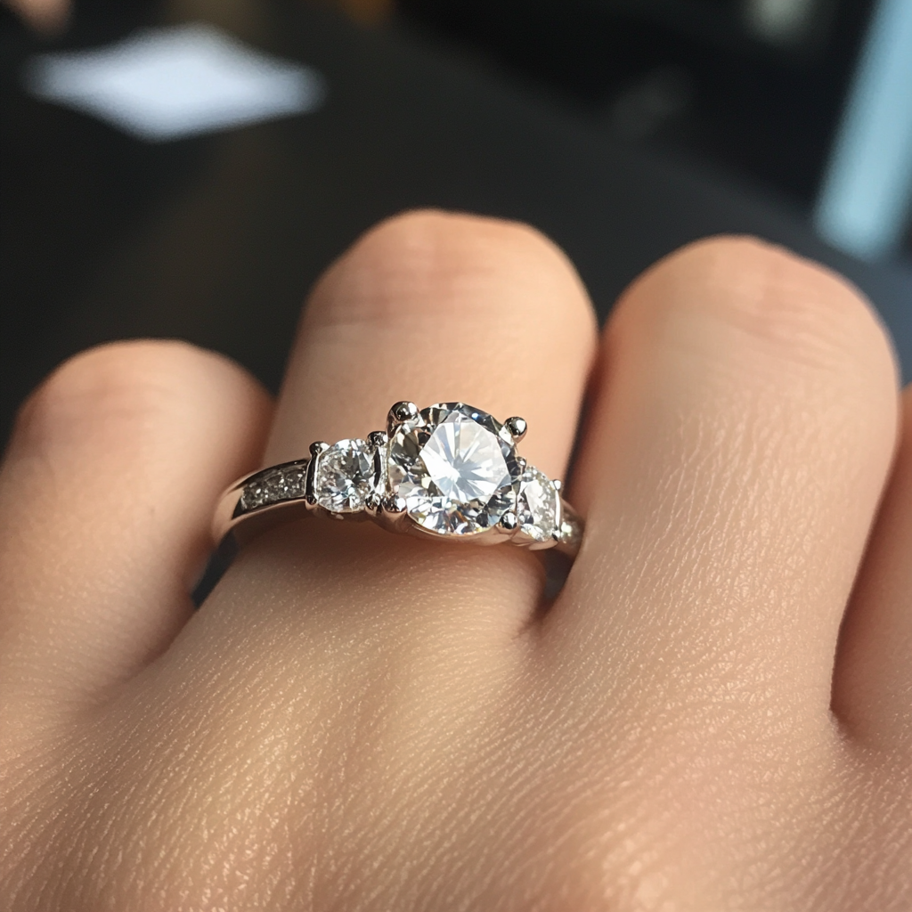
I found some settings that were beautiful but weirdly/poorly manipulated. Like what happened to the top of this stone in the Last photo at the bottom? The entire top edge seems to be missing. At first I thought it was supposed to be a heart but it's just round on the other side???

http://www.briangavindiamonds.com/engagement-rings/three-stone/trellis-with-sidestones-18k-rose-gold-5558r18

Anyhow, the designs look pretty nice but all of the reflections and drop shadows and softening of lights is pretty distracting and makes it hard to see a lot of the detail.
 
I have worked w BGD on 3 items and I LOVE their glamour shots- whatever magic it is they do in their photo booth, is incredible!! I don't think the pics are CAD's or photoshopped - they are just simply AMAZING to look at!

Their workmanship and customer service has been spectacular, in my experience, and I would highly recommend them. I have dealt mainly with Denise, but have spoken with Lesley and Brian. They will set outside stones for a small setting fee.

Nice choice for an active lifestyle!
 
brian.png

These came from the "image gallery" - I think they're supposed to be actual photos of the rings...but they look weird too :(
 
I'm very interested in a Brian Gavin ring for myself. I'd love to read about your experience if you decide to go with them.
 
ieatbugs, there are ZILLIONS of rl pictures of BGD settings in Rocky Talky and Show Me The Bling. The glamour shots are fairly accurate depictions. I do think they are glamour shots and not CADs - I've seen BGD CADs and they look very different. BGD is a very trusted vendor on this forum - tons and tons of people have gotten BGD settings. Their bezels with milgrain are especially popular for earrings and pendants - they seem to be one of the most popular among PSers for bezel settings. (And the "heart shape" you're seeing in that one picture is the extreme contrast causing the top glinting facet to blend into the background in that one pic.)
 
distracts|1349030257|3276933 said:
ieatbugs, there are ZILLIONS of rl pictures of BGD settings in Rocky Talky and Show Me The Bling. The glamour shots are fairly accurate depictions. I do think they are glamour shots and not CADs - I've seen BGD CADs and they look very different. BGD is a very trusted vendor on this forum - tons and tons of people have gotten BGD settings. Their bezels with milgrain are especially popular for earrings and pendants - they seem to be one of the most popular among PSers for bezel settings. (And the "heart shape" you're seeing in that one picture is the extreme contrast causing the top glinting facet to blend into the background in that one pic.)

It wasn't my intent to be critical of his work, I just feel like the depictions on his website don't seem to give me a clear sense of what the ring is going to look like in real life and on my hand.

The OP asked for advice on making a purchase and I think asking for photographs in normal light in 'regular' conditions is a good idea regardless. :)

Whatever the images are, they have certainly been edited to some degree according to some basic error level analysis.
 
And what I'm saying is if the pictures on their website aren't sufficient, you can find tons of them on PS just by searching.
 
distracts|1349033719|3276962 said:
And what I'm saying is if the pictures on their website aren't sufficient, you can find tons of them on PS just by searching.

Well that should be super helpful for the original poster then! :)
 
ieatbugs|1349022399|3276872 said:
Just checking out his website, the settings look beautiful but they are CADs and heavily photoshopped. I would ask to see a real life picture of the setting that hasn't been enhanced before I purchased.

I found some settings that were beautiful but weirdly/poorly manipulated. Like what happened to the top of this stone in the Last photo at the bottom? The entire top edge seems to be missing. At first I thought it was supposed to be a heart but it's just round on the other side???

http://www.briangavindiamonds.com/engagement-rings/three-stone/trellis-with-sidestones-18k-rose-gold-5558r18

Anyhow, the designs look pretty nice but all of the reflections and drop shadows and softening of lights is pretty distracting and makes it hard to see a lot of the detail.


An assertion that a vendor - any vendor, PS darling or not - is photoshopping their wares to the point of misrepresentation is a serious accusation. You may feel comfortable confidently posting your opinions as fact without confirmation, but to do so is terribly unfair to the vendor, and you do yourself no favours when circumstances prove otherwise :sick:

I do agree that glamour shots can be hard to interpret, but usually vendors will be happy to send other pictures/views on request.

ETA: I just tried a couple of searches and I can't find any real-world pics of that setting, does anyone have a link?

nsiderbam I like the idea of the bezel, especially if you know she'll want to keep her ring on for outdoor activities and/or you're considering a coloured gem center! The one thing I don't love is how high the bezel holds the stone, but that'd be dependent on stone size as well...
 
Yssie|1349049802|3277091 said:
ieatbugs|1349022399|3276872 said:
Just checking out his website, the settings look beautiful but they are CADs and heavily photoshopped. I would ask to see a real life picture of the setting that hasn't been enhanced before I purchased.

I found some settings that were beautiful but weirdly/poorly manipulated. Like what happened to the top of this stone in the Last photo at the bottom? The entire top edge seems to be missing. At first I thought it was supposed to be a heart but it's just round on the other side???

http://www.briangavindiamonds.com/engagement-rings/three-stone/trellis-with-sidestones-18k-rose-gold-5558r18

Anyhow, the designs look pretty nice but all of the reflections and drop shadows and softening of lights is pretty distracting and makes it hard to see a lot of the detail.


An assertion that a vendor - any vendor, PS darling or not - is photoshopping their wares to the point of misrepresentation is a serious accusation. You may feel comfortable confidently posting your opinions as fact without confirmation, but to do so is terribly unfair to the vendor, and you do yourself no favours when circumstances prove otherwise :sick:

I do agree that glamour shots can be hard to interpret, but usually vendors will be happy to send other pictures/views on request.

ETA: I just tried a couple of searches and I can't find any real-world pics of that setting, does anyone have a link?

nsiderbam I like the idea of the bezel, especially if you know she'll want to keep her ring on for outdoor activities and/or you're considering a coloured gem center! The one thing I don't love is how high the bezel holds the stone, but that'd be dependent on stone size as well...


I NEVER said it was a misrepresentation.

I said the images were modified, and one cannot tell to what degree the modifications are. In no way do I think it was to deceive a potential customer, it's simply how catalog images are created! In order to create a set of uniform images lighting will need to be tweaked, colors need to be balanced to reflect the actual item. It's a fact of the imaging world that most photographs are not perfect and uniform.

I did perform a forensic analysis on the images before stating that. I can say with 100% certainty they are modified images. Whether that modification is to make the images look more like the real life product, to fix lighting, etc, I can't say: all I suggested was that the person ask for additional images, because modifications absolutely were made to these.

Images can be modified to make photographs look MORE representative of the actual items in cases.

But I don't think it's fair to ascribe motive to my comments: there absolutely was none other than the opinion that the buyer might want to request additional pictures or seek customer photographs.
 
I actually met Mr. Gavin last Friday at his office. He is a delightful man and really knows his stuff.

He's creating two rings for me. I purchased the stones elsewhere.

My two projects are small, but he treated me as if I was his most valued customer.

~~~

Now about your sapphires. Are you happy with the color? I noticed that the color is not a dark blue. Will that be okay with your fiance?

They are beautiful gems, and I think both are a good price.

I do agree that the bezel setting will "protect" the stone than a regular prong setting.

I love the rose gold color with the color of both sapphires.

Can't wait to see the finished product!
 
I have a cold so I'm not seeing clearly. I see that you said you wanted the lighter colored sapphires.

They are both pretty! It'd be hard for me to choose between the two of them.
 
That's a lovely setting, though I'd ask them to set the stone lower if possible. I'd be a bit worried that the sapphires are lighter than you are expecting, as they were photographed on a darker background. I also wonder if the round one windows. I'd ask Ed for a back of the hand picture so that you could compare them together.
 
I'd like to comment on the stones if it isn't too late:

1. Cushion
Extremely light colour; I suspect this one to show just a touch of colour. There is also no straight face on photo which I think will be helpful and also a hand shot. There is so much glare that I cannot make out the crown facets nor the pavilion facets. Other than that, if that's the colour you like, it's a decent stone with no other issues.

2. Round
I would not pick this stone. It is shallow and shows a medium sized window. Colour-wise, it is also just barely coloured, but it seems you are looking for this type of stone? By this, I suspect the stone to just have a hint of colour.

The BGD setting is lovely but it seems to have quite a bit of air space underneath the stone. I like my settings low set and would request to have the culet almost touching the shank underneath.
 
I'm with Chrono, what's with those stones? They are pricey for their poor color and cut. The Montana sapphire is mostly gray and will show up a dismal stone. The other one is not at all saturated and will be washed out.

There are many pale, light-toned stones that have great saturation.

Did you check some of our other preferred vendors to see what they have? Not everything is on their websites, you can email and ask. Gemfix has lots of sapphires, some are untreated, if you read the descriptions closely. Gene at Precision Gem had some lighter blue rough, and he cuts beautifully, he is worth contacting.

Are you sure she's going to like a bezel setting? Does she have other bezel stones? I despise them, myself, I much prefer a prong set stone. Tastes are strong when it comes to settings. . .
 
I found this setting which is very similar but also lower-set -- personally, I think this one is prettier as well:

http://www.briangavindiamonds.com/engagement-rings/solitaire/lola-sholdt-18k-rose-gold-5341r18


I was hoping to get something unheated/untreated, but would get a heated-only sapphire if the price was right and I loved the color. Would you recommend something like these?

sapphire1_4.jpg
sapphire11.jpg

"Montana Sapphire Round "Portuguese" Cut
Weight: 1.50 cts
Measurements: 6.5 mm, height 4.6mm
Clarity: VVS
Origin: Montana, USA
Enhancements: Heat only
Price: $ 1180.00
Order/Stock No.: sapphire_montana_294
Description: Sparkly light-medium blue, no green. Excellent cut and clarity.
(Cut by Andrew Gulij)
Pantone 540C & 542C (in daylight)"


or

sapphire2_3.jpg
sapphire22.jpg

"Montana Sapphire Round "Portuguese" Cut
Weight: 1.52 cts
Measurements: 6.7mm, height 4.5mm
Clarity: VVS
Origin: Montana, USA
Enhancements: Heat only
Price: $ 1200.00
Order/Stock No.: sapphire_montana_296
Description: Beautiful medium blue with just the slightest hint of teal, but not green. Excellent cut and clarity. (Cut by Andrew Gulij)
Pantone 541C & 2915C (in daylight)"
 
I know you are the one picking out the ring but a light blue sapphire stone in rose gold is very specific and very unique for an engagement ring. Are you sure this is something that she would like? I like sapphires (light and dark) and rose gold and I love the combo for a right hand ring, but this is definitely not what I would want for an engagement ring. Just suggesting that you are sure this meets her tastes before purchasing. But maybe you have already done so...

I really like the Sholdt setting you posted :love:
 
I actually prefer the first setting and think it can be lowered because I've seen such rings. The second BGD setting gives the illusion of being lower because the shoulders and shank come up much closer to the stone, so I suspect the stone height is no different from setting 1.

The Gemfix stones could be hit or miss. The last few posters who purchased sapphires from him had stones that did not look like the picture. Did you check out his suggested pantone colours? I heard that they are more representative of what the stone looks like IRL. I plugged the numbers into Google and was surprised to see the colour, which looks different from even his handshots.
 
Unfortunately I agree with those who have said those two gems from Wildfish will be so pale as to be nearly colourless. It is truly difficult to judge from a photo whether a gem will meet your expectations, it's a matter of comparing the photo to the description and then comparing other photos on the website to see what changes might be evident in lighting etc.

Do you live in a city where you can visit some jewellers and ask to see their palest sapphires? It might help to get your eye attuned since there is nothing like seeing the real thing.

Be wary of checking Pantone colours online. Pantone is designed for the print industry however even they have to convert the Pantone colour to CMYK (cyan, magenta, yellow and black) - our monitors can only reproduce RGB (red, green, blue) therefore the comparison can be quite misleading. In addition your monitor needs to be calibrated to either CMYK or sRGB depending on preference. One reason Macs are used almost exclusively in graphics and print environments, the uniformity and brilliance of their colour representation.

Pantone colours should really only be compared to a Pantone colour chart in-hand. I went round and round this mulberry bush designing a logo with a graphics person on a different continent. I think Gemfix's recent innovation of providing a photo on hand is actually far more helpful than the Pantone colour ever was because it can be so misleading.
 
I'll try to get out and look at some stones this weekend.

Starzin, are gem-in-hand photos generally accurate online?

I've looked through most of the suggested vendors listed on here -- are there any that are particularly well-known for their color accuracy and good cuts?
 
nsiderbam|1349229446|3278406 said:
I'll try to get out and look at some stones this weekend.

Starzin, are gem-in-hand photos generally accurate online?

I've looked through most of the suggested vendors listed on here -- are there any that are particularly well-known for their color accuracy and good cuts?

The very first thread on this forum is a comparison of Vendor Photos versus Customer Photos of stones. You can look through here to see hundreds of examples and you will get an idea of who has the most accurate representation.
 
stargurl78|1349135803|3277717 said:
I know you are the one picking out the ring but a light blue sapphire stone in rose gold is very specific and very unique for an engagement ring. Are you sure this is something that she would like? I like sapphires (light and dark) and rose gold and I love the combo for a right hand ring, but this is definitely not what I would want for an engagement ring. Just suggesting that you are sure this meets her tastes before purchasing. But maybe you have already done so...

I really like the Sholdt setting you posted :love:


I second this. I've never seen this combination of colors/stones anywhere and there might be a reason for that.. ;)
 
ieatbugs|1349229799|3278417 said:
stargurl78|1349135803|3277717 said:
I know you are the one picking out the ring but a light blue sapphire stone in rose gold is very specific and very unique for an engagement ring. Are you sure this is something that she would like? I like sapphires (light and dark) and rose gold and I love the combo for a right hand ring, but this is definitely not what I would want for an engagement ring. Just suggesting that you are sure this meets her tastes before purchasing. But maybe you have already done so...

I really like the Sholdt setting you posted :love:


I second this. I've never seen this combination of colors/stones anywhere and there might be a reason for that.. ;)

Or maybe not. If everyone always stuck to what has been seen before, there would be no progress or innovation.

Personally, I love light blue or minty stones in rose gold. I can't remember who was it that set a small star sapphire in a rose gold bezel - it was a lovely combination but it was reset later in a lotus (wonky bezel, if I am not mistaken). Have I ever mentioned how awful I am with names?
 
Starzin, are gem-in-hand photos generally accurate online?

I can't tell you that they are, sorry. Again, simply because lighting plays such an important part in photos however I do feel that it's a bit easier to see the how the stone will perform in a setting by the fact that it usually rests between the fingers. Colour can be manipulated on these as well and we've seen photos on PS where the hand might be an overly pink, orange or blue....so *shrug* I think I was really just trying to say I felt it was more helpful than the Pantone numbers because they don't translate to a simple lookup of that colour's code for most people.

Hopefully you've followed up ieatbugs' lead to the comparison thread of vendor's photos vs in-hand.
 
In general, hand shots are a little harder to manipulate but not impossible.
 
Lady_Disdain|1349232074|3278441 said:
ieatbugs|1349229799|3278417 said:
stargurl78|1349135803|3277717 said:
I know you are the one picking out the ring but a light blue sapphire stone in rose gold is very specific and very unique for an engagement ring. Are you sure this is something that she would like? I like sapphires (light and dark) and rose gold and I love the combo for a right hand ring, but this is definitely not what I would want for an engagement ring. Just suggesting that you are sure this meets her tastes before purchasing. But maybe you have already done so...

I really like the Sholdt setting you posted :love:


I second this. I've never seen this combination of colors/stones anywhere and there might be a reason for that.. ;)

Or maybe not. If everyone always stuck to what has been seen before, there would be no progress or innovation.

Personally, I love light blue or minty stones in rose gold. I can't remember who was it that set a small star sapphire in a rose gold bezel - it was a lovely combination but it was reset later in a lotus (wonky bezel, if I am not mistaken). Have I ever mentioned how awful I am with names?

I actually do think its a lovely combination. I was just questioning it because many women hope for a diamond e-ring so I was curious if she had expressed a preference for something different or if that was her style...
 
GET 3 FREE HCA RESULTS JOIN THE FORUM. ASK FOR HELP

Featured Topics

Top