shape
carat
color
clarity

Custom Setting for AVC e-ring: Thoughts and Recommendations

elliefire99

Brilliant_Rock
Joined
Oct 12, 2018
Messages
584
The e-ring adventure begins!

First off, thank you thank you thank you to @Starfacet for offering me your beautiful stone! I am beyond excited (hence this immediate post). Such a great induction into the PS community :)

The stone: 1.01ct N color (preloved) AVC, 5.95mm X 5.9mm

Stone, check, and on the the setting! I am looking for any comments and recommendations you all have in terms of design and/or recommendations for people who do custom work. Working in the 1k-2k range, not the 3k-6k range. Yellow gold, potentially with white gold accents.

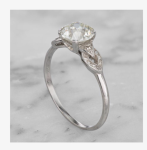
The main inspiration this old ring online. I really love the sort of cupped setting it has. I like how it falls visually between a bezel and prongs, but I am not sure if it is possible to create a similar visual effect without a full cup on the bottom, to let more light through to the stone.
image-jpg.655056


The general idea is to mix that setting with the clusters of melee as seen in this ring:
image-4-jpg.655060


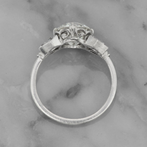
The overall "feel" of the ring I am going for, in terms of proportions and overall silhouette, is closer to this, but without the very pronounced "wings". I am also digging the double shank.
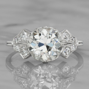
upload_2018-10-24_23-51-33.png

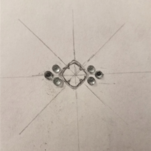
I did some sketches of what that might look like. I set the cushion on point, because I liked the trefoil/clover look it created, but I'm not set on that.
20181021_224722-jpg.655057


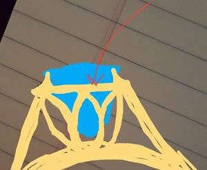
Some sketches of some ideas of how to let light into the bottom of the stone, but gallery design is honestly totally flexible. The top image is a tracing I took of another ring's gallery and then modified. Since I was looking to set the cushion on point, the head in the top picture would actually have to be rotated 45 degrees. The bottom two (uglier) sketches are an attempt to capture what that would look like. I am also unsure if the melee clusters would be better on a cathedral-type setting, or down below the diamond, more low-profile.
20181021_224733-jpg.655058


And last, but not least. I have some 2.3mm kornerupine melee (I have 8 ) that I would love to incorporate. I know some designers have strict policies about using their own melee and side stones. I could easily change this for light colored sapphires or something if necessary.
kornerupine-melee-jpg.655059


And that's the bulk of it! Any thoughts, concerns, criticisms, or specific designer recommendations are welcome! I have reached out so far to DK, The Gemstone Project, and Sally at Heat of Water for quotes and feedback.

I defer now to the experts. Thanks in advance!
 
Last edited:
This is actually a repost of a thread I posted in the CS forum, that got side-tracked into questions of design. Original thread here: https://www.pricescope.com/communit...e-project-vs-david-klass.244414/#post-4434357

In that thread, Rfisher and CHRISTINE-DANIELLE tag-teamed the creation of this little rendering. Gotta give credit where credit is due. :)
20181022_222133-png.655072


Also, one of my concerns was that the center stone may get a bit "lost" in this setting due to the larger melee. I attempted to draw and actual size plot of the ring to get a better idea of real proportions. Thoughts?
upload_2018-10-25_0-7-53.png
 
I feel like you could totally do the cupped setting you love but with an open gallery or open bottom just by having the cup not be a solid thing but instead be filigree or cutouts?
 
I knew the proportions were off, I think your proportioned sketch looks great! I agree with foxinsox, you could get the cup look but keep the bottom open. I really like the ideas you came up with regarding this, especially the top one. You are well on the way to a solid design!
 
I love your drawings! I'm going to let you design my next ring! I bet Caysie at CvB could rock any of your designs!
 
The e-ring adventure begins!

First off, thank you thank you thank you to @Starfacet for offering me your beautiful stone! I am beyond excited (hence this immediate post). Such a great induction into the PS community :)

The stone: 1.01ct N color (preloved) AVC, 5.95mm X 5.9mm

Stone, check, and on the the setting! I am looking for any comments and recommendations you all have in terms of design and/or recommendations for people who do custom work. Working in the 1k-2k range, not the 3k-6k range. Yellow gold, potentially with white gold accents.

The main inspiration this old ring online. I really love the sort of cupped setting it has. I like how it falls visually between a bezel and prongs, but I am not sure if it is possible to create a similar visual effect without a full cup on the bottom, to let more light through to the stone.
image-jpg.655056


The general idea is to mix that setting with the clusters of melee as seen in this ring:
image-4-jpg.655060


The overall "feel" of the ring I am going for, in terms of proportions and overall silhouette, is closer to this, but without the very pronounced "wings". I am also digging the double shank.
upload_2018-10-24_23-51-33.png

I did some sketches of what that might look like. I set the cushion on point, because I liked the trefoil/clover look it created, but I'm not set on that.
20181021_224722-jpg.655057


Some sketches of some ideas of how to let light into the bottom of the stone, but gallery design is honestly totally flexible. The top image is a tracing I took of another ring's gallery and then modified. Since I was looking to set the cushion on point, the head in the top picture would actually have to be rotated 45 degrees. The bottom two (uglier) sketches are an attempt to capture what that would look like. I am also unsure if the melee clusters would be better on a cathedral-type setting, or down below the diamond, more low-profile.
20181021_224733-jpg.655058


And last, but not least. I have some 2.3mm kornerupine melee (I have 8 ) that I would love to incorporate. I know some designers have strict policies about using their own melee and side stones. I could easily change this for light colored sapphires or something if necessary.
kornerupine-melee-jpg.655059


And that's the bulk of it! Any thoughts, concerns, criticisms, or specific designer recommendations are welcome! I have reached out so far to DK, The Gemstone Project, and Sally at Heat of Water for quotes and feedback.

I defer now to the experts. Thanks in advance!


Your designs are looking so great already, i think i've previously mentally pinned each of your inspiration images and I think you brought the elements together well! I do think the melee are maybe a bit large for the stone at least in your plot/layout, maybe if they are angled a bit outward they won't detract from the stone (like the wings in your 3rd inspiration photo are).
 
Caysie at CVB could come up with a fabulous design and ring for you. So much talent.
 
Thanks everyone! I think you are all right. I would LOVE to work with Caysie at CvB. All of her designs are incredible. A little bit afraid, that she may be a bit out of my price range looking at the cost of her stock settings, but definitely no harm in reaching out!

But general consensus is a cathedral rather than flat profile? I feel like @acv123 is right, in that having the side stones angle down on the shoulders might help make them less prominent.
 
Just thinking about your design dilemna, I was wondering if you've seen pseudo bezel style rings? Where it appears that maybe there's a bezel, but there's actually prongs holding the stone? That way you'd have your metal framework, and you'd get that metal all around the stone look. Your 4 petal like prongs could come off the bezel frame. Then your basket detail would not be restricted as much by stone orientation. Please forgive my horrible drawing, but hope you get what I mean.
20181025_173135.jpg
 
I just had my N AVC set by Caysie, & I wanted to add in my experience. I wanted to play up on the color, & we set it in a faux 18K bezel with a plat shank. I had no idea how it would turn out, as my first setting for the stone was an abysmal failure. The stone is absolutely beautiful in this new setting due to the gold. The prior 100% plat setting greyed out that gorgeous N color. It's on her Instagram. I love the direction you are headed with your ideas, so exciting!
 
Just thinking about your design dilemna, I was wondering if you've seen pseudo bezel style rings? Where it appears that maybe there's a bezel, but there's actually prongs holding the stone? That way you'd have your metal framework, and you'd get that metal all around the stone look. Your 4 petal like prongs could come off the bezel frame. Then your basket detail would not be restricted as much by stone orientation. Please forgive my horrible drawing, but hope you get what I mean.
20181025_173135.jpg

Your drawing is wonderful! I can't draw on a computer for beans, sooo...

And you're right, a pseudo bezel would be a good way to accomplish the look I'm going for. Time for some Googling :) :) :). My only concern is that a lot of the "fake" bezels I have seen are pretty unnatural-looking. Like a floating ring around the middle of the stone. Yaddamean? But that's not to say they are ALL like that. I'm sure there are great ones out there. Just have to find them!
 
I just had my N AVC set by Caysie, & I wanted to add in my experience. I wanted to play up on the color, & we set it in a faux 18K bezel with a plat shank. I had no idea how it would turn out, as my first setting for the stone was an abysmal failure. The stone is absolutely beautiful in this new setting due to the gold. The prior 100% plat setting greyed out that gorgeous N color. It's on her Instagram. I love the direction you are headed with your ideas, so exciting!

We need pictures here - sounds beautiful!!
 
MGR, I thought I would wait until I have the ring back, as she's doing some additional polishing right now!:wavey:
 
MGR, I thought I would wait until I have the ring back, as she's doing some additional polishing right now!

Oh, ok, but when she is done with her final fitting, I'd love to see your new ring!! :appl:
 
I just had my N AVC set by Caysie, & I wanted to add in my experience. I wanted to play up on the color, & we set it in a faux 18K bezel with a plat shank. I had no idea how it would turn out, as my first setting for the stone was an abysmal failure. The stone is absolutely beautiful in this new setting due to the gold. The prior 100% plat setting greyed out that gorgeous N color. It's on her Instagram. I love the direction you are headed with your ideas, so exciting!
Saw this! It's stunning!!!
 
I just had my N AVC set by Caysie, & I wanted to add in my experience. I wanted to play up on the color, & we set it in a faux 18K bezel with a plat shank. I had no idea how it would turn out, as my first setting for the stone was an abysmal failure. The stone is absolutely beautiful in this new setting due to the gold. The prior 100% plat setting greyed out that gorgeous N color. It's on her Instagram. I love the direction you are headed with your ideas, so exciting!

Just stalked instagram and found it. It's incredible! Can't wait for more photos :)
 
After much humming and hawing, SO and I have decided to work with Sally at heart of Water. Lots of friendly people with great quotes, but she just seemed to GET it the most, in terms of what I am looking for. Also, SO feels sentimental about the idea of a hand-forged ring, so hopefully it all works out. Excited to get the ball rolling!

My biggest indecision at this point is regarding the profile of the ring. With the clusters of melee on the sides, I don't know if I should treat it like a three-stone, or exaggerated shoulders, or flat, orrrr... Ahhhh! Obviously working with Sally on this too, but I would love some groupthink opinions too!
 
I pulled some generic settings from Stuller. They call this kind of ring "accented" I discovered, and it seems like most of them use a modified three-stone profile. My original inclination was treat the sides like oversized versions of a cathedral shoulder, but I can't find that anywhere.

I couldn't really find examples of bezeled "accents", so these are just for the sake of very general profile "shape" details will have to be different for sure.

Some examples:
Three baskets like a three stone, but the side stones are actually clusters. I DO like how just the portion of the band under the stones is engraved. Nice detail.
Stuller

https://www.stuller.com/products/bu...ion&recommendationId=193680#/mounting-options


Another approach. prongs that open up like a flower around the the center stone. (I couldn't find the right adjective for this. Nested?). I could see this working with little bezels. But it's not as light and airy feeling as the one above.
Stuller


https://www.stuller.com/products/bu...ion&recommendationId=195567#/mounting-options

Third approach. Side stones set on a horizontal "platform." This is the most like most vintage/antique settings I have seen, and the closest to my original drawings. I just don't really like how the shank starts up higher that the side stones. Bonus points for the prongs that continue over the donut.
Stuller

https://www.stuller.com/products/bu...dationSource=CategoryBrowse#/mounting-options

Fourth approach. Fill in the negative space. Something totally different, as it forgoes the bottom curve of the shank entirely. I think this is cool, but I'm hesitant, as it seems you would kind of have to center your whole design around something bold like this. Sure is pretty, but I miss the downward swoops and slopes of a cathedral.
Stuller

https://www.stuller.com/products/12...onType=recommendation&recommendationId=195567


I guess the long and short of it is, I love the downward slopes of the shoulders on a cathedral setting, but looking at other rings similar to the design I have proposed, it seems like that kind of profile may be impossible. Has anyone seen examples of "accented" rings with more slopey sides? Or should I stick with one of these three-stone silhouettes?
 
Last edited:
A sampling from true vintage settings:

They seem to either have very slightly raised accents. Sort of like a half-cathedral.
upload_2018-11-1_23-41-44.png

Or are just solid platforms, like my "overall" inspiration ring.
upload_2018-11-1_23-44-24.png

Should I just go that route?
Gahhhhh... so many variables! Enjoyable, but egads so many decisions for one little ring!

So funny, I literally just posted the top one in Missy's setting thread. I knew I must have found it originally on pricescope - love that setting!
 
Sally will take care of you ! She's a talented artist and designer, and she often draws options to help people visualize. I love her work and have worked with her on colored stone projects. I wouldnt hesitate to work w. Her more. I'm excited to see it come to life!!!!
 
Sally has been such a dream! Currently just terrified that I am going to spell Pomme's crazy Thai name wrong and my package will never arrive. Haha.

But well worth it. Beautiful work and a beautiful human.
 
Stones sent! And I should have layouts from Sally in the next few days! How does anyone stand the anticipation of these custom projects??

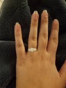
Meanwhile, back at the ranch..... Testing out proportions on my big hands.20181106_224939.jpg

(You all are giving me DSS, and I haven't even set my first diamond yet!)
 
Oooh new to this thread (how did I miss it!) and just have to say wow I love your inspiration settings and it is going to be amazing.:love: And your hands are so *not* big! They are lovely. Very excited for you.

And to answer your question:
How does anyone stand the anticipation of these custom projects??

It's a rollercoaster of emotions and yes stressful at times. Hang in there you are in good hands! And cannot wait to see your gorgeous ring on your finger.:appl:
 
So excited about this ring!!!
 
Aw, thanks @missy! Glad to have your experienced eyes on this thread! All of your big, beautiful old cut rings always have me drooling...

And I don't dislike my hands, but they ARE big. That's a size 8 finger, and almost 78mm long! Lots of real estate I suppose...
 
First set of (very preliminary) drawings from Sally! To scale, so a a lot of the details aren't super clear, but rather described verbally.

These came accompanied with a long email with a bunch of things she wants me to consider and comment on (height of setting/side stones, design of side stone supports, prongs-lotus v. more angular tiffany style tulip, double vs single shank, and more...). I also have some very preliminary thoughts (the floating ring!, I think I want a donut, more angled side-stones etc.). More complete drawings will follow this clarifications.

I will get back with more specific comments on all of this once I have fully digested and mulled over.... But I was too excited not to share!

I know this isn't quite the same as looking at a CAD, but if this inspires any reactions, inspirations, concerns at face value, please share :)

upload_2018-11-9_11-24-5.png
 
I like the orientation of the AVC!
 
GET 3 FREE HCA RESULTS JOIN THE FORUM. ASK FOR HELP
Top