shape
carat
color
clarity

Custom Setting for AVC e-ring: Thoughts and Recommendations

I am excited! And thank you for sharing in my enthusiasm. I think everyone else in my life is sick of me talking about this project haha.

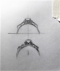
The black in the middle is an indented detail that gives a bit of a double wire look to the shank. As shown in the Insta post twang07 shared earlier in the thread: https://www.instagram.com/p/Bp-pkiYhI8m/?utm_source=ig_share_sheet&igshid=1hagdao9bmnse

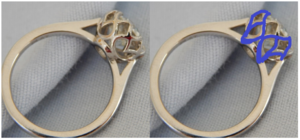
And those points.... I was pretty disenchanted when I first saw them yesterday, as they are a complete departure from what I set out to do. Kinda came out of left field.... But looking at that profile view with the pointed shank detail...:love: It looks dainty and flowing but also malevolent. Such a conundrum. What to do...
My biggest fear is that with the bottom points so low on the diamond I won't be able to see the metal all around the stone from the top. Which is a #1 design consideration.

Trying to keep the galleries as simple as possible while not totally empty. Surprise stones are fun, but in this case they would be beneath a cluster of tiny stones. To many little stones! But for the future...

This is such a great project - don't stop talking about it!

Okay yes I understand about the indented bit - will it be 'sharp' or 'soft'?

I love the word malevolent, that's exactly what they are but they're also beautiful because of it. It may be that you decide to go down the route of what you were imaging, and that would be absolutely fine, but that is a very beautiful profile. I rather love it. But I also feel you'll 'know' about it. And you're right, the points on it are so steep I doubt you would be able to see the metal all the way around like you're hoping for.

Yeah I agree that the galleries would be better really simple. It would just be a particular type of simple and I'm not sure what that simple should be. Perhaps Sally can give you various options rather than just one scroll idea?
 
Gaah! I know! I am really falling in love with that pointy profile. But it's a bit scary to throw away a big portion of the vision I had from the get-go. Sally assures me that you will still be able to see the gold from above, so maybe I should trust her on this.

She's drafting one more basket design, with the gold higher up. Hopefully seeing them both will help me decide if I love the points or not! :rolleyes:
 
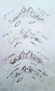
Round # of basket designs from Sally!

I asked her to add the scallops from the first design back on to the pointy design for the sake of getting some gold higher up on the stone and closer to the girdle. She drew a curvy option and a straight option for my thoughts.

I feel like neither of them really "sing" to me. First glance, I liked the curves more, upon further consideration, the straight ones seem more consistent in terms of design.

I actually think I like the simple points design from before, but I still fear that it won't have that "cupped"/metal faux-halo view I want from above.... :???::???::???::???::?:

Recommendations???


upload_2018-11-17_11-14-0.png
 
At a bit of an impasse too.

If I want to have the ring before I go to visit my fiance, the design should be finalized by Monday. Sally is more than happy to continue tweaking and do the ring later. If so, Luis won't see the ring in person until late June at the earliest D:

I know PS standard recommendation would be to take my time with the design, as I will be looking at the ring for years... what's another 6 months? But I also wonder if I am just over-analyzing and getting myself in a tizzy (analysis paralysis?), because the ring will be beautiful no matter what.

blerg.
 
HOLY MOLY! Basket epiphany!

With this last email, Sally asked me to re-send her some of my early inspiration photos, so she could show them to Pomme (the benchman extraordinaire). One of them was a picture of D&T's beautiful DK tulip solitaire. I originally just sent Sally the top view, to show how I wanted the gold to be visible all around the ring. But next to the top view in the folder was the side view! And *click*

I realized what I have been trying to propose all along was a modification of that basket. For 4 instead of 8 petals, and a pointed donut.

What a relief.

Hopefully it is clear enough that there is still time to make this happen!

upload_2018-11-17_12-57-25.png
 
So these last two designs Sally has done, they do look like they would show good amounts of metal from the top view? The other one with the pointed prongs and the lower central section on page two of this thread, the one you think is malevolent (in a great way) - I can see why you wonder whether that would show enough metal... Is there any way that Sally could draw you a 'close up' of the top view? And if she does make a ring, and it doesn't have that when it was meant to, I would have thought it would be something she would be willing to rectify?

Of these two designs, if it's any help, I really like the curvy one a lot, with the pointy prongs. I like that it's a combination of your original design and hers, too. Having the 'swirls' in the basket I feel would then tie in really nicely with a 'scroll' underneath the side stones. I also love the original pointy one she did - that appears to be growing on you - that doesn't have the metal built up in the centre. That would also expose the body of your central stone a lot, and if she can indeed do it so there's still that rim of metal from the top... (I imagine the basket would have to essentially be as big as the diameter of the central stone to make that happen, though...?)

The second one of these new two that you're talking about, the one with the straighter lines, I just see an 'x' shape, and I personally don't feel it actually ties in that much with the setting in general.

I do think you shouldn't rush with this. I know it's difficult - it's very hard to have patience especially when there are added components to it like the other time-limit you have. But I also think you'll just KNOW when you see the correct version and I'm not sure you're there yet? Is that something you think you'll have? That feeling?

Up until the point when my ring was nearly nearly correct, I found it easy to know whether some feature was 'it'. At the point when I was nearly there, I found the smaller details much more difficult, and I did sometimes get the feeling that between two choices, I might not be too fussed if I chose either of them. But one did feel better than the other.

What does Luis say? Like, genuinely? I know my partner wouldn't care if it took another six months to see the ring if it meant I was happy with the final ring - especially if I could wear it during the wait. Whereas if I had rushed it and then wanted to change it... what does that gain you? :)

Sorry for such a long message... :shock:
 
HOLY MOLY! Basket epiphany!

With this last email, Sally asked me to re-send her some of my early inspiration photos, so she could show them to Pomme (the benchman extraordinaire). One of them was a picture of D&T's beautiful DK tulip solitaire. I originally just sent Sally the top view, to show how I wanted the gold to be visible all around the ring. But next to the top view in the folder was the side view! And *click*

I realized what I have been trying to propose all along was a modification of that basket. For 4 instead of 8 petals, and a pointed donut.

What a relief.

Hopefully it is clear enough that there is still time to make this happen!

upload_2018-11-17_12-57-25.png

Ooh, just seen this post!

Ooh that's so exciting! Yes I can see where your inspiration came from, your modified version is beautiful. Also - it has a very pointy element to it, have you noticed? If you like the points, that aspect of it could be emphasised even further.

I'm glad you've seen the basket that you adore. Could you take any of that negative space to make your under-galleries for the side stones???

:D :D :D

I love the points. For my original communications with Sally, I sent a bunch of pictures of gothic arches. Haha. I know tulip settings are everywhere, but hey, I like them. They are both flowery and angular at the same time... what's not to like? I can definitely ask Sally about the pointiness.

Any particular ideas for the negative space shapes? Right now, all I can see is either the kite/diamond shapes or an inverted version of the curvy V on top (which I think you pointed out before)

For D&T's ring, the diameter of the head is 2mm wider than the diameter of the stone. Some mini-halo/illusion action.

As for Luis, he is totally fine with waiting. I made sure of that before contracting someone for the design, as I knew it may take longer than that deadline. The question of whether or not it matters comes down to how I feel. heh. But logically, I know I will wait until I feel totally comfortable. Meeting the deadline would be awesomesauce though.

And no need to apologize for your long posts! I like them. They allow me to snowball on my excitement :)

I also love the points. They really 'add' something.

Yes, there's the kite/diamond shape - which you could always do sideways rather than upright. There's also the curvy pointy V on the top. There's also an 'M' shape, and a 'W' shape - but you could have shorter outer lines (attached to the side of the gallery not the top) compared to the middle point so that it's less obvious. Is there a shape available from the bottom of the ring that you can bring to the side of the gallery? Or - you could leave it empty. Or put a really simple swirl in... or how about some sort of petal or leaf design? Something to remind you of tulip leaves? Like a diagonal pointy oval that goes from the lower inner part of the side-stone gallery up to the upper outer part of the gallery.

Hmmm.

Okay, regarding your feelings about Luis and him seeing the ring - how DO you feel??? :)
 
Your wish is my command!

Honestly, I think I like either just the basic curved point or Sally's scrolls. I don't think there is quite enough pace for the full shapes like the ovals or diamond shape.

upload_2018-11-17_15-13-43.png

As for ME, I would very much prefer to have the ring. Spending 80% of the engagement apart is really hard. It would be a nice light point. But only if I am 98% happy with the ring and the design :)
 
Haha you're amazing. That's great, I'm actually honoured that you tried out all the options.

You're right, they all look so busy. Maybe an empty gallery would be better? I think the pointed crescent would only look good if the gallery was only half the size, it's just too long to work. I'm not sure what I think of any of them to be honest. I sort of like the curvy 'v', it seems to replicate the middle v a little. What would a v look like rather than an upside-down v?

If Sally's scroll was really thin, rather than bulky, i.e., more like wire filigree - that would be nice? What about some sort of ~ shape but with curlier ends? I think that would all look too busy too.

Difficult one!!!

I wonder if someone like @rockysalamander is around to chip in, she tends to have very good setting ideas! I know she's been less often on Pricescope recently though....
 
Late to the party, but love the "curvy V" and "Sally scroll". Both are gorgeous, imho, and go with the design and aesthetic you want.
 
Late to the party, but love the "curvy V" and "Sally scroll". Both are gorgeous, imho, and go with the design and aesthetic you want.

Haha. Thanks for joining up after my sob story! Still bouncing back and forth between those two options, but I appreciate the support!

Hopefully all will be finalized before the 20th, but if not, at least I know where I'm going now!
 
Ring goes into production tomorrow! After discussions with Pomme, the basket will end up looking closer to the "points" version for structural integrity reasons (That kite set cushion causes a whole slurry of complications!), but the points will be a bit softer and rounder at the base. They will also be a tad bit wider to make sure the gold is seen from the top!

nervousnervousnervous
excitedexcitedexcited

Thanks everyone for all your help thus far, and onwards!

Ok that is so so so exciting!

What are you doing for the side stone under gallery section?
 
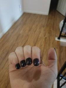
At the risk of sounding weird, I thought of you yesterday when I got my nails done in a "malicifent" black w. Colored sparkles. It reminded me of the gothic arches that inspired your ring :) 20181119_073600.jpg
 
At the risk of sounding weird, I thought of you yesterday when I got my nails done in a "malicifent" black w. Colored sparkles. It reminded me of the gothic arches that inspired your ring :) 20181119_073600.jpg

Oh my god, those nails with your diamond and red spinel ring!!! That would be a sight to behold! HINT HINT.
 
At the risk of sounding weird, I thought of you yesterday when I got my nails done in a "malicifent" black w. Colored sparkles. It reminded me of the gothic arches that inspired your ring :) 20181119_073600.jpg

What an AWESOME color! It's like a galaxy on your nails. Or dark water... like the reflection of the moon on the ocean at night? Either way, so cool
 
What are you doing for the side stone under gallery section?

Mostly just "whatever fits" haha. Pomme mentioned that the space is teeeeeny tiny, so there isn't really space for elaborate punchwork. Most likely just little bitty points. They will check with me once they get to that point in the ring (more or less the last thing) and we know exactly how much space we are working with.
 
I'm so excited for you!!!! Pomme and sally are incredible and I know they'll make it perfect
 
I'm very excited to see the outcome! Beautiful design :kiss2:
 
If all goes according to plan, ring should be ready by Dec. 3rd or 4th!

*waits anxiously*

My part is done, and I'm kinda sad hahah
 
If all goes according to plan, ring should be ready by Dec. 3rd or 4th!

*waits anxiously*
My part is done, and I'm kinda sad hahah
Waiting is so hard, but it'll be worth it!
 
If all goes according to plan, ring should be ready by Dec. 3rd or 4th!

*waits anxiously*

My part is done, and I'm kinda sad hahah

It's like... Post wedding blues...

So exciting though! The anticipation must be intense! Will you get it in time for Luis???
 
So exciting though! The anticipation must be intense! Will you get it in time for Luis???

Should be! I have to decide if I want to pay the extra for DHL shipping, which will only take 3 days (vs. 16-20). It's a lot, but for me probably worth it to have the ring!
 
Should be! I have to decide if I want to pay the extra for DHL shipping, which will only take 3 days (vs. 16-20). It's a lot, but for me probably worth it to have the ring!

I feel it's one of those things that will be totally worth it! And also I feel sure that will feel extra secure, too, and you won't have to worry about it spending so long in the post! Who will insure it during the postage?
 
I insured the diamond through JM before sending it to Thailand, so that the insured value doesn't have to show on the package. I believe Sally guarantees items shipped from her, just not to her.
 
Two more days until it's done!! *squirm*

Some minor design changes had to be made in the forging process, but trying hard not to overthink/worry about them. I just want to see the beauty!
 
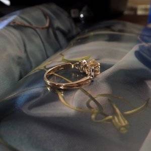
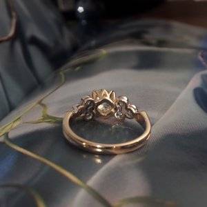
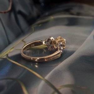
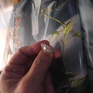
Teaser photos from Sally! The ring was finished late at night, so clearer, professional photos to come in the morning, but I had to share!

I haven't really had a chance to totally absorb and process yet, but initial reaction is that I had maybe hoped for the bezels to be a bit more delicate. Holding off judgement until I can see the final, clearer photos.

But for now super duper exciting!!
Renae and Mary 016.JPG Renae and Mary 032.JPG Renae and Mary 033.JPG Renae and Mary 062.JPG
 
GET 3 FREE HCA RESULTS JOIN THE FORUM. ASK FOR HELP
Top