sunnyd
Ideal_Rock
- Joined
- Nov 5, 2007
- Messages
- 7,353


Date: 7/15/2009 2:29:23 AM
Author: VRBeauty
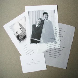
It''s not looking very wedding invitational to me. What I see is more like a menu, albeit a menu for a high-class restaurant... or a portfolio.
I''m not sure exactly what element is doing that... maybe it''s having the invitation on the left side, rather than the invitation being the first thing you see when you open the envelope. A ribbon of some sort rather than a plain band might also make a difference. But mainly I think it''s because the first thing you see when you open the folder is a band that''s holding a bunch of things together.
Your invitation is very elegant... I''d suggest that you find a way to highlight that, rather than the other miscellaneous pieces.
have you thought of using some crafty paper, I love see through rice paper that has a great texture. you could use it in the center so you don''t lose that gorgeous outer color and when you print text on it it looks niceDate: 7/14/2009 10:24:52 PM
Author:sunnyd
First attempt, don''t laugh at me! Questions to follow pics...
The front:
Date: 7/15/2009 1:06:26 PM
Author: ckrickett
have you thought of using some crafty paper, I love see through rice paper that has a great texture. you could use it in the center so you don''t lose that gorgeous outer color and when you print text on it it looks niceDate: 7/14/2009 10:24:52 PM
Author:sunnyd
First attempt, don''t laugh at me! Questions to follow pics...
The front:

Totally confused.Date: 7/15/2009 12:58:31 PM
Author: TopoDazzle
Date: 7/15/2009 2:29:23 AM
Author: VRBeauty
It''s not looking very wedding invitational to me. What I see is more like a menu, albeit a menu for a high-class restaurant... or a portfolio.
I''m not sure exactly what element is doing that... maybe it''s having the invitation on the left side, rather than the invitation being the first thing you see when you open the envelope. A ribbon of some sort rather than a plain band might also make a difference. But mainly I think it''s because the first thing you see when you open the folder is a band that''s holding a bunch of things together.
Your invitation is very elegant... I''d suggest that you find a way to highlight that, rather than the other miscellaneous pieces.
What if in addition to reversing the L and R sides, you switched the color of the outer wrap to match the graphic and used the red for the ribbon. i think the contrast between the colors of the background and insert is contributing to the menuishness. if it was more blendy it might work to undo that.


Hi Lily, yeah I don''t really know why it''s doing that. The paper is absorbing too much of the black ink?Date: 7/14/2009 10:31:34 PM
Author: sunnyd
Also, the black ink on the actual invite came out gray. It''s blending a bit with the graphic and I don''t know how to fix it. Anyone know?
Thanks!!

Yes, I know it is, please see above post.Date: 7/15/2009 3:41:21 PM
Author: Inanna
I really like them! I actually think the ribbon holding the RSVP card and inserts(s) looks cool and creative.
Can you post a closer pic of the actual invitation? I''m not sure if the background design is getting in the way of the text or not. Also, I do think the tag on the front should be bigger, and since there is ribbon on the inside already, I wouldn''t do another band around the whole invitation.

I thought about doing that but wondered if that would be the "right" side! All the pocketfolds I've seen have the pockets on the right so I went with that...but I like the left side better.Date: 7/15/2009 3:57:59 PM
Author: VRBeauty
Hmmm... how about:
misc stuff on the left side, held in place with a vertical ribbon that's secured on the front with the decorative seal. As an alternative-- can you fashion a half-or full pocket to contain the other things? It doesn't have to be a pocket folder per se -- you could stick it to the back of the folders you already have with glue dots. You could also use a horizontal ribbon, if you cut a slit in the fold.
Invitation on the right side.
Date: 7/15/2009 1:25:19 PM
Author: sunnyd
Date: 7/15/2009 12:58:31 PM
Author: TopoDazzle
Date: 7/15/2009 2:29:23 AM
Author: VRBeauty
It''s not looking very wedding invitational to me. What I see is more like a menu, albeit a menu for a high-class restaurant... or a portfolio.
I''m not sure exactly what element is doing that... maybe it''s having the invitation on the left side, rather than the invitation being the first thing you see when you open the envelope. A ribbon of some sort rather than a plain band might also make a difference. But mainly I think it''s because the first thing you see when you open the folder is a band that''s holding a bunch of things together.
Your invitation is very elegant... I''d suggest that you find a way to highlight that, rather than the other miscellaneous pieces.
What if in addition to reversing the L and R sides, you switched the color of the outer wrap to match the graphic and used the red for the ribbon. i think the contrast between the colors of the background and insert is contributing to the menuishness. if it was more blendy it might work to undo that.
Totally confused.Outer wrap? I can''t return any of this stuff, so I need to use what I have.
Maybe I''m being confusing (as usual!). Here''s what I''m using: a red folded once card. ivory invite. ivory insert. ivory rsvp/envelope. brown satin ribbon. I also have some brown 8.5x11 sheets, but not enough to back the invite, which would also require cutting 1/2'' off each side of 65 pieces. Not fun.
I don''t know...are they just completely hideous and that''s why noone is responding?
I think you could recreate that. You would have to buy more ivory paper.Date: 7/15/2009 11:16:47 AM
Author: sunnyd
Thanks Lanie, my twin!No inner for us.
BB, those are the same colors I'm using, how funny! I like what she did with the ribbon and monogram...I wonder how I could recreate that.
I'd really hate to buy more stuff. The red is pre-folded, I have a ton of brown, some leftover cream. Should I go back to the drawing board?
Bahahahahaha!!!!Date: 7/15/2009 5:11:46 PM
Author: Lanie
I think you could recreate that. You would have to buy more ivory paper.Date: 7/15/2009 11:16:47 AM
Author: sunnyd
Thanks Lanie, my twin!No inner for us.
BB, those are the same colors I''m using, how funny! I like what she did with the ribbon and monogram...I wonder how I could recreate that.
I''d really hate to buy more stuff. The red is pre-folded, I have a ton of brown, some leftover cream. Should I go back to the drawing board?
What I would do if I were you...look in a mirror and admire how beautiful and gorgeous you are, THEN I would print out a monogram for you and FI on that ivory paper. This is the part that takes work, but if I did it for 150 invitations, so can you. Get one of those Fiskar cutters, and cut those into squares. 2 x 2. Then buy 2.25 x 2.25 squares from cardsandpockets (they come in all colors and are pretty cheap), and glue the monogram square on top of the cards and pockets square. It gives it a nice frame. Glue them straight onto the red folded card.
OR, have the ribbon around the outside and glue the monogram tag onto the top of the ribbon. Then you can have everything loose inside. I get ''loose'' invites in the mail all the time and they have never bothered me or made me think there should have been a band/ribbon holding them down.

