shape
carat
color
clarity

DK CAD assistance needed!

KKJohnson

Brilliant_Rock
Premium
Joined
Aug 15, 2017
Messages
1,836
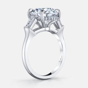
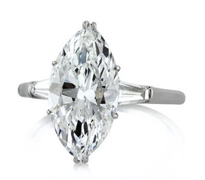
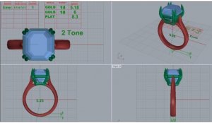
I got my first CAD back and I asked for a few tweaks; I asked to have the 1) diamond bridge removed and the 2) profile to be reworked to allow for more of a floating look on the side stones along with having the 3) center stone prong trips to be slightly longer. I have also asked if there were other 4) melee stone options beside trapezoids as I am not a huge fan of them but if not then to see how having another set of them graduating down the shoulders would look. Also 5) ring size will be adjusted to a 5 since I am a 4.5 (I don't like my rings very tight and since this appears to be a slightly thicker band I went up half a size). The center stone is 4.68 carat marquise in the color range of O-R (it has been sent to GIA for cert, should be getting back any day now)

If you have any suggestions please let me know! This is my first custom ring so this is all new to me and any help is very much appreciated.
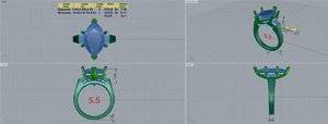
40575 QUAD.JPG40575 QUAD.JPG

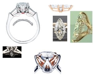
profile inspiration
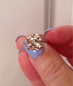
IMG_0992.JPG
 
Shameless bump...due to the lake of responses I am guessing I'm heading in the right direction? GIA report is in, color is where I thought but clarity was a S1 as opposed to V2 like the appraisal stated :( so I'm a little disappointed there
 
Bummer about the clarity, but it so beautiful that you'll never notice it.

The only other thing I'd note is that the overall CAD setting looks pretty bulky and you have quite a small ring size. That seems to be driven by traps being less steeply angled from top to bottom and the shank not narrowing to the width of the trap. With a large stone, you don't want the band super-thin, but this seems to tip too far into sturdy. Your revised insp picture looks much more flowing.

I think you've hit the key things to consider. I think you'll get more thoughts after the next CAD with those major changes made.

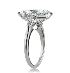
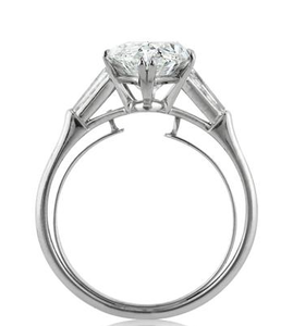
Ring by Mark Broumand that Gives Another look for the gallery. This is a 4.32 c marquise.
upload_2017-9-20_22-3-23.png
upload_2017-9-20_22-3-39.png


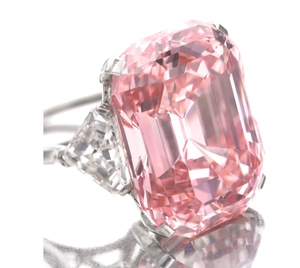
Here's the 24.78 carat pink diamond, but I wanted to show you the side stones for another option if DK can get them in the color you want.
upload_2017-9-20_22-6-49.png
 

Attachments

  • upload_2017-9-20_22-3-57.png
    upload_2017-9-20_22-3-57.png
    98.8 KB · Views: 45
The CAD- where the marquise prongs originate under the stone - it is convex.
On the inspiration pic - it is concave.
Cad had no donut.
Inspiration has a little one or a bumpout.
Not a suggestion as there's no right/wrong
Just an observation.
And you are saying you did not specify the traps replace the baguettes?
 
Just a thought - (re: looking bulky) therainbowradish had her marquise set in two rings by DK and posted the cads here as well as the finished product.
If you have not seen them - go take a look. You will get a feeling of how his cads relate to the finished product.
 
The CAD- where the marquise prongs originate under the stone - it is convex.
On the inspiration pic - it is concave.
Cad had no donut.
Inspiration has a little one or a bumpout.
Not a suggestion as there's no right/wrong
Just an observation.
And you are saying you did not specify the traps replace the baguettes?

I had asked for bullets, baguettes, or possibly shields and he came back with traps...I'm hoping he comes back with a more elongated stone. I think he had to nix the donut from my original request because of the diamond bridge hence why I am asking to remove it since I would prefer a donut instead.

But this was my original inspiration photo collage. It may have been a bit too much so I'm hoping that after emailing him just the new inspiration design we end up with something a bit less hefty looking.
Custom ring with baguettes.jpg
 
Bummer about the clarity, but it so beautiful that you'll never notice it.

The only other thing I'd note is that the overall CAD setting looks pretty bulky and you have quite a small ring size. That seems to be driven by traps being less steeply angled from top to bottom and the shank not narrowing to the width of the trap. With a large stone, you don't want the band super-thin, but this seems to tip too far into sturdy. Your revised insp picture looks much more flowing.

I think you've hit the key things to consider. I think you'll get more thoughts after the next CAD with those major changes made.

Ring by Mark Broumand that Gives Another look for the gallery. This is a 4.32 c marquise.
upload_2017-9-20_22-3-23.png
upload_2017-9-20_22-3-39.png


Here's the 24.78 carat pink diamond, but I wanted to show you the side stones for another option if DK can get them in the color you want.
upload_2017-9-20_22-6-49.png

Thank you! Glad to know I am addressing the things that need some tweaking and it's not just me looking at the CAD too harshly. I had to start numbering so I could keep it all straight. I am hoping the design can look more tapered in the next CAD
 
The shank at the bottom is 2.6 mm and the top is more like 2.8 or so. So, its not crazy thick. I think @msop04 is the same size. Maybe she can give you some thoughts on the CAD and how it might look on her fingers. She's had several rings made.
 
The shank at the bottom is 2.6 mm and the top is more like 2.8 or so. So, its not crazy thick. I think @msop04 is the same size. Maybe she can give you some thoughts on the CAD and how it might look on her fingers. She's had several rings made.

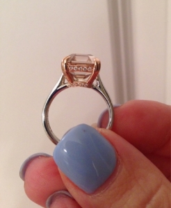
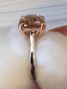
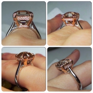
Okay, so I think @rockysalamander is referring to my old honey zircon asscher made by DK... I felt like it was too thick. In retrospect, I wish I'd had DK make the shank more rounded to accommodate the heft, instead of flat/thick.
imageuploadedbytapatalk1434816511.jpgimageuploadedbytapatalk1435242954.jpgimageuploadedbytapatalk1434917774.jpg


I just wanted to throw this out there, as it is one of my favorite MQ settings... shank and basket are both very fluid and elegant, especially for a larger stone. Notice how the shank gets heavier toward the bottom, but it's very rounded, not just "thick"...
lm_mqsoli.jpg
 
The shank at the bottom is 2.6 mm and the top is more like 2.8 or so. So, its not crazy thick. I think @msop04 is the same size. Maybe she can give you some thoughts on the CAD and how it might look on her fingers. She's had several rings made.

I just need to try on bands thicker than 2mm...I just had another diamond set into a solitaire and I'm going to ask the jeweler what the thickness of it is. After wearing the original setting for so long with that thing being super wide I'm worried about ending up with the new setting either too thick or too wide. I just hate really thick bands on my short fingers but I still understand that it's sometimes a necessity.
 
Okay, so I think @rockysalamander is referring to my old honey zircon asscher was made by DK... I felt like it was too thick.
imageuploadedbytapatalk1434816511.jpgimageuploadedbytapatalk1435242954.jpgimageuploadedbytapatalk1434917774.jpg


I just wanted to throw this out there, as it is one of my favorite MQ settings... shank and basket are both very fluid and elegant, especially for a larger stone.
lm_mqsoli.jpg

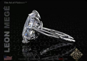
I was just reading the link on your asscher! I had just saw Leon's ring today as well, I really like how he did the basket on that ring
 
Here are some more photos so you can compare the CADs with the finished product...

imageuploadedbytapatalk1434819253.jpgimageuploadedbytapatalk1434816535.jpgimageuploadedbytapatalk1434819730.jpgimageuploadedbytapatalk1434819300.jpgimageuploadedbytapatalk1435242954.jpgimageuploadedbytapatalk1435242930.jpgimageuploadedbytapatalk1434816491.jpg
 
The CAD- where the marquise prongs originate under the stone - it is convex.
On the inspiration pic - it is concave.
Cad had no donut.
Inspiration has a little one or a bumpout.
Not a suggestion as there's no right/wrong
Just an observation.
And you are saying you did not specify the traps replace the baguettes?

Thank you for putting into words the difference from the new inspiration photo and the CAD, the more I look at the inspiration pic the more I really like the concave look as you put it. It helps having the correct verbiage when trying to decide what it is you find appealing.
 
I just need to try on bands thicker than 2mm...I just had another diamond set into a solitaire and I'm going to ask the jeweler what the thickness of it is. After wearing the original setting for so long with that thing being super wide I'm worried about ending up with the new setting either too thick or too wide. I just hate really thick bands on my short fingers but I still understand that it's sometimes a necessity.

Since your stone is so large, have you considered a Euroshank instead of just a super thick band? It will help the spinning issue and allow you to have a thinner band.
 
I was just reading the link on your asscher! I had just saw Leon's ring today as well, I really like how he did the basket on that ring

With a stone as substantial as yours, I think you should consider doing a more elegant basket like LM's... I feel this look "lightens" what could potentially look pretty heavy and clunky.
 
Here are some more photos so you can compare the CADs with the finished product...

imageuploadedbytapatalk1434819253.jpgimageuploadedbytapatalk1434816535.jpgimageuploadedbytapatalk1434819730.jpgimageuploadedbytapatalk1434819300.jpgimageuploadedbytapatalk1435242954.jpgimageuploadedbytapatalk1435242930.jpgimageuploadedbytapatalk1434816491.jpg

I feel like the CADs and finished product are pretty spot on so that's a good thing, makes me feel better about my challenge issues.
 
With a stone as substantial as yours, I think you should consider doing a more elegant basket like LM's... I feel this look "lightens" what could potentially look pretty heavy and clunky.

You mean, adding more curves instead of straight lines for the basket? It's hard to get a visual of something like that when everything for trilogy rings are all the same. I will look again at Leon's video just to get a better idea of this design
 
You mean, adding more curves instead of straight lines for the basket? It's hard to get a visual of something like that when everything for trilogy rings are all the same. I will look again at Leon's video just to get a better idea of this design

I mean adding curves, but also being fluid and airy... not thick and bulky. DK can make pretty much anything, BUT you really need to find photos to show him almost EXACTLY what you want -- with maybe a few tweaks here and there. Are you dead set on a three stone?
 
I feel like the CADs and finished product are pretty spot on so that's a good thing, makes me feel better about my challenge issues.

Yes, DK's CADs are pretty good. I'd have him do a wax for you so you'll have a better idea of how it will look before it's cast.
 
I mean adding curves, but also being fluid and airy... not thick and bulky. DK can make pretty much anything, BUT you really need to find photos to show him almost EXACTLY what you want -- with maybe a few tweaks here and there. Are you dead set on a three stone?

Yep. I'm pretty set on the three stone or at max five stone setting. I looked at rings for about 9 months before making up my mind on it and now after starting the process I'm even more firm in my belief it's what I want. I was to try on a HUGE oval at a local jeweler that had very similar finger coverage to my marquise in a variety of different settings and I just fell in love with the trilogy settings.
 
Yep. I'm pretty set on the three stone or at max five stone setting. I looked at rings for about 9 months before making up my mind on it and now after starting the process I'm even more firm in my belief it's what I want. I was to try on a HUGE oval at a local jeweler that had very similar finger coverage to my marquise in a variety of different settings and I just fell in love with the trilogy settings.

Gotcha.
 
Not much to add but I was thinking tapered bullets would add a nice transition between the marquise and the shank. The traps just dont seem like they do
much for the setting. I also love the LM setting but not sure how you could do it with a 3 stone.

Edit...the other option I was thinking was pears. The curves are very feminine and I think would help
lighten the look.
 
Last edited:
Not much to add but I was thinking tapered bullets would add a nice transition between the marquise and the shank. The traps just dont seem like they do
much for the setting. I also love the LM setting but not sure how you could do it with a 3 stone.

Edit...the other option I was thinking was pears. The curves are very feminine and I think would help
lighten the look.

I think the pears are a great idea and would add a lot of grace. The OP could retain the SK like shank as it works great to avoid a tail prong on a pear. It is also easier to find more colors in pears.

But, the OP would lose the step cut side stones, which seems a consistent design element.
 
I think the pears are a great idea and would add a lot of grace. The OP could retain the SK like shank as it works great to avoid a tail prong on a pear. It is also easier to find more colors in pears.

But, the OP would lose the step cut side stones, which seems a consistent design element.

I would prefer to stay with step cuts, pears would be rather bulky looking and between the two Traps would look more appealing to me. Still waiting on what DK has to offer.
 
Yeah I hope he can find more elongated side stones! I'm sure it's hard in that color range, but that shape does change the design - not for the better IMO sadly :\ Would be curious to see CADs with 5-stone traps though if that's all that's available - might give it a nicer taper.

I really like and prefer your new profile inspiration pic - simpler and more fluid than what he has with the extra pair of prongs for the side stones. And I like that it boosts the side stones a little further up than what he has - makes them more visible!
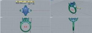
Good calls on your part, looks like now it's down to whether the right sides can be found. How are you feeling about the culet btw, did you decide not to recut? Any more thoughts on metal color?
 
Yeah I hope he can find more elongated side stones! I'm sure it's hard in that color range, but that shape does change the design - not for the better IMO sadly :\ Would be curious to see CADs with 5-stone traps though if that's all that's available - might give it a nicer taper.

I really like and prefer your new profile inspiration pic - simpler and more fluid than what he has with the extra pair of prongs for the side stones. And I like that it boosts the side stones a little further up than what he has - makes them more visible!
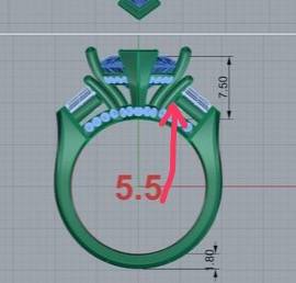
Good calls on your part, looks like now it's down to whether the right sides can be found. How are you feeling about the culet btw, did you decide not to recut? Any more thoughts on metal color?


He emailed me today saying he is having a diamond dealer stop by on Monday to look at stock, I told him I would be ok going with Ks and up just as long as they don't face up white I'm ok with faint yellow. I decided against cutting the stone since my husband wasn't on board with it. I did ask him if his 18k white gold was faint yellow and he told me it was very white but his 14k wg was more yellow.i think once he gets the stone back and we can get the design worked out then I will revisit which alloy. As long as the metal compliments the stones I could really care less what we used lol

Also he is going to redesign based off the new photo once the side stones are picked. I'm just really hoping the dealer has some decent choices for him and they won't hurt the checkbook too much.
 
Here is a new CAD showing the concave band which I love but it doesn’t seem that any of the other chances were made yet. He was able to find a pair L color .5 each shield cut stone, which was definitely one of the 3 requested step cuts I was considering and I’m pretty with the look.

So the remaining changes to the design is to have the diamond bridge removed, ring resized, and to have the side stone prongs connect to the basket instead of coming up from the bridge.

Let me know if there is anything else I should consider. I haven’t really been able to review too much since we are on vacation in Chicago.
Thank you!
D5F3D307-2971-415E-822C-03437F4C5C86.jpeg
 
I'd like to see if he could remove the two prongs holding the shields and just use the prongs holding the marquise to hold the shields in place. Or at the very least, remove a portion of it to think it out. He did a three stone for me and he was able to thin that. I'll see if I can find photos.
Also I know this is a design thing but the diamond in the donut always seem superfluous. If you're going to wear a. And the band will be scratched by the diamond and the diamond la could come loose due to the band. Plus you won't see it! I like the idea of diamonds in the band of the head, maybe have him do more diamonds in the band of the shields top so you still get that look with more of a practical application. I think that's more of personal preference thing it's just in every ring I see I never think there's much point to do it diamonds
 
1506717054848.jpeg This bit
 
GET 3 FREE HCA RESULTS JOIN THE FORUM. ASK FOR HELP
Top