shape
carat
color
clarity

DK CAD assistance needed!

I think I actually like the prongs going down to the base better. It just looks funny in the CAD because the tip of the prong isn't folded over the stone.

Unless I am misunderstanding your intent, Kristine, I do not think this ring will look right at all without the bridge.
 
That's where we disagree, as I think the multiple struts gets busy and clunky. But this all comes down to personal preference of course.
 
Also look at the side views of the cads I think the v prongs are too wide at the top of the prongs and I'm not sure you need pave right above where the shields sit. I'd probably forgo in there and try to get the shields to butt right up against it
 
Ooh I think the shields are much prettier! Yay!

To my eye it would look nice and fluid for the side-stone prongs to split off from the main prongs in like a tight Y - not quite like starting at the basket, but not quite like the parallel prongs he has now. I would also nix the diamonds on the donut as Niel suggests, and I think the ones on the basket look pretty!

Whatever you decide for the remaining details, I think it's looking lovely and you can't go wrong :love:
 
I want to have the side stone connected more to the basket, The bridge isn’t going anywhere, I only want the melee nixed but it doesn’t seem that he has worked on all of my prior suggestions just yet :)

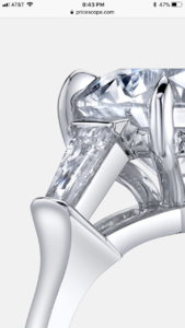
Here is a zoomed in photo from the inspiration photo of what I am looking for...edit-I am just not sure what style setting this is called but I’m hoping he understands when I send this zoomed in pic
DFE1C3E2-D583-4F08-97FC-8258977E924B.png
 
Last edited:
I have requested for the following changes on the design. I know the v tip prongs was brought up as being too wide but I think I might have to see them on the mold to know how I feel about them. I did as him to make them wider and I like the tapered look they have connecting the the basket. If there is anything I might be overlooking or other opinions on the design please let me know!

1) eliminate the strut on the shields and have the connect directly to the bridge
2) eliminate the diamond bridge
3) have the 4 center stone prong sharper
4) try and slim band width by .3mm

Thank you! I appreciate all the help I can get :D
 
By eliminate the diamond bride do you mean take out the melee in the stone completely. If so I'd say that instead as eliminate the bridge could be read as "remove that element from the design"
The prongs won't seem pointy until it's completed the cads don't really show that, if that's number 3 on your list.
I'd ask I as to think the V prongs a bit. :)
It'll be fab!

Got it, I will specify the bridge better to him. This verbiage stuff can be slightly confusing lol
 
He sent me photos of the stones together!!! I think it looks great but please let me know what y’all think.

7D97217A-563E-4A24-8D36-7C2233CD9311.jpeg
 
Love. Is the stone going to be in yellow gold? I may have missed that
 
Love. Is the stone going to be in yellow gold? I may have missed that

I have not made up my mind on that...I wanted him to see about putting in the temp settings of different alloys so I could make up my mind. He did say that his 14k white gold has a bit more of yellow hue than his 18k
 
but it'll definitely be all white?
 
I have not made up my mind on that...I wanted him to see about putting in the temp settings of different alloys so I could make up my mind. He did say that his 14k white gold has a bit more of yellow hue than his 18k

Do you maybe have this backwards? His 14k white is more yellow than his 18k?

FWIW i have his 14k white and I think it looks rhodium plated. I specifically asked for no plating, supposedly it is not- but to me it's very white.
 
Do you maybe have this backwards? His 14k white is more yellow than his 18k?

FWIW i have his 14k white and I think it looks rhodium plated. I specifically asked for no plating, supposedly it is not- but to me it's very white.

I had it mistaken, I just double checked. He said 14k yellow gold.


Hi Kristine,
I have a stone dealer coming here on Monday with some warmer shade tapered baguettes and bullets. If I can't find a good pair I will get another smaller pair of traps to go with the set we have. I will change the shank of the ring and V prongs. My unplated 18k white gold is quite white, maybe 14k yellow would be better? Thanks David
 
The current sides are nice ... Obviously small sides seem to be a bona fide look WWW
 
The current sides are nice ... Obviously small sides seem to be a bona fide look WWW

I’m really happy he was able to find something in the half carat range for each, with the feature stone being so chubby it needed something larger.
 
I was just able to reread his email. He has two choices one is an L, which is wider and shorter total 1.05 carats

B596CD6A-D0B8-4171-B957-CE7830437681.jpeg


The next is an J which are longer and thinner total .58 carats


AA1F1864-D15D-4409-A471-7E2626D5F0FB.jpeg
 
I am leaning toward the L set but this is a tough choice
 
The current sides are nice ... Obviously small sides seem to be a bona fide look WWW

I actually don’t see your question on here anymore but to answer it, the original setting has colorless side stones and it just wanted a different look with the warmer stones. I will be making a single prong wedding band out of the original side stones to go along with this ring. For me the colorless stones were too much of a contrast and I wanted a more blended look.
 
The Ls blend well.

Would you rather have something different ?
 
The Ls blend well.

Would you rather have something different ?

I think doing the warmer side stones is different, you see a lot of colored feature stones with the colorless side stones or just all colorless. I haven’t seen very many examples of warmer stones paired with warmer stones. This is something I have debated for about 9 months prior to contacting any designers since I wanted to know what I was looking for without irritating them lol

Don’t get me wrong I think the colored stones with colorless melee can look very nice but for me, I just didn’t want that look for this project. I’m sure some people would definitely go with colorless, it would have opened up more options on the stones
 
I haven’t seen very many examples of warmer stones paired with warmer stones.

Yes ! I am happy to see a distinctive ring in the making !

[the marquise is so beautiful to me - a dream of a stone... I couldn't quite get it in the old setting]
 
I told him the Ls :). So excited!!!
 
If it were my stone I would do a white shank with white side stones and a yellow head for the prong to play up the color contrast. I'm not sure Ls will play up the contrast. Now of course it's all a matter of if that's what you're trying to accomplish
 
If it were my stone I would do a white shank with white side stones and a yellow head for the prong to play up the color contrast. I'm not sure Ls will play up the contrast. Now of course it's all a matter of if that's what you're trying to accomplish

Im going for blended instead of contrast. The old setting had colorless side stones so I specifically requested a warmer pair.
 
If it were my stone I would do a white shank with white side stones and a yellow head for the prong to play up the color contrast. I'm not sure Ls will play up the contrast. Now of course it's all a matter of if that's what you're trying to accomplish

One place also recommended mixing the metals to play up the color, I will have to look at examples
 
Im going for blended instead of contrast. The old setting had colorless side stones so I specifically requested a warmer pair.
That's certainly understandable to try and avoid looking like the old setting but really it's already going to look nothing like it. And even the Ls contrast a lot in color. I just think if they are going to not match, they should REALLY not match so it seems on purpos Rather than a lack of attention to detail. Imagine wearing a black suit with blue pants.
 
Last edited:
You were saying you were going to look for two tone examples. It's harder to find light yellow center stones but here's one
IMG_0292.JPG
 
GET 3 FREE HCA RESULTS JOIN THE FORUM. ASK FOR HELP
Top