shape
carat
color
clarity

Do we love or hate this color combo?

Joined
Jan 20, 2012
Messages
4,961
Hello all,

I'm still stuck on what to do with this periwinkle sapphire. Inspired by everyone's creative designs, I've been trying to think outside the box a little, rather than just pairing each CS with colorless diamonds. So here we have my latest creation... it's either a monstrosity or unique beauty; I can't tell anymore. My thought process was that yellow diamonds might be a nice compliment, since they are opposite violet on the color wheel. Do they enhance the sapphire or clash with it?
helpme!.jpg


Many thanks as always,
Autumn

P.S. I have fancy intense yellows here... please also let me know if you think a more subtle fancy yellow would work better or if I should scrap this altogether. TIA!
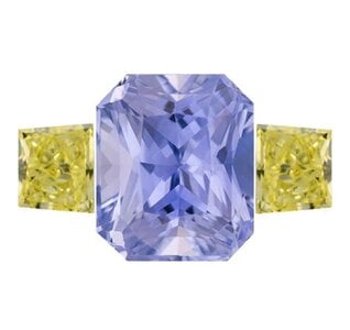
Captureg,li m.JPG
 
This is mostly a matter of personal taste and preference. However, two things should be taken into consideration here:

1. The complementary colour for blue isn't yellow but orange.
2. If one of the colours is a more delicate, pastel shade, I think whatever colour you pair it with will look best if it's also pastel and delicate.

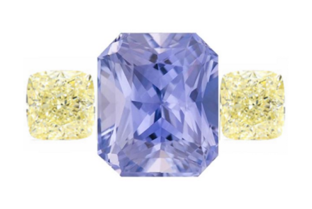
So here's what it looks like with a more gentle shade of yellow:
1655556511389.png
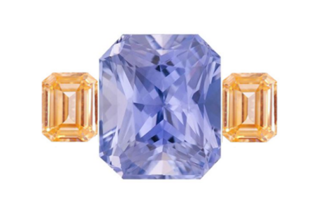
And if we pair it with orange instead:

1655556671928.png
 
Agree to above, but periwinkle has a violet/purple component, and violet's complimentary color is yellow on the color wheel. I personally think the mock up with the pale yellow stones above is gorgeous!
 
IMO a peachy pastel orange would be ideal.
By pastel I mean the color saturation would be on the lower end.
 
FWIW, it doesn’t do it for me, sorry.
 
I’ll be honest. I don’t like the pairing.
 
This is mostly a matter of personal taste and preference. However, two things should be taken into consideration here:

1. The complementary colour for blue isn't yellow but orange.
2. If one of the colours is a more delicate, pastel shade, I think whatever colour you pair it with will look best if it's also pastel and delicate.

So here's what it looks like with a more gentle shade of yellow:
1655556511389.png
And if we pair it with orange instead:

1655556671928.png

I’d go with the pale yellow colour but a step or scissor cut, not crushed ice brilliant. Just to mix things up!
 
I have a ring with a similar color combo (spinel and chrysoberyl) and I have to be honest, I don’t wear it much, as I think the colors don’t enhance each other.
 
What’s tricky about complementary colors is that if there is even a hint of, let’s say grey in the blue or green in the yellow, it’s going to be OBVIOUS and really make the stones look poorly. No color is pure in gemstones and undertones are just a reality as you’re not dealing with pure pigments

Complementary colors does not = complimentary colors, if that makes sense

Color theory is tricky business. I recommend actually placing your stone in different lighting conditions next to different colors to see if anything makes your heart sing. Copy-pasting images probably isn’t going to give you the strongest sense of how they might actually play together - although it is good enough to nix BAD combos
 
Yellow without any green in it or orange-ish works best. I'd pick the orange.
 
The stone is such a gorgeous color on its own. I don’t think I would add anything. If you do decide to introduce another color, I would stick to the softer tones.
 
I can't tell how I feel, honestly. It's something I'd have to see with my eyeballs.
I think it will be personal preference with the caveat that the side stones should be 'soft' toned no matter the color family chosen.
 
Hello all,

I'm still stuck on what to do with this periwinkle sapphire. Inspired by everyone's creative designs, I've been trying to think outside the box a little, rather than just pairing each CS with colorless diamonds. So here we have my latest creation... it's either a monstrosity or unique beauty; I can't tell anymore. My thought process was that yellow diamonds might be a nice compliment, since they are opposite violet on the color wheel. Do they enhance the sapphire or clash with it?
helpme!.jpg


Many thanks as always,
Autumn

P.S. I have fancy intense yellows here... please also let me know if you think a more subtle fancy yellow would work better or if I should scrap this altogether. TIA!
Captureg,li m.JPG

just like Ukraine the colour of my most beloved home province (Otago) :kiss2: is blue and gold
so just from a lifetime of gravitating towards this colour combo i think its awsome :kiss2: :kiss2: :kiss2: :kiss2: :kiss2:
and i would do it and i would wear it !!!!
Go for it ! :appl: :appl: :appl: :appl: :appl: :appl: :appl: :appl: :appl:
 
This is mostly a matter of personal taste and preference. However, two things should be taken into consideration here:

1. The complementary colour for blue isn't yellow but orange.
2. If one of the colours is a more delicate, pastel shade, I think whatever colour you pair it with will look best if it's also pastel and delicate.

So here's what it looks like with a more gentle shade of yellow:
1655556511389.png
And if we pair it with orange instead:

1655556671928.png

I love these! I was initially looking for orange side stones, but had my heart set on diamonds, and just couldn't find the right ones. I also really want to bring out the violet tones, so as @RMOO said, that's why I was shooting for yellow. But I'm loving the softer tones you have here. Thank you!
 
FWIW, it doesn’t do it for me, sorry.

I’ll be honest. I don’t like the pairing.

I have a ring with a similar color combo (spinel and chrysoberyl) and I have to be honest, I don’t wear it much, as I think the colors don’t enhance each other.

Not a fan. Love each alone, just not together.

You don't want the side stones to steal the show. With a soft-coloured stone like yours, that's hard to avoid. I'm thinking white diamonds might work.

Thank you all for your honest opinions!
 
I vote for orange/purple, looks like a lavender honey treasure

IMO a peachy pastel orange would be ideal.
By pastel I mean the color saturation would be on the lower end.

Agree

I think the bright yellow really clashes - the softer yellow is better but pale peach would be yummy! I’m picturing a matte peach gold setting…

Yellow without any green in it or orange-ish works best. I'd pick the orange.

I'm really warming up to the idea of something in a soft peachy-orange! I wonder if I could find a matched pair of pads that isn't astronomical...
 
I actually enjoy the option OP posted - I like the color and saturation of the yellow/green stones against the purpley center stone.

Thank you!

I’d go with the pale yellow colour but a step or scissor cut, not crushed ice brilliant. Just to mix things up!

I'm going to keep this in mind! Appreciate it!!

The stone is such a gorgeous color on its own. I don’t think I would add anything. If you do decide to introduce another color, I would stick to the softer tones.

Definitely going to go softer or chicken out and stick with white. lol

I can't tell how I feel, honestly. It's something I'd have to see with my eyeballs.
I think it will be personal preference with the caveat that the side stones should be 'soft' toned no matter the color family chosen.

Staying with "soft" accents, if I decide to use color, seems to be the consensus!

just like Ukraine the colour of my most beloved home province (Otago) :kiss2: is blue and gold
so just from a lifetime of gravitating towards this colour combo i think its awsome :kiss2: :kiss2: :kiss2: :kiss2: :kiss2:
and i would do it and i would wear it !!!!
Go for it ! :appl: :appl: :appl: :appl: :appl: :appl: :appl: :appl: :appl:

Thank you, my friend!

Right now, I'm leaning towards a more subtle yellow, like @Rfisher suggested. So rather than a fancy intense yellow diamond, perhaps I should shift to the lighter fancy yellows. Hmm... being an indecisive Gemini is a life-long curse. :roll:
 
What’s tricky about complementary colors is that if there is even a hint of, let’s say grey in the blue or green in the yellow, it’s going to be OBVIOUS and really make the stones look poorly. No color is pure in gemstones and undertones are just a reality as you’re not dealing with pure pigments

Complementary colors does not = complimentary colors, if that makes sense

Color theory is tricky business. I recommend actually placing your stone in different lighting conditions next to different colors to see if anything makes your heart sing. Copy-pasting images probably isn’t going to give you the strongest sense of how they might actually play together - although it is good enough to nix BAD combos

I appreciate the insight, thank you! And I agree... I'll just have to get some yellow diamonds home and pair them in person. Testing the waters first to see if folks thought they were an immediate and hard "no." lol
 
I prefer white diamond sides. That being said, what about really saturated darker tanzanites? Those would bring out the purple in your stone.

Interesting! Thank you for the suggestion!! :)
 
Thank you!


I'm going to keep this in mind! Appreciate it!!


Definitely going to go softer or chicken out and stick with white. lol


Staying with "soft" accents, if I decide to use color, seems to be the consensus!


Thank you, my friend!

Right now, I'm leaning towards a more subtle yellow, like @Rfisher suggested. So rather than a fancy intense yellow diamond, perhaps I should shift to the lighter fancy yellows. Hmm... being an indecisive Gemini is a life-long curse. :roll:

well a paler yellow would go with the periwinkle and it'll still be blue and gold to me and i will adore it
 
GET 3 FREE HCA RESULTS JOIN THE FORUM. ASK FOR HELP

Featured Topics

Top