Indylady
Ideal_Rock
- Joined
- Apr 28, 2008
- Messages
- 5,785
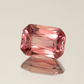
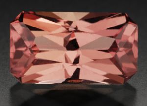
And that''s not the best pic of it that I''ve seen. On my monitor (which is why it''s so hard to judge them by computer monitor pics!) it looks orange with hardly any pink. But I know that stone shows pink in pics because I''ve seen it, and it''s gorgeous.Date: 10/19/2009 12:07:48 AM
Author: szh07
TL- My jaw just dropped after see Art Nouveau''s padparadascha.

Date: 10/19/2009 12:14:38 AM
Author: TravelingGal
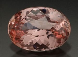
Putting them next to each other since we''re now on page 1 of this thread...


Thank you for the synopsis Morecarats. The part I''m confused about is the highlighted part above. As Coatmundi (a GG herself) pointed out earlier in this thread, the less saturated a warm stone, the more brown. I would think it would be rather low to medium tone, such as the pastel tones they are referencing above. Always learning about padparadschas, so if you have anything to say to that, I would appreciate yours and other opinionsDate: 10/19/2009 2:59:11 AM
Author: morecarats
Everyone has an opinion about padparadscha sapphire. You see all kinds of colors represented as pads, from the brown-pink of the original poster''s stone to the spessartite-like orange in the brightly-lit ring setting. Everyone knows what they like, and many people have a preference for the highly saturated colors. So you see a lot of these offered as pads.
As far as the gem trade goes, it''s worth considering the best effort to date to try to bring some kind of standard to the topic. In April 2007, the Laboratory Manual Harmonisation Committee (LMHC), a committee with representatives from the world''s leading gem labs, published a statement on Padparadscha Sapphire (''Information Sheet #4). Here are the main points:
----------------------------------------
Padparadscha sapphire is a variety of corundum from any geographical origin whose color is a subtle mixture of pinkish orange to orangey pink with pastel tones, and low to medium saturation.
The name ''padparadscha sapphire'' SHALL NOT be applied in the following cases:
* If the stone has any colour modifier other than pink or orange.
* If the stone has major uneven colour distribution when viewed with the unaided eye and the table up +/- 30 degrees
* If the stone has been treated by lattice diffusion of a foreign element, treated by irradiation or dyed, coated, painted, etc.
------------------------------------------
I asked if the original poster''s sapphire was offered by the dealer as a padparadscha and whether it had been certified as such. I wouldn''t want to offer an opinion until I saw the actual stones, and I would defer in any case to the lab gemologists who have seen hundreds or thousands of padparadscha candidates.
Given the guidelines from the LMHC, it is possible that the original poster''s gem would fail to qualify due to the brown tones, or that the bright stone in the ring setting would fail to qualify due to yellow tones or color zoning or high saturation. Or maybe they both qualify as pads.

The horse may be long dead already, but I''m not sure it''s been established that a low to medium saturation is necessarily going to show a brown undertone. I know someone said that, but I''m not yet convinced. I''ve seen light baby pinks in sapphire and tourmaline that didn''t seem to show any brown. Maybe there''s a color theorist in the house who can demonstrate for us that this isn''t possible.Date: 10/19/2009 8:45:09 AM
Author: Chrono
Morecarats,
I’m not trying to beat a dead horse but I am honestly confused. If LMHC’s stance that ''any colour modifier other than pink or orange'' would disqualify it as a padparadscha, a stone with low to medium saturation is going to show a brown undertone. Any lack of saturation is going to manifest itself as brown (in warm colours) or gray (in cool colours).
As for the stone itself, it could very well be a nice stone in person. It could just be a not so nice picture.
I don''t want to derail the thread, but I''m not sure about this point on aquamarine. Isn''t the so-called "Santa Maria" aquamarine especially valued because it is a more saturated intense blue than your average pastel aquamarine?Date: 10/19/2009 8:01:06 AM
Author: Chrono
If it is indeed a low to medium saturation, then it’s definitely not the stone for me. I take it to mean that a fine quality padparadscha sapphire will never be a vivid and intense colour. So a vivid orange pink untreated sapphire of equal parts and well mixed will remain an orange pink sapphire, and not a padparadscha?
Slightly off topic, but the categorization of the low to medium saturation reminds me very much of aquamarines where saturation doesn’t count for much, only tone.
A light baby pink is just that to me; a stone with light tone but not low in saturation. I too am interested in having this straightened out.Date: 10/19/2009 9:00:00 AM
Author: morecarats
The horse may be long dead already, but I''m not sure it''s been established that a low to medium saturation is necessarily going to show a brown undertone. I know someone said that, but I''m not yet convinced. I''ve seen light baby pinks in sapphire and tourmaline that didn''t seem to show any brown. Maybe there''s a color theorist in the house who can demonstrate for us that this isn''t possible.
I’ve read past discussion here in CS and elsewhere that the determining price factor for aquamarines isn’t the saturation but the tone. A darker (toned) blue aquamarine showing a gray undertone is priced more than a lighter (toned) blue aquamarine even if the lighter toned aquamarine has a more intense (saturated blue with almost no gray undertone) colour.Date: 10/19/2009 9:04:11 AM
Author: morecarats
I don''t want to derail the thread, but I''m not sure about this point on aquamarine. Isn''t the so-called ''Santa Maria'' aquamarine especially valued because it is a more saturated intense blue than your average pastel aquamarine?
I thought in color theory pink is just a desaturated red. Since baby pink is not really on the intense end of pink, it would seem to follow that baby pink is not highly saturated.Date: 10/19/2009 9:18:23 AM
Author: Chrono
A light baby pink is just that to me; a stone with light tone but not low in saturation. I too am interested in having this straightened out.Date: 10/19/2009 9:00:00 AM
Author: morecarats
The horse may be long dead already, but I''m not sure it''s been established that a low to medium saturation is necessarily going to show a brown undertone. I know someone said that, but I''m not yet convinced. I''ve seen light baby pinks in sapphire and tourmaline that didn''t seem to show any brown. Maybe there''s a color theorist in the house who can demonstrate for us that this isn''t possible.
I hope this is not a case of the blind leading the blind, but I''ll try. Though pink is not as saturated as red, some pinks -- like hot pink -- are more saturated than other pinks, such as baby pink. Saturation is relative.Date: 10/19/2009 9:33:24 AM
Author: Chrono
MoreCarats,
You brought up a good point that in theory, pink is a de-saturated red. So how does one categorize an intense hot pink colour?
Slightly off topic, but just to provide a reference, Richard Wise makes this statement in his book. It appears one of the few stones that has this distinction. I'm still confused about how the gem labs came up with this distinction of only low to medium saturation for padparadschas though.Date: 10/19/2009 9:23:03 AM
Author: Chrono
I’ve read past discussion here in CS and elsewhere that the determining price factor for aquamarines isn’t the saturation but the tone. A darker (toned) blue aquamarine showing a gray undertone is priced more than a lighter (toned) blue aquamarine even if the lighter toned aquamarine has a more intense (saturated blue with almost no gray undertone) colour.Date: 10/19/2009 9:04:11 AM
Author: morecarats
I don't want to derail the thread, but I'm not sure about this point on aquamarine. Isn't the so-called 'Santa Maria' aquamarine especially valued because it is a more saturated intense blue than your average pastel aquamarine?

Date: 10/19/2009 7:42:45 AM
Author: tourmaline_lover
Thank you for the synopsis Morecarats. The part I'm confused about is the highlighted part above. As Coatmundi (a GG herself) pointed out earlier in this thread, the less saturated a warm stone, the more brown. I would think it would be rather low to medium tone, such as the pastel tones they are referencing above. Always learning about padparadschas, so if you have anything to say to that, I would appreciate yours and other opinions
Date: 10/17/2009 11:54:24 PM
Author: szh07
Does it really have a brown undertone, or is it simply just very saturated in color, which might make it look dark?

http://rwwise.com/products/category%7C92Date: 10/19/2009 2:06:51 PM
Author: szh07
I''ve just emailed the vendor to ask for additional pictures. This thread has created such an interesting discussion!
T-Gal, that color really is incredibly close the the one I originally posted! I just looked all over Richard Wise''s site, and I couldn''t find it. I''m really close to being won over, but I''m going to wait till I get to see a couple more pictures. I want to scope it out thoroughly before I order it, because I usually have a hard time letting go of a gem after I''ve gotten it unless there really is a serious problem.
TL- I like the color of this stone; I also don''t mind if its not called a padparadascha. I was never quite after a pad; I''ve always liked them, but wasn''t precisely looking for one when I came across this. What else do you think it should be called? Just a pink sapphire? The amount of brown that I see in the stone is just borderline out of the color that I really love. However, finding the color that I really love within my budget usually results in a very tiny gem (my emerald is a great example). The stone has a wonderful tropical sunset type feeling. I''ve asked to see the gem in different lighting and with a different background, which I am hoping will lead me to a decision.
