shape
carat
color
clarity

FCD Ring Design

I think the demantoid and the two pale pink FCDs would be perfect in the inspiration ring you posted. I hope you find a design that works.
 
I still like it without the green.
 
They all look lovely in your hand shot but I too find my eyes stray to the green and it sounds as though you're not totally convinced either, no matter how much you'd like it to work :((
 
With the garnet, I look first at the green, then think, "oh, there are other stones in it too." They seem to get pushed to the back burner where they don't deserve to be.

I really don't like being a party pooper, but I don't like the pink pair with the demantoid either. On my monitor, at least, they have a secondary violet/purplish tendancy & the demantoid more to the yellow-green, which kind of clashes to me -- at least, nothing relates them to each other. This gets harder & harder!

--- Laurie
 
i think the green is powerful to stand on its own.

I know you want to enjoy the FCD on a ring, how about a bangle? similar to what preg curious posted... the one with many gems on it. I think that woudl work well.
 
Okay party poopers, the green garnet is out. My wrist usually sports either a silver bangle or 22k bracelet so other wrist items are out of the question.

ETA
I'm back with my pathetic Paint mockup design. I don't think I like the play of colours. :knockout:

fcd_design_part_deux.jpg
 
A couple notations to go with the horrible Paint job.
1. The pink leaves are supposed to be smaller, rounder and curved higher.
2. The shank is pinched where the stones are centered, curving downwards then upwards, widening as it gets further away from the center with the widest part just past the 2 leaves.
3. The tiny melee diamond at the bottom of the design is fan shaped. I don't know how to draw that and used a triangle instead.
4. None of the stones are bezeled. They are all prong set although there is a thin metal rim around all the stones with the exception of the yellow pear FCD.
5. The pink oval FCD will be set in a rectangular cushion-y metal outline.
 
I'm not sure I get it. Can you draw it using a pen and paper instead? Is the bottom curvy line supposed to be the shank? If it is, it looks really top heavy, being that all of the large stones are above the shank?
 
Yes, the design is top heavy but I've also seen such a ring design before. It seems suited to very small stones, which mine all are. And yes, the curvy line at the bottom is the shank. The proportions are close but not exact.

img_2991.jpg
 
Do you have a picture of what you're envisioning the leaves to look like?
 
No idea what the leaves will look like since it is greatly modified from the original inspiration picture.
 
Is this your inspiration piece, Chrono? Gives a good idea where you're starting from & general proportions, though you'll change those however you like. It does work, being somewhat top-heavy; it has a creative, artistic feeling.

unique_engagement_ring_s.jpg
 
JF,
That's the one! Do you have more pictures of it? Full sized ones?
 
it looks like the love child of a missile toe and a fleur de lis
 
VapidLapid|1386792637|3572133 said:
it looks like the love child of a missile toe and a fleur de lis

I take it that you don't think too highly of the design. :lol:
 
Who doesnt like missile toe and the French?
 
I really don't like the two stones that are attached to the rest of the ring by the thin lines of metal. They look like they were just added at the last minute and don't really add anything to the design. I think there are ways to make it flow better and have less potential to break off. Otherwise, I can see potential in the design, although it's not something I'd wear, personally, mostly because I'd catch it on everything and I have symmetry issues I'm trying to work on.

Who would you have make such a design?
 
VapidLapid|1386793246|3572145 said:
Who doesnt like missile toe and the French?

I dislike mistletoe and have no opinion of the French. :bigsmile:
 
FrekeChild|1386793562|3572153 said:
I really don't like the two stones that are attached to the rest of the ring by the thin lines of metal. They look like they were just added at the last minute and don't really add anything to the design. I think there are ways to make it flow better and have less potential to break off. Otherwise, I can see potential in the design, although it's not something I'd wear, personally, mostly because I'd catch it on everything and I have symmetry issues I'm trying to work on.

Who would you have make such a design?
I'm not feeling this design 100% either. It still needs a lot of tweaking to make it work. As for who is going to make it? That's the million dollar question which has been tossing around in my brain for months.
 
At least he didn't say camel toe? :Up_to_something:

I was thinking of a few ways to tweak it. If the kiddo goes to sleep within a reasonable amount of time, and sleeps for a while, I might be able to pull out a sketch book and play with the shapes?
 
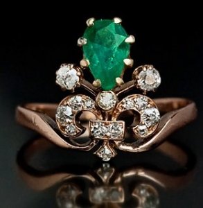
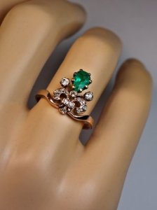
Here are larger pics -- one of them as it looks on a "hand." It's a different design for sure. I think would need some tweaking to smarten it up a bit, but it doesn't look to me like there's anything sticking up that would get caught on stuff. Who could do it is a good question -- and would they want next year's mortgage to try?


Looking at it now, my first thought is that it would look more balanced if the shank could somehow be more toward the middle of the design, rather than having the whole fleur de lis, etc., popping out of it. Just a thought.

--- Laurie

fleaur_de_lis_ring.jpg

antique_tiara_ring.jpg
 
I ran out of time, but I did kind of play with one based on your other design you posted on the first page. I added a fancy yellow melee. Obviously it's not at all refined. What are the measurements on your stone?

for_chrono.jpg
 
FWIW I actually like your pasted FCD colours above - what is it that you think is not right? Too pale after all your large, strongly coloured rings? But you've loved this design for an age so it obviously has something that keeps drawing you back.

As to execution, how about Steven Kirsch? Take a look at this ring with the zoom and note the way the stones are outlined with bezel but bead set in the centre where they come together.
http://test3.codussoft.com/stevenkirsch/engagement/right-hand/r0902.html

Do you have a better photo of the ring that Freke just posted? I think you said it was a PSer's ??? more pics???
 
Oh well done JF! :appl:

Now who has the photoshop skills to put the pear and pinks in there for us? pretty pleeeez

ETA: Oops - ignore my reference to SK and bezel/bead - I missed where you said all would be prongs.
 
Okay... I had a go on Design 1 (D1) too - I closed it up a bit.

Design 2 (D2) could always have the "stalks" shortened a bit so that they nestle in to the bottom of the pear more.

chrono-d1-2.jpeg
 
Freke.
The proportions are as follows:
Yellow pear 6 x 4 mm
Pink oval 4.4 x 3.3 mm
Pale rounds 4.0 mm
These aren't easy proportions to work with and my preference is to not add anymore stones to the group.

JF,
Thanks for posting the large picture. I can see the details and how everything fits together better now. The suggestion of the shank starting at the "square" part would help balance the look of the ring and is a good one.

Starzin,
I'm not sure what is off about the design. It isn't a paleness factor, that's for sure. I suspect the proportions and flow feels awkward. The design is very organic and I'm not sure who is able to pull this off. Done incorrectly, it will look cheapish. One of my top contenders is Greenlake. Unfortunately, I don't recall whose ring it is nor have more or better pictures, only that it has a round chrysoberyl.
 
Here are a few that catch my eye. There are many elements that I like and hope to be able to use.

1000056_0.jpg

an_flower.jpg

an_5.jpg

an_ruby.jpg
 
Chrono|1386855915|3572745 said:
Here are a few that catch my eye. There are many elements that I like and hope to be able to use.

Those are very pretty, but unless you can find a true antique piece with the right specifications, it might be difficult to find a jeweler that can recreate that beautiful organic detail to your high standards.
 
Those are very pretty, Chrono. They give a good sense of where you want to go. I'd say to find a jeweler now, then work with him or her to design just what you want. The jeweler will tell you as you go along what will work & what won't and save you time & anguish.

--- Laurie
 
I vote Greenlake.

I like the third down the most as far as those last designs go.
 
GET 3 FREE HCA RESULTS JOIN THE FORUM. ASK FOR HELP

Featured Topics

Top