4ever
Ideal_Rock
- Joined
- Dec 9, 2008
- Messages
- 2,260
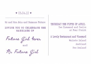
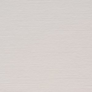
SB- No Accent colour as of yet, just various purples, a natural brown paper colour and white. I thought a nice swirly font would make it look more Chic as well but so far with my photo shop trials, the more casual fonts just look better. Not as casual as the yellow invite used above, but my current favourate has a typewriter font for the main text and a handwriten looking caligraphy font for our names. Also I'm thinking I'll use a white linen card because the texture reminds me of old fashioned wall paper and I think textured paper makes invites look classyer. I think this goes with the twine. Ugg This is hard!





300x240.png)