shape
carat
color
clarity

Hot Pink in a White Setting?

chrono

Super_Ideal_Rock
Premium
Joined
Apr 22, 2004
Messages
38,363
I am undecided about what to do with this setting. I've had it for nearly 6 years, unset and unworn because I cannot find the right stone for it. I even considered getting a cheapo sphene or African demantoid in hopes that the sparkle will wow me to compensate for the colour. Then again, I'm not too keen on sphenes and demantoids indoors. :blackeye:

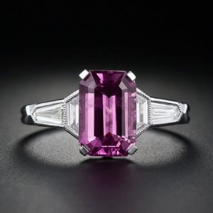
The setting is a gorgeous white gold true Art Deco antique setting with single cut diamonds. I've always thought that that period requires either a blue, red or green stone so I'm not sure if pink fits. I've already lots of blues, reds and have a green ring coming up soon which limits my options. What do you all think? Looks great or looks weird (out of place)?

It's a very poor picture taken in a rush so the setting looks blurry but you get the idea.
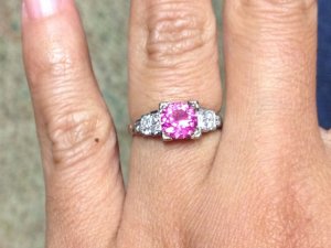
hot_pink.jpg
 
I like it. As you said it isn't historically accurate, but I think the mix of old and new makes it more interesting. I think a benefit is that if you wear multiple pieces this allows you to choose from vintage and newer pieces. Both the stone and setting are stunners. If you change your mind and decide to go the traditional route I see green or blue.
 
Well, you know my trials with a white metal ring. It has taught me a lot and now I know (finally!) in white I only like "blue" or blue-ish stones. Blue, blue/purple or hot pink And this pink definitely looks awesome! I love it :love: :love:
 
I personally like hot pink in a white setting. I like the contrast and think it makes the stone really pop. Of course I am biased though, my hot pink sapphire is in a white setting.
 
As someone not 'into' jewelry (they are more a vehicle to allow me to see my stone), I'd never even think "hey, that stone is new and that setting is vintage, how odd". So only the very obsessive jewelry-connoissoir would notice something like that, and only the very 'traditional' of said connoissoirs would think that was something wrong. So, if you like it, I'd set it.

Also, unlike JBK, I prefer white gold over yellow most of the time when it comes to bright stones. I would clearly pick white over any other color with a bright pink stone, I think it makes it really pop. I think the duller yellow would 'dumb it down' a bit more. Just my opinion.

I like yellow, I decided to set my new upcoming Chrome Tourmaline in yellow, but that was after a lot of debate. Almost any other color I'd prefer in white.

Have you seen really "GOOD" Sphenes though? I'd think of all people you would. I have a killer Sphene that Dan cut for me, that looks amazing indoors...outdoors...everywhere, it practically glows in the dark. But Im too afraid to set it. LOL. I was toying with the idea of setting a lesser (but still nice) Jeff Davies sphene in sterling silver just to wear it sometimes, but haven't done it yet.

Also, remember not all African Demantoids are created equal. Dispite the lousy pics of the ones I posted on DB recently, the little round stone was a very bright lime green. It just didnt appear that way in the pics. And I know that wasn't the best best color those come in. The thing looked like a green Diamond. I dont know why I am telling you this, this is something you probably know more than I do about. Maybe you've just seen the brownish Demantoids?? Curious...
 
Thanks for sharing your personal experience with regards to pinks in a white metal setting. I'm relieved to read that it's not such a hare-brained idea after all.

When a stone is very strongly saturated, it'll look great in any metal colour; it just stands out on its own. I guess my concern is that it doesn't fit the time period. I think I already own 2 or 3 blue stoned rings so I don't want or need another blue ring. Green isn't my favourite colour so it's something I doubt I'll wear often.

Yes, I've seen very good sphenes and demantoids. Excellent colouration but when indoors, my eyes detect the modifiers and that puts a damper on my enjoyment.
 
I like everything in white gold.

To me that's like little black dress...you can never go wrong with white gold and diamond setting...
 
I like pinks in white metal and think the stone pictured looks very nice in that setting. There is a ring somewhere on pricescope that is a pale pink sapphire in a white metal halo that is one of my favorite rings on this site. I think it's really pretty and feminine.
 
For me, it would be a bit too neon-y. A great raspberry colored garnet (if that's not too red), pretty much any color spinel, or a violet tanzanite would look beautiful.
 
The white and pink combination is certainly very pretty, but IMO the color of the stone is just a little incongruous with the vintage setting; The two just don't seem to go together to me. I think it's from years of looking at hundreds of antique/vintage rings on ebay and other sites; I've never seen such a vivid pink stone in an antique setting so it seems a little off to me. That said, this is just my opinion and there are no rules in jewelry so if you love the look you should go for it!

eta: forgot to say the setting is gorgeous!! :love:
 
Well, I love hot pink, and I love white gold, and there is no such thing as "too neon-y" as far as I'm concerned! I think that is a striking combo and agree with Chris that it seems doubtful anyone else would think "hmm" with regards to the time period/mismatch, so it would really come down whether or not it would bother you.

I say dooooo eeeeeeeet...

And if you change your mind later, just sell the whole thing to me. :Up_to_something:

What's the stone?
 
Good try, NKOTB but it's not working. What stone do you think it is? :naughty:
 
Dang! ;(

Can I just call blanket dibs on everything you own? :lol:

In all seriousness, though, I think it would be lovely.

I was afraid you'd ask...Sapphire, spinel or umbalite?
 
Pink tourmaline. ;))
 
Gah!! Fail. I should have guessed that. :nono:
 
I'm not a white gold fan, but I think that ring is stunning, Chrono. It works -- & I like the contrast between vintage setting & the bright tourm. I say, Keep the Sucker the way it is! :appl:

--- Laurie
 
I love art deco pieces and white gold, and I'd put pretty much anything into a piece like that. The sky is the limit! I don't think anyone will see that and think "that's not period enough." Instead, people will be stunned by its beauty.
 
Chrono, I love this setting so much!!!

Ok so here is my honest opinion.

Initially when I first looked at the pictures I felt like the stone overpowered the setting. It is a fairly loud stone in terms of saturation.
I found myself wanting a softer pink stone in the setting.

However, after many glances at the picture I think the hot pink stone will work nicely. Its funny what a little extra time and perspective can do.

If it were MY setting I would probably put a softer pink in that setting but that's just my personal preference.

~Justin
 
Justin_Cutter|1349430961|3279797 said:
Chrono, I love this setting so much!!!

Ok so here is my honest opinion.

Initially when I first looked at the pictures I felt like the stone overpowered the setting. It is a fairly loud stone in terms of saturation.
I found myself wanting a softer pink stone in the setting.

However, after many glances at the picture I think the hot pink stone will work nicely. Its funny what a little extra time and perspective can do.

If it were MY setting I would probably put a softer pink in that setting but that's just my personal preference.

~Justin

+1 These were my thoughts,too!!
 
I love that look!!! I like the contrast and how the pink pops - but I like "pop" more than subtle, so I'm biased! ;))

If you are uncomfortable with it or having any hesitancies, would you still enjoy it if you keep it set as is? If not, then all the "oh I like it" 's in the world won't help --- if you don't like it! And you are a woman with EXQUISITE taste in combining gems and settings, so I think you have to go with your very well experienced opinion! You are pretty amazing at putting awesome combo's together :halo:

(but FWIW... I still love it!! I'll wrestle NKOTB for it!! :lol: )
 
NKOTB,
There is no passing or failing grades when it comes to guessing gemstone types by pictures because we all know there are nuances photographs cannot convey. Your guesses are good though.

I'm sure pretty everyone in CS knows I like "loud" stones. :lol: Well, I sent 5 rings off to the jeweller's yesterday so there migh be an update in 2 weeks or so. A few are simple resets but one is a remake (stone was set way too high). Thank you for your opinions. Although sometimes it might seem as though I don't "listen" to your advice, I do appreciate them nonetheless.
 
Chrono|1349435843|3279808 said:
NKOTB,
There is no passing or failing grades when it comes to guessing gemstone types by pictures because we all know there are nuances photographs cannot convey. Your guesses are good though.

I'm sure pretty everyone in CS knows I like "loud" stones. :lol: Well, I sent 5 rings off to the jeweller's yesterday so there migh be an update in 2 weeks or so. A few are simple resets but one is a remake (stone was set way too high). Thank you for your opinions. Although sometimes it might seem as though I don't "listen" to your advice, I do appreciate them nonetheless.

Have yo uconsidered some dark or medium gray spinel sidestones?

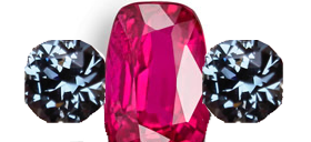
One of my future projects is going to be something NEON super bright pink with a deep gray with no blue modifier for sidestones. I think it'll really be an eyecatcher with some great contrast!


Excuse my messy photoshop here, just wanted to show the two colros next to each other:

neonpink.png

One with a bit of a purple modifier would look great to I bet:

http://mastercutgems.com/images/gems/23991.jpg
 
Ieatbugs,
Dark and gray spinels hold no attraction for me. I like bright colourful gemstones, with the occasional pastel but well saturated colours. Your idea of contrasting stones is interesting and requires a fine balance. If the side spinels are too drab in comparison, nobody will notice them at all but if done well, will be an eye-catching ring.
 
Disclosure: Not a big fan of bright, saturated pink and I think you have exquisite taste.

That said, Chrono, you know my heart is in the right place. I have to disagree with the others, and say I do think it looks out of place in that setting. I love the setting, and when I opened the thread, my immediate thought was "I want," followed by "one of the loveliest examples from its period that I have ever seen." I would want you to put the tourmaline in only if you know you are getting away from the period look and taking attention off that lovely setting. **shrinks and huddles down so as to be a smaller target** please don't shoot me...
 
Chrono|1349435843|3279808 said:
NKOTB,
There is no passing or failing grades when it comes to guessing gemstone types by pictures because we all know there are nuances photographs cannot convey. Your guesses are good though.

I'm sure pretty everyone in CS knows I like "loud" stones. :lol: Well, I sent 5 rings off to the jeweller's yesterday so there migh be an update in 2 weeks or so. A few are simple resets but one is a remake (stone was set way too high). Thank you for your opinions. Although sometimes it might seem as though I don't "listen" to your advice, I do appreciate them nonetheless.

Diplomatic and kind, as usual, Chrono. So, are you leaning one way or the other, at this point?

Enerchi, I should warn you, I'm almost 6 feet tall. :cheeky: :lol:
 
Minou,
I don't mind dissenting opinions at all. I like it even better if there is an explanation of why so that I can attempt to see it from a different point of view. No need to fear me - I am a horrible shooter. :cheeky:

NKOTB,
Wow, you have a model's height! I am definitely leaning towards this combo.
 
Phew! **comes out from behind the tree**

OTH, that deep pink looks great with your skin tone.
 
It works for me. And it works on your hand. It's a feminine and romantic look.

How about leave it and find another vintage setting to put a vintage type stone in?
 
A good idea, Sonoma, except I've already done that. ::) Chunky faceted blue sapphire in another true antique platinum Art Deco setting with 3 single cut melees on each shoulder. This setting deserves lots of wear time. I'm tired of admiring a few minutes every few minutes at the vault. :bigsmile:
 
GET 3 FREE HCA RESULTS JOIN THE FORUM. ASK FOR HELP

Featured Topics

Top