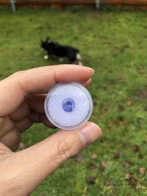
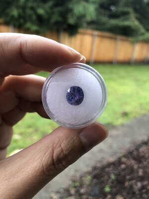
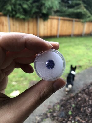
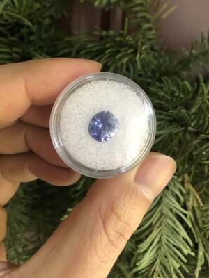
shape
carat
color
clarity

I just bought a 5.5 ct unheated sapphire. What do I need to look for/ be aware of when I get it?

I like that it’s less deep. I didn’t want to set a deep stone because I don’t like high set rings. I like the way Jerry cut it but I can’t pinpoint why because it more or less looks the same and I can’t comment on how cutting styles affect anything cause I don’t know anything about that. I like that it’s no longer an egg shape with weird flea bites.
This above is everything :)
It’s beautiful!

I love looking at recuts. It’s an amazing journey and thank you for letting us tag along and look over your shoulder in real tine!
 
This above is everything :)
It’s beautiful!

I love looking at recuts. It’s an amazing journey and thank you for letting us tag along and look over your shoulder in real tine!

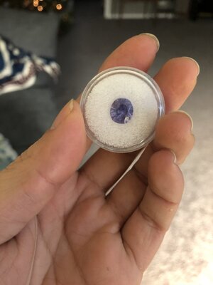
Thanks!

And I do intend to try to get better pics in the gem jar so it’s a more accurate comparison. But I had like 3 min until I had to get back to working and I wanted to wear it, so I slapped it in a holder and quickly took some pics.
 
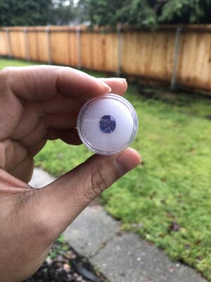
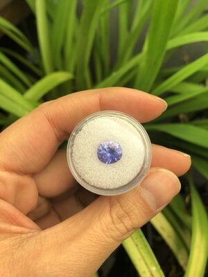
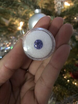
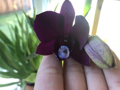
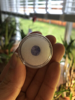
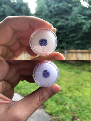
Ok gem jar photos for a better comparison some ft my orchids. I’m happy my dendrobium threw out flowers despite my cat’s constant attempts to kill it so I plopped the sapphire in. And then my brassidium is my reliable bloomer so I had to get pics of that too. Gem jar is already scratched up sorry if the photos look less clear because of that.

C27CAFD2-CD4D-4903-84C0-62B2507858EF.jpeg44158989-2CF2-4EC3-AB03-D4CBF1A88843.jpegE6900AB6-B670-4B2B-82C4-840E8391F05D.jpeg40B4048F-9495-499A-B568-2CC5888CB8EC.jpeg346E3499-B2A7-4830-828D-0C17318B5600.jpegBA4BAA18-6618-44B2-84EA-633B4754D29B.jpegCB850660-5A31-4700-BC0B-381CA7F45856.jpeg5FA5D5CE-E7F3-459A-89FE-595501E90527.jpegA8F6FC0F-30DE-4560-A1DF-C42AFEC26347.jpegFE840D0C-5937-47FD-8E2D-38B61454CEAF.jpeg611727CD-3304-49B5-9CBA-525FD293CF27.jpegC1F66182-AE15-44E9-9CC7-5E2FC7B7BEF1.jpeg
 
It’s beautiful @winnietucker :love: . It looks like it has a lot of personality with nice color shifts too! I hope you are able to set it soon!
 
I’m looking at all my old photos and maybe the recut did wash out the color? I remember getting after it was initially unset and thinking “oh this isn’t the same. It’s so pale now.” And when I got it back from Jerry I don’t remember feeling like it looked a ton different.

Curious to get other opinions.
 
Hard without knowing if pictures were taken in exact same environment and time of day.
I think these two from your pictures 12/11 and Thursday are the closest in environment to compare.
6F713DA2-B0E5-447E-88FD-1650992DF084.jpeg

Not enough pictures to compare to when it was set that I can guess are close to environment of unset ones.

I’m not smart enough about tone and saturation to speak in that manner. So I’ll just speak ignorantly and hope my intention comes across.
It’s hard to tell from pictures if it’s just dark areas of poor light/color return were lessened by the recut or you have lost perception of more/depth of color.

I don’t see a huge difference in color between these two pics. Some, yes. There were a few very light ones taken after the recut that don’t compare at all to any before the recut. Is that by chance none were taken in that environment or is the picture just not representative to what you see irl?
At this point, I think it’s overthinking.
The recut addressed items you wished to be addressed.
 
Hard without knowing if pictures were taken in exact same environment and time of day.
I think these two from your pictures 12/11 and Thursday are the closest in environment to compare.
6F713DA2-B0E5-447E-88FD-1650992DF084.jpeg

Not enough pictures to compare to when it was set that I can guess are close to environment of unset ones.

I’m not smart enough about tone and saturation to speak in that manner. So I’ll just speak ignorantly and hope my intention comes across.
It’s hard to tell from pictures if it’s just dark areas of poor light/color return were lessened by the recut or you have lost perception of more/depth of color.

Gemstones are so hard... I just went to take my dogs out to potty and there are times outside when the sapphire looks more blue than my phone’s camera will capture... and isn’t that supposed to be opposite of how that happens?

Jerry did say he didn’t believe color would be affected and he’s the expert, which is why I okay’d the recut.
 
@winnietucker If I may chime in, I don’t appreciate a BIG difference in color and agree that more subtle changes in color are harder to tell unless I’ve seen this stone in person myself.

However, at the risk of sounding annoying, here’s my honest (unasked for?) opinion: For me, to lose so much carat weight I would want a result that vastly out-performing the prior stone, be it in terms of color return, shape, etc, etc. And I don’t feel like this was done here. Sure, the window is gone, but this stone is also much smaller, and that would displease me.

Also, even though the chunky prior ring setting was not my style, for some reason at least based on the photos I felt like it somehow made the color of the stone more intense and brought out the lovelier attributes of the stone.

All in all, I would have left it alone. If I wanted a really different ring, I would have simply passed on this ring to begin with instead of spending time/money to tweak it and not sure if I will in fact achieve my expectations in the end. In my limited experience, the only way to know I will get what I want is to buy exactly what I want, not trying to fix something that is not quite what I want to begin with.

But then again, it’s not my stone/ring and I’m just talking out my ***, so please don’t be offended and if you do disagree, please do disregard my unasked for opinion! Personally I come on PS for honest opinions even if they may not be ones I want to hear, so I try to do the same for others (assuming this is what others want).
 
Last edited:
@winnietucker If I may chime in, I don’t appreciate a BIG difference in color and agree that more subtle changes in color are harder to tell unless I’ve seen this stone in person myself.

However, at the risk of sounding annoying, here’s my honest (unasked for?) opinion: For me, to lose so much carat weight I would want a result that vastly out-performing the prior stone, be it in terms of color return, shape, etc, etc. And I don’t feel like this was done here. Sure, the window is gone, but this stone is also much smaller, and that would displease me.

Also, even though the chunky prior ring setting was not my style, for some reason at least based on the photos I felt like it somehow made the color of the stone more intense and brought out the lovelier attributes of the stone.

All in all, I would have left it alone. If I wanted a really different ring, I would have simply passed on this ring to begin with instead of spending time/money to tweak it and not sure if I will in fact achieve my expectations in the end. In my limited experience, the only way to know I will get what I want is to buy exactly what I want, not trying to fix something that is not quite what I want to begin with.

But then again, it’s not my stone/ring and I’m just talking out my ***, so please don’t be offended and if you do disagree, please do disregard my unasked for opinion! Personally I come on PS for honest opinions even if they may not be ones I want to hear, so I try to do the same for others (assuming this is what others want).

No I asked, so I want and appreciate honest opinions. I 100% agree with the being set part. It was a more interesting stone when set IMO.
 
I see less saturation and more colour zoning faceup post-recut. But these are the expected outcomes of a typical precision recut.

Precision-cutting of coloured gemstones is a lot like precision-cutting of diamonds - the objective is usually to create a pattern that (A) prioritizes symmetry, (B) increases crispness of faceting, and (C) exaggerates contrast. Not always, but usually.

Lightness/“brightness” is achieved by faceting the pavilion (the crown and pavilion, but primarily the pavilion) such that light that enters the top of the stone spends minimal time (minimal refraction path length) inside the stone before it exits back out the top of the stone. Every moment a ray of light spends inside the stone is energy that the stone material absorbs - by minimizing this, the exiting light is higher-energy and whiter.

The longer that light spends inside the stone (longer path lengths), the more light bounces around inside the stone before exiting, the more strongly coloured that stone will look. Coloured stones - including coloured diamonds - usually benefit from longer path lengths. The opposite of what precision cutting usually aims to achieve.

We knew from the first photos that the material of your stone isn’t inherently very strongly saturated. The total colour is coming from total accumulation of layers upon layers of that material. We could also see some zoning in the original, but it was minimal - there wasn’t enough contrast (difference between light and dark) to highlight it.

The recut has changed the pavilion faceting per typical precision-cutting priorities: Light that enters the stone faceup now spends much less time inside the stone than it used to pre-recut. Less time (shorter path length) = whiter and brighter, which, as is typical with coloured stones, reads as “less saturated”. The recut has also simply reduced the amount of material available to contribute to total faceup saturation of colour. Lastly, now that differentiation between light and dark has been achieved (higher contrast via brightness vs. obstruction), faceup visibility of the colour zoning has increased.
 
Last edited:
Precision-cutting of coloured gemstones is a lot like precision-cutting of diamonds - the objective is almost always to create a pattern that (A) prioritizes symmetry, (B) increases crispness of faceting, and (C) exaggerates contrast.

Lightness/“brightness” is achieved by faceting the pavilion (the crown and pavilion, but primarily the pavilion) such that light that enters the top of the stone spends minimal time (minimal refraction path length) inside the stone before it exits back out the top of the stone. Every moment a ray of light spends inside the stone is energy that the stone material absorbs - by minimizing this, the exiting light is higher-energy and whiter.

The longer that light spends inside the stone (longer path lengths), the more light bounces around inside the stone before exiting, the more strongly coloured that stone will look. Coloured stones - including coloured diamonds - usually benefit from longer path lengths. The opposite of what precision cutting usually aims to achieve.

We knew right away that the material of your stone is not inherently very strongly saturated. The total colour is coming from total accumulation of layers upon layers of that material. We could also see some zoning in the original, but it was minimal - there wasn’t enough contrast (difference between light and dark) to highlight it.

The recut has changed the pavilion faceting per typical precision-cutting priorities. Light that enters the stone faceup now spends much less time inside the stone than it used to pre-recut. Less time (shorter path length) = whiter and brighter, which, as is typical with coloured stones, reads as “less saturated”. There is also much more differentiation between light and dark now, which has increased the visibility of the colour zoning faceup.

Very informative, thanks! How would setting it in a gold bezel affect the color? I remember thinking it looked noticeably paler when it was originally unset (before the recut). Would a bezel setting help to darken it up? Also - how do Jerry’s photos lean blue while mine lean purple?
 
Very informative, thanks! How would setting it in a gold bezel affect the color? I remember thinking it looked noticeably paler when it was originally unset (before the recut). Would a bezel setting help to darken it up? Also - how do Jerry’s photos lean blue while mine lean purple?

Different latitude. Where you are can affect how color appears.
 
Very informative, thanks! How would setting it in a gold bezel affect the color? I remember thinking it looked noticeably paler when it was originally unset (before the recut). Would a bezel setting help to darken it up? Also - how do Jerry’s photos lean blue while mine lean purple?

A bezel would definitely darken it - a cup that encloses the pavilion would further concentrate colour (but that makes it harder to clean).

I don’t think recutting is ever “bad” - or “good”, I suppose! Really just depends on what you hope to achieve and whether the result fulfilled those goals...
 
@winnietucker

A few things...
1. Take the stone out of the case to really look at it. No stone looks better in a case in my experience so take it out and see if you feel a bit different about it after a few days (usually I leave it somewhere safe like my working desk but it’s secure from pets/kids/etc).
2. Stones usually become a shade darker when set. More when bezeled. Maybe you can try to fashion a “fake” setting using aluminum foil and put your stone inside to see how it may look after setting.
3. It doesn’t look bad imo after the recut. Yes the color doesn’t look as saturated etc for the reasons explained above but if you take a step back and look at the stone on its own merits it’s not a bad stone considering is unheated etc. plus it will darken after setting.

If after going through all that and you still don’t like it, then maybe sell it.

I still like it FWIW. I liked it best when it was set though. Even after it was unset I was kinda surprised at how different it looked.
 
Yeah some stones don’t turn out that well after setting so it’s great that you prefer it set.

I saw that you put it up for sale that’s why thought it’s worth rethinking/looking at the stone.
 
Yeah some stones don’t turn out that well after setting so it’s great that you prefer it set.

I saw that you put it up for sale that’s why thought it’s worth rethinking/looking at the stone.

Oh yeah I like it but idk if I like it enough to prioritize it over diamonds. I’d probably always prioritize diamonds over gemstones. If my husband wasn’t ending my jewelry buying I’d probably sit on it a little longer.
 
It's a beautiful stone both before and after the recut, at a great price. The stone still has the same face-up measurements, so you've only lost weight that you cannot see. The stone will deepen after setting no matter what -- you don't NEED to use a bezel, so if I were you I would pick the setting based on your heart's desire, not worrying about requiring a bezel to deepen it. Of course if a bezel is your heart's desire, go for it!

I think the main difference that you are seeing is that the stone is returning more light due to the excellent cut, in some lighting conditions where it was previously flat. I think it has lost a tiny bit of saturation, but I think it's most likely you are noticing improved performance in sub-ideal lighting conditions.

Buying perfect stones vs. improving imperfect stones is a matter of preference, there isn't a right or wrong approach. My own preference is to be open to improving imperfect stones, because it opens up more bargain opportunities and I can get exactly the cut I want (ex: I wanted an old mine cut teal indicolite, there are just a tiny handful of high end specialty cutters producing that from rough, I was able to get one for MUCH LESS by buying a stone intending to recut.) But I also support the approach of folks who only want to buy from the high end cutters too.
 
Different latitude. Where you are can affect how color appears.

This. Also different cameras/phones can have surprisingly varied colour sense!
 
I see less saturation and more colour zoning faceup post-recut. But these are the expected outcomes of a typical precision recut.

Precision-cutting of coloured gemstones is a lot like precision-cutting of diamonds - the objective is usually to create a pattern that (A) prioritizes symmetry, (B) increases crispness of faceting, and (C) exaggerates contrast. Not always, but usually.

Lightness/“brightness” is achieved by faceting the pavilion (the crown and pavilion, but primarily the pavilion) such that light that enters the top of the stone spends minimal time (minimal refraction path length) inside the stone before it exits back out the top of the stone. Every moment a ray of light spends inside the stone is energy that the stone material absorbs - by minimizing this, the exiting light is higher-energy and whiter.

The longer that light spends inside the stone (longer path lengths), the more light bounces around inside the stone before exiting, the more strongly coloured that stone will look. Coloured stones - including coloured diamonds - usually benefit from longer path lengths. The opposite of what precision cutting usually aims to achieve.

We knew from the first photos that the material of your stone isn’t inherently very strongly saturated. The total colour is coming from total accumulation of layers upon layers of that material. We could also see some zoning in the original, but it was minimal - there wasn’t enough contrast (difference between light and dark) to highlight it.

The recut has changed the pavilion faceting per typical precision-cutting priorities: Light that enters the stone faceup now spends much less time inside the stone than it used to pre-recut. Less time (shorter path length) = whiter and brighter, which, as is typical with coloured stones, reads as “less saturated”. The recut has also simply reduced the amount of material available to contribute to total faceup saturation of colour. Lastly, now that differentiation between light and dark has been achieved (higher contrast via brightness vs. obstruction), faceup visibility of the colour zoning has increased.

@yssie - thank you for writing this up. Over the years, many folks have discussed the light refraction in colored stones and written explanatory texts, but no one has written as lucidly and as eloquently as you just did. This is a great introductory explanatory text. Well done, my friend!
 
I actually think that resetting it brought back some of the aspect that made it so initially appealing. Almost all of the depth of color is there with improved sparkle; especially with CS not possessing the same perfection of make that diamonds do if they weren't precision cut from the outset. Even precision isn't really precision in that case and I learned that you have to love their lumps for the color most of the time. I think it turned out to be a beautiful sapphire.
 
56380461-8F8A-4B73-A3E3-2029F2DD348A.jpeg56E569BE-0E79-42A3-823A-EC0F746C0802.jpeg
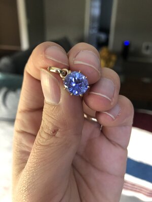
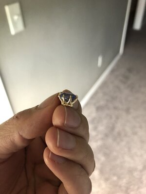
In case anyone was curious. It’s set pointy side down though, which really bugs me.

Who did this setting? I think it’s lovely. For what it’s worth, I just realized specially when it comes to gemstones, what really matters is what YOU like. Do you like it?
 
I think the open setting of the pendant really allows the color to shine beautifully.
Great choice! Enjoy!
 
Can’t see the pointy side and agree with @ItsMainelyYou that the color has deepened with setting. Do you think you will ever reset as a ring?

I’m glad it’s not obvious to everyone. But I don’t know yet. Maybe. Daniel M is super cheap so it’s a possibility.
 
GET 3 FREE HCA RESULTS JOIN THE FORUM. ASK FOR HELP

Featured Topics

Top