shape
carat
color
clarity

Invitation proofs

Status
Not open for further replies. Please create a new topic or request for this thread to be opened.

E B

Ideal_Rock
Joined
Aug 31, 2005
Messages
9,491
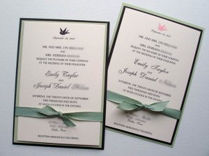
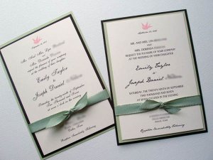
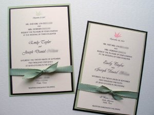
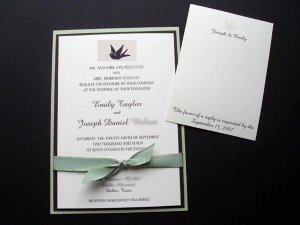
Today, I got several different drafts of my invitations from my wonderful invitation-maker. They're photographed two to a picture, so I'm just going to call them 1, 2, 3, and so on, with 1 and 2 being in the first picture.

None of these are quite right, so I'll be swapping fonts and possibly ribbon. But overall, I'm pretty pleased! Please, let me know what you think and what about them you like best/don't like!

(Warning: I'm going to be adding new pictures to this thread as I get 'em, and feedback is always appreciated.
9.gif
)

Invitations 1 & 2:

ebreeinvites12.jpg
 
Invitations 3 and 4:

ebreeinvite34.jpg
 
So far my favorite is #4 with the font from #3.

They''re super cute BTW!
 
Hi EBree!!

OMG, you are SO ahead of me with this stuff!! My invite proofs are not even near done!! Yikes!!!
That said, I love invite # 3. I like the formality of the font and the light pink birdie...so pretty!!! YAY for you!!!

ps isnt it scary how time is just flying????? Our weddings are like, SOON!!!!!!!!!!!!
6.gif
 
I like everything with #3.
 
Invitations 5 and 6:

ebreeinvite56.jpg
 
Thanks neatfreak, dani, and onedrop!

#3, eh? All of my friends (well, my real life friends!) have favored #1; they all said the pink bird looked out of place.

My favorite, for the most part, is #1 as well. I like the script font from #2, though. FH liked them all.
2.gif


I'm not sure if the ribbon is quite right. She's getting back to me with other ribbon samples and bird decals, and I'll be sure to post 'em. Oh, and there were a couple of typos we caught this morning that will be changed.
 
I like everything about #4 the best except for the bird. I like the bird in black the best.
 
Date: 5/1/2007 5:39:24 PM
Author: Dani
Hi EBree!!


OMG, you are SO ahead of me with this stuff!! My invite proofs are not even near done!! Yikes!!!

That said, I love invite # 3. I like the formality of the font and the light pink birdie...so pretty!!! YAY for you!!!


ps isnt it scary how time is just flying????? Our weddings are like, SOON!!!!!!!!!!!!
6.gif

Don''t worry...you still have time! I got on the ball this weekend after reading a wedding planning checklist in my InStyle Weddings. Apparently, invitations should have been ordered 6-9 months out! Eek. I think that''s a bit early, but, still. I don''t even want to think about what else we''re behind on.

Do you have an idea of what kind of invitations you want? And did you choose a color scheme?
 
Date: 5/1/2007 5:52:31 PM
Author: robbie3982
I like everything about #4 the best except for the bird. I like the bird in black the best.

Does it look black to you too? It''s supposed to be brown. Maybe it just photographs black?
 
Date: 5/1/2007 5:52:43 PM
Author: EBree


Date: 5/1/2007 5:39:24 PM
Author: Dani
Hi EBree!!


OMG, you are SO ahead of me with this stuff!! My invite proofs are not even near done!! Yikes!!!

That said, I love invite # 3. I like the formality of the font and the light pink birdie...so pretty!!! YAY for you!!!


ps isnt it scary how time is just flying????? Our weddings are like, SOON!!!!!!!!!!!!
6.gif

Don't worry...you still have time! I got on the ball this weekend after reading a wedding planning checklist in my InStyle Weddings. Apparently, invitations should have been ordered 6-9 months out! Eek. I think that's a bit early, but, still. I don't even want to think about what else we're behind on.

Do you have an idea of what kind of invitations you want? And did you choose a color scheme?
Yes. I am working with an invitation company right now...but I havent finalized anything yet....I am going to go with a bi-fold style invite- kind of like a modified pocketfold....

Colors were so hard for me as you know. But mostly we are going with chocolate brown (that is what the girls are wearing) and lots of cream, white, salmon, and peach for flowers....Hopefully it will all work out!! What colors are you going with?
 
The bird and border def. look black to me, and I've tilted my laptop screen all sorts of ways. Is the bird going to be brown, and the border and font black? or are the font and border a brown too?

In general they look very classy and well done. My pick, if the border & font are black is either for a green or pink bird. If the border, and font are also brown then I'd go for a brown bird.

Hope that makes any sort of sense!
 
Date: 5/1/2007 6:00:59 PM
Author: peridot83
The bird and border def. look black to me, and I''ve tilted my laptop screen all sorts of ways. Is the bird going to be brown, and the border and font black? or are the font and border a brown too?


In general they look very classy and well done. My pick, if the border & font are black is either for a green or pink bird. If the border, and font are also brown then I''d go for a brown bird.


Hope that makes any sort of sense!

Thank you, peridot! I''m actually wanting a brown border, font, and as of now, a brown bird. It does look black, though, and I''m thinking that a) she she might have just used some black cardstock she already had, or b) it IS brown, but looks dark in photographs next to that light green. I just emailed her to let her know that we definitely want a dark brown.
 
Date: 5/1/2007 5:59:59 PM
Author: Dani

Yes. I am working with an invitation company right now...but I havent finalized anything yet....I am going to go with a bi-fold style invite- kind of like a modified pocketfold....


Colors were so hard for me as you know. But mostly we are going with chocolate brown (that is what the girls are wearing) and lots of cream, white, salmon, and peach for flowers....Hopefully it will all work out!! What colors are you going with?

We''re going with chocolate brown, light green, champagne, ivory and a hint of light pink. It''s a transitional summer-to-fall color palette.
 
My favorite is number 3 with a brown bird.
 
I wish the bird was bigger & more balanced with the ribbon visually. The other fonts would need to be reduced a bit to do that.

Yeah - something''s not right with that ribbon ....but I can''t but my finger on it. Is there ribbon with edging that''s another color ... like green with choc brown edging ... or choc brown with green edging?? That would be ZESTY! (Especially with a bigger bird
31.gif
)

Think I like the fonts from #1 best -- but I like "clean", abhor "fussy".
 
I like them all, but like #6 the best-
agree with deco re. bigger bird (it''s a great motif- deserves some more focus!)

I thought the ribbon looked fine, but if you''re looking for something different you could try a more "satiny" ribbon (hard to tell from photo, but to me it seems as though these are a bit textured?? maybe not
 
Thank you Robbie, Anchor and Deco!

Deco- She''s going to photograph or send samples of the other ribbon she has. I think it''s the color that''s off.

Oh, and she confirmed that the dark layer is in fact a deep brown, as is the ink for the text and bird. The paper has texture, too, which she says adds beautiful interest. She used it for her wedding invitations.

More pictures to come as I get them! I thank you all for your help.
 
Those are really pretty! I also prefer a brown bird, larger.

One thing I noticed that may totatlly be the way invitations are supposed to read but....well.....it doesn't sound right when you read it aloud..........

"Mr and Mrs X and Mrs Y request the honour of your presence at the wedding of thier daughter, Ebree and Ebree's Fiance..........."

This reads as if your fiance is also a daughter of your three parents. Perhaps it should read ".....Ebree to Ebree's Fiance.........."?


Wait, perhaps I'm reading wrong and Mrs Y is one of your fiance's parents? In that case, it would read ".......at the wedding of thier children..........." i think.
 
labbie and so_happy, thank you so much!

I see what you're saying about the bird, and I agree. When she finds a couple more bird graphics, I'll address the size. And good point about the wording, so_happy! I'll look into that.
 
I don''t like the ribbon because the invites already have so many colors going on and the ribbons add ANOTHER color that doesn''t *quite* match IMO. Maybe a pink or brown ribbon? Or otherwise the green ribbon needs to match the invites IMO.
 
Date: 5/1/2007 11:24:21 PM
Author: neatfreak
I don''t like the ribbon because the invites already have so many colors going on and the ribbons add ANOTHER color that doesn''t *quite* match IMO. Maybe a pink or brown ribbon? Or otherwise the green ribbon needs to match the invites IMO.

I completely agree! She hasn''t gotten back to me about the ribbon she has, but she says it''s good stuff. I can''t wait to see what she has.

Okay, with a crude substitution in paint, what do we think of this one? Imagine a different ribbon, and perhaps a different bird. Ignore the RSVP card. And please, you won''t hurt my feelings! I need honesty.

ebreeinvitesnew.jpg
 
I like the proportion MUCH better ... you def don't miss the date that was on TWICE before. I ALMOST want the bird to balance the size of the ribbon "bow" though ... maybe plump the bird a bit or trim down the bow a bit.

Where is JCROW when we need her??
3.gif


Also agree about the ribbon color -- it needs to match *exactly* .. either green or chocolate or a combo. What about a goldish shiny champagne color ribbon - maybe a bit sheer??

ETA!!!!!!!!

OOOOOO -- what about sheer chocolate brown ribbon -- so that the rolled edging matches the choc brown paper, yet you can see through it a bit for texture & body.
36.gif
 
Date: 5/1/2007 11:57:00 PM
Author: decodelighted
I like the proportion MUCH better ... you def don''t miss the date that was on TWICE before. I ALMOST want the bird to balance the size of the ribbon ''bow'' though ... maybe plump the bird a bit or trim down the bow a bit.


Where is JCROW when we need her??
3.gif


Also agree about the ribbon color -- it needs to match *exactly* .. either green or chocolate or a combo. What about a goldish shiny champagne color ribbon - maybe a bit sheer??

I agree, the proportions are much better. And we''re switching the ribbon out, so I''m thinking we''ll go with something thinner so the bow won''t be as huge. Love the idea of a sheer champagne; I''ll ask her about that. Thanks!
9.gif
 
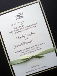
Here''s an updated invite with our favorite text and a different bird. Most importantly, it has matching satin ribbon! Yay!

What do you think? Do you like this bird better than the other? I''m so horribly indecisive. Opinions needed!

ebreeinviteupdate.jpg
 
I like everything about #1 . . . including the bird but without the ribbon.
I think something about the ribbon feel too cluttered. Maybe a thinner one or a lighter color, pink or beige.

Don''t particularly care for the new birdie though . . .
 
Hmmmmm.... love the ribbon ... love the SIZE of the bird ... like the new bird yet it feels a little "clip arty". Not *special* enough.

Maybe even if they turned that "clip art" bird into a choc. brown silohuette of itself & it''s matching leaves ... that would be, eh, *fresher* maybe???

It took it to a "sweet" place where the other one looked slightly more modern. Yanno???
 
Thanks Hikerchick! This new satin ribbon looks to be thinner. Does it look less cluttered?

Date: 5/2/2007 5:29:17 PM
Author: decodelighted
Hmmmmm.... love the ribbon ... love the SIZE of the bird ... like the new bird yet it feels a little ''clip arty''. Not *special* enough.


Maybe even if they turned that ''clip art'' bird into a choc. brown silohuette of itself & it''s matching leaves ... that would be, eh, *fresher* maybe???


It took it to a ''sweet'' place where the other one looked slightly more modern. Yanno???

I see what you mean, and I can''t decide if I want to go ''sweet'' or ''modern''. Regarding the clipart, I already asked her to find these and I''d hate to send her out for more. We found a sweet little bird illustration back when we thought we were going DIY, so maybe I''ll send her that.
 
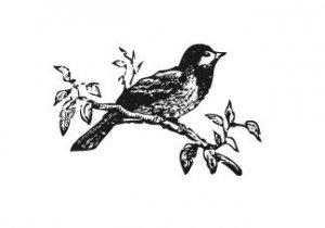
What about this little guy (but in brown, of course)?

littlebirdebree.JPG
 
The two newest birds don't have the same "clean" lines as the first bird did. I'm also afraid that both those clip art images would look very faded compared to the rest of the invitation which has a very geometrical border and clean colors. The invitation has a very modern feel to it with the font (non-cursive for the post part).Unless you were willing to scrap the border, or maybe get more "antiquey" looking paper or ribbon, or switch to a more cursive font, I'd leave the bird as is.

I like the new ribbon though, and I think the invitations will look lovely whatever you decide.
 
Status
Not open for further replies. Please create a new topic or request for this thread to be opened.
GET 3 FREE HCA RESULTS JOIN THE FORUM. ASK FOR HELP
Top