shape
carat
color
clarity

Invitation proofs

Status
Not open for further replies. Please create a new topic or request for this thread to be opened.
I like the last one you posted for ribbon colour but with the original bolder bird and the font in no.3.

You might need to be careful with the shade of brown. Black borders are a bit funereal looking.
 
Thank you, peridot and pandora!

I'm torn on the birds, but FH likes the 'antique' bird better (and I want him to have as much say as possible, since he feels he hasn't done much for the wedding).

My invitation-maker said that the color of the ink for the bird was too grey, so hopefully when she finds the right shade of dark brown, they'll be more bold. Also, we're not using that modern block font shown. FH is going to find a more antique, softer looking block instead, so the bird will match better.

Pandora- the brown border actually isn't that dark, but it comes out black-looking in photos. I've seen it in another light in some of her other examples, and it's actually quite pretty. A dark, cocoa brown with a sort of rough texture.

Thank you so much for your opinions! Keep 'em coming.
9.gif
 
I like everything about 5... I guess I'm the odd man out.
2.gif


ETA: I like the new ribbon better than the old by A LOT.
 
Sorry Ebree . . . my comment on the ribbon was about the old ribbon, not the new . . . I do like the new ribbon MUCH better. I like the old version of the bird because I like cleaner more modern lines but the newest bird, bird #3 is better than the #2. Also, I still like the font for #1 and maybe I''d switch the dark brown border to the middle like in #2 . . .
Overall, it looks really nice.
 
Date: 5/2/2007 7:51:17 PM
Author: hikerchick
Sorry Ebree . . . my comment on the ribbon was about the old ribbon, not the new . . . I do like the new ribbon MUCH better. I like the old version of the bird because I like cleaner more modern lines but the newest bird, bird #3 is better than the #2. Also, I still like the font for #1 and maybe I''d switch the dark brown border to the middle like in #2 . . .

Overall, it looks really nice.

Thank you, hiker! We''re definitely putting the brown in the middle, and going with the new ribbon. FH is stuck on bird #2, but I''m going to suggest bird #3 as well.
 
Hmm, not sure how easily your printer can do this, but what about making the bird both colors? Just a rough idea of what I mean:

ETA: I really really like this, actually, not to sing my own praises or anything
12.gif


invitebrowngreenbird.jpg
 
WOW that''s my favorite so far LadyC!
 
oh, i like the bird sans date too. give me a second to go through this thread and i''ll put in my opinion :)
 
Date: 5/3/2007 1:35:28 PM
Author: ladyciel
Just a rough idea of what I mean:
ETA: I really really like this, actually, not to sing my own praises or anything
12.gif

OH I LOVE IT ... that''s what I''d been thinking too -- kind of SOLID COLOR bird - but the 2 color really dresses it up -- GREAT IDEA!!!!
 
re: the ribbon -i love the new ribbon. it''s much nicer - perfect color & texture compared to the first one.

re: the bird- in a way i prefer the first one. it''s cleaner. i like the use of negative space in the graphic. i also think it goes with the type it looks like you''ve chosen.

re: the type - is there a way the designer can add more space between the letters of all the type except for the script type of your names? i dunno, it feels a bit too tight.
 
I love #1 - everything about it. Font, black bird, everything.
 
ladyciel,

I love that! Thank you! :)

The problem would be having my invitation-maker re-create it. I don't think she's a graphic designer and I'd feel bad saying, "please, figure this out", you know?
 
It probably depends on what kind of printing process she uses. Can you send her that pic and ask if she could print a 2-color image like that? I bet she could do it in two parts if not all at the same time (like they do different colors on silkscreened t-shirts - a stencil for each color). If you find out what kind of file types she can use and can get me the birdy clipart, I can most likely make it for you without any trouble.
1.gif
 
I didn''t know where to post this comment because I didn''t want to hijack dixie''s cake thread but posting it here is a hijack of this thread but since my comment was to you I figured I would hijack your thread . . . hehehe
3.gif


I think the double chocolate mousse cake sounds mouth-wateringly yummy. I hope you pick that flavor, YUMMY . . .
9.gif
 
I love ladyc''s version!!
 
Me again!
19.gif


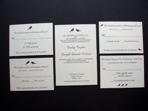
I thought about what you all said about the bird we'd chosen, and we were also having a hard time incorporating the little bird onto the RSVP cards (tying it all togther). I found these little bird silhouettes, and my invitation maker put together a bunch of cute choices.

Do you like the little bird silhouettes better than the 'vintage' bird? I've got other options to post as well, and I'd love opinions. I'm just so indecisive.

ETA: These aren't the final invitations- they'll still have the green and brown backing with the green ribbon.

birdsil1.jpg
 
Here''s what she came up with for the ''vintage'' bird:

vintagebird1.jpg
 
Ebree, while I do love the vintage bird thing, I think I love the other option (the first one) more. I''ve seen the vintage bird done before, and yes, while stunning, the first one is outdoor garden-y birdy. I''m lame.

I also love the RSVP with the leaves, though. I like the card without the blank
(with the _ Will Attend) better than the one that looks like a blank notecard.
 
I also love the first ones more. I especially like option 3.
 
i prefer the vintage bird. it's less done. the style is unique and adds personality. out of those, i especially love the bird in the center of the initials. and i love the small card with the bird above your names. i don't care for the bird and leaves blown up big.
 
I agree with Jcrow about the bird in between the initials!
 
Thanks Amber, jcrow and shinythings!

Amber- when you said you liked the first, you meant the first of the *newest* choices, right? The two little birds in silhouette? shinythings said she liked option #3, which confused me as there were only two new options (but I assume she meant the 3rd option from the very beginning).
 
I prefer the vintage bird- it seems to have more character, and I love the RSVP with the large branches-
although i agree with jcrow re. the large bird/branch one (with bird large in the center)
i don''t care for that particular version
 
Thank you labbie!

Anyone else? For anyone that hasn''t yet seen this thread, I''d love opinions on the 2 choices on the 3rd page. Pretty please?
9.gif
 
Of these most recent ones I VASTLY prefer the second one, with the old-fashioned bird. I agree with jcrow - its just less "done" and to me it looks much more interesting and classic.
 
I like "vintage" bird. It seems more formal than the other two options, and fits the overall feel of the invitation better IMHO. It''s also just more interesting to look at!
 
Thank you AmberGretchen and MINIMS! It''s funny, I figured the silhouette would ''go over'' better in this community as I had another ''modern'' choice in the first round, and it seemed people preferred that one more.
 
Hi EBree! I''ve been wondering how your invites were coming along! Out of the two latest choices, I prefer the 2nd with the antique-y bird. I think the problem with the other is the birds seem too simple and disconnected from everything else on the page, like they''re lost.

As for the RSVP cards, I really like the one w/ the bird btwn the initials w/ the blank card and the one w/ the branches blown up on the blank card. I''m generally partial to the blank card because it gives people room to write a note if they wish.
 
I still like the first bird. The sparrow thing is very trendy in a good way to me. BUT out of the 2nd two, I like the vintage bird. He''s pretty cool too. I can''t wait to see the finished product!
 
Thank you, ladyciel and fancy! After the opinions in this thread and in another wedding thread, we decided to go for the vintage bird.

I can''t decide between the RSVP card with the bird in between the initials and the watermark of the branch/leaves, so if anyone wants to throw a vote in...
9.gif
 
Status
Not open for further replies. Please create a new topic or request for this thread to be opened.
GET 3 FREE HCA RESULTS JOIN THE FORUM. ASK FOR HELP
Top