- Joined
- May 14, 2010
- Messages
- 4,333
Your new setting is stunning @Bonfire! The cathedral shank curves so elegantly, I love it
The original setting was a beauty! Most definitely. However, over time I found that I didn’t love how extremely low set the head and stone were. The culet rested on top of my finger. The stone was too sunken into the widened donut for me. The prongs on that ring were divine though. The profile, as pretty as the scalloped crown was, just bothered me by how *squat* it sat. I love shoulders that taper in some fashion. A build up to the stone. My old setting was a flat squared off band with the head *sitting* on top. It was created to be very low profile, pretty but I like more *movement* in a setting if that makes sense. Graceful curves. Even if the old head was on a tapered band I would have enjoyed it more. I also wanted a setting that let more light in from the sides, and because of that I think my stone preforms better now (looks bigger too!)Yes I see some tint but also a lot more sparkle! It all comes down to personal preference. I attached comparison photos that show what I’m talking about.@Bonfire I’m curious about this new setting vs the original VC setting it was in when you bought the OEC. What did you not like about it that made you choose to get a new setting?
They are both beauties
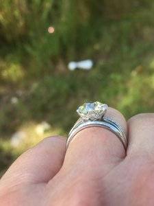
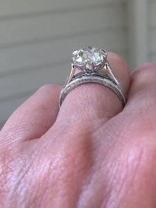
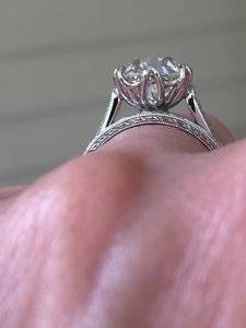
The original setting was a beauty! Most definitely. However, over time I found that I didn’t love how extremely low set the head and stone were. The culet rested on top of my finger. The stone was too sunken into the widened donut for me. The prongs on that ring were divine though. The profile, as pretty as the scalloped crown was, just bothered me by how *squat* it sat. I love shoulders that taper in some fashion. A build up to the stone. My old setting was a flat squared off band with the head *sitting* on top. It was created to be very low profile, pretty but I like more *movement* in a setting if that makes sense. Graceful curves. Even if the old head was on a tapered band I would have enjoyed it more. I also wanted a setting that let more light in from the sides, and because of that I think my stone preforms better now (looks bigger too!)Yes I see some tint but also a lot more sparkle! It all comes down to personal preference. I attached comparison photos that show what I’m talking about.


The original setting was a beauty! Most definitely. However, over time I found that I didn’t love how extremely low set the head and stone were. The culet rested on top of my finger. The stone was too sunken into the widened donut for me. The prongs on that ring were divine though. The profile, as pretty as the scalloped crown was, just bothered me by how *squat* it sat. I love shoulders that taper in some fashion. A build up to the stone. My old setting was a flat squared off band with the head *sitting* on top. It was created to be very low profile, pretty but I like more *movement* in a setting if that makes sense. Graceful curves. Even if the old head was on a tapered band I would have enjoyed it more. I also wanted a setting that let more light in from the sides, and because of that I think my stone preforms better now (looks bigger too!)Yes I see some tint but also a lot more sparkle! It all comes down to personal preference. I attached comparison photos that show what I’m talking about.


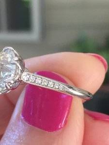
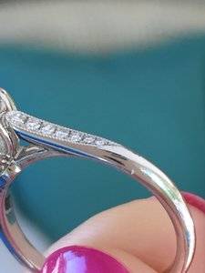
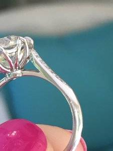
Back atcha girl! Your’s is a slice of heaven! After you upgraded and listed your dahlia setting for sale (my stone was just a wee bit too big) I knew I wanted (no neededI keep coming back to this thread @Bonfire. This ring is the stuff dreams are made of!
Thank you for your kind compliments DSMe, too! I adore this setting and it was so helpful seeing the difference in height between this one and the first one. This setting is the perfect height, in my opinion! I love this shank, too!