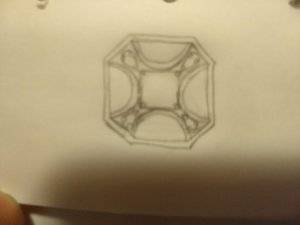
shape
carat
color
clarity

My search for a "flaming red" CS

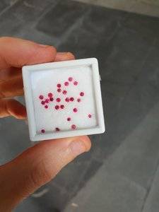
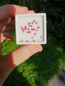
Hi lovedogs, these are the red mele. IMG-20180728-WA0000.jpg IMG-20180728-WA0001.jpg

Kindred I got greedy and bought them both. But now I cant decide what I want to do with them, so I guess I got my just deserts.

I really dont think settings are generically cheaper here. Maybe with the exception of some options in Hong Kong and china (and I think the hong kong stuff is actually being set in china anyway). I remember the discussions about some of the chinese prefabricated settings (from the recomended vendor list) having been more flimsy recently because they skimped on the gold to keep the setting cost down. It makes sense, I have spent some time in shenzhen (the boarder to hong kong) over the last year, and the city is getting very expensive. Cost of living is skyrocketing, property and shop front costs are phenomenal (the appartments have been doubling in cost rappidly. I think they double ever 1-2 years at the moment. It now costs of the order US 800k to 1 million to buy a three bedroom appartment in the (nice) district I was looking at well outside the CBD. At some stage late last year I tried to buy a generic pot of english tea, nothing special. Not special tea house stuff, just english breakfast. Luckily I realized the pots cost US $24 each before I purchased it.). My husband is currently in macau (the other neighbour to hong kong) and he tells me that the buildings are being constructed so rappidly that google maps is inaccurate. These regions of china are becoming extremely rich.
 
omg @qubitasaurus those are SO amazing! Wow, lucky that you snapped them up! Thanks for the info--that's really helpful.
 
lovedogs,

I am still active on PS ogling at everyone's goodies!

I am in the process of having a pair of custom interchangeable diamond drops made by diamondmounts, so that I could wear them with my tiny diamond huggies.

This way, I can wear a pearl pendant or necklace with the diamond drops as I don't like to wear pearl earrings with pearls around my neck.

Splitting payment in 3 instalments as they cost more than I anticipated due to the amount of diamonds - they are round drops and not flat drops, and paved with diamonds all over and not on one side, if you know what I mean.

CAD already approved, however I am going to add a small jump ring to the design as it would make the drop swing better IMHO.

If all goes according plan, they will be with me in early September 2018, and I promise to post pics.

DK :))
 
DK I remember you have a setter in Shezhen, can I ask about their details? I get a bit bored while I am there, and would love something to keep me distracted.

lovedogs,

I am still active on PS ogling at everyone's goodies!

I am in the process of having a pair of custom interchangeable diamond drops made by diamondmounts, so that I could wear them with my tiny diamond huggies.

This way, I can wear a pearl pendant or necklace with the diamond drops as I don't like to wear pearl earrings with pearls around my neck.

Splitting payment in 3 instalments as they cost more than I anticipated due to the amount of diamonds - they are round drops and not flat drops, and paved with diamonds all over and not on one side, if you know what I mean.

CAD already approved, however I am going to add a small jump ring to the design as it would make the drop swing better IMHO.

If all goes according plan, they will be with me in early September 2018, and I promise to post pics.

DK :))
 
The stone looks to be a beautiful stone in the video. Jedi stones are not called "flame spinels" flame spinels in the trade are a reddish orangey and often brown colour so even mentioning the word flame when talking about spinel gets confusing. I have pink Jedi melee and red Jedi melee but it's tiny squares in the reds not rounds. I can probably get rounds, if you are still looking for them.
 
DK I remember you have a setter in Shezhen, can I ask about their details? I get a bit bored while I am there, and would love something to keep me distracted.

I only arranged to meet my usual contact at diamondmounts for dim sum tea across the border, and do not know the location of their workshop.

DK :))
 
@dk168 your earrings sound fabulous!!! I assume that you are still happy with the quality and communication from diamond mounts since you are still using them. I've been impressed at their responsiveness so far, so I'm glad they are doing quality work!

@arkieb1 sounds like you have some gorgeous red stones! Do you mind posting pics? I'd love to see them.
 
Yes, I am still using diamondmounts for custom pieces.
I had not used them for about 1.5 years due to lack of free pennies, that's all.
The earring drops soaked up the entire bling budget for the year, along with a synthetic Emerald from JW.
DK :))
 
I only arranged to meet my usual contact at diamondmounts for dim sum tea across the border, and do not know the location of their workshop.

DK :))

Thanks, I'll check it out :D.

Sorry to hijack the thread.
 
narrowing down setting ideas!

I know these aren't people's favorites, but they are my favorites so far, and I'd love advice about which one to pick (and why).


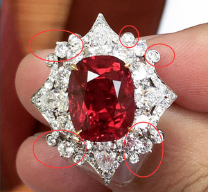
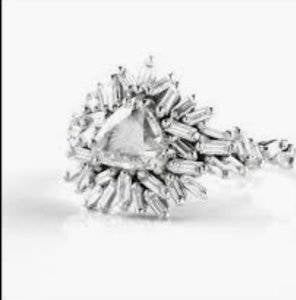
These are my 2 favorites so far. The first I found on instagram, but it will be different than the photo in a few ways. the circled stones will be the larger ones, and the rest will be pave (whereas the original has many more large stones). So it will be smaller than this pic.

s-l1600-2.png


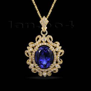
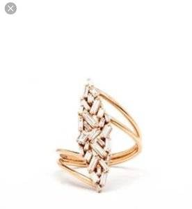
This is the other one I like, and it would be kept the same (just changed to fit my stone, and to be a convertible ring/pendent).

s-l500-1.jpg


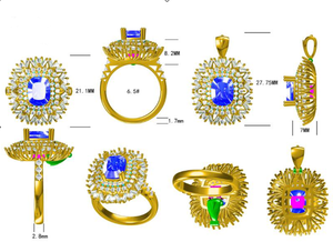
Lastly, this is one that diamond mounts suggested (their CAD), but I have to admit I'm not a fan. The blue-looking melee is to show the separation of stones so it doesn't just look like a blob. I'm not totally sure what I don't like about it--maybe the baguettes? Do others like this? It feels kind of messy to me, but it might be the CAD. If others like it, then maybe enlighten me about what it could look like when finished, because I'm just stuck on how much metal I see from the sides, and how the baguettes look somewhat haphazard.


s-l1600-3.png

I agree with you about the CAD. The word that came to mind when I saw it was “bramble”... definitely looks bushy and also I feel will distract from the spinel, which rightly deserves to be the jaw dropper.

I like the middle design the best! Would look good as a ring or as a pendant.
 
@peacechick maybe that's my issue! It *does* look "bushy", which is just an odd look for a piece of jewelry, and I agree would distract from the stone.
 
Tough call between the first two. I like the first one because kite set. Enough said. But the second one has softer lines and may look better as a pendant. The diamondmounts CAD gets a hard no from me. I also agree that it distracts from the center stone. Plus, it looks like there's a gazillion places where a baguette can snag on something. *shudder*
 
I don't care for the third one at all. It's too busy for my personal tastes. I do like the first two. The second one looks more vintage-y, romantic and the first one (with the changes you outlined) looks a little more modern, sophisticated. I often have difficulty deciding which "vibe" I want to go with, so I'd be having trouble deciding between those two. They're both very pretty.
 
So I'm a halo junky... I think most of y'all know that:lol:

Ok that out of the way, the first was....hmmm. Its ok...for a really large stone! I thought you had a much smaller stone right? Don't get me wrong, its gonna be seen (it can't help it with the color it is) but it also might just be too much of a good thing.

I do like the 2nd option. Thats pretty! Maybe a mix between one and 2?

Of the cads...I don't like them. Its too many straight lines... (I can only describe it as this) I don't know that you'll see all that much metal, but on CAD it looks disturbing. without ticking anyone off, it looks too grandma 1970's era grandma.
 
7A1191DD-07B5-49FD-817E-06CDE06AEADC.jpeg
E0CA15EC-7D98-4EF1-AC39-334337064FD3.jpeg
I like the first one best. The second one is pretty, but the lines of the scrolls around the edges are very strong and sweeping, which constantly draws my eye away from the center stone to the edges, so that they compete with the central focus. The third has little if any focus IMO. I’m not sure what the thick width of diamonds is there for. It feels superfluous.
Nothing wrong with unstructured baguettes as a focus on and of themselves, or really carried out fully so that they create an organic look, a tension between order and disorder.. but in this design, they are neither here nor there. Still clinging to the ordered look, but only kind of.
An example of unstructured baguettes as a central design focus, one clearly defined idea carried out fully, done boldly. ( I’m not suggesting these btw, just demonstrating what I mean with visuals.)
 
Last edited:
I LOVE LOVE LOVE the 2nd one. It looks totally regal to me. Would you keep the yellow gold? I don't usually like yellow gold but I love it in this piece!
 
I don't like the diamondmounts CAD at all. I don't think anyone here does.

I love your first idea and think that the kite silhouette works well in both ring and pendant settings. The second design, with the curving scrollwork...I'm pretty sure you showed it to us before, and while I think it's gorgeous as a pendant, to me it also has too many design elements going on that it would be distracting as a ring.
 
Thank you all for validating that the CAD design isn't great, that makes me feel much better! I'm still torn between the other two, but leaning towards the first (kite shape) one.

I think I'll have to see the stone in person to decide about gold color. I've seen red stones look great in RG/YG, but love the inspiration pic with the wg as well.
 
@lovedogs Did you purchase anything from higems_ on Instagram? It's my first time ordering a gem and don't know what to expect especially since it's overseas. How was your experience?
 
@lovedogs Did you purchase anything from higems_ on Instagram? It's my first time ordering a gem and don't know what to expect especially since it's overseas. How was your experience?

I still have the stone on hold (put a small deposit). I ended up buying a diamond so told the vendor I needed more time to pay and offered to loose the deposit because I won't be able to buy it as soon as I thought. But the vendor says it's just 1 stone and it's really not a big deal for him/her to hold it. So it'll still be a while before I get it. Sorry!

But my experience has been good so far in terms of communication and kindness!
 
@lovedogs That’s very helpful, thanks! What made you decide to purchase from this seller instead of just trying to find a similar stone in the US and save on shipping?
 
@lovedogs That’s very helpful, thanks! What made you decide to purchase from this seller instead of just trying to find a similar stone in the US and save on shipping?

I searched for "jedi spinel" on IG and found them that way. I spoke with multiple vendors, got pics, video, etc, and liked this stone the best. I honestly couldn't find something of this color from any of the US vendors in my price range.
 
narrowing down setting ideas!

I know these aren't people's favorites, but they are my favorites so far, and I'd love advice about which one to pick (and why).


These are my 2 favorites so far. The first I found on instagram, but it will be different than the photo in a few ways. the circled stones will be the larger ones, and the rest will be pave (whereas the original has many more large stones). So it will be smaller than this pic.

s-l1600-2.png


This is the other one I like, and it would be kept the same (just changed to fit my stone, and to be a convertible ring/pendent).

s-l500-1.jpg


Lastly, this is one that diamond mounts suggested (their CAD), but I have to admit I'm not a fan. The blue-looking melee is to show the separation of stones so it doesn't just look like a blob. I'm not totally sure what I don't like about it--maybe the baguettes? Do others like this? It feels kind of messy to me, but it might be the CAD. If others like it, then maybe enlighten me about what it could look like when finished, because I'm just stuck on how much metal I see from the sides, and how the baguettes look somewhat haphazard.


s-l1600-3.png
Love dogs, can I be really “rude” and ask what diamondmounts was indicating as a price for their CAD design.
I am definitely wanting to put RubyRuby in a convertible pendant / ring and I’m just wondering what $$$ it’s likely. :love:
 
They were giving quotes in the 450-650 range, depending on the specifics of the design I wanted. I think the ones you quoted above were close to 650 bc of the pave work and some larger accent stones (in rhe first)But I wouldn't be using anywhere close to the large stones from the pic....it would be more pave and less of the big diamonds. The second was also in the 600 range I think, but would need to go back to check for sure.
 
Hi again everyone! I have been very indecisive about this stone and project, so sorry for the long delay!

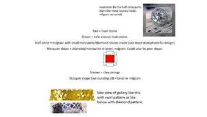
I realized that I wasn't finding the exact design I wanted, because it only existed in my brain. It definitely has elements from CvB design, but also other elements that I find appealing.

I "drew" it via powerpoint and descriptions, but I have no clue if this makes sense to anyone except me. Do you guys understand the scribbles/random elements in different colors, or does it make no sense? ring_pendant-idea.jpg
 
I think I do understand your description after seeing the inspiration picture. I think it's a neat idea, but you or whoever does the CAD will need to play around with the proportion of the half-circle. In the CvB it's a narrow curve, and I wouldn't describe that as a half-circle. That part might need to be more thin and narrow than it appears in the PowerPoint drawing to appeal to my personal aesthetic. Having the marquise in the corners would be a neat touch. If this were up to a vote I'd vote pear over marquise. My concern with the proportions as-is is that that looks like a lot of space, between the "half-circle" and marquise shapes. Also, while I can picture an octagon shape for the whole finished product, those half-circle shapes would have to extend out a lot more for me to see an octagon instead of rectangular box.
 
I think I do understand your description after seeing the inspiration picture. I think it's a neat idea, but you or whoever does the CAD will need to play around with the proportion of the half-circle. In the CvB it's a narrow curve, and I wouldn't describe that as a half-circle. That part might need to be more thin and narrow than it appears in the PowerPoint drawing to appeal to my personal aesthetic. Having the marquise in the corners would be a neat touch. If this were up to a vote I'd vote pear over marquise. My concern with the proportions as-is is that that looks like a lot of space, between the "half-circle" and marquise shapes. Also, while I can picture an octagon shape for the whole finished product, those half-circle shapes would have to extend out a lot more for me to see an octagon instead of rectangular box.

thanks, that's super helpful! Yeah, stupid powerpoint (and my lack of artistic skills) = monstrous half circles instead of the narrow curve I was going for (like in the CVB inspiration pic). I am also leaning towards pear for the corners, but powerpoint didn't have that shape :(
 
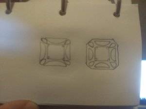
Just because making 2D sketches to help me visualize a design is fun for me, I took up my pencil and produced these. I have trouble drawing pears and parallel lines, but I share these on the off chance they might help you even a tiny bit.

With the first photo, the sketch is to show you that setting the gems further apart would give you more of an octagonal shape, whereas setting them close together would make the outline look more square. Also, I think the tips of the pears should be pointing at your flaming red spinel, because the design just looks more harmonious with the rounded parts of the pear hugging the diagonal sides.
IMG_20181021_185224613_BURST000_COVER.jpg

The second photo/sketch is to show different proportions with thicker half-moons. This shows the center stone and pears set with prongs (little circles) and the half-moons bezel set. Apologies my phone took a blurry pic.
IMG_20181021_185236879.jpg
 
ooooh @voce I like the last one, but I like the idea of having the corners being "outside" the lines of the rest of the design. Does that make sense? In my horrible "sketch" thingy, I like how the kite shaped corner stones jut out from the octagon bezel.
 
GET 3 FREE HCA RESULTS JOIN THE FORUM. ASK FOR HELP

Featured Topics

Top