shape
carat
color
clarity

New project - small purple/blue sapphire

Kim Bruun

Shiny_Rock
Joined
May 18, 2008
Messages
376
Hi, guys!

I've long enjoyed you posts and projects here, and now I have a project of my own that I would be interested in hearing your thoughts on. I have a .68 honeycomb cut colour shift sapphire that has been lying around for too long (I photographed it with the red spinel because at one point, I considered if they would look good set together - I like the idea of playing with colour, but abandoned this particular combination):
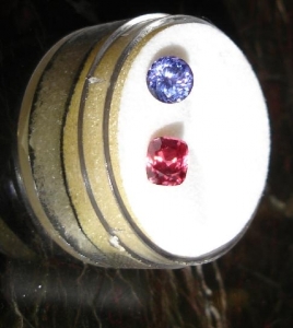
Spinel&sapphire.jpg

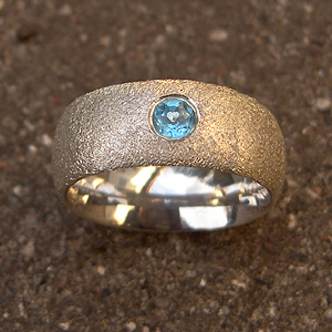
I'm a guy, but I refuse to let that limit me to steely blue and inky sapphires. I want something that pops with colour. But I also want a design that doesn't make it look like I've donned one of my mom's rings. So something simple and the slightest bit chunky, something that puts emphasis on the stone itself. I'm thinking something along the lines of this design:
da+heri333_0.jpg

What do you guys think? I really like the rough finish, especially since it's for a men's ring. Do you think this kind of finish would show wear faster than a smooth finish? Also, I'm partial to red gold.

I also have a spinel coming from Richard Homer that I am very excited about. I haven't decided how I want set when the time comes, but the work and material is beautiful! :))

All the best!

/Kim
 
How dark in tone is your sapphire? The reason I ask is that your photo looks to have a lot of bright light on the stone, and I can't judge the tone too well. If it's medium dark or darker in tone, it will go darker in that kind of gypsy setting, and you may not get enough sparkle out of the stone. If it's medium or medium light, it would be a better choice.
 
TL|1334002478|3166796 said:
How dark in tone is your sapphire? The reason I ask is that your photo looks to have a lot of bright light on the stone, and I can't judge the tone too well. If it's medium dark or darker in tone, it will go darker in that kind of gypsy setting, and you may not get enough sparkle out of the stone. If it's medium or medium light, it would be a better choice.

See, this is exactly why I should be coming here! Thank you for your insights, TL!

Well, I photographed it with the sunlight streaming in from the window, with no flash. But the stone is perhaps a bit darker than in the photo. Sparkly and nicely saturated, but not a light stone. I will try to take a photo that catches the tone better.

Gypsy setting? lol! What does that mean? For a men's ring, I definitely can't see prongs, but I also don't want the stone to look like a glop of ink. I will say though, that I have a tsavorite in a similar closed setting (red gold pendant), and while it is a dark stone, it is definitely and very obviously green (an 8 year old boy at work to a gander at the pendant and said "that looks expensive!" - needless to say, that comment ingraciated him quite a bit with me).
 
Kim Bruun|1334003176|3166800 said:
TL|1334002478|3166796 said:
How dark in tone is your sapphire? The reason I ask is that your photo looks to have a lot of bright light on the stone, and I can't judge the tone too well. If it's medium dark or darker in tone, it will go darker in that kind of gypsy setting, and you may not get enough sparkle out of the stone. If it's medium or medium light, it would be a better choice.

See, this is exactly why I should be coming here! Thank you for your insights, TL!

Well, I photographed it with the sunlight streaming in from the window, with no flash. But the stone is perhaps a bit darker than in the photo. Sparkly and nicely saturated, but not a light stone. I will try to take a photo that catches the tone better.

Gypsy setting? lol! What does that mean? For a men's ring, I definitely can't see prongs, but I also don't want the stone to look like a glop of ink. I will say though, that I have a tsavorite in a similar closed setting (red gold pendant), and while it is a dark stone, it is definitely and very obviously green (an 8 year old boy at work to a gander at the pendant and said "that looks expensive!" - needless to say, that comment ingraciated him quite a bit with me).

A gypsy set stone is one that is bezel set into the band of metal itself. For example, the Tiffany etoile ring has gypsy set stones all around it.

http://londonprettyboy.files.wordpress.com/2011/03/etoile.jpg
 
Again I must thank you for educating me. :)) I wasn't aware that a bezel set into a band of metal was called a gypsy setting (a term which sounds mildly but humourously derisive to my ears).

Question: Can I get an impression of how much the stone will be darkened if I press it into a bit of sticky tac or warm wax to box it in like it would be in a bezel?
 
Question: Can I get an impression of how much the stone will be darkened if I press it into a bit of sticky tac or warm wax to box it in like it would be in a bezel?

Oh dear...several PS'ers just fainted. The usual - and far more gentle - way to go about seeing how a bezel (or gypsy setting) will affect a stone, is to wrap the stone in alfoil :)) All you're doing is closing the light source.
 
Please attempt the foil method - I am curious to see how the colour shifting properties will be affected by the bezel. As more light is restricted, I expect that you will see less colour shifting. The shifting will always be there, but it will be less obvious.
 
Starzin|1334054868|3167325 said:
Question: Can I get an impression of how much the stone will be darkened if I press it into a bit of sticky tac or warm wax to box it in like it would be in a bezel?

Oh dear...several PS'ers just fainted. The usual - and far more gentle - way to go about seeing how a bezel (or gypsy setting) will affect a stone, is to wrap the stone in alfoil :)) All you're doing is closing the light source.

Actually using sticky tac is a brilliant idea! I've been known to do this! If you put a gem between your fingers, you will typically be doing the same thing!

Kim - I really like your initial idea and having a rough textured finish to the ring. The alternative is to have a matt finish rather than textured. I also like tension set rings for men. I'm not sure if your stone may be too large for that though. Not sure if you've posted the stats ie mm size?

Another option is to have a thin matt finish ring on either side with the stone tension set between the two bands (or filled in at either side). Hope that makes sense.
 
Thank you, LD, I really appreciate your thoughts and insights!

I think the stone is 5 mm in diameter. I like the tension setting myself, and that could definitely be an option if the stone would prove too dark in a gypsy setting. One question, though: Would I be wrong to assume that the tension setting is slightly more delicate? I'm a physical guy, and while I would never wear jewelry for sports or other activities where the jewelry might easily be damaged, it is always nice to know the pros and cons.

I'm glad the idea with the sticky tack wasn't that bad. I figured that it would be smart to have something the could block out light from the sides while temporarily holding the stone firmly in place so that I can examine how it performs under different lighting conditions.

I think matt, textured, and polished can all be attractive, but since it's for a ring, I will probably choose the one where the wear will be least apparent.

Again, I am very grateful to you guys/girls for taking the time to educate me!
 
Ok, well, if you need a setting that will hold up to a bit of knocking about then a full tension setting probably won't do the trick.

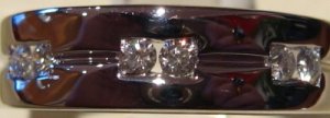
So how about something in between. The photo below is of one of my husband's rings. Imagine it with a larger round centre stone but still set into a square shape (so tension set) but protected by the rest of the ring? Ignore the side diamonds as that's probably overkill. You could set this in a matt finish BUT be aware that any finish is likely to show signs of wear unless you go for the textured look.

Diamond Gents Ring 0.21ct_1_1.jpg
 
LD I am unable to get a handle on the topography of that ring of your DH. Could you post other photos?
 
Matte finishes on rings can show scratches very easily, and the scratches will look smooth/shiny compared to the rest of the ring. The more rough and irregular the finish, the better it will hide scratches. I had a ring with satin finish, and it started showing scratches on day 1. The ring you showed is pretty rough, so the finish should last longer. You can always have it refinished by a jeweler.
 
I have been advised by bench people that a satin or matt finish will show scratches more easily than a polished finish. I think an irregular looking or textured finish will also hide wear and tear quite well.
 
VapidLapid|1334104460|3168012 said:
LD I am unable to get a handle on the topography of that ring of your DH. Could you post other photos?

VL, it's the only one I have I'm afraid. I will ask him to do some modelling at the weekend and get some better shots for you. If there a particular view you want?

Actually he has another ring with an equally interesting design but it wouldn't be suitable for a larger stone. Happy to post that also if you want?
 
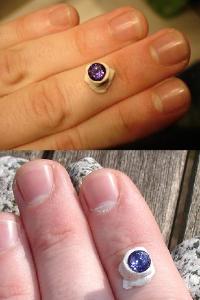
The sticky tac experiment worked just fine - photographing the stone proved to be another matter:

Sapphire_0.jpg

Please ignore my pale (and colour shift!) hands. The top pic is electric light at night time, and the bottom pic is sunlight. It is a dark stone, but I still think it exhibits a lot of sparkling purple and purplish blue. I actually like that it is a little dark - gives it a bit of mystery without drowning the colour. Also, while it is not obvious in the pic, the stone is VERY clean, and the honeycomb cut is beautiful and very symmetrical.

I've been weeping bitter tears over the inadequasies of my camera/camera skills, but I'd much rather invest on a setting for the stone than a new camera.
 
It is actually not terribly dark when totally enclosed; you can still see the colour and a lot of flash. Based on your trial, I think the sapphire will continue to perform well in a gypsy setting.
 
I have read so much here about bezels causing the stone to go dark. From my experience this isn't true. When cutting a stone, one of the dops is a cone shape that holds the pavilion. If I place a stone in the cone, which in effect simulates a bezel, the appearance of the stone doesn't change. The light returning through the crown of the stone is essentially the light entering the crown and then being reflected back out. Now if a stone is cut with the wrong angles, then this isn't true and the stone may loose performance when bezel set, but a properly cut stone by design is gathering light through the crown and reflecting it back out, not through the sides or pavilion.

Sticking the stone in the clay will effect the performance as now the facets are in direct contact with the clay and will loose their fine mirror surface polish. Similar to a dirty stone.
 
Gene,
The key word here, is WHEN properly cut, which you know isn't always the case.
 
PrecisionGem|1334248668|3169350 said:
I have read so much here about bezels causing the stone to go dark. From my experience this isn't true. When cutting a stone, one of the dops is a cone shape that holds the pavilion. If I place a stone in the cone, which in effect simulates a bezel, the appearance of the stone doesn't change. The light returning through the crown of the stone is essentially the light entering the crown and then being reflected back out. Now if a stone is cut with the wrong angles, then this isn't true and the stone may loose performance when bezel set, but a properly cut stone by design is gathering light through the crown and reflecting it back out, not through the sides or pavilion.

Sticking the stone in the clay will effect the performance as now the facets are in direct contact with the clay and will loose their fine mirror surface polish. Similar to a dirty stone.

I think bezels and halos have a tendency to darken tone, which can be a good thing if a stone is very pale to begin with. At least this is what I have noticed in my experience, with both well cut and badly cut stones. If a stone is very dark in tone, I don't think a bezel can help it much. JMO.
 
Kim Bruun|1334003176|3166800 said:
TL|1334002478|3166796 said:
How dark in tone is your sapphire? The reason I ask is that your photo looks to have a lot of bright light on the stone, and I can't judge the tone too well. If it's medium dark or darker in tone, it will go darker in that kind of gypsy setting, and you may not get enough sparkle out of the stone. If it's medium or medium light, it would be a better choice.

See, this is exactly why I should be coming here! Thank you for your insights, TL!

Well, I photographed it with the sunlight streaming in from the window, with no flash. But the stone is perhaps a bit darker than in the photo. Sparkly and nicely saturated, but not a light stone. I will try to take a photo that catches the tone better.

Gypsy setting? lol! What does that mean? For a men's ring, I definitely can't see prongs, but I also don't want the stone to look like a glop of ink. I will say though, that I have a tsavorite in a similar closed setting (red gold pendant), and while it is a dark stone, it is definitely and very obviously green (an 8 year old boy at work to a gander at the pendant and said "that looks expensive!" - needless to say, that comment ingraciated him quite a bit with me).

Gypsy set is the same as flush set.
 
Kim Bruun|1334245745|3169313 said:
The sticky tac experiment worked just fine - photographing the stone proved to be another matter:

Sapphire_0.jpg

Please ignore my pale (and colour shift!) hands. The top pic is electric light at night time, and the bottom pic is sunlight. It is a dark stone, but I still think it exhibits a lot of sparkling purple and purplish blue. I actually like that it is a little dark - gives it a bit of mystery without drowning the colour. Also, while it is not obvious in the pic, the stone is VERY clean, and the honeycomb cut is beautiful and very symmetrical.

I've been weeping bitter tears over the inadequasies of my camera/camera skills, but I'd much rather invest on a setting for the stone than a new camera.

Well, wipe those bitter tears away because actually your photos are excellent! Capturing the different colours that shift is INCREDIBLY DIFFICULT and sometimes you won't be able to do it no matter how hard you try! That, unfortunately, is why people will often manipulate photos to produce something more akin to what they are actually seeing.

Now then, having said all of that, I have to say that I love your stone and the size is perfect. It's not too big or small and will certainly perform well if you head off down the bezeling route.

I can't wait to see what design you finally settle on!
 
Thank you, LD! I would have liked to show a little more detail , but the camera has its limitations - so I went for the pics that were the most true to the actual colours of the stone. I will definitely want to come here with the finished result to hear what you guys think.

@ PrecisionGem: Thank you for your feedback! My first attempt was jamming the stone directly into the sticky tac, and it lost all sparkle. On my second attempt, I fashioned a tiny tube of the material around the stone, so as not to lose the mirror surface on the pavillon.

@ Chrono: I actually think the stone is quite well cut - the seller called it a honeycomb cut and said it had more facets than the brilliant cut. The stone has NO window and no big, dead areas - there are sparks of purple, pink and blue dappled all over the crown. And it has none of the irregularity that you often see in native cut stones.
 
You know, I had my doubts when you spoke about bezeling it. But your exercise with the sticky tack is great - in fact, sounds easier than tin foil for future reference - and I think it will be lovely gypsy set with textured metal.
 
GET 3 FREE HCA RESULTS JOIN THE FORUM. ASK FOR HELP

Featured Topics

Top