shape
carat
color
clarity

Opinions needed! A project (and some of my sketches) . . .

Status
Not open for further replies. Please create a new topic or request for this thread to be opened.
Of your newest creations I prefer 3 & 8. Looking forward to seeing what you decide!
 
I like F, G, and H because they look very antique and the design is such that they have a strong presence, suited for a pendant. However, from your latest post, it appears she likes a more modern and clean line, which leads me to think she’ll like design U. I’d stay away from any pear shaped stones since she already has one (or is that two?). You can still do a cushion stone but set at an angle (like a kite).
 
Of your new designs 1 and 2 are lovely (similar to U) but how about turning the cushion on it's end so it's in a kite shape (as Chrono has suggested) - this would give a modern twist to the necklace. Also can you take design 1 (for example) and add two coloured gemstones into the necklace (same colour as the bottom large stone)? Design 12 is unusual and very pretty indeed but I'm not sure about the colour for the central gemstone. It needs more "oomph" if you know what I mean!

You asked for other shape ideas? How about a marquise or an oval? Although it will take a long search, you may be lucky and find a true kite shape - however the chances of finding one in a gemstone you want, in a short timeframe and in the size you want, will be problematic!

In terms of colour - think carefully about pale gemstones like chalcedony. Some people like them but others find them too pale and as they don't sparkle they don't make such a statement piece. I'd also stay away from yellow and oranges (unless your Mum can wear these colours well). To wear yellow and orange you need a certain skin tone. If you really want to incorporate yellow how about Ametrine?
 
A, D, O, 4 or 8

My personal favorite is A cos is simple and extremely classic (+ you dont have to buy any more stones)
 
I think E, from your first set is so elegant that I, uh, sort of want to have a custom piece of my own made up on its basis - the highest praise! Seriously, you have a real eye for design ... I really enjoyed looking through this thread!
 
A big thanks to everyone for all the comments!

Packrat: I liked the contrast of the chalcedony with the diamonds and thought it might be well suited for regular wear (chalcedony seems more casual to me for some reason); the chalcedony seems to polarize people because its translucent and cabochon - I may dabble with some more sketches later on.

JStarFireB: I tried to incorporate some cushion, round, and emerald cuts into my new sketches - I agree that the large amethyst wasn't doing much (at least the way I designed it).

SarahBear621: For this project, I think I may be phasing out the Edwardian look; maybe E or H would make a nice birthday present for my sister?
2.gif


Ma re: I tried to play around with some of your design suggestions a bit - take a look at the sketches and let me know what you think; BTW, my mom is an artist, so I don't have to be too neutral with color (I am leaning towards a blue or yellow gemstone).

AustenNut: I tried some new interpretations of the linear drop style found in 3 and 8 - let me know your thoughts.

Chrono and LovingDiamonds: I sketched some more designs that have clean lines (as well as some more complex ones lol); I am leaning toward the following cuts for the gemstone: cushion, emerald, or round. I may even end up going with an asscher or cushion (either could be angled). I'm not too sure how my mom would respond to marquise or oval cuts, so I may hold off on them for now.

MAC-W: Sketch A does have its advantages - its simple and maybe the most cost effective. I got a good deal on the .75ct diamond (I think?), so this necklace project is (hopefully) going to look much more expensive than it costs. I noticed you tend to like my more linear designs - let me know what you think about the ones I am posting below.

Circe: Thank you for your kind words - I'm glad you are enjoying the thread! You could also modify sketch E to make some striking earrings (or even custom earring jackets for diamond studs, I suppose).

Let me know your feedback on my most recent set of sketches (below)
9.gif


JSdesoptpen (5).jpg
 
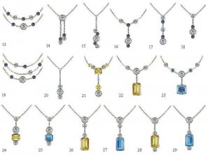
I like 17 and 26 best!
 
I like E, F and N, with one of the more vivid-colored stones, like the yellow sapphire (although the aqua is lovely too) - you have lovely taste!
 
23 but with the cushion turned to a kite, 24 25 26 27 28 29 and 30 are all winners in my opinion.

More importantly which do YOU like?
 
I''m trying to think about what she''d like (trying to put my taste to the side), based on the info provided, and of that last batch I''m thinking 22, 23, 29 and 30. Not sure she''d be thrilled with those designs that include smaller stones (but I don''t know her...).
 
15 if she likes it simple, otherwise 22 and 23 (with the stone set at an angle like a kite).
 
Packrat and AmberGretchen: Thanks for your kind words; I like the simplicity of those sketches; I think those designs are pretty versatile for everyday wear - I tried to dabble with some more designs below - I do like the idea of incorporating a vivid color; I''m still leaning towards a blue or yellow (but threw some champagne and orange/red(fire opal) into the mix). That being said, I did try out a colorless elongated rock crystal in one sketch.
1.gif


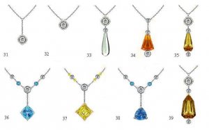
LovingDiamonds, Chrono, and Ma re: Thanks for your input on the sketches; in my below designs, I tried out an angled cushion, as well as a trillion, an angled square step-cut, a fan, and a kite. I''m having a very tough time picking my favorites out of all the designs. LovingDiamonds and Ma re: I''m very sorry about the confusion with the numbering - I actually didn''t have a sketch #30 in my last set lol
2.gif
I skipped 30 in this set to avoid any confusion.

SanDiegoLady: I appreciate your comprehensive input
1.gif
I still can''t make up my mind - its so hard for me to choose between all the styles and combinations - I just end up doing more sketches!

And with that, I have some more sketches below
9.gif


JSdesoptpen (6).jpg
 
By the way, I wanted to wish everyone warm holiday greetings!
35.gif
 
I like all the pendants in the last batch. Merry Christmas Rockhuntin.
 
Of these I like 33/37. Can you do a picture of 26 with the yellow kite set from 37?
 
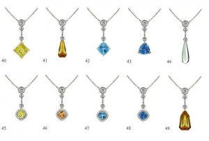
Thanks for the request, Packrat! I did some quick adaptations using the basic structure of some of my sketches (most recently, 26 and 27). The below sketches utilize some of the gemstone colors and shapes found in my above post. I also derived a few designs using diamond accent halos in an angled cushion shape.

Let me know what you think
9.gif


JSdesoptpen (7).jpg
 
Yowza, that''s a lotta new designs.

16, 23 (but kite set as others mentioned), 27, 29 are the ones that do it for me from that set.

From the next one, hands down 36.

And the last one, 47-48 are probably my favorites, with 42 close behind. I''m liking the halos.

FWIW, I think blue stones have a much broader appeal than yellow/orange (and they wear better on most skin tones as LD mentioned), so unless you know your mom specifically likes citrine, I''d stick with the topaz/sapphire/aqua grouping.
 
Date: 12/25/2009 1:57:04 AM
Author: RockHuntin

Let me know what you think
9.gif
That you have a better shot at becoming a jewellery designer than getting this necklace done
9.gif
I mean, it''s nice when a person giving such a present is creative, but you really have an idea overload and in most cases this only makes the person more indecisive about what to do. Here''s another tip - different cutting styles have different kinds (levels) of brilliance. If you think your mom likes more bling/sparkle/scintillation and lively sparks from within the stone, then get her something in some variation of a brilliant cut (i.e. oval, pear, trillion, marquise, heart...). If you think she''ll more appreciate the fine luster, serene shine and watery/mirror quality of a gemstone, then get her something done in a step cut (emerald cut, asscher, kite, baguette...). And another tip; some setting techniques are better suited to certain shapes, so if you''re thinking about bezeling this stone, it''s better if you go with something rounded, that doesen''t have sharp points (less chance of damage in the process).
 
This batch I like 40! And 44 2nd.
 
I like 36, 37, 40, 42, an 43 (in no particular order). I''d start looking for your colored stone(s) and then decide on a design. You may find the fabulous larger size center stone, but not find any matching sidestones so that could influence your design. Or you may find a great stone that does have sidestones to go with it, in which case you may go in a different direction. Basically, I think you have a lot of great ideas and now you should just go rock hunting and then select your design.
 
36 for me because it uses all your existing stones plus seems in line with what your mother might like. Otherwise, all your latest designs are very pretty.
 
AustenNut and JStarFireB: I think I'm going to take everyone's advice and browse some gemstones before finalizing a design. Finding the "perfect" gem(s) will definitely influence the design. I noticed that yellow hues can be tricky; my mother has mediterranean coloring, so I think the "right" yellow/gold/orange might be okay. That being said, light or medium blue or blue/green hues would show up well against her skin tone.

Ma re: I definitely hear what you are saying; idea overload is an understatement - and you haven't seen all the sketches I haven't posted
9.gif
I am going to have to think about whether I want to go for brilliance, serene linear cuts, or just a subtle glow (ie cabochon). Funny you mentioned the issues with bezeling - I was actually reconsidering the notion. My deep .75 ct is around 5.5-5.6mm wide, which is a bit off-round and non-standard for bezel castings. To keep things cost-effective, I may go with a simple three or four prong setting for that stone, which will influence the setting styles of the other stones.
 
Loving this project. My favorites are the drop designs. I'm wondering if something like this Mexican opal briolette *Removed by Moderator; Links to blogs are not allowed on the forums. Please follow policies.* from Briolettes.com would make for a stunning focal stone?

mexican_opal_briolette.jpg
 
Lovinggems, Packrat, Chrono, Ma re, AustenNut, JStarFireB, and all the other wonderful PSers:

I have a potential "issue" that may influence the design - I am suspecting my .75ct has fluorescence. Its H in color, but frankly looks somewhat bluish white in some lighting; in comparison, its making my two I-J color .20ct diamonds look a bit dingy
8.gif
The .20s are currently set in yellow gold four prong baskets, and I''m hoping that''s influencing how they face up; otherwise, if there''s still a big contrast when they are taken out of their yg settings, I will have to get creative or leave them out of the design. Either way, no worries . . .
 
Thanks, Fly Girl! I'm really intrigued by briolettes and appreciate that you sent me that link.

That Mexican opal is really vibrant! I'm thinking that one might be a bit short for this project though; when I read it was 8.72 carats I thought it would be huge, then I pulled out a dime (for size comparison) and did a double take lol. In terms of distribution of carat weight, if I decide to go with a briolette, I think I might go for a longer, slender one. Thanks again for sharing that link!
 
Date: 12/26/2009 4:02:16 PM
Author: RockHuntin
Lovinggems, Packrat, Chrono, Ma re, AustenNut, JStarFireB, and all the other wonderful PSers:

I have a potential ''issue'' that may influence the design - I am suspecting my .75ct has fluorescence. Its H in color, but frankly looks somewhat bluish white in some lighting; in comparison, its making my two I-J color .20ct diamonds look a bit dingy
8.gif
The .20s are currently set in yellow gold four prong baskets, and I''m hoping that''s influencing how they face up; otherwise, if there''s still a big contrast when they are taken out of their yg settings, I will have to get creative or leave them out of the design. Either way, no worries . . .
The yellow gold will most definitely be influencing the colour of the two smaller diamonds. I wouldn''t worry about that. When you take them out you''ll see a huge difference.

Fluor is a diamond (for me) is the best thing since sliced bread! I adore it! There''s a resurgence of love towards these gorgeous diamonds!!! Rightly so. If your diamond is definitely exhibiting some blue then I''d be doubly tempted to go with a blue central stone.

Good luck finding your centre stone and do post up some choices won''t you? We (as you''ve probably noticed) do like to look at a bit of gemstone eye candy
31.gif
 
Thanks for the encouragement, LovingDiamonds! I actually really like the .75 diamond and its bluish/white tendencies; even though it doesn''t have a perfect cut or clarity, it has character and is great for a pendant/necklace. At the end of the day, I think I did well with the purchase (bought it for just under half the price of the opal briolette).

I was thinking a blue or blue/green gemstone would look great too; I may still consider a yellow gemstone for contrast though. I think the .20s should be fine; if they are still noticeably tinted when they are out of the yg, I could go with a design like 28 that places some distance between the .20s and the .75 (or just save the .20s for another project hehe
1.gif
).

I will definitely share gemstone options when I find them - since this is my first design project, everyone''s input will be greatly appreciated
9.gif
and of course, everyone will get to enjoy the gemstone eye candy
2.gif
 
If you want to accentuate a blue glow, maybe going with a moonstone would be a good option too (sometimes they cut them in drops also). And mixing that glow of moonstones with the brilliance of diamonds might be really something.
 
Date: 12/27/2009 2:38:26 AM
Author: ma re
If you want to accentuate a blue glow, maybe going with a moonstone would be a good option too (sometimes they cut them in drops also). And mixing that glow of moonstones with the brilliance of diamonds might be really something.
Great idea! Especially something that has a halo around it.

RH, I suspect that it's the yellow gold baskets that are making your I/J diamonds appear tinted. Once you bezel them in a white metal, that should influence their face up colour.
 
I didn''t read all of the posts, but I have to say, the more that you had to it, the harder your decision is going to be to make! However will you choose? There are so many lovely ideas! I prefer the deco styles with the halos and the east west set asscher stones........ but I also love the chalcedony large drop pear.... The bottom line seems to be what is your mom''s style and what you see her wearing the most of!!! Good luck in your choice! This is a hard one!
 
Status
Not open for further replies. Please create a new topic or request for this thread to be opened.
GET 3 FREE HCA RESULTS JOIN THE FORUM. ASK FOR HELP

Featured Topics

Top