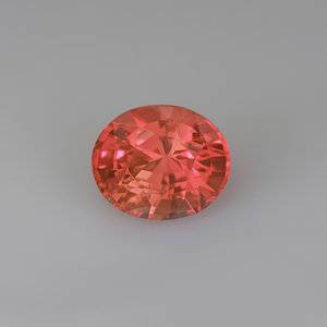
shape
carat
color
clarity

Padpardscha sapphire and tsavorite toi et moi

:love: Oh, I can imagine your color-bomb ring with Doc Marten boots! The heart must have what it wants!
 
I think it turned out beautifully. The colors are amazing. I love the mixed metal colors and textures, and I think the metal "halo" around the pad balances the proportions of the stones nicely. Well done!
 
Thanks! I find the satin finish to feel very lux. Maybe because you don’t see it as often?

Took some more photos including better perspective shots outdoors

0F45B08D-2C86-44D2-8042-E689566E782D.jpeg FA3160EE-508B-4543-8847-889B1A30D352.jpeg 4835C365-7C9F-40C4-929E-0241FDC06C00.jpeg
 
Hmm. I’m having a hard time capturing the orange in the stone. All the photos end up more straight pink than what I’m seeing or getting a weird purple tinge.

The vendor photo seemed to capture if but I just can’t seem to get it to translate in photos! Any tips?

@natasha-cupcake do you find this happens taking photos of your pad sapphire?
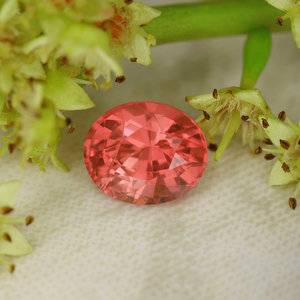
A5C1747E-2C5A-4C2D-A905-5321A8CDF321.jpeg7E253746-C21B-4CE9-B0B8-AC561ECF9398.jpeg
 
Your ring is so beautiful :love:. I’m so happy you were able to see your vision for the ring turn out so perfectly!
 
Hmm. I’m having a hard time capturing the orange in the stone. All the photos end up more straight pink than what I’m seeing or getting a weird purple tinge.

The vendor photo seemed to capture if but I just can’t seem to get it to translate in photos! Any tips?

@natasha-cupcake do you find this happens taking photos of your pad sapphire?

A5C1747E-2C5A-4C2D-A905-5321A8CDF321.jpeg7E253746-C21B-4CE9-B0B8-AC561ECF9398.jpeg
Yes, I have the same issue. I see way more salmon-y, coral-y, orange-y hues in person than I do in photos (which do seem to emphasis the pink). Conversely, the occasional purple hue I see in the photos is just not present in real life. I stink at photos (and I have an older iPhone) so I really don't know how to capture the pretty colors I see. Every now and then I'll get lucky with color representation, but screw up the focus or some other important aspect.

I have to say that the pleochroism is striking and really fun to see. My pad shifts from pink to orange with everything in between as I move it around. That can't be appreciated in a photo, of course. I tried to capture the color shifting with a video, but that didn't work out so well either--not for lack of trying, however. I think I might be just a wee bit obsessed.

Yes! Thank you :p
Glad it’s not just me! And yes I love the flashes of pinks and orange
 
Last edited:
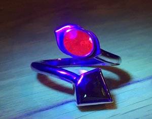
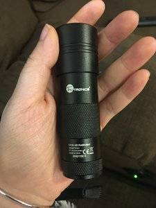
It came! It’s a really nice compact flashlight and boy does the pad glow red. Will return with some pics later :)

But highly recommend if you were still thinking of getting it

Edit: came back with photos!

2247DBB3-5A07-4A19-AA0D-20DD16F42BD9.jpeg E6FCB6F0-591D-4571-BFDC-90AA9015E9EB.jpeg

Thank you! It looks great. I’m definitely going to get that one. :mrgreen2:
Btw, don’t you just love seeing the pad glow red like that? So cool!
 
So out of frustration I dug up my Canon cheapie point-and-shoot camera and I do feel like it does a better job with white balance and capturing the color

Here it is under my Aerogarden grow light lol
IMG_0248.JPG

bedroom window:
IMG_0289.JPG
 
I love your ring so much!! Everything about it is perfect!
 
Thanks! I wanted something more abstract and modern since overall I am not a very girly person. I love admiring all the beautiful halo rings and delicate deco designs here but they’re not me. I thought about doing 4 petals but thought it’s be too “flower” and a pink flower would look too girly to me. I literally own nothing else pink lol. I run around with half my hair shaved and doc marten boots. So I wanted a sleek and kind of edgy lotus interpretation lol. Sounds weird but the heart wants what it wants.
Lol, I'm very similar, MTG :-) I avoid anything with a heart on it, jewelry or clothing and bum around in jeans and tee shirts most of the time. No wonder I like this ring so much!
 
Lol, I'm very similar, MTG :) I avoid anything with a heart on it, jewelry or clothing and bum around in jeans and tee shirts most of the time. No wonder I like this ring so much!

I’m actually thinking of getting a lotus tattoo. It’s one of my favorite symbols for numerous reasons, one of which being that I associate it with my grandfather who passed away and who had a lot of lotus stuff in his house as part of his Buddhist faith.
 
What a perfect ring! Your ring captures the the Lotus flower look/color scheme that the best Pads are known for. I love toi et moi rings for the index finger.
 
Such a beautiful design! I have the same problem with the pad I just purchased from gemfix. It always photographs purple for some reason. I’ve given up :lol-2:
 
Such a beautiful design! I have the same problem with the pad I just purchased from gemfix. It always photographs purple for some reason. I’ve given up :lol-2:

Right?!? Makes me crazy.
 
Gorgeous! I love those contrasting colors together.
 
This whole wearing the toi et moi on my index finger is really growing on me! I think I'll get my other toi et moi resized to wear on my index finger too!

This also means I'm more open to wearing bands again! :Up_to_something2:
I don't like when rings on adjacent fingers tough, and since I usually wear my RHRs on my middle finger, I haven't been wearing bands. But now!
 
This ring really has turned out fabulously! It's intricate but not fussy. Cool but not trendy. Thanks for all the additional photos. =)2
 
This ring really has turned out fabulously! It's intricate but not fussy. Cool but not trendy. Thanks for all the additional photos. =)2

Haha. Well I’ve been taking pictures like a possessed person tryin to capture the colors. So far still not satisfied with the results but likely can’t do better without a nicer camera and equipment. :/
 
YES! One of my favorite pass-times during boring speeches: watching my gems sparkle and check colors. Less impolite than checking your phone and faaaar more beautiful. Those are the times when I truly value the money I spent on rings-stones, counting all the little happy-moments together makes for a good fun-per-$ investment.
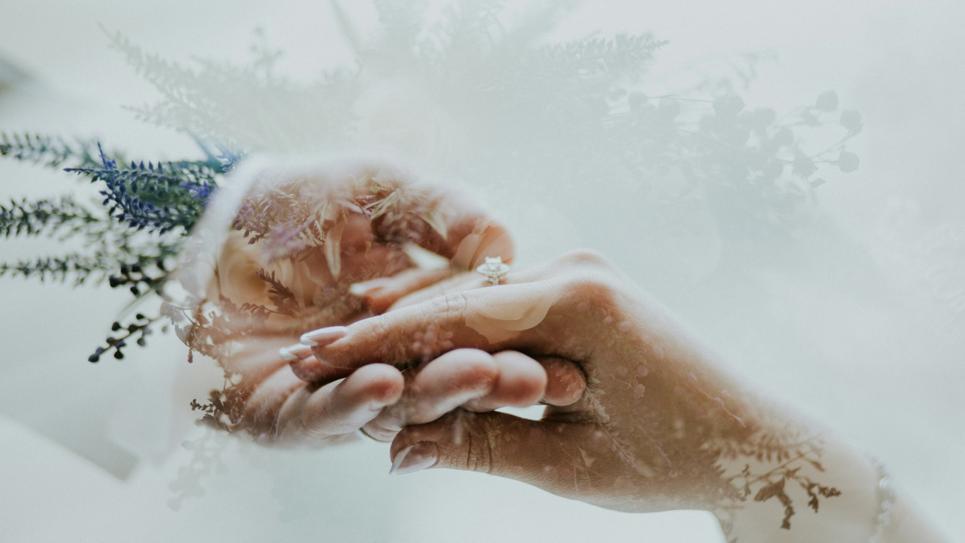
 
YES! One of my favorite pass-times during boring speeches: watching my gems sparkle and check colors. Less impolite than checking your phone and faaaar more beautiful. Those are the times when I truly value the money I spent on rings-stones, counting all the little happy-moments together makes for a good fun-per-$ investment.

Hehe yup! And also why it’s fun to have a few different ring options to change up the view at meetings lol
 
Hmmm. Can this go in an ultrasound cleaner?
 
Super saturated colours! WOW!
 
GET 3 FREE HCA RESULTS JOIN THE FORUM. ASK FOR HELP

Featured Topics

Top