shape
carat
color
clarity

Peach pink or bright red?

Which is better?

  • Peach pink

    Votes: 10 34.5%
  • Bright red

    Votes: 19 65.5%

  • Total voters
    29

CBianco

Brilliant_Rock
Joined
Nov 25, 2021
Messages
615
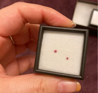
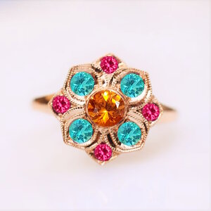
Based on the rendering photo, the peach pinks make the ring appear more florally while the red spinels make it more geometric, as the 4 points really stand out. As much as I'm usually a sucker for super saturated pink/reds, this is not an easy decision! But I'm sure you'll figure it all out, it's going to be lovely either way=)2
 

Avondale

Brilliant_Rock
Joined
Oct 31, 2021
Messages
1,111
@Rfisher Thank you so much! This was wildly useful. And, believe it or not, it might've actually helped seal the deal.

I might be doing the vendor a disservice in comparing the color label imperial from shipment to shipment 4 years apart. I don’t know if or what range does exist for them to consider certain ones but not others for labeling ‘imperial’. She’s had other lots of peach, pink orange (or whatever mix) over the years that hasn’t been labeled imperial. So that’s an unknown, and might need to be taken into consideration.

There's definitely some range to the colour of the melee that's described as imperial. The listing photo of yours makes them look almost identical to these 1.5mm ones that, I admit, I did ogle for a while.

This is where I get lucky - someone recently bought both the 1.5mm that look like yours and the 2mm I want to use, wrote a review and posted a picture of both. :mrgreen2:

1719211109350.png

You can clearly see how the smaller one is, in fact, more orange leaning and not too dissimilar to your own photo. The larger one definitely has more pink in comparison.

But in any case, I like the orange undertone. I'm not looking for bubble gum pink. So even if there's a little bit more orange to them than the photos allow, it wouldn't bum me out, quite the contrary.

I do notice you put pink in your verbiage as well.

Yes, but I shouldn't be trusted with colour descriptions. :lol: The listing of the 2mm stones doesn't say pink anywhere, only orange, peach and imperial.

I did one more edit where I took the pink stones and edited them to make them more rusty. I think I managed to get pretty close to the look from your photos. And... I don't mind. I still like the look.

1719212744492.png


I also wrote to Yvonne ...again. One day she'll be in her full right to tell the comical story about that one client who went bonkers over some tiny pink stones. I wanted to ask her if any of the spinels would either get desaturated or darker in low light. As I suspected, the peach ones don't do either, but the jedis tend to get a bit darker.

This is more or less cementing my decision. I still have several hours to think about it because I don't want to write when it's the middle of the night for her. I never expected to receive a reply on Sunday, so who knows if she'll get a notification on her phone to wake her up at 3am.
 

Dreamer_D

Super_Ideal_Rock
Joined
Dec 16, 2007
Messages
26,187
I am loving the peach for your project as emphasizing the floral pattern of the lily and allowing the spess to shine seem like important goals for this project.

Those paraibas are killing me though.
 
Be a part of the community Get 3 HCA Results
Top