shape
carat
color
clarity

Please help me decide!!! *pics*

Please help me decide!!! *pics*

  • picture 1

    Votes: 1 100.0%
  • picture 2

    Votes: 1 100.0%
  • picture 3

    Votes: 1 100.0%

  • Total voters
    1
  • Poll closed .
Status
Not open for further replies. Please create a new topic or request for this thread to be opened.
Okay, not the best, but all i have is photoshop elements and a laptop track pad (DHs computer).

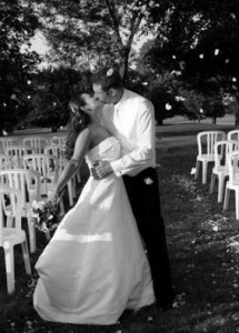
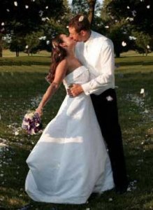
I copied the right side, flipped it horizontally and put it on the left side and under the top layer (you and DH). I then cut away the background on the left and moved the top layer (the one of you and DH and the real right side) over until you were in the middle of the "aisle". I then made a horrible attempt at rubber staming the chairs out and blending the trees in the background. You couldnt tell it from this, but i''m a pretty good with the rubber stamp. Too bad you cant send me the pic... i would be more than willing to help you.
tacori_thankyou.jpg
 
Date: 9/11/2006 11:09:48 PM
Author: kcoursolle
Number one is amazing...but I actually voted for number three. I like that you can see your faces in number three. However, number one is definitely an awesome picture, tough decision. Number two is definitely out because the other two are so beautiful and much more romantic.

Yeah, I wasn''t really impressed with #2 but thought I would throw it in there for fun. My veil looks so funny in that one. I have some blank 3.80 x 9.5 from my invites. Maybe I will print a few of the first one to send to out just for fun and the rest of the third.
 
Oh thanks njc! It does look better without those chairs. Maybe I will play around with it a little.
 
No problem... that picture is just way too fun to give up on!
 
I wish I could just e-mail it to you. I have been so lazy today
24.gif
 
Date: 9/11/2006 10:44:40 PM
Author: Tacori E-ring

Date: 9/11/2006 10:37:31 PM
Author: JulieN
3 is my favorite: you look great!

2 is my second choice, but I''m too much a product of Asian and Catholic upbringing for it to be something I''d (personally) use.
37.gif

Why is that?
Yes, I meant #1.
 
Date: 9/11/2006 11:31:17 PM
Author: JulieN
Date: 9/11/2006 10:44:40 PM

Author: Tacori E-ring


Date: 9/11/2006 10:37:31 PM

Author: JulieN

3 is my favorite: you look great!


2 is my second choice, but I''m too much a product of Asian and Catholic upbringing for it to be something I''d (personally) use.
37.gif


Why is that?
Yes, I meant #1.

Haha, I was wondering. We were just holding hands
2.gif
 
Black & White and centered. I like #1 the best then #3. Of course I like the color version as the bouquet is beautiful.

I wish I would have used the one without chairs. Maybe I'll give that a shot, but I don't mind the chairs.

TacoriThankYou_edited2.jpg
 
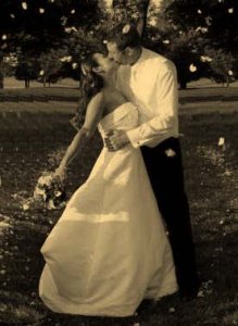
I like njc''s color version better, but I took her hard work and used the sepia setting.

TacoriThankYou_edited_edited.jpg
 
~~I like #3 the best...You two look sooo happy!!!
 
I love them all but like 1 best. Whimsical and spirited. I do not think you need faces, people know what you look like, and that one captures the essence of things. What color is your stationery? This would help with deciding black/white, color or sepia tones...
 
photo #1 is a terrifically romantic photo. NJC also made it even better without the chairs!
 
hard choice!

I absolutely love the one of you 2 kissing,
but the look on your faces in #3 is priceless,,


mmmm....if it were me i''d probably go with #1 because it is so romantic and seems to capture the moment- it''s a very fun shot

:-)
 
i vote #1.

you look a bit timid in #2
and in #3 i wish your husband was turned a little bit towards the camera.
 
congratulations on getting your pictures. isn''t waiting hard!

I''m torn as to which picture to recommend.

I love #1. I think it''s a wonderful shot that captures how happy and beautiful and in love you both were on your wedding day. i love the picture after njc worked her magic and removed the chairs. my only hesitation is that i can''t see myself sending such a close-up and exhuberant photo as a thank you. for me, i would want something just a bit more understated. maybe even if it was that shot, but taken from a further distance...

but that is wholly personal preference! it''s definately the best shot of the three
emstar.gif
and i think that changing it to a B&W might win me over.


btw: we did photo thank yous too. and it was a kissing pic (you''d think that all we did was kiss on our wedding day
2.gif
) everyone thought that it was a great idea as a thank you!
 
I like the chairs, plus if you think of what this picture is used for, a Thank You to those who were sitting on those chairs.
Kind of a reminder of their presence at the event...

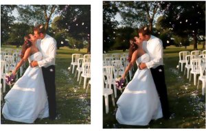
The first pic is just a slight "rotation" and brightening, the second "smart blur" and saturation...just 2 more looks

Beautiful couple!

TC_CH.jpg
 
I think Irina''s on to something here. Why don''t you make the photo an abstraction of real life - however you deem fit. That way you''re not hesitating about the details. Remember, it''s just a thank you card. The idea will be captured after 1 second of viewing and then the card opened up. It might even stay on someone''s refrigerator for a while.
 
They are all darling pictures.. But I like 1 the best for a thank you card!
 
#1! the others look too 'posed'in a way for a card front. i do like #3 in general though, but #1 for the card.
 
Date: 9/12/2006 9:45:39 AM
Author: Pricescope
I like the chairs, plus if you think of what this picture is used for, a Thank You to those who were sitting on those chairs.
Kind of a reminder of their presence at the event...

The first pic is just a slight ''rotation'' and brightening, the second ''smart blur'' and saturation...just 2 more looks

Beautiful couple!
Ooh, I like the smart blur one...feels like a wonderful, romantic painting!
 
oooh- I like njc''s new and improved version of #1!

You look lovely!
 
Thanks everyone! I contacted the photographer and asked if she had any more versions of the petal toss. She is burning those and a few other on a disk since they are really lo-res now. Hopefully there will be something perfect. My mom said she hoped these weren''t the best pictures. I like them but they didn''t wow me for sure. I agree maybe the chairs are good since that was where all the guests were sitting. I for sure am not going with #2. I just don''t think it is that great of a picture of either of us. I''ll keep everyone updated. Thanks again for all the suggestions and photoshop work!
 
#3 is my pick!!
 
Thanks everyone for your votes. My mom is sending me two CDs of pictures she picked up for me
36.gif
so I might have to re-do this poll once I have more options.
 
OK, even though this may not be a useful vote anymore, I SO love photo #1 once it was Photoshopped to remove the chairs -- love it love it love it!!!
 
I like #1
 
I voted for #2 because you can see both of your faces clearly, and you look so happy and NATURAL! #1 is incredible but somehow it just looks really staged to me. (to be totally blunt, sorry!) #3 is very sweet, but I can''t see your DH''s face.
 
I voted for #1 because it is just so joyful!!!!
I can''t wait to see the rest of the pics! You kept us waiting tooooooo long!
 
No. 1, with the flying petals, the kiss, it just looks like a spontaneous moment rather than posed for the photographer : )

I wish you well,

Bridget
 
At first I liked #3, but now I am leaning towards #1 with the cropping that NJC, and I love the B&W. I would love to receive that picture on a thank you card. Your wedding day was beautiful by the way!
1.gif
 
Status
Not open for further replies. Please create a new topic or request for this thread to be opened.
GET 3 FREE HCA RESULTS JOIN THE FORUM. ASK FOR HELP
Top