shape
carat
color
clarity

Announcement PriceScope Upgrade of October 7th

@psadmin Stemming from discussion in this thread: https://www.pricescope.com/community/threads/please-rethink-your-pricescope-privacy-options.252046/

Can you please advise what the various privacy settings/options in our profiles actually mean/show/don’t show? For example, what ‘details’ on my profile are/are not shown via that option? And what ‘identities’ are/are not shown?

I have all of mine ‘locked down’ for privacy because I’m not sure what some of those options mean (and clearly I’m not alone). As a result, it’s preventing members from also being able to view my past threads, which I don’t have a problem with, but not sure how I can allow my posts/threads to be visible while keeping everything else ‘locked down’ in the interest of protecting my privacy (see above question).

DISREGARD AS THE LINK DOES NOT WORK FOR ANYONE BUT THE MEMBER ... In the interim, I posted a link to my threads in my siggy;

Wasn’t sure if any of these are related to the recent forum updates, but figured I’d post these items here for awareness/visibility. Thanks! :wavey:
 
Last edited:
I was looking at the “Find your diamond” link and I noticed that blue Nile diamonds are not showing up. Do you know if it’s due to maintenance activity or as per the plan?
 
I was looking at the “Find your diamond” link and I noticed that blue Nile diamonds are not showing up. Do you know if it’s due to maintenance activity or as per the plan?


We are currently experiencing Datafeed issue with Blue Nile and working to fix soon.
 
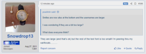
Smiles are now also at the bottom and the usernames are larger.

I was wondering if they are a bit too large?

What does everyone think?
 
Smiles are now also at the bottom and the usernames are larger.

I was wondering if they are a bit too large?

What does everyone think?

I like it.

But my eyes are challenged with small print so large works well.
 
Smiles are now also at the bottom and the usernames are larger.

I was wondering if they are a bit too large?

What does everyone think?
They are large (and that’s ok) but the rest of the text font is too small! I’m peering thru my varifocals...........
 
They are large (and that’s ok) but the rest of the text font is too small! I’m peering thru my varifocals...........

Can you adjust the font? On my MacBook I hit view and then Zoom In and that makes the font larger.
HTH.
 
Thank you @psadmin for working to address some of the finer points on the system.

On the smilies, I see they are now on the bottom if I click on them. Is there a way for the USER to define them as the #1 spot on the left (instead of My Favorites) so that we don't have to click on them each time we want to use them?

Also, do you want them as "Smiles", or "Smilies" or "Emojis" or "Emoticons". Haha, seems simple enough right, but I think we all refer to them a little differently.

Also, is it possible to update the smiley section? The ones that used to be on top prior to the update seemed to be a newer style I did like. Those are gone. It seems to have been replaced with the more common smartphone style emoji's. I'm sure you could go down a rabbit hole quick with trying to figure out which ones should stay and which should be deleted. Some suggestions, not that you asked...

1571680738167.png
yes.gif
beatdeadhorse.gif
1571681032814.png
beer.gif
drink.gif


e-needpics.gif
 
Oooh, I really like that you've put it at the bottom but also kept it at the top! Great idea! Actually even within this message I've been using both options depending on where on my screen I am so it's perfect for me, at least! :appl:Thank you!

My understanding is that the majority of people know 'Smiles' as 'Smilies'? I've just looked on Wikipedia and it agrees with me. They are each called a Smiley and the pleural is Smilies. :bigsmile: I would much prefer it be called 'Smilies' on that tab because I think that makes it really clear what that tab is for.

What does everyone think?

As for the text - I'm on my phone and the usernames are a bit too big for me, but I think it's the disparity/disproportion between the very large usernames and reasonably small general text that is making me feel that way. As people are mentioning, there are a lot of people who would appreciate larger text in general, so perhaps the general text could be a bit larger? That would make the disproportion less obvious and the usernames then may not seem so large!

Thanks again for all the hard work you are continuing to put into this!

:D

ETA @sledge posted at the same time as me - I think lots of people understand the term Emoticons too. I would prefer either Smilies or Emoticons.
 
Thank you @psadmin for working to address some of the finer points on the system.

On the smilies, I see they are now on the bottom if I click on them. Is there a way for the USER to define them as the #1 spot on the left (instead of My Favorites) so that we don't have to click on them each time we want to use them?

Also, do you want them as "Smiles", or "Smilies" or "Emojis" or "Emoticons". Haha, seems simple enough right, but I think we all refer to them a little differently.

Also, is it possible to update the smiley section? The ones that used to be on top prior to the update seemed to be a newer style I did like. Those are gone. It seems to have been replaced with the more common smartphone style emoji's. I'm sure you could go down a rabbit hole quick with trying to figure out which ones should stay and which should be deleted. Some suggestions, not that you asked...

1571680738167.png
yes.gif
beatdeadhorse.gif
1571681032814.png
beer.gif
drink.gif


e-needpics.gif

Hi @sledge if you go to this thread you can find more smileys. It is an extra step but fyi.


and yes definitely this one is a must
e-needpics.gif


and is included in the emoticon thread.
 
Hi @sledge if you go to this thread you can find more smileys. It is an extra step but fyi.


and yes definitely this one is a must
e-needpics.gif


and is included in the emoticon thread.

Yeah, I've got that bookmarked.

The issue I have now that @psadmin hasn't yet fixed is you can't simply cut & paste an animated GIF from one one source to another. When you do this (simple operation) the new system make it complex and creates a new STILL image in PNG format. You can do the drag & drop method, but that's not realistic IMO. Other option is to right click, hit copy image address then click the image button up top, paste in the address and they enter right.

That's clunky. It's functional. I'm not griping. But it needs fixed. Then I'd be cool with copying & pasting from elsewhere.

That said, I still think there is some value to updating and adding a few extra smilies.
 
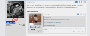
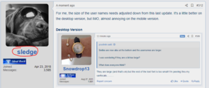
For me, the size of the user names needs adjusted down from this last update. It's a little better on the desktop version, but IMO, almost annoying on the mobile version.

Desktop Version
Capture99.PNG

Mobile Version
mobilecap99.jpg


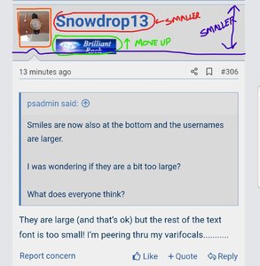
Also, the more I see this the more it becomes obvious some updates of the badges, titles, etc needs to be considered. Below is a markup of the mobile version to identify some issues that could be addressed to make it better.

Red = Make user name text smaller

Green = With user name size changed, the Brilliant Rock logo should naturally shift upwards a bit. It may be necessary to zero out your pad spacing to make it fit closer though, so you don't see so much of a gap.

Also, is this where it makes sense to go with a simple text title, as Brilliant Rock instead of the old badges? If text only, make it contrast. Lighter blue that doesn't blend with grey too much, but offsets the darker blue nicely.

Orange = Depending on the final decision of the badges/titles, adjust the size of the user icon on the mobile version so the bottom of that image aligns with the bottom of the badge/title. In the example below, it appears to need to increase in size.

Purple = The above changes working in combination should reduce the vertical height of the username header. When scrolling on a mobile device I believe that is an important factor as it helps you navigate quicker and easier.

I didn't mark up a desktop version, but you'd want to use similar logic with logos, usernames, titles/badges to help lessen that vertical space as well. Oddly enough, while I feel the user icons are too small on the mobile, I feel they are too large on the desktop version.

Inkedmobilecap99_LI.jpg
 
I noticed another small glitch.

After posting the above comments, I realized the username font size went back to the old size. Hitting CTRL+R for a refresh brought it back to recently updated larger size.

Probably a cache setting you need to modify.

After Posting:
Capture98.PNG


After Posting and Hitting CTRL+R:
Capture98r.PNG
 
Can you adjust the font? On my MacBook I hit view and then Zoom In and that makes the font larger.
HTH.
I’ll give that a go! Thanks Missy
 
Thanks for the update. I will see what we can do.
 
Yea, I think the user names need a slight downsize. :???:
068EEA13-4C20-416E-8439-A333F3353EB1.jpeg
 
I noticed another small glitch.

After posting the above comments, I realized the username font size went back to the old size. Hitting CTRL+R for a refresh brought it back to recently updated larger size.

Probably a cache setting you need to modify.

After Posting:
Capture98.PNG


After Posting and Hitting CTRL+R:
Capture98r.PNG

This should be fixed.
 
The search page no longer works properly. You can no longer search for titles of threads by a single keyword.
 
The search page no longer works properly. You can no longer search for titles of threads by a single keyword.

Will look at it.

Thanks for letting me know.
 
@psadmin
Yup, much easier if the admin can fix it.

I looking into it, but it is not as simple as it seems.

The current workaround is: select the emoticon, copy it and paste it. This will work.

If you right-click and copy it then it does not work.

I tried this on the old system and this seems to be the same.

So looking for the best solution.
 
@psadmin Stemming from discussion in this thread: https://www.pricescope.com/community/threads/please-rethink-your-pricescope-privacy-options.252046/

Can you please advise what the various privacy settings/options in our profiles actually mean/show/don’t show? For example, what ‘details’ on my profile are/are not shown via that option? And what ‘identities’ are/are not shown?

I have all of mine ‘locked down’ for privacy because I’m not sure what some of those options mean (and clearly I’m not alone). As a result, it’s preventing members from also being able to view my past threads, which I don’t have a problem with, but not sure how I can allow my posts/threads to be visible while keeping everything else ‘locked down’ in the interest of protecting my privacy (see above question).

DISREGARD AS THE LINK DOES NOT WORK FOR ANYONE BUT THE MEMBER ... In the interim, I posted a link to my threads in my siggy;

Wasn’t sure if any of these are related to the recent forum updates, but figured I’d post these items here for awareness/visibility. Thanks! :wavey:


I still need to look it very carefully.

The goal is to remove things like if you are on or what you are currently viewing. We will remove the choices that are from the list that make no sense. Some are just left behind from the standard platform.

We really can not remove to search by you or see all your posts/threads as anyone can just use Google.
 
I looking into it, but it is not as simple as it seems.

The current workaround is: select the emoticon, copy it and paste it. This will work.

If you right-click and copy it then it does not work.

I tried this on the old system and this seems to be the same.

So looking for the best solution.

I use keyboard commands more than right clicks, so I can't comment about the old system and right clicks.

I did use CTRL+C and CTRL+V to copy and paste animations in the old system and don't recall it being an issue. When I do this on the new system, it behaves just like right clicking and creates a non-animated PNG file of the original.

The only way I can currently "copy" animated GIFs is to drag and drop, which is just annoying at best. Or to grab the image URL and use the image embed button in the edit screen.

It works. Both methods seem painfully slow and deters me from using them.
 
This is a minor thing and I apologize if it's been asked already...I have "show your current activity" unchecked in my privacy settings but when I click on my user name it still gives that information...I would prefer that that information not be shown.
 
This is a minor thing and I apologize if it's been asked already...I have "show your current activity" unchecked in my privacy settings but when I click on my user name it still gives that information...I would prefer that that information not be shown.

It will be removed.
 
Scratch that seems there is another way to view it. We will have this removed.
 
Why so many spam threads now? There are 7 at the top of RockyTalky right now. Seems worse since the upgrade.
 
GET 3 FREE HCA RESULTS JOIN THE FORUM. ASK FOR HELP
Top