shape
carat
color
clarity

Sapphire setting CADs

indigoblue

Shiny_Rock
Joined
Dec 7, 2012
Messages
344
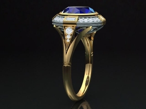
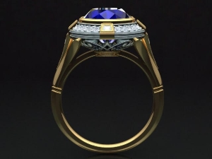
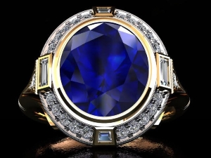
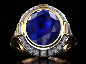
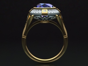
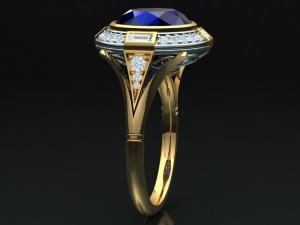
I've been in contact with Caysie at CvB Inspired Design about creating a setting for my 10x9 roval sapphire. I am NOT artistic at all, so after giving her a few inspiration photos, here's her first design. It looks great to me, but since this is my big opportunity to make changes, I feel almost obligated to make some. haha! I'm not a huge milgrain fan, but if it complements the stone and setting, it's fine with me. And there seems to be a whole lotta tiny little prongs. What are other options for those diamonds in the halo?

What do you think?
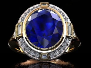
cvb1a.jpg
cvb1b.jpg
cvb1c.jpg
 
It's gorgeous! The milgrain is so fine that I think you'll only notice it when you scrutinize it up close.
 
What a gorgeous design!!! What are the specs of your sapphire?

The milgrain looks super fine. It will be a very subtle look.
The prongs around the diamond melee indeed looks big. This is probably due to the CAD, but I would ask Caysie about it.
 
Gorgeous setting! I think the milgrain looks great (but unlike you, I am a fan).

I agree - ask about the prongs...they appear darker in the cad so maybe that is what makes them stand out.
 
If the prongs are bothering you on the diamonds maybe they could be channel set--keeping the same gold combination of white gold on the diamonds and yellow gold everywhere else??
 
What a beautiful setting. I'm a big fan of milgrains :love:
 
CAD often makes the prongs heavy looking.
This is because the program places them in their unset form, leaving them solid and flat.
Once set they are cut down the inside edge to fit the diamond, then pushed over the diamond and beaded down into a slightly rounded dome, the gap between the prongs is widened slightly with this process making them separate and finer looking. And they will be shiny and polished.
You are also looking at it enlarged to the size of a bangle. If you can print it out at home try shrinking it to actual size, cut it out and bend the band section down, then place it over your finger.
 
Gawd that looks gorgeous!
 
Thanks for the replies. The sapphire is 9.97 x 8.92 mm 4.88ct oval. I tried to start a thread on it last summer. [URL='https://www.pricescope.com/community/threads/want-to-set-two-stones.223819/']https://www.pricescope.com/community/threads/want-to-set-two-stones.223819/[/URL]

She explained about the prongs and said that when it's finished, they wouldn't be noticeable, and all I'd see would be sparkly diamonds. She will also get another CAD sans milgrain just so I can see what it would look like, but I'll probably go with the milgrain. I guess the milgrain makes all of the angles appear even sharper. I'd like to see it with softer looking yellow gold just for comparison.

I also sent her that garnet, but this setting is costing about a third more than I was hoping, so the garnet may have just gotten a free ride to California and back. I can just put it in a stock 14k yg pendant setting.
 
If you aren't into milgrain, I think it would also look gorgeous without it, just more sleek and modern. Which is a look I quite like! I actually think not having milgrain would look better with the baguettes.

I'd leave the tiny prongs alone - with CVB doing this I'd think they know what they're doing and they're not going to be noticeable.

This ring is going to be a stunner :love: :love:
 
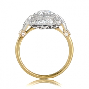
What would it look like if the basket angled out toward the split shank instead of angling in toward the donut? I've decided that it looks a little too much like a flying saucer perched on top of the supports. I don't want something that looks too top heavy. I like the setting as it is, but I need the nomenclature (and the courage) to ask for alterations so I can see if something else looks better to me. Does anyone have any pictures that demonstrate what I'm trying to say?
 
How beautiful!!!! I might start setting as well.
Congrats to such a nice color and design.
Pompous in the very best sense of the word!!!!!
 
indigoblue|1479099213|4098062 said:
What would it look like if the basket angled out toward the split shank instead of angling in toward the donut? I've decided that it looks a little too much like a flying saucer perched on top of the supports. I don't want something that looks too top heavy. I like the setting as it is, but I need the nomenclature (and the courage) to ask for alterations so I can see if something else looks better to me. Does anyone have any pictures that demonstrate what I'm trying to say?

Congratulations on your CVB project indigoblue!
I am in a similar situation as you- looking at a CAD and fearing the UFO- ish profile. Different designer, though.
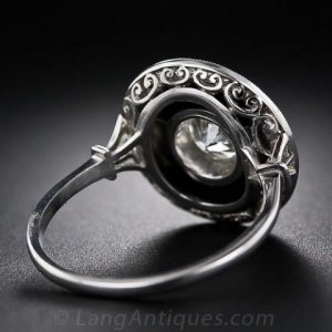
I initially wanted to see additional CAD's that incorporated something like these under galleries instead:


But they would not work with the pieced onyx surround I want..... Soooooooo ....I'm back on faith!

Have you looked back at LadyMCH's thread on her CVB ring? Look at the profile shots of the CADs and actual ring. I think that might help you. (I hope I got her name right) her inherited grandmas LARGE fancy yellow OEC from a few months back?

I think your ring will be gorgeous! Hope you post more on the ride through and the finished product.

_1502.png

_6270.jpeg
 
The more I think about it, I'm afraid that widening the basket might make it look like a class ring. I'll probably go with CvB's design and trust her judgement. But I still want to see it without the milgrain just to be sure.
 
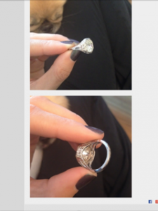
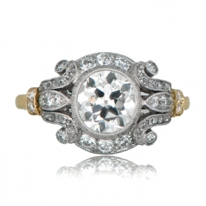
This is a picture I saved a while back and sorta forgot about until last night when I ran across it again during a web search. This is what I mean about widening the gallery, although the depth of the sapphire may prevent me from doing it exactly like this. And here's the side view again for comparison.

11409-estate-ring-sv.jpgcvb1c.jpg

And the other view. The diamonds in the split shank would be more visible too.
11409-estate-ring-tv.jpgcvb1a.jpg
 
Which do you prefer? With or without milgrain around the stone and tapered diamonds?

cvbsansmilgrain.jpg
cvb1a.jpg
 
Any updates indigoblue?
 
Good call to update this thread - hopefully the OP is sporting a beautiful new sapphire ring now!
 
We sorta took a break over the holiday season and quit working on it. Since this is not a rush job, I told her to concentrate on her Xmas orders. She contacted me on Thursday and said that she's been thinking about it but is having a hard time incorporating the changes. The stone is so deep (which elevates the ring) that she's having trouble making the changes to the shoulders that I requested.

My concern is that the ring sits up high and the shoulders have a slight concave slope to them. This seems like it would make the ring less stable and more likely to move back and forth on my finger. I usually keep my rings centered by closing the two fingers on either side so that they touch the shoulders of the ring. If the shoulders are concave, it's a little harder to keep the ring perfectly upright on my ring finger. Does that make sense?

What if she bumped them out slightly so that they were just a little convex instead? Would it look better or worse if you could see more of the shoulders when looking at the full frontal view of the ring? The CADs don't show a perfectly centered shot from the top, but it doesn't look like you can see much of the shoulders except from the side views. Opinions??

We're going to put sizing beads in the band, so that will help with keeping it upright on my finger.

I think I like it better without the milgrain. Maybe my perception of milgrain is flawed, but it always looked to me as though it was intended to fool the eye by trying to simulate diamonds. So when I see milgrain, my mind says "cheap setting." ha!

Do any of you have settings similar to this where the shoulders have a concave slope and the stone sits up high? Pictures? Do you like this feature? I'm really torn. I think it will be a spectacular setting, but I'm spending a wad on this, and I want to LOVE it.
 
Well, I'll probably just go with the one without all of the milgrain and hope I like it.
 
indigoblue
In reply to your question in my other thread:
I think you should go with the milgrain.
And I would not channel set the small diamonds. I'd leave them as they are.
The milgrain is very fine as the posters up thread stated. Tiny.
Would I have my local jeweler do the milgrain? Absolutely not. It would look like you fear. I had the same fear, but mine (of course not by CVB) is super tiny fine.
But- it will look equally attractive without it- that's how nice CVB's work seems to be.
As for it wearing off- with daily wear, what are we talking about ---40 years?
Gold, I'm not sure how much shorter it would be, but still. And again it's with daily wear receiving friction on the top of the ring. I for sure do not plan on wearing mine whilst doing chores or working.
I'm sorry the belly of your stone will not allow you to set it as low as you may wish.
But - I think with the money involved in this project you really need to love it. In real life the setting as is may turn out to be everything you wanted.
With that said- I think you should contact CVB and ask if she possibly has any empty mounts she can send you with some of the design elements you have questions about. And you can put on a ring that will mimic the height. Or - cast your cad in silver. Or cast one she already has in silver- I dunno.....
This , of course will not be free, but I think it's worthwhile to invest the fraction of the cost of the total product for peace of mind and to get what you truly want. I like that learning curve better than forging ahead and having mounting regrets.
Best wishes
 
How high is the setting vertically off of your finger and how much will the stone add to that?
Before I made changes, it would total out to be 10 mm plus change.
After the changes I wanted it is 8.3 with the stone. To me 2mm made the world of difference. I guess stating it would be "unwearable" at 10mm+ was a bit of an exaggeration.
I know you are in a different boat- this is just a side note.

Have you gone thru any of the threads that show cvb CAD's, tweaks, and final product on the hand yet?
 
Thanks so much for the comments. CbB hasn't contacted me lately so am still waiting on the changes we discussed a couple of weeks ago.

The milgrain will probably complement the bezel quite nicely. It's just not one of my priorities. And the prongs are staying. After hearing all of the explanations, I'm sure they will look just fine.

The stone is 4.88 deep, so I can't imagine that the ring will be much over 6-7mm high. It looks like she has it set as low as possible. And seeing an empty mount or having it cast in silver is a good idea, but I'll probably just trust her judgement. The sizing beads should keep it upright on my finger.

Still waiting for more CADs with the shoulders bumped out just a tad so that they're not concave.
 
I love the design. Can't wait see the ring.
 
We're still working on the revisions. The latest is no milgrain at all. It's my favorite. I just do not think that the milgrain complements (or completes the look of) the setting. Or maybe my eye just does not like the extra "busy-ness" that the milgrain adds. I prefer the sleek, shiny look of the setting without it.

cvb_cindy_halo_-_cindy-v3_-_no_millgrain_03.jpg
cvb_cindy_halo_-_cindy-v3_-_no_millgrain_02.jpg
cvb_cindy_halo_-_cindy-v3_-_no_millgrain_01.jpg
 
Indigoblue - I love this version of the CAD. I like it better without the milgrain as well. It gives the ring a very streamlined Art Deco appearance.
 
Poodles4me|1486581531|4126096 said:
Indigoblue - I love this version of the CAD. I like it better without the milgrain as well. It gives the ring a very streamlined Art Deco appearance.

I have to agree, and I'm one of the biggest milgrain fans on earth haha. I think that with everything the ring has, the milgrain makes it almost too "busy", and this version is sleek and streamlined in a way I find gorgeous.
 
lovedogs|1486585697|4126138 said:
Poodles4me|1486581531|4126096 said:
Indigoblue - I love this version of the CAD. I like it better without the milgrain as well. It gives the ring a very streamlined Art Deco appearance.

I have to agree, and I'm one of the biggest milgrain fans on earth haha. I think that with everything the ring has, the milgrain makes it almost too "busy", and this version is sleek and streamlined in a way I find gorgeous.

Thanks!

Also the shoulders have been bumped out just a tad so that they are not quite as concave as they were in the original design. I'll probably go with this version. This process has been dragged out too long. I'm ready for a ring.
 
I stumbled across this thread and wanted to tell you how beautiful I thought your design is. Do you have a completed ring yet?
 
And I wanted to ask: Is the color real?
 
GET 3 FREE HCA RESULTS JOIN THE FORUM. ASK FOR HELP

Featured Topics

Top