shape
carat
color
clarity

Setting Suggestion for Garnet

Status
Not open for further replies. Please create a new topic or request for this thread to be opened.

Barcelona

Shiny_Rock
Joined
Jan 23, 2009
Messages
202
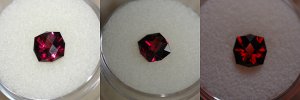
I have a tanga garnet in the same cut as Babyblue033''s red zircon below:
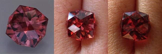
zirconcompare.jpg


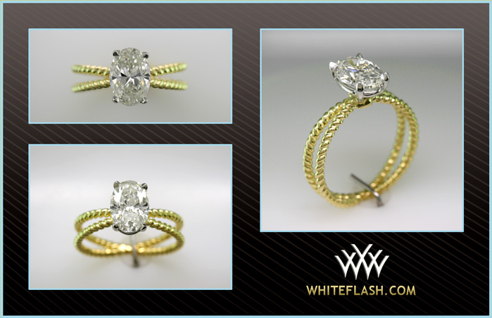
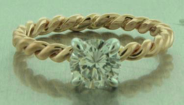
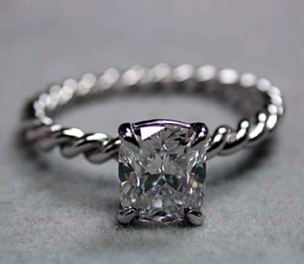
The garnet is a great red/raspberry color, but can appear dark in some light situations (mainly compact fluorescent which my house is filled with!) so I''m looking for setting suggestions that will compliment the interesting cut while not darkening the stone. These were some settings I was thinking of, but I''m open to any suggestions:
Flat%20Angle.JPG


ropesolbdj.jpg


Ronda208.jpg
 
If you don''t want the stone to get any darker than it already is, avoid strong tonal contrasts, such as that of dark red with white metal. Since you''re obviously into more modern designs, I''d suggest going with yellow gold, preferably of higher purity (18k or above). As to the setting, are you sure you''d only want a ring? We discussed these "strange/pointy/cornerish" shapes on quite a few occasions and the conclusion is that it''s best if they''re set as pendants, for security/longevity reasons. With all these corners and tips it would be quite easy to damage the stone, especially in a more open setting, which this stone requires due to it''s darker tone. Take your time and think carefully.
 
Thank you for your response ma re. You make a good point about the contrast of color vs. metal. I''m not a big fan of necklaces though. But I am concerned about the corners/points of the stone. However, this ring would probably only be worn once or twice a month, but then again "it only takes one time".
 
Is your stone the same size as the one pictured? If so, you''d probably get a fair bit of finger coverage and you may not even see much of the band. I might rule out the double band if that''s the case.

Maybe 6 prongs would help protect all the corners.
 
There's a possibility to set it lower than the rest of the ring in sort of a square "ditch", which would protect it more (even if it stays in prongs), but I'm not sure how many of such stock settings even exist - i.e. it would probably have to be custom made.

Edit: Good suggestion on six prongs, Kismet
2.gif
 
Just to follow up on your comment about the garnet looking dark under compact fluorescent lighting. Last year we stayed in a hotel and the compact fluorescent lights in our room completely lacked the red portion of the color spectrum. All reds turned brown, whether it was my stunning Burmese ruby, our red clothes, or the border of the Time magazine cover. It was so hideous that my husband said we would never, ever have those in our home. We are moving towards daylight incandescent bulbs to try to get a truer color spectrum. BTW, our daughter is an artist, so accurate colors are vital to her work.

Beautiful garnet, BTW. Just want to say that turning brown under your home lights will probably happen to any stone which is reddish in color.
 
How about something like this lotus setting?
https://www.pricescope.com/community/threads/moonstone-e-ring-and-band-set.101388/

Here is the Ebay store page and she''s on Etsy now too. Lots of delicate settings in her store.
http://stores.ebay.com/Heart-of-Water-Jewels/About-Us.html

She''s very nice as well.
 
Kismet, the stone is 8x8 so yes, it will cover quite a bit of my finger. And thank you for the 6 prong suggestion, I think that should help with protecting it.

ma re, I was planning to go custom anyways so I will definitely consider that. I know the top 2 rings I posted are both custom from Quest and the WF one actually looks very similar to a Adwar setting. But I haven't come across many stock settings with that band type.

Fly Girl, I guess I've never noticed since my house is mostly cool shades or dark woods and this is my first warm colored stone, but not my last! Time to change the bulbs! That's actually a photo of Babyblue033's red zircon, but has the same cut as mine, Britt's Antique designed by Jeff Graham.

innerkitten, very pretty setting! I'll have to take a look at her Etsy page.
 
How about setting it on a diagonal as well with the prongs on the flatter sides. That would be interesting.
 
Date: 4/3/2009 3:32:39 PM
Author: tourmaline_lover
How about setting it on a diagonal as well with the prongs on the flatter sides. That would be interesting.
It''s doable but then the pointy tips are even more exposed?
 
Barcelona I love those settings. May I ask where you got them from? I have looked on the whiteflash site and can t see them anywhere. They are just beautiful, esp the yellow gold one.
 
Forgive me if I am wrong, please! But there are 8 points on the stone, so wouldn''t six prongs expose more points since the prongs would have to be spaced between the points of the gem? What about 8 prongs? Or is that too much metal? A bezel setting similar to the LOGR that allows plenty of light underneath? Its a gorgeous rock no matter!
30.gif
 
tourmaline lover, I think that would be doable if I did something like one of Gelin Abaci''s diagonal tension settings. I think Chrono is right though that a prong setting might expose the points more if set diagonally.

mousey, those rings are all custom. The top 2 are designed by Quest and the bottom was designed by WF to look similar to David Yurman. I believe it''s owned by woobug02.

ilovesparkles, I was thinking that you''d put prongs on 6 points, leaving only 2 exposed. That might look really off though - I have a hard time visualizing it.
 
Here some very quick shots.

tangabrittantique.jpg
 
Six prongs would indeed leave two tips open, but if those would be pointing north and south there wouldn''t be too much risk of damage to them. Bezeling would probably be tricky to do, due to an unusual shape. Stone might even get damaged in the process.
 
Status
Not open for further replies. Please create a new topic or request for this thread to be opened.
GET 3 FREE HCA RESULTS JOIN THE FORUM. ASK FOR HELP

Featured Topics

Top