shape
carat
color
clarity

Starting the chrysoberyl ring

packrat

Super_Ideal_Rock
Joined
Dec 12, 2008
Messages
10,614
Got sketches from Chris at myheartmonster this morning for my round yellow chrysoberyl ring. 1 and 2 are my favorites, and I'm fairly certain I'm going w/#1. Wanted to show them b/c it's fun to see the different stages and I'm excited!

get_convo_image.jpg
 
packrat ~

Thanks for sharing. I like the first sketch as well. The two-tone 'extra' and shape sold me. :) Have fun with it!

~ faegrace
 
Even before I read the end of your post, I thought, 1.
 
Thanks guys! Yeah, when I clicked on the picture to look at it this morning I was just immediately drawn to #1. I'm interested to see how she does the top down view. She said she'll start as soon as I chose this part!
 
Packrat - does your chrysoberyl has a thread? I do not remember the stone itself...
 
I'm really loving the direction you're going with this setting. Please keep updating as you go through the process!
 
Pretty stone. Appears a strong color-changer, too.
 
packrat|1301179026|2880865 said:
Got sketches from Chris at myheartmonster this morning for my round yellow chrysoberyl ring. 1 and 2 are my favorites, and I'm fairly certain I'm going w/#1. Wanted to show them b/c it's fun to see the different stages and I'm excited!
I'm trying to understand what the drawings are showing. It appears to me that #1 and #3 are the same except #1 has a gold piece under the head. #2 and #4 will sit lower than #1 or #3, since the head goes down to the finger. The only difference between #2 and #4 is how the side arches meet the hoop of the ring, with #4 looking a bit more filled in to me. I'm curious if I'm missing something here.

I like #3, which is the same as #1, but keeps the two metal colors separated a bit more. I do like the two color look.
 
3 and 4 are a little more blocky, 1 and 2 are a little bit more tapered, but yeah, that's pretty much it. Slight differences is all.
 
packrat|1301268098|2881407 said:
3 and 4 are a little more blocky, 1 and 2 are a little bit more tapered, but yeah, that's pretty much it. Slight differences is all.
o.k., are you looking at the bottom of the shank, where 3 and 4 are curved on the bottom, and 1 and 2 are flat? In that case, I definitely prefer #3, but then I should admit that my e-ring has that exact shape. It fits nicely along the palm of the hand, and the euro shank does help with spinning issues.
 
I prefer 2.
 
Thanks PT--2 is awful close..I've gone back and forth a few times.

FG, nope, I didn't even notice that at all and I've stared at them for a long time, deciding. It's like one of those brain teasers where one picture is slightly different than the other and you have to pick out the differences. I never would've caught on to that if you'd not pointed it out. I'll ask her about it. I wonder if the more tapered would still spin??
 
packrat|1301275878|2881500 said:
Thanks PT--2 is awful close..I've gone back and forth a few times.

FG, nope, I didn't even notice that at all and I've stared at them for a long time, deciding. It's like one of those brain teasers where one picture is slightly different than the other and you have to pick out the differences. I never would've caught on to that if you'd not pointed it out. I'll ask her about it. I wonder if the more tapered would still spin??

Having had a euro shank like 3 and 4 for many years, I developed a habit of feeling for the bottom corner with the thumb of the same hand and straightening the ring up. Kind of miss doing that with totally rounded shanks.
 
1 seems more elegant and fluid than the rest. A good choice.
 
Nice designs, very sleek and modern. I think I like 1 the best as well. Just curious, do they all look the same from the top down?
 
Thanks Chrono and Kismet! I think I'm going to ask about 1 spinning, just to make sure. Kismet, I've not seen any sketches yet on the top down view but I would guess it would be the same on all-will be like the Maevona Ensay top down view only in yellow gold.
 
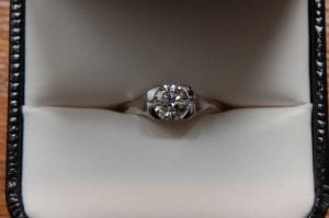
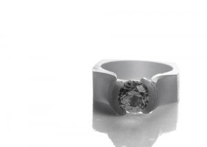
Got wax pics this morning. Thought I'd get some help looking at them. One thing on first glance is I don't see the flared out part of the bezel like the MaeVona Ensay. That's the only thing I don't see tho. Any thoughts or opinions of anything I need to look at or change?

This is what she said about the pics: There are several things that still need attention. I'll be truing up some of the edges yet and there is still quite a bit of fitting to be done in general. The center portion (that part that will be yellow gold) was made separately and as such it is just floating in there for the sake of the photos so if it looks a little off center it is because there is really nothing to hold it in place properly. It was especially tricky to get it to lay in there right as the photo lights make the wax soft and more flexible. So don't fret about that as it will not be slightly askew once it is metal. I will be taking quite a bit off of the stone setting portion as well so it still looks a bit heavy and uneven at the moment. The inside edges have yet to be softened, once that is done it will not be so sharp and as such will be much more comfortable to wear. Once the ring is metal the part where the two pieces (silver and gold) meet at the top will be filed to a smooth transition so the little ledge you see now will be gone.

mhmprofile.jpg

mhmtop.jpg

maevonaensay4.jpg
 
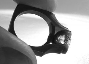
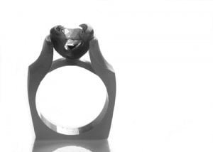
Got refined wax pics last week. Chris said it would be about 2 weeks before completion as she's gotten super busy. The flare/split in the semi bezel isn't on the wax b/c she said the wax isn't up to all the carving-once the ring is made she'll fashion the semi w/the flare/split. She thinned the shank down for me so it's not as wide as it was in the other wax pics.

revisedwax2.jpg

revisedwax.jpg
 
Looks so interesting! Can't wait till these two weeks are gone!
 
Thanks Crasru! I know it's not everyone's cup of tea but I'm awfully excited!
 
GET 3 FREE HCA RESULTS JOIN THE FORUM. ASK FOR HELP

Featured Topics

Top