shape
carat
color
clarity

Victorian repro splendour from Black Opal Direct, M'sOpalWorld, and CvB - B&W opal/OEC earrings + bracelet

I love opals - in fact, my first piece of jewelry that I chose and wore for many years was an opal ring. Your opals are the crown jewels. They are exquisite, fabulous. I should be getting ready, but I am just mesmerized by this thread.

OMG they're so lovely. I thought the earrings were stunning to begin with, and I have never been a person who matches things - my sister for years described me as the one who wears plaid with stripes - and yet once the new black opal was brought to its rightful home, those earrings soar. They ascend the firmament.

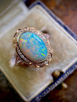
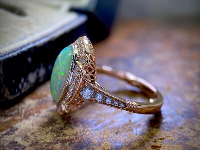
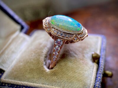
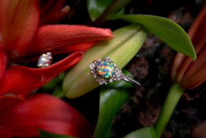
The ring is gorgeous. The rose and white gold bring out the subtleties of the fire. And on your hand, wow!

But the bracelet. Those two stones (it's hard for me to think of opals as stones - they look more like living things) in the Cora are so wonderful. Something about it just speaks to me. (That's not me, looking for Cora on CVB's Instagram. Not when I have grading to finish. Absolutely not.)

If we ever have a GTG here on the east coast, I will come a very long way to see any of your collection!
@empliau I waited until today to respond to your post because I wanted to be sure I wasn't going to be distracted with work whilst thinking about everything you've written.

Thank you so much! For both what you've shared and the way you describe your thoughts :love:

So I'm kinda the opposite. Both pearls and opals, I loved neither on first meet & greet. Too quiet, too subtle, not flashy enough - I remember telling my husband that I wanted gemstones that would be "aggressively in-my-face". Like diamonds, diamonds are my first love. But somehow, over the past few years, I've reached a point where I will happily climb mountains for perfect peals and opals but I wouldn't put nearly that much effort into those in-your-face options. Some people are like you, they know a good thing right when they first see it - others like me have to grow into it but we get there eventually :bigsmile:

I'm wearing paisley on the bottom and stripes on the top right now and I've been informed that it's an eyesore :lol: Actually back when I first had the earrings made I did think about alternating the stones - black top and white bottom, white top and black bottom. Would have hidden the mismatched blacks much better. But that just felt too easy, y'know? I really wanted one white earring and one black earring, it would always have felt like too much of a compromise. Well - I mean, I guess I ended up doing a partial remake anyway so I wouldn't have lost anything trying it, but...

OMG I love the Cora halo so much :love: I thought about having the ring made as a Cora!! But Cora needed too much width for that stone on my finger - the horizontal curve wouldn't have looked right. Would work great for a smaller stone or a bigger finger though!

I'm at opal peace for now. I'd like a glorious crystal one day but I can wait for that. No rush. If we meet one day I'll be sure to bring them all to play ❤️
 
I really appreciate reading your meticulous and inspired adventures creating with genius artisans! Your visionary collection is marvelous. Thanks for once again sharing.
You're so kind, thank you!!

This project has just… Been a WIP for so long… It feels surreal to cross it off my list!

OMG. I'm so dang happy with these earrings. I know they aren't the most expensive pieces and they aren't the world's most spectacular opals but they're all mine and whoever said that when you work and wait for something you appreciate it more, they were spot on, I definitely do. There are a few pieces that I look back on and think "I wouldn't buy those today", these are *not* on that list.

But all that said - can I just say that I’ve had enough of multi-year projects to last me a lifetime. No more. They're stressful!!
(First world problems I know) :bigsmile:
 
So gorgeous—there’s enough brilliance and color play in these stones to light up an entire cityscape! Enjoy these beauties this holiday!
 
OMG. I just love all of these pieces but the earrings in particular!!! It would be great to see some everyday shots of what they look like irl rather than showing at their highest possible contrast.

if you are willing to share I am really interested to know what body tone grading and brightness grading the black opals have. I have been looking at their website from time to time but just a bit nervous to select a piece online.
 
So gorgeous—there’s enough brilliance and color play in these stones to light up an entire cityscape! Enjoy these beauties this holiday!
Thank you so much!! I'll be wearing them to my family dinner tomorrow :bigsmile:


OMG. I just love all of these pieces but the earrings in particular!!! It would be great to see some everyday shots of what they look like irl rather than showing at their highest possible contrast.

if you are willing to share I am really interested to know what body tone grading and brightness grading the black opals have. I have been looking at their website from time to time but just a bit nervous to select a piece online.
:love: Thank you!!

So the earrings photos, those are the nicest that they look in those specific lighting environments, if you know what I mean. I ended up taking a couple hundred photos, took a bit to sort through :lol: No editing besides cropping and all taken with a camera, and I let the camera white balance for me with a grey card (that I cropped out). I normally do white balance by hand but I was running low on camera battery and I'd have lost my sunlight waiting for recharge :cool2:


Info on the opals is scattered all over this thread... Lemme find...

The big black on earring bottom is from Black Opal Direct
1.76ct, Lighting Ridge
Body tone: N4
Brightness: B4
Predominant colours: Red
Direct link: https://www.pricescope.com/communit...nd-cvb-b-w-opal-oec-earrings-bracelet.250000/

The small black on earring top is from Black Opal Direct
Bought at 0.52ct but recut smaller, Lighting Ridge
Body tone: N4
Brightness: B4
Predominant colours: Blue, red
From Black Opal Direct
Direct link: https://www.pricescope.com/communit...-earrings-bracelet.250000/page-5#post-5146742

The old small black on earring top that I replaced was also from Black Opal Direct
0.60ct, Lighting Ridge
Body tone: N4
Brightness: B5
Predominant colours: Red, green
From Black Opal Direct
Direct link: https://www.pricescope.com/communit...nd-cvb-b-w-opal-oec-earrings-bracelet.250000/

The bracelet black is from FreeformRockArt, bought through Opal Auctions
1.13ct, Lightning Ridge
Body: N2
Brightness: B5
Direct link: https://www.pricescope.com/communit...-earrings-bracelet.250000/page-4#post-4812244

I took some comparison pics today too, those will be more helpful I think!
 
For @CMN -

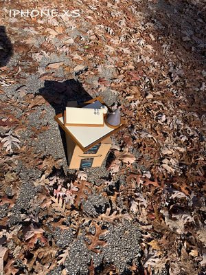
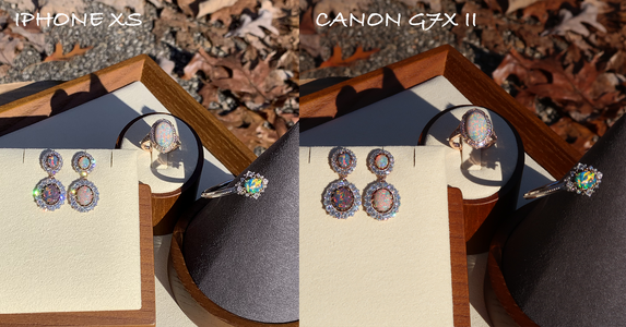
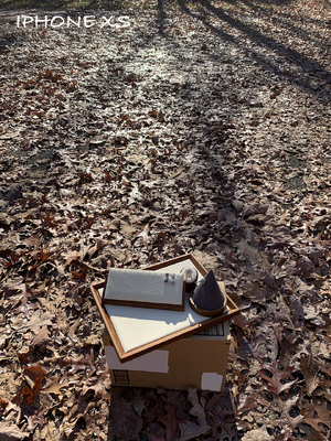
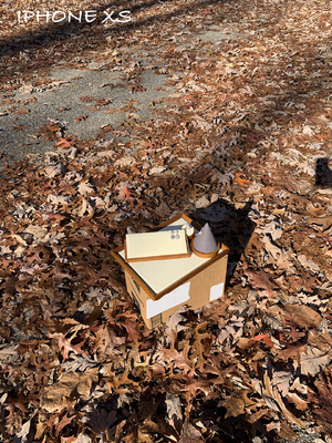
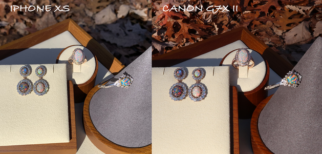
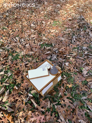
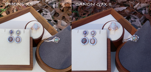
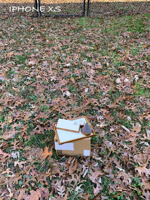
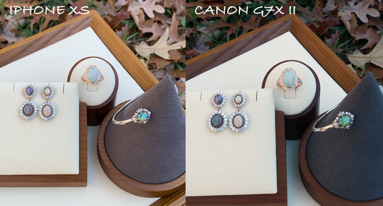
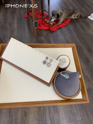
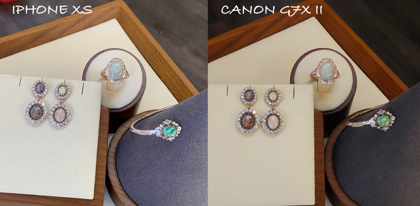
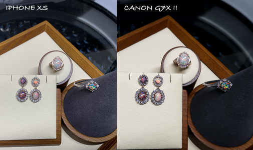
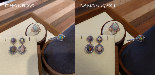
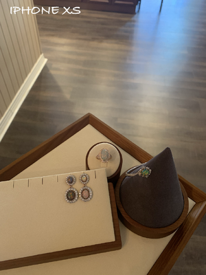
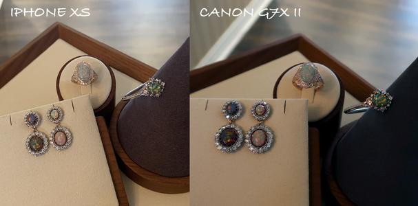
The pic named "Setup" is a quickie phone shot to show lighting environment. Then in the comparisons - phone pic on the left and camera pic on the right.

The camera pics reflect what I see IRL very well. The phone... Tries? But it likes to lose red, exaggerate green, and blow brights out. These pics were taken with my old iPhone XS but my other half's iPhone 14 did the exact same thing, other phone brands probably have different quirks.

For me the biggest difference between a #great opal and an #okay opal isn't how bright the play of colour is - it's more about how sticky the colour play quality is through different lighting environments. I had an #okay opal a long time ago and in the exact right conditions it was amazing but if angle or lighting changed even a tiny bit it lost its colour play. Irritatingly fickle.

I also see my bracelet black's mackerel sky pattern as more bright than my earrings, even the old top earring black that was also a B5. I think my eyes prefer patterns that have bigger chunkier blocks of colour. But the black earring colour, reddish blue like the ocean right after sunset :love: I'll never be able to afford both this colour and chunky colour play so something had to give :bigsmile:

And you can see why I had the bracelet black set in YG prongs and the earrings and ring set in RG/WG! The blue-ness in the bracelet black didn't work with RG at all. But I'd never have worn them together, that's too matchy-matchy for me even if the metals had been the same.


OPALS_1-SETUP.png

OPALS_1-COMPARISON.png

- - - - - - - - - -

OPALS_2-SETUP.png

OPALS_2-COMPARISON.png

- - - - - - - - - -

OPALS_3-SETUP.png

OPALS_3-COMPARISON.png

- - - - - - - - - -

OPALS_4-SETUP.png


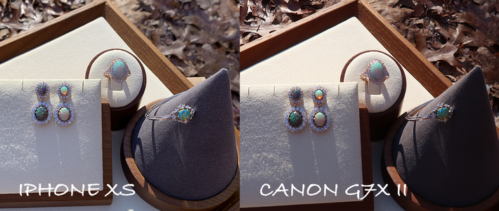
This comparison was shocking, the way the phone mis-renders reds and greens! The earring top white looks completely different from reality in the phone photo - so so so green. And the phone lost nearly all of the deep red in the bracelet black :shock:

OPALS_4-COMPARISON.png

- - - - - - - - - -

OPALS_5-SETUP.png

OPALS_5-COMPARISON.png
 
Last edited:
Continued -


OPALS_6-SETUP.png

OPALS_6-COMPARISON.png

- - - - - - - - - -

This is in my basement, under long white fluorescent tubes like school classrooms always have. On my washing machine. No setup pic for this one, the background mess is impossible to crop out :bigsmile:

This is actually the absolute best lighting for opals. Makes them look as red and as bright as they ever can. Opals, perfect for teachers and medical professionals!!

OPALS_7-COMPARISON.png

- - - - - - - - - -

In my kitchen under bright LED spotlights:

OPALS_8-COMPARISON.png

- - - - - - - - - -

Dimmed warm LEDs:

OPALS_9-SETUP.png

OPALS_9-COMPARISON.png
 
@yssie you are amazing and so generous with your time. Thank you. I was toying with whether to get a dark white crystal opal or black opal but your photos in ordinary lighting confirm my heart desires a black opal.

Thats not to say white opals aren’t beautiful as well. I have them in my Lavalier but I am also looking for something a bit different.
 
My pleasure, I’m glad I can be helpful! The blacks are my favourites for standalone pieces, they’re so striking and assertive :love: And M’s Opal World is owned by jordyonbass here on PS, he and BOD are wonderful about taking extra photos and describing differences ❤️

I am once again struck by the lunacy of having learnt about opals and WSS and pink diamonds only after moving to the the other side of the globe. If only, if only :lol:
 
  • Like
Reactions: CMN
As ever, I'm in awe of your discerning vision and your dogged persistence. The outcome is wonderful.

This is in my basement, under long white fluorescent tubes like school classrooms always have. On my washing machine. No setup pic for this one, the background mess is impossible to crop out :bigsmile:

This is actually the absolute best lighting for opals. Makes them look as red and as bright as they ever can. Opals, perfect for teachers and medical professionals!!
That make sense, based on experience with my one bright but directional black opal and a fair bit of theorizing. (You know I like theorizing. Half the pleasure of gemstones is in thinking about how they work...)

I think the best lighting for opals is contrasty and directional, but not pin-sharp. Justin at Black Opal Direct seems to agree – his pics show what appears to be a 3 by 4 array of frosted bulbs reflected in the dome surfaces.

Physically, the bright flashes of my opal are brightest in direct sun. But they are too bright – they dazzle the eye and max out the camera – so their colour can’t be fully appreciated. This is not surprising, because they are in fact (Bragg) reflections of the sun, which is too bright to look at directly. By contrast, a fluorescent tube is an extended source – you can look at it directly, and you can appreciate the colours of its reflection.

Another point: even within each ‘block’ of colour, the angle of best reflection varies slightly. So pin-sharp lighting will show colour only on parts of the block. Extended light sources have a better chance of showing colour on the whole block – most parts of the block reflect at least some part of the source.

So yes, it makes sense that fluorescent tubes are good for lighting opals. Another good source is a bright window at a reasonable distance.
 
My pleasure, I’m glad I can be helpful! The blacks are my favourites for standalone pieces, they’re so striking and assertive :love: And M’s Opal World is owned by jordyonbass here on PS, he and BOD are wonderful about taking extra photos and describing differences ❤️

I am once again struck by the lunacy of having learnt about opals and WSS and pink diamonds only after moving to the the other side of the globe. If only, if only :lol:

I echo what others have said about 1) the absolutely glorious nature of these pieces and 2) how helpful it is for you to explain, in such detail, the process and what you've learned about the stones, the process of designing the pieces. Also, your photos!

I love colored stones and have learned a lot from this community, but know nothing about opals, despite them being my first love (I decided, at some point, that they were too soft and that I would damage them... same with pearls, but I'm coming around to both of them... I have one of my mother's beloved strands that I might share in the pearl forum so someone can teach me something about it!). In any case, thank you!

PS: I was about to post when I saw @Starstruck8's post about lighting... I learn a lot from your approach (i.e. "theorizing about gemstones" :)) too!
 
As ever, I'm in awe of your discerning vision and your dogged persistence. The outcome is wonderful.


That make sense, based on experience with my one bright but directional black opal and a fair bit of theorizing. (You know I like theorizing. Half the pleasure of gemstones is in thinking about how they work...)

I think the best lighting for opals is contrasty and directional, but not pin-sharp. Justin at Black Opal Direct seems to agree – his pics show what appears to be a 3 by 4 array of frosted bulbs reflected in the dome surfaces.

Physically, the bright flashes of my opal are brightest in direct sun. But they are too bright – they dazzle the eye and max out the camera – so their colour can’t be fully appreciated. This is not surprising, because they are in fact (Bragg) reflections of the sun, which is too bright to look at directly. By contrast, a fluorescent tube is an extended source – you can look at it directly, and you can appreciate the colours of its reflection.

Another point: even within each ‘block’ of colour, the angle of best reflection varies slightly. So pin-sharp lighting will show colour only on parts of the block. Extended light sources have a better chance of showing colour on the whole block – most parts of the block reflect at least some part of the source.

So yes, it makes sense that fluorescent tubes are good for lighting opals. Another good source is a bright window at a reasonable distance.

And you know I’ll join you in the theorizing :bigsmile:

I keep thinking opals will behave like pearls. But they really don’t. With pearls a diffuse lighting environment with no clear source of light highlights overtones the best, with opals it mutes play of colour the most. I think you’re spot on re. “Reasonably bright and directional”, but not blindingly bright and not pinpoint-single-source.

But one thing that opals and pearls definitely have in common is that phones can lie egregiously about them :eek-2: I know that there are gemstones which phones are reasonably forgiving of, white diamonds... Some yellow diamonds? :lol: So this exercise was superbly useful for me ::)

I was mooning over this one for a while but the directionality always made me pause. Then it sold and I felt more relief than disappointment. No clearer sign right? I still stalk the site nearly daily though, just window shopping!
 
Not if you’re planning to topple down stairs with them :lol:

For real though, I was thinking earlier today, now to make sure nothing ever happens to them because there is absolutely *no* possibility I’ll ever be up for trying this project again! Matching opals is actually worse than matching pearls :silenced:


:love: Thank you!! I went through so many ideas - normal halo, double halo, side stones, coloured stones… But then I saw the my MIL’s ring and it was a total cartoon popup lightbulb moment :love:

Here’s her ring, I was blown away when I saw it and she adores it and wears it daily ❤️
FBF0C11B-8853-45D5-8F6A-C1A611498462.jpeg

Yes. Yes. Yes.
 
And you know I’ll join you in the theorizing :bigsmile:

I keep thinking opals will behave like pearls. But they really don’t. With pearls a diffuse lighting environment with no clear source of light highlights overtones the best, with opals it mutes play of colour the most. I think you’re spot on re. “Reasonably bright and directional”, but not blindingly bright and not pinpoint-single-source.

Yes! On diffuse vs directional light, here's a demo I've posted before:
https://www.pricescope.com/community/threads/moody-stones-post-them-here.278830/post-5253380
(I've linked rather than quoted because I don't want to pollute your thread with pics of my merely average opal!)

For opals, for a fixed viewing angle, each colour block has a small range of lighting angles for which it shows its brightest and best colour, and a much larger range of lighting angles for which it doesn't. See this demo, which I've also shown before:
https://www.pricescope.com/communit...orrigible-enablers.275835/page-3#post-5186724

So, with directional lighting, the blocks that are 'on' show their best colour and the blocks that are 'off' are pretty dark. So you get great colour and contrast. With diffuse lighting, the effects of each lighting angle ('good' or 'bad') are all averaged together. Each block shows a bit of its 'best' colour averaged with a lot of its 'off' colour. So the colours are muted and the brightness is pretty even between blocks. Boring...

On pearls vs opals: Pearls don't have 'blocks'. The best lighting direction is just the 'mirror' direction. As a very crude approximation, much of what you see at a point on the surface is a reflection of the part of the environment at the mirror angle (as if the pearl were a ball-bearing). So variations in the lighting environment can overwhelm the subtle overtones.

Is that enough mansplaining for one post? But I like to think about these things, and I like to try out ideas with like-minded people. Outside PS, such people are very few...

I can't say anything about phones vs 'proper' cameras - I don't use a phone much.

I was mooning over this one for a while but the directionality always made me pause. Then it sold and I felt more relief than disappointment. No clearer sign right? I still stalk the site nearly daily though, just window shopping!
I understand. Great colour but strongly directional. Like mine - at least the strongly directional bit. When I'm wearing it, I try to angle my hand to show the colour flash...

I rather hope you will go on the hunt for a top red-and-purple black opal with a large-block flagstone pattern. You 'need' an opal pendant, don't you? We would all follow your pursuit avidly...
 
Prima with 14k unplated WG bezel and 14k RG halo - metals chosen for colour :love:

Caysie's photos:

Ring_Caysie_Prima1.JPG

- - - - - - - - - -

Ring_Caysie_Prima2.JPG

- - - - - - - - - -

Ring_Caysie_Prima3.JPG

- - - - - - - - - -

Ring_Caysie_Prima4.JPG

Proof that I am an idiot above.

However, my consolation is that someone I love has some of the best things I have ever sold! :lol: Thank you for choosing the perfect setting for this opal!
 
I echo what others have said about 1) the absolutely glorious nature of these pieces and 2) how helpful it is for you to explain, in such detail, the process and what you've learned about the stones, the process of designing the pieces. Also, your photos!

I love colored stones and have learned a lot from this community, but know nothing about opals, despite them being my first love (I decided, at some point, that they were too soft and that I would damage them... same with pearls, but I'm coming around to both of them... I have one of my mother's beloved strands that I might share in the pearl forum so someone can teach me something about it!). In any case, thank you!

PS: I was about to post when I saw @Starstruck8's post about lighting... I learn a lot from your approach (i.e. "theorizing about gemstones" :)) too!

Oh yes please share your mother's strand with us in the pearls forum! We always love a good ogle out there :bigsmile:

I don't understand opals nearly as well as I do pearls. But I think I probably still understand opals much better than I do most other coloured stones :lol: I'm definitely a depth-not-breadth person when it comes to gemstones. Pearls are so much hardier than you might expect, from how frequently they're labelled "delicate", I'm really hoping opals are the same way... Guess I'm about to find out :halo:

But you could always do a pendant or earrings, something that doesn't get banged up!! :love:
 
Last edited:
Yes! On diffuse vs directional light, here's a demo I've posted before:
https://www.pricescope.com/community/threads/moody-stones-post-them-here.278830/post-5253380
(I've linked rather than quoted because I don't want to pollute your thread with pics of my merely average opal!)

For opals, for a fixed viewing angle, each colour block has a small range of lighting angles for which it shows its brightest and best colour, and a much larger range of lighting angles for which it doesn't. See this demo, which I've also shown before:
https://www.pricescope.com/communit...orrigible-enablers.275835/page-3#post-5186724

So, with directional lighting, the blocks that are 'on' show their best colour and the blocks that are 'off' are pretty dark. So you get great colour and contrast. With diffuse lighting, the effects of each lighting angle ('good' or 'bad') are all averaged together. Each block shows a bit of its 'best' colour averaged with a lot of its 'off' colour. So the colours are muted and the brightness is pretty even between blocks. Boring...

On pearls vs opals: Pearls don't have 'blocks'. The best lighting direction is just the 'mirror' direction. As a very crude approximation, much of what you see at a point on the surface is a reflection of the part of the environment at the mirror angle (as if the pearl were a ball-bearing). So variations in the lighting environment can overwhelm the subtle overtones.

Is that enough mansplaining for one post? But I like to think about these things, and I like to try out ideas with like-minded people. Outside PS, such people are very few...

I can't say anything about phones vs 'proper' cameras - I don't use a phone much.


I understand. Great colour but strongly directional. Like mine - at least the strongly directional bit. When I'm wearing it, I try to angle my hand to show the colour flash...

I rather hope you will go on the hunt for a top red-and-purple black opal with a large-block flagstone pattern. You 'need' an opal pendant, don't you? We would all follow your pursuit avidly...

Nahhh ain't no mansplaining here. Just an enthusiast enthusiasing and I welcome all enthusiasm 10/10 in any of my threads ❤️

I don't know enough about opals to know why the blocks of colour develop. This article has some interesting info and helps explain why red and violet are more rare than green/blue:
http://opalsociety.org/opal_cutting.htm
By comparing common opal (colorless potch) to precious opal they discovered that precious opal was composed of very constant sized spheres in a tightly packed uniform pattern. In common potch the spheres are jumbled together in no particular pattern and are of different sizes.
[...]
Color is produced by light entering the opal and being broken up into colors by the spheres and spaces between them. It follows that the space between the spheres must he uniform since the spheres are uniform.
[...]
The size or the spheres determines the color one sees. Large spheres (0.00003 mm - equals one millionth of an inch) produce reds. Blue and greens are produced by medium size spheres. Small spheres produce violet.

But... What makes the spheres form differently in the first place? How does spacing - amount of space, orderliness of spacing - impact colour or pattern? How does sphere shape and size and organization translate into brightness of colour play? Does depth of these spheres play a part (separate from diameter)? So many questions still...

I want a #LifeAltering opal, I just can't afford a #LifeAltering opal because I'm too busy blowing the budget on #LifeAltering pearls! Woe is me :lol:

Edit - I'll add more in the Moody Stones thread that you linked :bigsmile:
 
Last edited:
Proof that I am an idiot above.

However, my consolation is that someone I love has some of the best things I have ever sold! :lol: Thank you for choosing the perfect setting for this opal!

I snorted out loud - loudly :lol: You are so very welcome, and I'll be Right Here for any future table scraps :lol:
 

Attachments

Issy these pieces are stunning!! I so admire your patience with your projects. The outcome is always perfection. I’ve done three custom projects now and the waiting never seems to get easier lol

You didn’t say much about it but that cuff is really special! It just seems so wearable? I’m very jealous and I want all of these pieces.

I decided earlier this year that I am going to start expanding my collection. After my RHR project this spring was drawn out for 8 months because of an insurance claim, I put a hold on my other plans, but a strand of pearls is close to the top of my list! I have a fake strand I wear all the time now and I want to replace it with real ones. I’ve been reading your pearl adventures trying to learn a little. I won’t be venturing too deep into that world, but it was so gratifying to read your threads and learn. I love opals too, though I don’t think I could wear on one my hand. Maybe a pendant?

Anyway, you never fail to inspire. I hope you are well lovely friend!
 
Ugh, @dreamer_dachsie, I must have missed a notification in this thread ;( How’s about half a month and change late…

Thank you so much!! The cuff has the nicest black opal I will ever own and I know it :love: There’s a few more pics back on Pg 3 of this thread, this one’s my favourite ::)
F327D1C0-1FB8-4028-ABE4-F7B9B60AEAC0.png

I gotta say, after having this ring made and getting these earrings back, I still gander through the various opal vendors’ websites but now the browsing is completely passive. The angst and the need-to-own is all gone. Unexpected… I mean, I had these pieces commissioned, I knew they were coming, I’d have guessed the Satiation Quotient of knowing they’re on their way would be about the same as actually having them in hand… Obviously I’ve been giving myself too much credit :bigsmile:

I followed your star sapphire story - what a journey!! That repurchase and remake has taken absolute gobs of patience and trust on your part - and it’s all paid off :love: Would you believe that I’ve never seen a star sapphire outside of the museum? And the ones in museums aren’t ever amazing. Not like yours. I’m gravitating toward gems with “secrets” these days, generally… We’re both evolving :bigsmile:

Yessss come join us in Pearlssss :halo:
 
Last edited:
@yssie We are both late commenters then babe! I didn’t see your thread when it was first posted either!!

That opal is stunning. I don’t think I have ever seen a nice opal in person, so we are in that same boat. However, I can imagine what it must look like! Star sapphires kind of have to me appreciated close up because in a nice one, the gem material itself has lovely water and the asterism permeates into the gem creating this incredible 3D effect. It can’t be captured in capers or video at all. I imagine opals are similar… the depth that binocular vision provides really influences how the light play is perceived.

What do you have in the works now? There must be something in your horizon.
 
Star sapphires kind of have to me appreciated close up because in a nice one, the gem material itself has lovely water and the asterism permeates into the gem creating this incredible 3D effect. It can’t be captured in capers or video at all. I imagine opals are similar… the depth that binocular vision provides really influences how the light play is perceived.
Yes! The 'silver curtain' and the 'floating star'. There speaks a true star stone lover.

And yes, with opals, the shimmer, partly from slight irregularities in each colour block, and partly from binocular rivalry, is fascinating.
 
@yssie We are both late commenters then babe! I didn’t see your thread when it was first posted either!!

That opal is stunning. I don’t think I have ever seen a nice opal in person, so we are in that same boat. However, I can imagine what it must look like! Star sapphires kind of have to me appreciated close up because in a nice one, the gem material itself has lovely water and the asterism permeates into the gem creating this incredible 3D effect. It can’t be captured in capers or video at all. I imagine opals are similar… the depth that binocular vision provides really influences how the light play is perceived.

What do you have in the works now? There must be something in your horizon.

The opal is the same honestly. Has to be appreciated in-person because the camera just can't capture the liquidity that I see IRL - the colourplay is so three-dimensional... Exactly how you describe the star sapphire asterism :love:

I've not seen a top-of-the-line crystal opal in-person but I imagine that to be the height of "deep" and "dimensional" play of colour in opals. I asked for a comparison of these two opals last year:
https://blackopaldirect.com/product/opal/crystal-opal/2-78-ct-gem-crystal-opal-10-7x7-9x5-3mm/
https://blackopaldirect.com/product/black-opals/3-41-ct-black-opal-14-2x9-3x4-2mm/

And BOD sent me these videos:

Justin and Ruth (owners of BOD) both felt the crystal was unbeatable - truly a tippity-top example of its type. I can see why, the rock is literally crystal clear, no haze, no undertone, and with that play of colour across the entire surface of the stone from every angle... But the black just looked brighter to me!! And, well, I need bright play of colour to be happy. Learnt that the hard way. I think that crystal sold within the week :shock:
 
Last edited:
Yes even to my untrained eye I can imagine the depth of the color play on the lighter one!
 
Yes even to my untrained eye I can imagine the depth of the color play on the lighter one!

Watching those videos again now is making me regret passing on that crystal… :shock:
 
That crystal opal is fascinating. I can only imagine what the 3d effect would be like in real life. I have a fantasy (maybe a bit more than that - I've mentioned it to a jeweller, and it may come to something) of a crystal opal set reversibly in a ring with a blackened interior.

That said, this one is neither perfectly clear nor haze-free, as the side-by-side video with the black opal shows. I suspect that the slight haze is taking the edge of the colours and lightening the background, which reduces both the actual and the perceived strength of colour play. So, crystal for 3d, black for intensity.

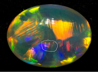
The crystal opals I've seen in person (not remotely of the standard of this one, of course) have all had a weird orangey colour in transmitted light (i.e. lit from behind with a flashlight). I suspect this one would too. See the image of the lights reflected from the back surface?
OpalScatteringA.jpg
It's orangey-red. You can see this is all the pics, once you start looking. The light you are seeing has passed through the stone twice.

I suspect that the story here is the same as the standard explanation for why the sky is blue and the sunset red. Small particles preferentially scatter shorter wavelengths out of the direct beam and leave longer wavelengths in it. (To be clear, I haven't seen this story stated explicitly for crystal opal, but I'm pretty sure of it.)

I also suspect that the colour-bearing layer in black opal isn't intrinsically any less hazy than in crystal opal - it's just that it's not a as thick, so there is less total scattering.
 
GET 3 FREE HCA RESULTS JOIN THE FORUM. ASK FOR HELP
Top