shape
carat
color
clarity

WF Does it again: 5 ct Spess Reset

my likey a lot..you sure don''t half-ass it chrono when you want something done you do your homework and go in feet first..well done!!!
 
Very Very beautiful and not chunky or clumsy at all. Really very elegant. Congrats to you!!
 
Chrono: First things first: What an amazing spessie. Truly beautiful.

Now the setting.

Okay, I get why your heart fell when you saw the pics, they are oddly lifeless.

But in your pics at home, it is a stunner. Cannot wait for the hand shots, please don''t forget!

Its kind of like when you see a pic of a model who has been Botoxed and heavily made up and then airbrushed and worked over by the computer. No sizzle or sex appeal at all.

That is what I would compare the pics of the ring to. Love the ring, it is wonderful.

Chrono, do you live near Whiteflash? I am considering them for a stone when I might be in their area.
 
Lovely ring!
36.gif
 
Wow it is beautiful!!! I love the color. Congrats!
 
Very pretty.
 
It''s beautiful!! I love the setting.
36.gif
 
Karpouzi,
Unfortunately, I do not own a tripod and the location that I use for photography makes it difficult to create a makeshift tripod. What I did do that helps is to lean my camera hand against a surface to help keep it still. However, because of this, I was unable to salvage as many handshots as I’d hoped. Too many were blurry and not usable. I found the stabilizer setting on my camera but it cannot be used in conjunction with the macro setting which sucks big time.
39.gif


MZ,
Glad to know you like the setting because I know you think halos are overrated and overused.
25.gif


Megeve, Charmy, MTG, Rebecca, Packrat, Arcadian, Swingirl, IndyLady, Sarahbear, Vc10um,
Hand shots are coming up! I hope it’s not too much of an overload.

LD,
Thank you. I’m glad it received your approval because you are very discriminating when it comes to design and workmanship. Yes, the swoopie bit is definitely easily seen when it is worn. In fact, I can’t stop tilting my hand this way and that way to admire the profile view.

AmGuy,
Feet first is the right word to describe it. WF was surely challenged and admitted it to me as well. This design, while easy in theory, is difficult to achieve via the CAD/cast method.

 
Treebean, LovingGems, Kribbie, Oddoneout, and Catmom,
Hang on tight; pictures are coming right up next!

Stoniegrl,
Thank you. Yes, I knew everyone will see the same thing I saw in WF’s pictures so I hope my “home pictures” will show otherwise even though I’m a poor photographer with a cheapie and very old digital camera. Your description of a botoxed, made-up, airbrushed and photoshopped model cracks me up.
9.gif
No, WF is all the way down in Houston, TX while I’m at least 1000 miles to the Northeast. Even though we are far away from each other, the communication is easy and quick, both via emails and telephone conferences.
 
The weather was NOT cooperative at all this weekend and yesterday; it was either raining or stayed cloudy and overcast. As such, all my pictures are taken indoors with very poor and dim lighting, which made photography a challenge since I’m an extremely poor photographer in the first place.

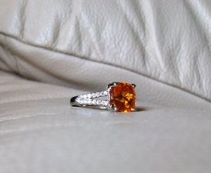
First off, is the “chair” series since the spess ring is on my footstool.


spesschair1A.JPG
 
This is the back or underside view showing the very open gallery.

spesschair2.JPG
 
I know this picture is blurry but I’m happy to have captured some brilliant white light return from the ACA melees.

spesschair3.JPG
 
You can see that this picture is very dark because there’s almost no light coming through the window. The nice thing about it though is that you can really see the design of the setting.

spessdarkroomprofile.JPG
 
Here comes the handshots!

handprofile1.JPG
 
I know the spess looks brown here but it’s so dark that even my skin looks very dark. I’m not that tanned at all!

handprofile2.JPG
 
A profile view on my hand. Again, it is dark and it’s not easy using just one hand to take a picture without any support.

handprofile3A.JPG
 
Urgh! Another horrible picture showing brown with yellow flashes but it’s really orange. It’s so frustrating; either the stone colour isn’t accurate or the picture is blurry.
38.gif


handprofile4.JPG
 
Here comes the wave!

handprofile5.JPG
 
Sideview showing part of the split shank. Again, you can see how dark the room is by how dark my skin looks in this picture.

handprofile6.JPG
 
The sun decided to cooperate a little here, so the colour of the spess is more representative of the real stone.

handprofile7.JPG
 
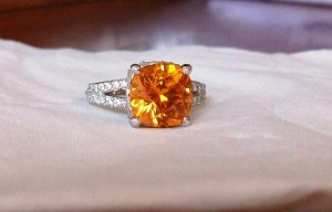
This is the “tissue” series. I had the “brilliant” idea of taking pictures of the ring on a whitish sheet of tissue to help my camera white balance / colour correct itself automatically. The camera seems to be able to handle the orange colour and sparkle of the diamonds a lot better. Maybe I should wear a white glove with the ring the on next time I take hand shots.
11.gif
9.gif


tissue1.JPG
 
Gotta love the super high crown and the diamond-shaped table on the spessartite. See, I’m not opposed to precision cutting at all, unlike what some may think since I stand up for decent to well cut native cuts quite often.
25.gif


tissue2.JPG
 
Another profile view showing the very gentle curvature of the split prongs.

tissue3.JPG
 
Picture of the spess showing the awesome colour, sparkle and cutting. Note that the setting looks horrible and very thick here for some strange reason.

tissueprofile1.JPG
 
This picture is similar to the previous but I couldn’t resist posting it. And that’s all I have. Comments good and bad both are welcome.

tissueprofile2.JPG
 
Might not be my personal cup of tea, but it sure is a pretty stone in a wonderfully done setting, and I always appreciate that!
 
Chrono, yes, i have not be timid in making it known that i think halos are overrated and over used: however, i don''t see your setting as a halo as much as a creative pavilion bezel/mounting. probably still not my cup of tea as ma ra stated, but i do think you and WF pulled off a piece that will be timeless in the long run....... what i appreciate so much with this ring is that the spess is not overwhelmed by a wash of diamond flash.....but those diamonds serve as a backdrop for your stone....or perhaps more accurately provide the structure for presenting our spess. your spess still appears to be uncluttered and stars in this setting...as well it should. obviously, i love the design of this ring and i do think there are many variations that could be done w/o as many diamonds for those on a budget. kudos to you and team WF!
face6.gif


mz
 
Wow! Those WF pics really show off the facet pattern, much more complex than I realized. Your hand pics confirm that the loss of a halo certainly did not reduce the visual presence :) I really like how well made the piece is, very much heirloom quality. Wear it in good health!

ps
Now I want a fiery ember on my finger
11.gif
 
I love how the prongs are done. They look sculpted and are very secure looking. I know people love Leon, but his prongs scare me, too small, sharp and they don''t look all that secure. It''s important to have a secure, as well as beautiful setting. Form and function!!
 
It''s gorgeous! I really love that setting. Since it''s a reset, what did the ''before'' look like?
 
GET 3 FREE HCA RESULTS JOIN THE FORUM. ASK FOR HELP

Featured Topics

Top