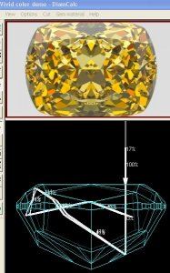
shape
carat
color
clarity

What causes the "crushed ice" look?

Rockdiamond said:
Here's a question for Kenny- or anyone else who has a thought on this....
Which of the two Pear/Piano photos more closely approximates what our eyes actually see?

Long Post Warning
Superb question RD, and the answer is, neither, sort of.

Even when not used for trick photography, the camera is kind of a trick that (several generations after its invention) few understand.
The camera and the live eye differ in that the eye is constantly connected to a brain.
They work together to instantly focus on what we are looking at.
A camera can't do that.
With a camera the focus decisions for everything in the view, near and far, are fixed forever the moment the picture is taken.

Evidence of how our brains and eyes are stuck doing only what they normally do is those autostereograms. http://en.wikipedia.org/wiki/Autostereogram
Stare at this long enough and a shark appears, in 3-D.
For me it helps to move close to the monitor and relax my eyes as if I'm looking out the window at the horizon.


The camera was truly a revolutionary invention in the trickery of "seeing".
It changed everything, in ways we are not aware unless pointed out.

I paint and draw and have taken a few art classes.
Drawing well is hard because we no longer see what's really there.
The brain takes shortcuts.
It has to; You'd go insane if you actually processed all the data coming from the eyes.
I have a saying, "Painting is easy; seeing is hard".

In my Beginning Drawing class the subject of "cameravision" quickly came up.
If you look at the art made before the camera was invented everything, near and far, was in focus.
The idea (or today, the artistic decision) to draw/paint a background out of focus to emphasize the subject simply did not exist before the camera.

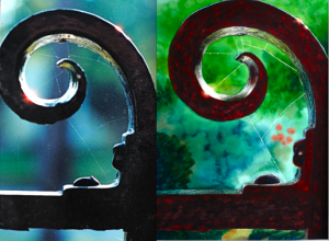
If you went back in time to 1800 and showed a person this watercolor that I painted (on the right) of the wrought iron gate in front of my house they'd say I'm insane.
Never having seen a photograph with the background out of focus my painting would elicit the reaction: "Does Not Compute!"
Today we are used to seeing such images.
The photo that the watercolor was painted from is on the left.


So RD to answer your question, "Which of the two Pear/Piano photos more closely approximates what our eyes actually see" . . .
The answer is neither, but some might argue the one on the right is closer, sort of.
The problem in comparing a photo to what the live eye/brain system (I'll call EBS) sees, is the live EBS is constantly bringing things into focus as it looks around.
It happens instantly and unconsciously.

When I look at the table of the diamond it is in focus; when I look at the culet it is in focus.
Human eye pupils dilate and constrict in reaction to light not artistic decisions of depth of field, but perhaps when there IS more light and the pupil constricts we DO experience more depth of field when near and far things are in close proximity - but this is just a theory of mine.
Obviously when the EBS looks around a pic it cannot bring things into focus that the camera has sent out of focus.

In real life when looking at the pear the EBS instantly brings the pear into focus.
Then when it looks to find out whether the near piano keys are in focus the system instantly brings them into focus.
Next, when it looks to find out whether the far piano keys are in focus the system instantly brings them into focus.
Like a dog chasing its tail; they eye will never catch anything out of focus.

The camera making everything near and far in focus is as much of a trick as how it can make backgrounds out of focus.

This is why asking whether the LIVE EBS sees everything in the piano-pear set up in focus, or not, is not really a fair question.
You are comparing something captured in one instant by an inferior system to something that is experienced live over time by a superior system.
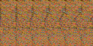
Stereogra.png

Picture 4.png
 
Great post Kenny. I was going to say neither but you can probably see for a split second each depending on how you try to focus. But it would be nearly impossible to see either in such a way that your brain really processes it as such.

I cannot do those 3D photos to save my life though. I can get my eyes to focus up close for a short while in a way that will allow me to see some of the facet structure like in a photograph though. I can't see the whole stone but I can take it apart section by section with my eyes. It is tiresome on my eyes though and I prefer not to do it much lol. I do have one particularly dry eye that gets tired if I use it as a dominant eye too much. So I learned how to switch focus from one eye being dominant to another. Learning this has allowed me to see things up close that used to be hard to hear. Normally I just switch dominance in the eye to give the other a rest. I only found this out after my doctor noticed redness in my eyes and figured I was sleeping with them partially open... one worse than the other.

You'd think after all that I could do the 3D pictures, but I can't.

Kenny brought up something I was curious about. I realize that a fancy colored radiant will show the color better so they will cut it that way to get a better price. Is there any drive for a cutter to take a stone like mine and make it a fancy shape instead of any other shape? My stone is Y-Z so no fancy price there but is there a bonus for a cutter to make it that way for color alone? Or would it most likely be due to shape of the rough and ease of cutting into that shape? I know money drives for fancy colors but how about for low colors?
 
I'll add that it is my opinion that when I'm buying a diamond online I want pics that show the entire diamond in focus, table to culet.

Sure seeing a diamond live is better but Internet sales are growing so we are stuck with photos, inferior as they are.
Trying to duplicate how a live person actually "sees" a diamond (and using that as an argument for intentionally leaving part of it blurred) is futile for reasons outlined in my long post above.
Pics can't duplicate what the live human eye/brain system does.

Full focus shows me what's there.
Blur obscures what's there.

When buying online I want pics that show me as much as possible what's there.
That means maximum depth of field and no blurry parts.
Any vendor selling diamonds can afford true macro equipment and learn to use it.
No excuses. :angryfire:
 
yap, many of the low colors are cut into fancy light yellow now, not sure why the cutter of your stone decide to have it graded as a colorless stone instead, judging from the image, not accurate, I think the face up color could have been in that grade.
 
Since Kenny gave his preference, I'll give mine. I would prefer the majority of the photos to be full focus. I'd rather see where the inclusions are, what they look like and what the facet structure looks like.

I do appreciate seeing one photo that imitates what the eye sees, but I want more of in focus. If I had to pick only ONE picture (and I doubt I could ever buy a diamond from just one picture) I would want it in focus totally. But I admit I have only bought stones online from places that show me more than one photo or can get me more than one. Obviously movies are best.

When I bought my last stone, I only had pictures that were totally in focus and that was just perfect for me. But I do understand why some would want the slightly out of focus. Particularly if they don't have accesss to stones in person or videos, they might want an idea of what is somewhat close to what the eye sees.
 
clgwli said:
I do appreciate seeing one photo that imitates what the eye sees, but I want more of in focus.

For you to still say this means I have failed to make my point in my long post. ;(

Pics cannot imitate what the eyes see.
 
Stone-cold11 said:
yap, many of the low colors are cut into fancy light yellow now, not sure why the cutter of your stone decide to have it graded as a colorless stone instead, judging from the image, not accurate, I think the face up color could have been in that grade.
I will say sometimes the stone does look more pale than others. I'd say that is the average color I see though. In my kitchen with the lighting in there (some sort of bright CF bulbs) it actually loos lighter to me. Then again that lighting makes my skin look pale and almost pinkish which it is definitely not! In other lighting it looks very golden and even deeper than what I see in the avatar.

But it does have me wonder why they didn't try for a darker shade if they could have. Not that I will complain personally, just makes me wonder. And obviously not just my stone but others out there in the low colors like U-V and lower.
 
kenny said:
clgwli said:
I do appreciate seeing one photo that imitates what the eye sees, but I want more of in focus.

For you to still say this means I have failed to make my point in my long post. ;(

Pics cannot imitate what the eyes see.
Oh no Kenny please don't feel that way. Actually I got distracted when I was typing that sentence and realize I forgot to change what I wanted it to say:

I do appreciate seeing one photo that TRIES to imitate what the eyes see. I'm not trying to back track here. I truly meant that as a response. ETA: If you see the very last part of my post, that is more of what I was trying to say honestly.

My son started coughing (he's napping) and I was listening for a minute to see if I had to go in and help him back to sleep or not. Hence the distraction.

Trust me I know photos do not completely imitate what our eyes see. But they try to. Sometimes they are more realistic representations and other times, particularly like the photos you took of your Octavia that you had in your avatar for a while, they are no where near what our eyes could ever see.
 
Got it. :wavey:
 
Hi All,
Kenny, this is such a relevant discussion- thank you for your thoughts!
We're all in agreement that photos are a substitute for looking at something in person- sometimes more effective, sometimes less so. In my opinion, the semi blurry photos do a very good job of imitating what the eye sees.

I believe that part of what makes a "crushed ice" stone beautiful is that the design basically "tricks" the eye.
I get your point about the eye focusing "automatically"- but the pear piano photo on the right has too deep a field of focus- I can't get me eyes to focus with such a deep field in total sharp focus. If I stood in the same relation to the piano you took those photos, looked at the piano keyboard ( for example) and focused on the bass keys, the ones are the far end would not be in focus- and vice versa.
Maybe what's happening in a "crushed ice" stone is that they simply does not understand where to focus....

Kenny- do we really need to be :angryfire: 'ing each other?
 
My daughter is an art student. When she was in high school I'd take her to a near-by college where they had live models (i.e., nudes) posing each week. This drawing practice was essential for her to learn how to interpret the human form, which is all rounded shapes and 3 dimensional, onto paper, which is 2-d, of course. It is important to teach the brain to do this interpretation in order to draw well.

People these days sometimes learn to draw using photographs. But if you do so, the camera has done the work of interpreting the three dimensions into two. And the resulting drawings tend to be flat, lacking that illusion of a third dimension that you see in a good drawing or painting.

The discussion of cameras and dimensions made me think of this. Over the course of a couple of years I really saw the improvement in my daughter's art work. I was looking at an art show today, and stopped to ask some of the artists about their drawing backgrounds. You could tell those who had never worked with live models.
 
Rockdiamond said:
If I stood in the same relation to the piano you took those photos, looked at the piano keyboard ( for example) and focused on the bass keys, the ones are the far end would not be in focus-

. . . but how would you know the far keys were out of focus without looking at them? ... and when you looked at them your brain/eye would immediately bring them into focus. (the actual sharpness of our peripheral vision is another can of worms)
Hence the whole problem ... No picture (regardless of any combination of focused and blurred) can duplicate what really happens during the live eye-brain experience.

Live, the eye-brain pays attention to what it pays attention to - hence it looks at it and brings it into focus.
It does this in real time over the entire area in question, one small area at a time.
Pics can't do that.
That's why all pics fail to duplicate the live experience.

Hence the vendor must decide... should they make their diamond pics fully in focus or partially blurry - the unfortunate and limiting reality of photography.

As a buyer shopping on the Internet I'm unfortunately making buying decision based on pics so I vote fully in focus.
More focus reveals more stuff.
Blur hides stuff.

I like vendors who reveal stuff and dislike vendors who hide stuff.

Attempting to duplicate the live eye-brain experience in a picture is futile for reasons outlined in my long post on page 1.

A real DSLR and a real macro lens can be bought used today very cheaply that can bring the entire diamond into focus, all the way from the table to the culet.
Full focus is possible and affordable.
Use a tripod or stand for the necessary long exposures.
 
kenny said:
Rockdiamond said:
If I stood in the same relation to the piano you took those photos, looked at the piano keyboard ( for example) and focused on the bass keys, the ones are the far end would not be in focus-

. . . but how would you know the far keys were out of focus without looking at them? ... and when you looked at them your brain/eye would immediately bring them into focus. (the actual sharpness of our peripheral vision is another can of worms)
Hence the whole problem ... No picture (regardless of any combination of focused and blurred) can duplicate what really happens during the live eye-brain experience...........

Kenny- what about peripheral vision?
If I look at one end of the keyboard I can still see the other end- but it's not in focus.
I agree that transparency in representation is key.

If all vendors were forced to use the same photographic setup, maybe that would allow for a better ability to compare from one to another.
But we know that's not going to happen.
If we're going to critique my photos- which is not a problem for me at all ( if folks want to post other photos they feel are effective so much the better!)- I will say that I find our array of in focus, and slightly blurry photos, along with video, to be the most effective method I've seen on the web to convey what the stone looks like.

Kenny, I sense that you disagree- and all this is also illuminating. It shows that there is no single "correct" method. Rather it's up to the photographer to use whatever means available to convey what they see.

Flygirl- what a great post! It makes such perfect sense.
It also directly relates to this discussion:
My photos relate to my experiences looking at, and grading diamonds.
Since I understand very well how the diamond looks in 3d, when I look at the photos, my mind conveys what my eyes see in 3d.
As an artist/photographer/merchant, I hope that others will somehow receive the same inner translation....if that makes sense.
 
Rockdiamond said:
Kenny- what about peripheral vision?
If I look at one end of the keyboard I can still see the other end- but it's not in focus.

Okay, peripheral vision.
I'm surprised you went there since it actually weakens your position.
And to you this is all about winning, not facts.

I hate entering your spider web of debate because IMHO you look for ways to not play fairly using your ridiculous college Debating101 "skills", but here we go ...
I guarantee at some point I will stop posting in this thread - not when you win - but when you play unfairly.


Yes when focusing and looking at the pear you can "see" the far end of the keyboard, somewhat, but not well.

Peripheral vision is that stuff around what you are focusing on.
Think of a Target with the pear in the middle.
The further things are from the pear the less we are able to resolve and perceive focus without looking away from the pear to look at what we want to look at.
(Which is the whole essence of why pics and live don't comapre.)

For my two pear pics on page 1 the camera was where this tripod is at the end of the pianos's keyboard . . .


In real life peripheral vision is such that the focus of piano keys are near the pear would be more noticeable than the focus of the ones far away from the pear.

In the pear/keyboard view a very large angle of view is needed.
In a diamond, viewed live, very little peripheral vision is needed.

Since little peripheral vision is needed when viewing a diamond live it has little effect - unlike the pear/keyboard pics.

tripodposition.png
 
Great posts guys, especially that long one Ken.

Regarding "crushed ice" look of diamond there are currently two ideas that come to mind when people say this in the realm of diamonds.

It can refer to

a. A really bright diamond whose optical characteristics emphasize many small flashes of of white light in diffuse/ambient lighting and a ton of scintillation in spot lighting (as seen in some rare fancy cuts and in rounds like Star129).
b. A diamond that exhibits very little light return and at best reflects back some pinpoints of light. The "crushed ice" effect here could be more accurately described as "watery, slushy crushed ice".

Most folks I talk to and in real world conditions, the latter is the one most referred to and I particularly do not care for it as it is the general result of excessive light leakage under the table and causes a diamond to look virtually dead in those areas.

In scenario a. above the facet design is highly responsible for the small bright reflections and high scintillation.
In scenario b. above facet design has little to do with the watery crushed ice effect as you can get it in many facet designs.

What contributes to it primarily is proportion factors and you can have it in both chunky/vintage faceted diamonds as well as modern or modified brilliant facet designs. Most radiants and many cushions are cut in this fashion as well and is generally the result of pavilion angles that are cut too shallow coupled with crown angles that contribute to the excessive leakage existing under the table.

I personally like crushed ice a. but do not care for crushed ice b.
 
Nice discussion.
One other issue that is especially true for cuts designed to enhance color is they increse the number of bounces within the stone, and this is the cause of the crushed ice effect - not the idea of additional facets.
So trying to photograph this effect means you must be able to focus often several times the difference in depth to the culet. So it becomes very difficult to 'defocus' and this is also one of the main reasons that ray traced images look very different - because the entire stone is 'infocus'.

5 times depth.jpg
 
Great point Garry.

I have always noticed (also pointed out in this thread) that many radiants and "crushed ice" cushions are cut to fancy colors. What appears to be a vice in white diamonds is a virtue when it comes to fancy colors. Your illustration really clarifies that too.
 
Garry H (Cut Nut) said:
Nice discussion.
One other issue that is especially true for cuts designed to enhance color is they increse the number of bounces within the stone, and this is the cause of the crushed ice effect - not the idea of additional facets.
So trying to photograph this effect means you must be able to focus often several times the difference in depth to the culet. So it becomes very difficult to 'defocus' and this is also one of the main reasons that ray traced images look very different - because the entire stone is 'infocus'.

Gary could you please clarify your last paragraph. Assuming the diamond's table plain is paralell to and directly in front the camera, why would the camera depth of field have to be several times the depth of the diamond? (which is difficult to do especially with macro photography) Why does one want to an out of focus shot?
 
Rhino said:
Great point Garry.

I have always noticed (also pointed out in this thread) that many radiants and "crushed ice" cushions are cut to fancy colors. What appears to be a vice in white diamonds is a virtue when it comes to fancy colors. Your illustration really clarifies that too.

Yeah, this is annoying me right now.
I'm on a colored-diamond safari and so many of the colors I want are in diamonds cut to radiant or cushion, which are not my cup of tea. :x

About the depth of focus needing to be deeper than the distance from table to culet for cuts like radiants . . . hmm (scratches head) . . . I think there may be something to that.
That had not occurred to me - but then I've never tried to photograph a radiant.

This may be a good time to bring up something...

Depth of field does not extend equally behind and in front of the point you focus on.
I've was taught it extends back further than it does in front.
So if you were photographing a round diamond and wanted it all in focus you'd not focus in the center but rather about 1/3 down from the table.

Better yet, stop down the lens and use your camera's depth of field preview button and TONS of light and watch closely AS you slowly focus back and forth, stopping at the point that gets both the culet and the table best in focus.

Oh and if your lens can stop down to f32, don't use f32 if your goal is razor-sharp images; only use f22 or f16.
At the smallest apertures (highest f-numbers) another kind of distortion starts to soften the image.
I forget the name of the distortion, but it is caused by a significant amount of the light rays bending a little as they pass so close to something (the blades of the aperture adjusted to a tiny hole).
 
Kenny as a general rule focus on the girdle gives the best results - and yes - I always told the focal range was best if you were 1/3rd the way into the object(s) you want in focus.

What shape and color would you prefer?
Generally people are trying to make the color of fancy colours as deep as possible. But take dark champagne brown diamonds - in this case a high liht return round can make the stone retain brightness.
Check out this page - especially the 6 or so movies just over 1/2 way down the page.
http://www.lexus-com.com/lexusnew/produ ... ghtbox.htm
 
Garry H (Cut Nut) said:
Kenny as a general rule focus on the girdle gives the best results - and yes - I always told the focal range was best if you were 1/3rd the way into the object(s) you want in focus.

What shape and color would you prefer?
Generally people are trying to make the color of fancy colours as deep as possible. But take dark champagne brown diamonds - in this case a high liht return round can make the stone retain brightness.
Check out this page - especially the 6 or so movies just over 1/2 way down the page.
http://www.lexus-com.com/lexusnew/produ ... ghtbox.htm

Wow, those movies are cool, thanks.

I'm considering a small red, purple or violet, preferably intense or better.
Also a vivid yellowish-green, yet that car anti-freeze color.

The cuts I like, in order of preference, is emerald, asscher then round.
Fat chance, I know.
 
kenny said:
Rhino said:
Great point Garry.

I have always noticed (also pointed out in this thread) that many radiants and "crushed ice" cushions are cut to fancy colors. What appears to be a vice in white diamonds is a virtue when it comes to fancy colors. Your illustration really clarifies that too.

Yeah, this is annoying me right now.
I'm on a colored-diamond safari and so many of the colors I want are in diamonds cut to radiant or cushion, which are not my cup of tea. :x

About the depth of focus needing to be deeper than the distance from table to culet for cuts like radiants . . . hmm (scratches head) . . . I think there may be something to that.
That had not occurred to me - but then I've never tried to photograph a radiant.

This may be a good time to bring up something...

Depth of field does not extend equally behind and in front of the point you focus on.
I've was taught it extends back further than it does in front.
So if you were photographing a round diamond and wanted it all in focus you'd not focus in the center but rather about 1/3 down from the table.

Better yet, stop down the lens and use your camera's depth of field preview button and TONS of light and watch closely AS you slowly focus back and forth, stopping at the point that gets both the culet and the table best in focus.

Oh and if your lens can stop down to f32, don't use f32 if your goal is razor-sharp images; only use f22 or f16.
At the smallest apertures (highest f-numbers) another kind of distortion starts to soften the image.
I forget the name of the distortion, but it is caused by a significant amount of the light rays bending a little as they pass so close to something (the blades of the aperture adjusted to a tiny hole).

Diffraction is an optical effect which can limit the total resolution of your photography-- no matter how many megapixels your camera may have. Ordinarily light travels in straight lines through uniform air, however it begins to disperse or "diffract" when squeezed through a small hole (such as your camera's aperture). This effect is normally negligible, but increases for very small apertures. Since photographers pursuing better sharpness use smaller apertures to achieve a greater depth of field, at some aperture the softening effects of diffraction offset any gain in sharpness due to better depth of field. When this occurs your camera optics are said to have become diffraction limited. Knowing this limit can help you to avoid any subsequent softening, and the unnecessarily long exposure time or high ISO speed required for such a small aperture.

A very good tutorial and a calculator for the diffraction limit is found here http://www.cambridgeincolour.com/tutorials/diffraction-photography.htm

There has been widespread debate from photo enthusiasts over whether ever increasing pixel size is nothing more than a marketing trick to sell newer models of cameras. Given that the sizes of the sensor in digital cameras are not being increased nearly as fast as the resolution is. The higher the megapixel count or the smaller the pixels are in the sensor, the wider the aperture at which point the camera becomes diffraction limited.

Garry did you answer my question and I missed it about why the depth of field has to be several times the depth of the diamond in a radiant or cuts with very long light paths and small virtual facets?
 
Rhino said:
Great posts guys, especially that long one Ken.

Regarding "crushed ice" look of diamond there are currently two ideas that come to mind when people say this in the realm of diamonds.

It can refer to

a. A really bright diamond whose optical characteristics emphasize many small flashes of of white light in diffuse/ambient lighting and a ton of scintillation in spot lighting (as seen in some rare fancy cuts and in rounds like Star129).
b. A diamond that exhibits very little light return and at best reflects back some pinpoints of light. The "crushed ice" effect here could be more accurately described as "watery, slushy crushed ice".

Most folks I talk to and in real world conditions, the latter is the one most referred to and I particularly do not care for it as it is the general result of excessive light leakage under the table and causes a diamond to look virtually dead in those areas.

In scenario a. above the facet design is highly responsible for the small bright reflections and high scintillation.
In scenario b. above facet design has little to do with the watery crushed ice effect as you can get it in many facet designs.

What contributes to it primarily is proportion factors and you can have it in both chunky/vintage faceted diamonds as well as modern or modified brilliant facet designs. Most radiants and many cushions are cut in this fashion as well and is generally the result of pavilion angles that are cut too shallow coupled with crown angles that contribute to the excessive leakage existing under the table.

I personally like crushed ice a. but do not care for crushed ice b.


Hi Jon!
I would suggest that the degree of crushed versus slush is far more variable than a simple A -B.
For example- pear shapes and ovals tend to mix crushed ice with chunkier facets- which results in the "bow tie".
Such stones could easily be dismissed as having "a vice" except many people love the look. Of course there are bow ties that I feel go "over the edge"
Even what you describe as "watery slushed ice"- such as Daussi cushions have their fans.
I think it comes down to differences in taste- what one person feels is a vice, another may find to be a virtue.
In many cases the additional size of stones with shallower pavilion /crown angles is extremely desirable to many buyers.
 
The only way photography relates to this discussion is a comparison of focus ( or lack of focus) and perspective that causes the mind to perceive the crushed ice look when people look at these diamonds
 
kenny said:
IMHO the crushed ice look is the result of a cutting style with lots of facets in a pattern so dense with facets that they look almost random.

Photography, (both where you choose to focus the lens, and how deep the depth of focus is set with the f-stop) can make it look like crushed ice that is melting a bit so it's blury or hard frozen so the edges of every facet and virtual face from table to culet are razor sharp.

But overall to me the crushed ice look is more the result of the cut than the photography.

While in fancy shapes it can be a function of the number of physical facets, ie (70 facet radiant versus 58 facet radiant) 70 will have smaller Virtual Facets, it is much more often a function of how well aligend these facets are and how short the path is for the primary light rays to exit back to the viewer's eye.

Radiants have longer ray paths(shown in Gary's simulations regarding color grading in the other thread). In very simplified terms the longer the ray path, the more different rays interefere with each other and the more the physical facets are broken up into smaller virtual facets that we see.
 
Rockdiamond said:
pear shapes and ovals tend to mix crushed ice with chunkier facets- which results in the "bow tie".

Huh?

Isn't bowtie obstruction resulting from cut proportions and angles?
 
kenny said:
Rockdiamond said:
pear shapes and ovals tend to mix crushed ice with chunkier facets- which results in the "bow tie".

Huh?

Isn't bowtie obstruction resulting from cut proportions and angles?

Hi Kenny, I'll explain this in simple terms even you can understand.
Take a circle. Cut it into 8 equal parts. Those are the basis of the pavilions of a round diamond. All eight are (theoretically) equal.
Now take an oval outline and attempt to cut it into 8 equal parts.
Can't do it, right? I mean you can divide it into 8 sections, but they are not equal in surface area.
The ones at the ends extend further out, creating longer, narrower slices.
The light bounces more rapidly due to the proximity of adjacent pavilion facets on the pointy end of a pear, a marquise, or the ends of an oval.
The facets in the middle are wider.
There's your bow tie- simply explained.
 
Rockdiamond said:
kenny said:
Rockdiamond said:
pear shapes and ovals tend to mix crushed ice with chunkier facets- which results in the "bow tie".

Huh?

Isn't bowtie obstruction resulting from cut proportions and angles?

Hi Kenny, I'll explain this in simple terms even you can understand.

Okay then.
 
Rockdiamond said:
kenny said:
Rockdiamond said:
pear shapes and ovals tend to mix crushed ice with chunkier facets- which results in the "bow tie".

Huh?

Isn't bowtie obstruction resulting from cut proportions and angles?

Hi Kenny, I'll explain this in simple terms even you can understand.
Take a circle. Cut it into 8 equal parts. Those are the basis of the pavilions of a round diamond. All eight are (theoretically) equal.
Now take an oval outline and attempt to cut it into 8 equal parts.
Can't do it, right? I mean you can divide it into 8 sections, but they are not equal in surface area.
The ones at the ends extend further out, creating longer, narrower slices.
The light bounces more rapidly due to the proximity of adjacent pavilion facets on the pointy end of a pear, a marquise, or the ends of an oval.
The facets in the middle are wider.
There's your bow tie- simply explained.

Hilarious David, hilarious.
A bow tie is caused because the pavilion angle in the zone across a marquise or oval is close to 45 degree or 50% pavilion depth and this makes a 'nail head' effect where when you look at the diamond face on, you are seeing straight back to your own head = you are obstructing the generally brighter areas above and around you.
 
OK Garry- the inequities caused by the difference in size of pavilion facets creates different angles. It's possible some of those are drawing light from directly above where head obstruction might cause darkness.
However the effect is visible at deflected angels as well- and the premise here it discussing the "crushed ice" effect. I have observed this effect in Pear Shape Diamonds specifically at the tips. Let's say that we can attribute this effect to the light bouncing around inside the diamond more times before it exits.
The different facet pattern causes a different amount of bounces for light coming in at the tips as it does for light that bounces off the larger ( more steeply angled) facets in the middle.
As you guys like to say, it's physics- different sized mirrors ( and windows) create different sized reflections.

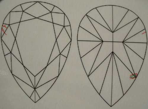
The four main modified design on the GIA plot below can sometimes alleviate a lot of the larger facets- and indeed , the bowtie.
r2452certa.JPG


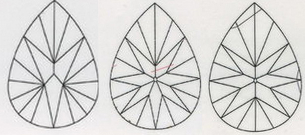
Below are a few other pavilion designs
psfac5.jpg
 
GET 3 FREE HCA RESULTS JOIN THE FORUM. ASK FOR HELP
Top