shape
carat
color
clarity

3 stone pendant help

Lovinggems

Ideal_Rock
Joined
Mar 28, 2009
Messages
3,622
I am in the process of sourcing a third stone for my 3 stone pendant project.
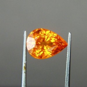
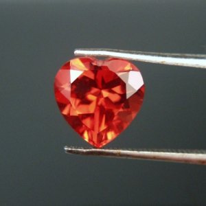
The top will be a 9mm heart shaped sunstone, the middle or bottom stone will be a 9.7 x 7.2mm pear spessartite. I'm stuck about ideas for the third stone. My Etsy jeweler suggested a marquise shape. I'm thinking amethyst peridot, tsavorite or pink tourmaline or spinel.

Any ideas will be much appreciated.
33707.jpg

33360a.jpg
 
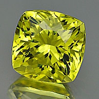
How about a green stone cut in a square cushion, hung on the diagonal?

I worry that, unless it's very wide, a marquise will be kind of puny. It's like flower arranging; biggest at the bottom, smaller as you go up.

Also, I think a purple (amethyst) would clash with the red. If you use the color wheel, red and orange are adjacent, and the complementary color is green.
 
I think the marquis will be too small too. I like the idea of purple or blue. I think if you add green it may look like a traffic signal? Will they be set in a straight line?
 
How about a metamorphosis of shape and colour? Heart to pear to trillion - red to orange to yellow
 
Thank you everyone for your ideas so far, it's been really helpful. My mind was stuck with the marquise shape, but no many nice marquise shaped stones available.

iLander I like the diamond shape idea, I like green too but Treenbean is right to suggest it'll look like a traffic light signal.

Thanks klewis for suggesting yellow, would not have thought of it myself! Great idea!

Thanks davi for the trillion suggestions, zircons should be sparkly!

Howabout this mali garnet, usually they have a bit of green to them, I'm asking the seller about the colour of this one, hung on the diagonal like iLander's suggestion? It is 6.5mm, is it big enough? Colour?

mali_408.jpg
 
How about Citrine - you can get yellows and orange yellows and as they're reasonably inexpensive you can get them in a variety of cuts also!
 
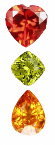
I was afraid the mali wouldn't go too well with the others, so i did a quick shop of the vendor pics together. It's a strange mix that works well, but this is just from vendor pics, I wonder how'll they'll fair IRL

lgpendant.png
 
I like the idea of the graduation of colour from red -> orange -> yellow. However, considering the size of the 2 current stones, I'm envisioning this pendant to be reallllllllllllllllllllllllyyyyyyyy long.
 
I agree with you Chrono.
LG- are you set on the 2 current stones for the pendant - I think it will be difficult to make a pendant design look cohesive with 2 stones of similar size and yet that differ so much in shape and colour?
Don't you need 2 pendants? :naughty:

I don't know if this would work for you but I thought of two smaller stones of the same shape - say the marquise end to end or rounds - followed by the heart which you could interchange with the pear for a different look?
 
The cushion isn't bad, but I think a smaller round stone would look better than this larger cushion. A round would create a kind of symmetry and contrast with the pointy parts of the heart and pear. I also don't love the yellowish Mali next to the other 2 stones. I'd go with a cool dark green, blue, maybe purple. JMHO!
 
Thank you LD for the citrine suggestion and davi for the gem collague.

You're right jstar I have a small round Mali garnet and it doesn't look good with the stones, the mali is a cool toned while the other two are warm toned.

You're right too Chrono I didn't think about the practicality of the design, it may be too long. :o

Klewis is also right the two stones are too close in size to look good together.


I have ditched this idea and will concentrate on the heart shaped stone, my initial idea is to set the heart in a domed shaped metal design, like this tsavorite pendant (top row second left). Any thoughts?

http://juliakaytaylor.com/necklaces.html

The spess I might set with a trillion peridot.

Thank you everyone for your ideas so far, it's been really helpful!
 
That’s going to look really nice in yellow gold.
 
Chrono said:
That’s going to look really nice in yellow gold.

How about two toned?
 
The back in a white metal and the flowery design in yellow?
 
Chrono said:
The back in a white metal and the flowery design in yellow?

I haven't thought that far ahead, but I like your suggestion, what do you think?
 
If you do the flowery part in 18K yellow, it will stand out against a white metal background. I think it’s going to looks smashing with the red heart.
 
Chrono said:
If you do the flowery part in 18K yellow, it will stand out against a white metal background. I think it’s going to looks smashing with the red heart.

Thank you Chrono, you have great ideas! :appl:
 
There's so much on that JKT page that's beautiful and I think the design you've pointed out will be perfect for the heart.
 
klewis said:
There's so much on that JKT page that's beautiful and I think the design you've pointed out will be perfect for the heart.

Yes so many pretties on JKT's site. Thanks for the affirmation on the design klewis!
 
GET 3 FREE HCA RESULTS JOIN THE FORUM. ASK FOR HELP

Featured Topics

Top