shape
carat
color
clarity

5-stone sapphire trellis ring project with Michael E

lovedogs

Super_Ideal_Rock
Premium
Joined
Jul 31, 2014
Messages
19,276
I'm currently in the process of starting a 5-stone trellis ring project with Michael E of Gem Shoppe and since he agreed to let me share the process with you all, I'm taking advantage of your opinions and wisdom :)

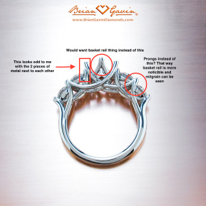
I've been very inspired by Yssie's gorgeous 5-stone trellis rings (loved both her VC and the re-make by DBL), as well as other, similar styles from Brian Gavin. I contacted Michael E, and he was immediately excited to help me undertake this, even with these (admittedly unclear) photos from me with notes on likes/dislikes. Luckily for me, he understood and was very helpful with everything :dance:
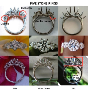
5stonecomparisons_notes.jpgBrianGavin_5StoneTrellisEngagement1_010912_notes.jpg

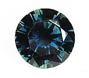
I was deciding between using aussie sapphires and blue topaz, but in the end durability won over potential $ savings, since I want this to be a ring I can wear regularly without worrying about the stones chipping. I looked around a bit for darker blue/green aussie stones, and in the end Michael offered to re-cut an older stone of his, as well as matching sidestones.

Here's his pic of the stone before the recut (9mm). I really like the color even though it is darker than some would prefer.
9mm%20dark%20sapphire%20for%20recut.jpg

Here's the original (before recut) stone with the sidestones we will use (4mm sides, and 3mm as the smallest stones--I loved Yssie's proportions, so I tried to get close to them with my preferred center stone size).
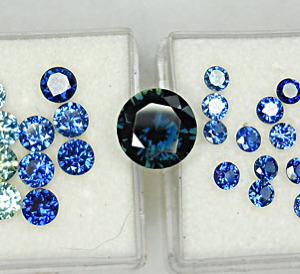
Katherine%20sapphires.jpg

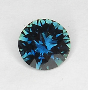
And here is the stone after the recut (7.7mm).
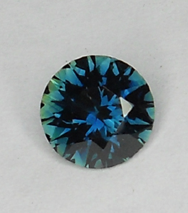
Katherine2.jpgKatherine1.jpg

I can't wait to see CADS, etc! Michael has been amazing thus far, and I am excited to see what he comes up with for the design, and also excited to share the process with everyone here! yay! :appl:
 
Ooooh lovedogs I am so excited for you! I can't wait to watch the process. I love all the pictures you've sent so far (even though admittedly I'm not 100% sure what your notes mean) and the 5-stone trellis style in general. Keep us updated! I've never had a ring custom made, though I have a lot of ideas for one in the future, so I will live vicariously through you :appl:
 
It brightened up after the recut and it looks like you are on the road to your dream ring.
 
What an interesting project! I look forward to following along. :)
 
Thank you for posting. I will also live vicariously through you to see a custom 5 stone ring with sapphires. I love how your recut turned out!
 
Wow! I will ensure to sit front row to see how this project evolves. It will look stunning!
Gorgeous center stone :love: the blue flashes are more apparant after the recut.
 
This ring is going to be gorgeous!
 
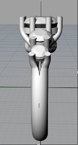
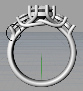
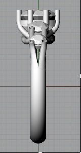
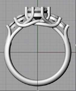
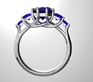
Hooray! Michael E gave me some initial screen grabs of his design for me. I really love how unique the wires are compared to what I expected when thinking about a trellis style. I also think that how the last stone has this "split" look from the side view is really cool. The only tiny thing I asked him to change was the very last prong and how it attaches to the shank.

Katherine%20Side%20View.jpgKatherine%20Top%20View.jpg


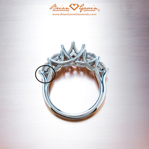
These pics show the only part I'd like him to change. I like that part of the BGD ring a lot in terms of how it attaches to the shank.

Katherine%20Front%20View.jpg
BrianGavin_5StoneTrellisEngagement1_notes.jpg

What do you all think about it thus far?
 
lovedogs|1443052350|3931049 said:
Hooray! Michael E gave me some initial screen grabs of his design for me. I really love how unique the wires are compared to what I expected when thinking about a trellis style. I also think that how the last stone has this "split" look from the side view is really cool. The only tiny thing I asked him to change was the very last prong and how it attaches to the shank.

What do you all think about it thus far?

Lovely! I agree with you on the point at which the gallery/trellis blend into the shank.
 
I agree with what you have decided so far. :)

I just noticed the bars underneath the main stone in the gallery...looks like that might need to be modified too somewhat? I doesn't quite flow well to my eyes...the intertwined bars..the ones that looks like its arms are crossed.
 
_lovesvintage_|1443113778|3931319 said:
I agree with what you have decided so far. :)

I just noticed the bars underneath the main stone in the gallery...looks like that might need to be modified too somewhat? I doesn't quite flow well to my eyes...the intertwined bars..the ones that looks like its arms are crossed.

Ok, I just wanted to try and make myself clearer in my wording. The CAD is definitely drawn correctly for how the trellis bars are supposed to intertwine, but the way it is represented underneath the main stone looks less fluid on the curve, so it needs to be brought down a smidgen. Unless that was what you wanted in your version? I really hope this explanation helped instead of confusing you further.
 
Keep up the great work, lovedogs! This is a ring I seriously cannot wait to see come to life. :D :appl:
 
_lovesvintage_|1443156730|3931570 said:
_lovesvintage_|1443113778|3931319 said:
I agree with what you have decided so far. :)

I just noticed the bars underneath the main stone in the gallery...looks like that might need to be modified too somewhat? I doesn't quite flow well to my eyes...the intertwined bars..the ones that looks like its arms are crossed.

Ok, I just wanted to try and make myself clearer in my wording. The CAD is definitely drawn correctly for how the trellis bars are supposed to intertwine, but the way it is represented underneath the main stone looks less fluid on the curve, so it needs to be brought down a smidgen. Unless that was what you wanted in your version? I really hope this explanation helped instead of confusing you further.

Sorry for ignoring you Lovesvintage! Definitely wasn't my intent--I was just trying to think through how I felt about the CAD, and trying to picture exactly what you mean. Do you mean that the center stone should be brought down a bit? To my eye, I think I might prefer it to be brought up a tiny bit, but am worried about it catching on things (he actually mentioned this in his latest email to me--that it would create more curvature if the center was brought up a bit, but then the ring might be less comfortable). He said he made it as low as possible to start, which to me is good....so I'm a bit undecided on whether I should ask him to render the center stone slightly higher and see how it looks.

Here are Michael's latest pics
Katherine%20Side%20View2.jpgKatherine%20Front%20View2.jpg
 
The stones look very low set and I don't think they can be lowered any further. I hope you won't be offended if I ask why you opted not to go with a U trellis for the connection between the 2 sidestones to the main center stone. The line looks rather squiggly and I thought a U type connection will look more fluid.
 
Chrono|1443193596|3931691 said:
The stones look very low set and I don't think they can be lowered.

Thanks for chiming in, Chrono. What do you think about the idea of slightly raising the center stone? Or do you think that would make the ring overly uncomfortable? I am just a huge newbie when it comes to looking at CADS, so it's hard to accurately picture how it will look in real life from these pics.
 
lovedogs|1443193408|3931686 said:
_lovesvintage_|1443156730|3931570 said:
_lovesvintage_|1443113778|3931319 said:
I agree with what you have decided so far. :)

I just noticed the bars underneath the main stone in the gallery...looks like that might need to be modified too somewhat? I doesn't quite flow well to my eyes...the intertwined bars..the ones that looks like its arms are crossed.

Ok, I just wanted to try and make myself clearer in my wording. The CAD is definitely drawn correctly for how the trellis bars are supposed to intertwine, but the way it is represented underneath the main stone looks less fluid on the curve, so it needs to be brought down a smidgen. Unless that was what you wanted in your version? I really hope this explanation helped instead of confusing you further.

Sorry for ignoring you Lovesvintage! Definitely wasn't my intent--I was just trying to think through how I felt about the CAD, and trying to picture exactly what you mean. Do you mean that the center stone should be brought down a bit? To my eye, I think I might prefer it to be brought up a tiny bit, but am worried about it catching on things (he actually mentioned this in his latest email to me--that it would create more curvature if the center was brought up a bit, but then the ring might be less comfortable). He said he made it as low as possible to start, which to me is good....so I'm a bit undecided on whether I should ask him to render the center stone slightly higher and see how it looks.

Here are Michael's latest pics
Katherine%20Side%20View2.jpgKatherine%20Front%20View2.jpg

I didn't think you were ignoring me, I am just not great with explaining sometimes. I meant having the trellis bars underneath the main stone lowered, if possibIe. I believe Chrono said it better though in saying it looks swiggly. So yes, ask for the main stone to be raised a smidgen if that helps those bars underneath to look more fluid and curve better instead of looking swiggly. Or ask to see if those bars can be lowered to get the nice curve and leave the stone set low like you want, if that is possible. I don't know enough about these trellis settings and the structural integrity it needs, but just trying to be helpful about the aesthetic appearance of your version of this design based on the CAD. It sounds like we are on the same page now though.

He is still going to fix the end side stones the way you want it done, right? Because I don't see that done in your latest CAD.
 
Chrono|1443193596|3931691 said:
The stones look very low set and I don't think they can be lowered any further. I hope you won't be offended if I ask why you opted not to go with a U trellis for the connection between the 2 sidestones to the main center stone. The line looks rather squiggly and I thought a U type connection will look more fluid.

Not offended at all :) I didn't give any direction about the wires, other than that I don't love how it looks when there are 2 U-shaped wires and they come together and look like 2 wires merging (like this pic). This is the example of what I like in terms of looking fluid, but not in terms of how the wires come together between the stones--if that makes sense. So that's what I wanted to avoid, and Michael said this would be the most "secure" in terms of the stones, and to fit what I like and don't like.

BrianGavin_5StoneTrellisEngagement1_010912_notes.jpg

_lovesvintage_|1443203278|3931768 said:
I didn't think you were ignoring me, I am just not great with explaining sometimes. I meant having the trellis bars underneath the main stone lowered, if possibIe. I believe Chrono said it better though in saying it looks swiggly. So yes, ask for the main stone to be raised a smidgen if that helps those bars underneath to look more fluid and curve better instead of looking swiggly. Or ask to see if those bars can be lowered to get the nice curve and leave the stone set low like you want, if that is possible. I don't know enough about these trellis settings and the structural integrity it needs, but just trying to be helpful about the aesthetic appearance of your version of this design based on the CAD. It sounds like we are on the same page now though.

Gotcha, that totally makes sense :) I do think part of the swiggly aspect is for structure (from what I understand of Michael's emails), and I do think it might look more fluid with the center stone raised a bit.

Edited: I just saw your comment about the curvature of the last stone, I think I must have missed it before, oops! I think it's improved from the first version to this one (first one on top, second version below)--to my eye I think it's curved enough now

Katherine%20Front%20View.jpgKatherine%20Front%20View2.jpg

Thanks to both of you for your help and comments!
 
I see the curve now...yes, that part is much better. :)

Edit: I just now noticed the trellis bar is weaved differently on the most recent CAD since you did that side by side comparison. It now has a kink too, so hopefully when you ask for the newest rendering, all will work itself out.
 
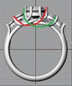
How about this? Fluid metal supports but no weird junction points.

mfront_view2.jpg
 
Chrono|1443204201|3931781 said:
How about this? Fluid metal supports but no weird junction points.

Yes, that is it! I agree with what Chrono is presenting for you to see.
 
_lovesvintage_|1443205001|3931789 said:
Chrono|1443204201|3931781 said:
How about this? Fluid metal supports but no weird junction points.

Yes, that is it! I agree with what Chrono is presenting for you to see.

Thanks, Chrono and Lovesvintage! Actually seeing your idea made it much easier for me to imagine. I emailed Michael about it, and he said that the reason that wouldn't quite work is because the stone would have to be set too high off my finger in that case (he mentioned that the end points are all in the same plane and the wires have to cross over the wires next to them). So the way I imagine what he's saying is that it's a balancing act between 4 factors:

1) finger size
2) height of the stone off my finger
3) thick enough wires to support the stone
4) making sure it "flows" aesthetically


To me, it's important that the stones not sit too high off my finger, or else I won't be comfortable. And I know there's only so much "real-estate" on my finger, and definitely want the wires to be thick and secure. I am definitely happy with the look overall, and how the wires cross doesn't bother me much at all. He did say he'd try to tweak a bit more, but I'm happy with the look as it is now :)

It's great to get your views and opinions, as these are things that wouldn't even occur to me :lol: . That's why I love PS and the CS subform so much!
 
LOVE the recut sapphire!

Thanks for sharing this journey with us. =)

ETA: What is your finger size? You seem to be covering plenty of finger real estate.
 
My finger is a size 7--so certainly not small :lol:
 
I love how it's coming together!! Keep us updated! :bigsmile:
 
lovedogs|1443228261|3931908 said:
My finger is a size 7--so certainly not small :lol:

Not large either! But you do have room for those side stones! :bigsmile:
 
Lovedogs, looks like things are progressing nicely! It's fun watching your project go forward! Looking forward to the next update. :wavey:
 
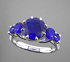
Thanks to you guys and the advice to make the wires flow more nicely, here is the latest rendering. I absolutely love everything about it, and think that the whole thing looks more fluid and curved the way I wanted it :)

katherine_set_high_front.jpgkatherine_set_hightop_view_2.jpg
 
OMG! Your ring is going to be so awesome and gorgeous! I love how it looks now with the new tweaks to your design.
 
That's gorgeous! I'm really following this, because I'm talking with Michael about a ring for me. How long a process has this been for you?
 
Demon|1443452461|3932745 said:
That's gorgeous! I'm really following this, because I'm talking with Michael about a ring for me. How long a process has this been for you?

not long at all! I've been admiring/planning a 5-stone for a month or so before deciding for sure, but I contacted Michael initially on Sept 4th, so everything has moved very quickly with him, especially since he cut the center stone for me and sourced the sidestones as well. I've been extremely happy with his service/responsiveness throughout the process, and I wouldn't hesitate to recommend him thus far :wavey:


EDIT: by "cut the center stone", I mean he cut down an older larger stone he had, not cut from rough. Just realized that might not have been clear at all.
 
GET 3 FREE HCA RESULTS JOIN THE FORUM. ASK FOR HELP

Featured Topics

Top