shape
carat
color
clarity

Another reset thread...

Reset or not?

  • 1. Reset into yellow gold.

    Votes: 44 95.7%
  • 2. Just stop, Gussie. Just stop!

    Votes: 2 4.3%

  • Total voters
    46
The lab diamond could make a great bracelet or be incorporated into another great pin for you!!
 
Since only DH and @Austina are for stopping :lol:, I just sent David an email to get started! It should be very easy since my lab diamond setting is almost exactly what I want. I think an MRB will be fine in that setting (minus the blackened silver top). And @Bonfire, you're right. I will figure out what to do with the lab diamond ring later. I am so excited y'all!!! I have wanted my ering in gold for a long time. It's funny how some people think yellow gold makes the stone appear more yellow and others think the contrast makes the stone look whiter. Honestly, I don't care! I realize that I am all about the entire piece of jewelry and I love rich yellow gold. Don't get me wrong, I want a beautiful stone. But the setting is just as important to me. As are the bands to go with it! ;-):D

Thanks for all the input! All of you enablers are my kind of peeps!

Ha - so DH says stop and you say full steam ahead!! Powerful stuff Gussie!! Lol!
Keep us posted - I can’t wait to see!!!
 
@Gussie I‘m so happy for you! I know you said you don’t care…but… just for info..Bee…is an H..I expected her to look yellow in the 18k yellow gold setting. She looks like an F/G in the yellow gold! I always saw a tint..I can’t see it anymore. She’s whiter and brighter! I can’t wait to see your ring when its done!
 
Back “in the day” most of us always thought (and I still do) that YG makes the diamond stand out more!!
Yay! So happy for you and can’t wait to see the remake!!
 
that's too beautiful of a stone not to wear, +1 on putting it in whatever setting makes you happy and you can always change it back.
 
Woo-hoo!! I’m so excited for you!

ETA: I agree, the design and materials used in a piece of jewelry or art is important to it’s overall beauty and evoking our emotional response. You are drawn to very rich and lux materials, colors, etc.
Your interiors and jewelry reflect that. All gorgeous! :kiss2:
 
Last edited:
@Gussie, Please get whatever makes YOU the happiest. The yellow bezel gold setting is beautiful and classic. Please keep your Margot setting. A girl needs to have options when it comes to jewelry!

You don’t need a new hobby. Think about all the women who live vicariously thru you. You don’t want to be a thief of JOY!!!

I started wearing yellow gold again about 7 years ago and love it. I think it looks prettier with my skin tone.


This has been a really fun thread!
 
@Gussie,

You don’t need a new hobby. Think about all the women who live vicariously thru you. You don’t want to be a thief of JOY!!!

This has been a really fun thread!
Yes!
Won't everyone think of Spirit Baby?
 
@Gussie, As your avatar clearly shows, yellow gold looks beautiful against your skin tone. You are going to be thrilled with your new setting. I can’t wait to see exactly what you decide, how it turns out and looks on your finger.
 
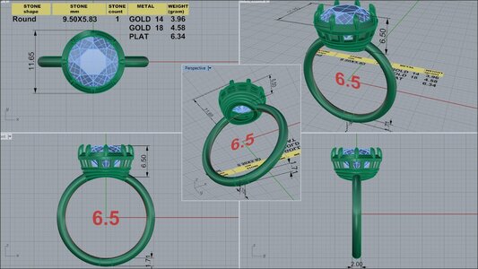
I just got the first cad from David. I am really terrible at this so would yall take a look? I decided to forego the cathedral since it is as low set as possible and the donut is large. Do you think it's too closed in the gallery? Cleaning won't be a problem with the huge bottom opening.

@yssie, @MissGotRocks , @mrs-b, @Bonfire, @MamaBee, @Cerulean , @Slickk, @Tonks
@tyty333 and anyone else who would chime in!dk 84010-quad.jpg
 
Last edited:
I just got the first cad from David. I am really terrible at this so would yall take a look? I decided to forego the cathedral since it is as low set as possible and the donut is large. Do you think it's too closed in the gallery? Cleaning won't be a problem with the huge bottom opening.

@yssie, @MissGotRocks , @mrs-b, @Bonfire, @MamaBee, @Cerulean , @Slickk, @Tonks dk 84010-quad.jpg

No, I don’t think it is too closed in for cleaning - and the bottom is completely open so that shouldn’t be an issue.
Are you doing prongs and bezel?
My only other thought is to perhaps taper the head as it meets the shank - making it less wide. That may be the aesthetic you are looking for though or it may be based on the size of the diamond.
What are your thoughts about it?
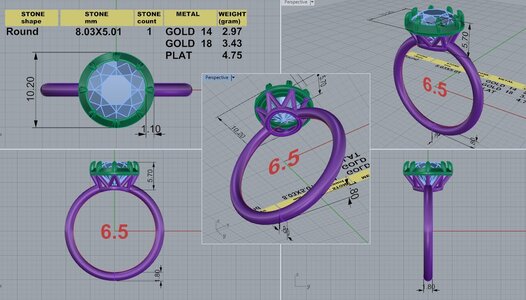

I am still thinking about the bezel and prongs. A clean bezel looks so chic but I adore claw prongs. Going to sleep on that. As far as the squatty look, I think that may be what I like. Here is the cad for my lab stone. It is very similar- just a gallery change. I like this setting on the lab diamond as much as anything I have had. It is so easy and wearable. It must be because of how low it's set. It feels very sturdy. Lol, maybe I'm moving away from delicate. DK 80748-QUAD (1).jpg
 
1661484289273.pngI just got the first cad from David. I am really terrible at this so would yall take a look? I decided to forego the cathedral since it is as low set as possible and the donut is large. Do you think it's too closed in the gallery? Cleaning won't be a problem with the huge bottom opening.

@yssie, @MissGotRocks , @mrs-b, @Bonfire, @MamaBee, @Cerulean , @Slickk, @Tonks
@tyty333 and anyone else who would chime in!dk 84010-quad.jpg

Two thoughts from me -
1. I like the top view with the eight prongs. Can those prongs come down into the gallery as well, rather than having the cutouts be spaced at non-multiplicative intervals? It's about 1.5 spaces per prong separation right now - would love to see this become either 1:1 or 1:2.
2. Was the ring design yours or DK's? Does it symbolize something?
 
I agree with @MissGotRocks, it’s not too closed in for cleaning with the open donut. I love the design, those 4 ridges are going to be beautiful in YG!
 
Thank you @yssie! I thought the spacing of the squares needed to align with the prongs too. I have a hard time explaining it though.

I looked at so many rings and sent DK pictures of different elements that I like. It doesn't mean anything. I'm not very sentimental lol.
 
I hesitated on setting my aca in a setting that is probably more apt for an old cut. But then I thought - who cares? It's my ring lol. :lol:
 
What do you think about integrating the head with a "closed" shoulder? This tapering shoulder would lead up nicely into that prong, if you make the cutouts change to line those up with the eight prongs.

1661485186702.png 1661485196402.png
 
Two thoughts from me -
1. I like the top view with the eight prongs. Can those prongs come down into the gallery as well, rather than having the cutouts be spaced at non-multiplicative intervals? It's about 1.5 spaces per prong separation right now - would love to see this become either 1:1 or 1:2.
2. Was the ring design yours or DK's? Does it symbolize something?

Came to say the same thing about the prongs extending.

I also think it’s certainly open enough for cleaning!

This is all personal preference…but since the bezel is adding visual weight, I’d bump up the shank to 2mm high off the finger and 2.2mm wide, something about it looks a bit too petite given the size of the head - if I recall the Margot is 1.9mm wide but it’s also platinum, so this is a bit thicker and sturdier, but I think a slightly thicker shank would go with the “vibe”
 
What do you think about integrating the head with a "closed" shoulder? This tapering shoulder would lead up nicely into that prong, if you make the cutouts change to line those up with the eight prongs.

1661485186702.png 1661485196402.png

This is a nice idea!
 
What do you think about integrating the head with a "closed" shoulder? This tapering shoulder would lead up nicely into that prong, if you make the cutouts change to line those up with the eight prongs.

1661485186702.png 1661485196402.png

So you think 8 vertical bars that align with 8 prongs is the way to go? Do you think the taper makes it appear more delicate?
 
Came to say the same thing about the prongs extending.

I also think it’s certainly open enough for cleaning!

This is all personal preference…but since the bezel is adding visual weight, I’d bump up the shank to 2mm high off the finger and 2.2mm wide, something about it looks a bit too petite given the size of the head - if I recall the Margot is 1.9mm wide but it’s also platinum, so this is a bit thicker and sturdier, but I think a slightly thicker shank would go with the “vibe”

I think I need to keep the shank at 2 mm so that I can still stack 2 bands.
 
I think I need to keep the shank at 2 mm so that I can still stack 2 bands.

Makes sense - especially when you have such a killer band collection!
 
What do you think about integrating the head with a "closed" shoulder? This tapering shoulder would lead up nicely into that prong, if you make the cutouts change to line those up with the eight prongs.

1661485186702.png 1661485196402.png

@yssie @Gussie - this I like! It makes the head look more integrated into the shank. Just another way to get the tapered look without actually changing the head.
 
@Gussie were it mine, and I’ve done quite a few with dk, I would ask him to slim down the gallery so you can easily pair your bands with it. I feel like you’ll have a large gap with this gallery.
Also, I preferred the bezel to the collet prongs (I had both) as there was a negative space around the stone with the collet that drew my eye (not in a good way). You can see my posting history for the collet.
Looking forward to this reset!
 
@Gussie I really like the cad the way it is as far as how the shoulder attaches to the head. It has the cupcake side views which I love because the shoulder is low and not connected. I know everyone likes it the other way by making it more incorporated. My previous Whiteflash Valoria setting had a similar side view..I just loved seeing the diamond cradled by itself. It also made the diamond look larger IMHO.
Since you love prongs I wouldn’t hesitate to have them. You would still have the bezel look..It would also be so easy to pop your diamond out for a change back to your other setting later if you get a change of heart.
One thing I would do is to make the shank 2mm..both height and depth..
I would just say to do what you like the best. There’s no right or wrong answer. Trust what you like..I can’t wait to see it done!

I keep looking at both views with the "cupcake" profile (perfect description BTW) and the tapered shoulder. I think I do prefer the cupcake. Lol, squatty gets a bad rap around here but when someone labels their Tiffany style solitaire "squatty", I always love the profile!

Oh, you might be a pser if you obsess all morning about cads and forget to wake your kid up for school! Uh-oh!!!
 
9690FEC5-90B0-478A-971E-D1DD225F8426.jpeg

Does this maybe might help you decide what you do or don’t want?

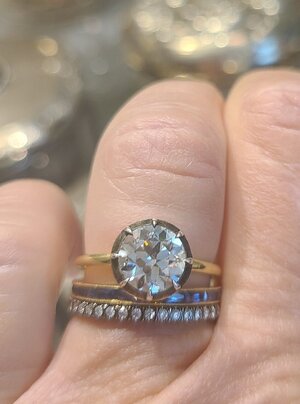
Yes this helps! Thanks @Rfisher! @Slickk mentioned that a gap might be too wide and that it needs to be slimmed down. I definitely see that from this drawing as well. I think that the double bezel needs to be single as in the left ring as well. Here is my current ring with 2 stickers. The gap is as wide as it can be so slimming down is a must. I love a gap as I think it gives a "messy bun" vibe. Lol - it takes a lot of planning to get a carefree look! :lol-2:20220826_073240.jpg
 
GET 3 FREE HCA RESULTS JOIN THE FORUM. ASK FOR HELP
Top