petrock<3
Brilliant_Rock
- Joined
- Mar 22, 2010
- Messages
- 1,142
So what I really liked about this cut was the points coming together in the middle. Caysie said she’s talking to the cutter about reshaping the pavilion. I have no idea what that would do, do any of you? Could that possibly fix it? @Karl_K penny for your thoughtsthank you
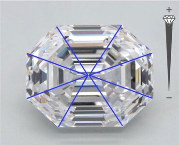
If the pavilion facets can be reshaped to close to the blue lines in the pic, it would solve the problem I think. Whether or not it’s possible for a cutter to logistically and physically to actually reshape it like that, I have no idea. I also have no idea how much mass you would lose by reshaping and whether or not they would be willing to do that if the result would dip under the 4.5 ct mark.

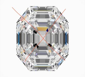
Im going to assume this is the new stone.
Im going to assume this is the new stone.
It was cut as an emerald cut, when its rectangular the center is rectangular to match with a strait section between the windmills.
Forcing the windmills to meet would not be standard for the cut.
That is likely where the communication error took place.
That said it looks very well cut, I would strongly recommend if possible seeing it in person and then deciding if you want changes.
Edit: the above stone as cut is 2x+ brighter and lively than this stone.

Just to clarify,,,If it’s more than 2 times brighter than it would be recut, I think
Im going to assume this is the new stone.
It was cut as an emerald cut, when its rectangular the center is rectangular to match with a strait section between the windmills.
Forcing the windmills to meet would not be standard for the cut.
That is likely where the communication error took place.
That said it looks very well cut, I would strongly recommend if possible seeing it in person and then deciding if you want changes.
Edit: the above stone as cut is 2x+ brighter and lively than this stone.
edit 2: keeping 4.5 is unlikely a large reshaping of the pavilion is going to take more than .2ct.
A stone this well cut should sell very well so if you decide to change, a fresh cut stone would be what I would ask for not a rework of this one.
@petrock<3 As I stated before I really like the look of the stone as is as a wide clipped cornered emerald! I just don’t think a culet would look good with it as it stands currently. If it’s more than 2 times brighter than it would be recut, I think @Karl_K ’s advice should be heeded. I think looking at it in person and seeing how it plays first is a good idea!
First, the video confirmed my impression, it is very well cut.Would this current stone still be superior to a new one with the little square in the center?
First, the video confirmed my impression, it is very well cut.
Could the cutter execute a non-standard design rectangular with touching windmills and maintain the light performance of this one.
Some could, so its possible.
Other option is asscher, square stone with touching windmills.
My recommendation if possible look at this one in person then decide. Shipping is not hugely expensive to see it unset first then send it back for mounting.
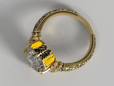
this the the EW rendering, will be getting NS rendering soon! Diamond is en route to Caysie right now
this the the EW rendering, will be getting NS rendering soon! Diamond is en route to Caysie right now
CADS look great! Did you decide to keep the diamond as is?
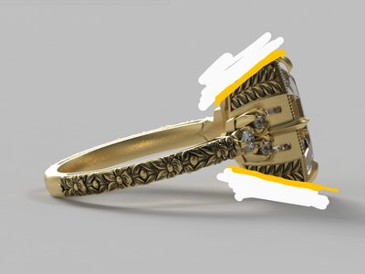
Something about the basket is making it look "heavy" in all the side views, but I'm not sure what it is.
It is a bulkier style ring, but yes the CADs look heavier than the real ones on her site. Maybe just the way the CADs look.
The diamond looks tiny too but that’s probably a product of being on Pricescope too much lol!
I looked at the original inspo and the engraved panel is the width of the cut corners. For the new vintage cut stone the panel is also the width of the cut corners, but because those edges are much longer than a typical emerald cut this might be what is making it look heavy.
Here’s the NS rendering
I love the NS version!

The black engraving at the corners looks way more balanced and less dominating in the N/S orientation too.
The basket could be angled in at the bottom so it is less straight up and down in profile, but this detail is a personal preference. Maybe not quite as steep of an angle as I mocked up herebut here's a pic for a visual of what I mean.
For fun and to see what it would look like, I tried switching the engraving to the middle and having a narrower strip border the prong extensions on either side.....but I think then way you have it already (with the having the engraving at the corners) is much better!
