shape
carat
color
clarity

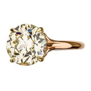
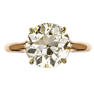
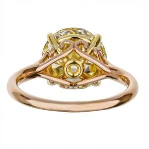
Can you help me decide on this OEC/OMC?

It’s a lovely stone. It’s big and gorgeous!

However, I see the conflict at play! The stone appears to have a combination of yellow, green and brown.

If you’re trying to convince yourself you’ll like it, I worry if you’re already playing a game you shouldn’t. It’s a lot of money, and although it’s a fabulous price for a HUGE rock, if you don’t love the tint now, I don’t know that it will grow on you. It doesn’t appear to be an antique, so the only thing that’s really unusual about it is the price.

If you do decide to keep it, I recommend as yellow-leaning of an alloy as possible. Would you consider peach gold? The more coppery the color, the more it’s going play up the green hues. That’s probably your eye can’t quite tell if it likes what it sees. Green and red are complementary colors, meaning they increase their contrast when next to one another.

Given your hesitation about the tint and desire to set in RG, I’d pass on this one. I know you’re eager to finally end the search, but you’re looking for something very specific and I think in your heart of hearts you know want a purely brown tinted stone.

I'm glad you said that because... My heart went *squeeze * when I read it. I feel sad thinking about sending it back and not getting to look at it any more. I think that's helpful!

So - yes, I've been looking around at peach gold threads on here! I'm thinking about making the gallery more enclosed, too, so it might pick up more rosy tint! I just sold my unplated 18k WG band but wondering, if I didn't want to lean into the tint & instead wanted it to look like a warm (but not funky) diamond in RG, perhaps I should try an 18k WG bezel to harmonize with the yellow in there. 14k rose is too pink, though, and is pulling out that hint of green.

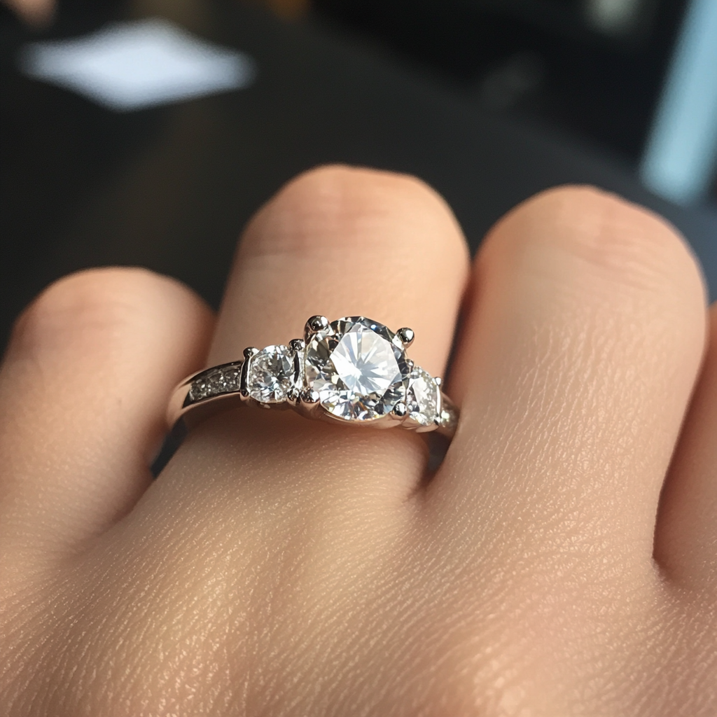
Gauging how you feel when faced the idea of letting of it go…is a really important thing! It is a GORGEOUS and lovely stone. And I love the idea WG prongs/bezel and RG shank! It might be funky but I saw a YG/RG ring with a very similarly tinted diamond from Burdeens. I haven’t seen it IRL but thought it was kinda neat


539F1EC1-8AEA-4E9D-8891-D2BB149084D9.jpeg
E346102E-33D6-4823-AB12-ACB421C7BDB5.jpeg
04721B13-0FDC-4D58-BFD4-F1BB44410524.jpeg
 
I'm glad you said that because... My heart went *squeeze * when I read it. I feel sad thinking about sending it back and not getting to look at it any more. I think that's helpful!

So - yes, I've been looking around at peach gold threads on here! I'm thinking about making the gallery more enclosed, too, so it might pick up more rosy tint! I just sold my unplated 18k WG band but wondering, if I didn't want to lean into the tint & instead wanted it to look like a warm (but not funky) diamond in RG, perhaps I should try an 18k WG bezel to harmonize with the yellow in there. 14k rose is too pink, though, and is pulling out that hint of green.

I'm curious to see the stone with unplated white gold. FWIW, my stone looks a touch olive toned in the inside of my taupey car.
 
I'm curious to see the stone with unplated white gold. FWIW, my stone looks a touch olive toned in the inside of my taupey car.

And all this investigation was done in this cream/beige hotel room or its beige balcony -- I can definitely tell the color is there and I need to be careful with it, but I don't see it when just normally playing with it, face-up!

Have people found David Klass to have a good eye for metal colors? I know he has access to many different colors but he's not a very active "designer" of settings, wondering how active he is at suggesting metals.

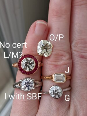
@Cerulean that Burdens ring looks so much warmer face up than this stone that I was surprised to find it was listed as O/P! Mine certainly shows more tint at the corners than centrally, light path length and all that. I haven't tested out how it'll behave in a bezel, and I think it may really change depending on closed vs open. Platform bezel all the way through largely enclosed gallery are all on the table, just want to do the stone justice...
 
My unsolicited tip is don’t try to “make it work”.
In both jewelry and makeup, if the color isn’t your perfect fit, move on. There are more options out there to love.

However, this is a stunner! If the color is good for you, you’ve found a treasure! Beautiful.
 
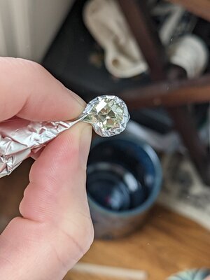
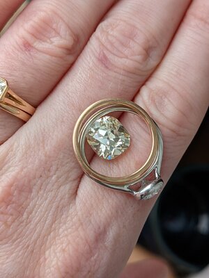
I think I'm getting to know her better. Tried out the aluminum foil bezel thing today, and with 14k and 18k rose gold, and even with rhodium plate. She's probably 85% yellow, 10% brown, 5% green?
PXL_20221016_202115610.jpg
I only see the green when I force it to come out -- 14k RG is not good, too pink, looks wrong. 18k RG basically turns her internal reflections into rose gold color, to an extent that I wonder if that might be a bad idea -- too similar to the body color -- but it definitely "goes"/"matches"/harmonizes. The color that comes out next to aluminum foil or the rhodium-plated 14k white gold ring (maaaaybe has some rhodium wearing off... warmest WG I could find, which is to say, not much warmth) is pretty and reads almost exclusively yellow-tone; it highlights the tint a little more than I would like, but of course, none of these are 18k unplated Ni-WG.
PXL_20221016_202554481_2.jpg
The J is set in 18k RG by DK.

So... I'm thinking that I could do an inner superfine bezel and gallery in 18k unplated WG, and an outer bezel and the rest of the ring in 18k RG and that would both keep the RG from touching the stone and setting off the rosy reflections, and not pull out the green/brown more.
PXL_20221016_201533007.MP.jpg
I'm at the point where I'm threatening myself to go to Michael's and get some rose-, yellow-, and silver-toned Sculpey and make some bezels!! I love-love her cut, her size, and her fluorescence. I feel like, if I say yes, all I gotta do is find the right setting and then I will never have to obsessively ruminate over this again, so -- time to convince myself the right setting exists. ;)
 
Based on your last post, it almost sounds to me like it isn’t the inherent color of the stone itself that is making you doubt, but rather the best way to set her to bring out the best in her. If that is the reason, I wouldn’t let her go. It’ll just take some time and experimenting to find out how to dress her up best.

When I had a 1ct champagne heart diamond set by DK, he gave me his opinion on what metal to use (went with 14k RG). So it wouldn’t hurt to ask, but he would need to have the stone in hand to give you his best assessment. But you’re right, he’s not the most “hands on” vendor out there.

I know you really expanded your budget for this stone, but if you had any leftover funds, would you consider a vendor that would help with design and aesthetic like CvB or VC if he’ll take your stone? Or maybe even Sako?
 
Based on your last post, it almost sounds to me like it isn’t the inherent color of the stone itself that is making you doubt, but rather the best way to set her to bring out the best in her.

Oh snap that's a great take. I have some non-negotiables - like, the majority of the ring needs to be rose gold of some type, and it needs to be bezel-set - so I just need to be confident that that'll do her justice. My aluminum foil bezel didn't kill her, and I think worst-case scenario setting her in all 18k RG brings out colors which aren't unpalatable even if it enhances the tint more than I'd prefer... So the more I deliberate, the closer I'm getting to feeling reassured I'll be able to find a way to set her which "brings out the best" while not compromising on my tastes.

Since DK was able to give you helpful gold color advice, I bet that's all I need! I have already designed the setting, so I think anyone but him wouldn't like my creative overreach, haha. Next I'm on my computer I'll screenshot it. It should be able to accommodate a white gold basket and inner bezel!


Yay! Can’t wait to see your plans for the setting. My honest opinion is that it looks lovely against the 18k rose gold. I don’t think there is any need for a white gold inner bezel unless it’s something you desire in your design.
 
@Mjay I think you're right... the more I think about it, the more embracing the tint makes sense. I have a white-white transitional (soon to be reset in platinum), I have diamonds down to M, I don't need to try to fake this one into anything other than its toasted-warm self!

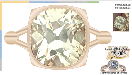
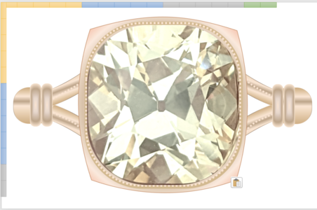
Here's what I had in mind for the setting: a delicate bezel like BrightIce's VC with inner-edge milgrain and a bit more heft to the outer part of the bezel itself, then with little points at the corners like the very generic CAD, and split-shank. The plan would accommodate a white inner bezel, but I did take away some design elements when I played with making it two-tone... and then went back to all rose. (The transition between the split shank and the main shank isn't right but that's my PowerPoint skills' limitation!)
1665975443488.png

The original plan had wraps and milgrain along the split-shank. I kinda think it's "too much" though, and prefer the simpler revision above. Could go with a brushed finish on the RG...
1665975519149.png

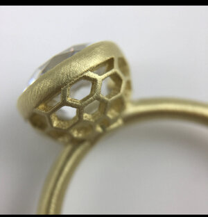
Gallery is up for debate. I like platform-style, i.e. no gallery, but I'm not sure it would be secure enough for this size of a stone. I've sketched out some galleries with a honeybee or honeycomb motif but I'm not sure I'm there yet. Still early days. :) But I do expect the bezel to amp up the "rose-goldiness" and warmth of the diamond itself. Still, that's a limited enough question I think David could definitely help with!

Yes!!!! I LOVE it! So that’s sorta what I went through with the color of mine. It was a bit different than I had expected but not in a bad way at all. I think yours will look lovely in all 18k rose or 18k peach. I’d see what David thinks. I love your design! Especially the corners. It’s going to look amazing! I love a good brushed finish. The old mine solitaire in my avatar pic is brushed gold as well. Omg I had a honeycomb gallery saved as inspiration for mine as well! I bet we saw the same pic. Obviously it didn’t work well with my design but it would pair beautifully with yours especially with a brushed finish. Omg I’m hoping that’s what you go with.
 
@Mjay I would LOVE to see your honeycomb gallery if you still have the pic saved - I haven't been able to find anything, which is kinda making me crazy bc I'm just not quite able to think in 3D enough to articulate what I want. We're celebrating 10 years on Thursday & our wedding symbol was a honeybee, & gave out little jars of honey as favors... It's a special motif.

I tried fitting little bee heads & bodies on the leafy marquise-shape motif in BrightIce's gallery but they looked more like lacewings than bees, the proportions were off.

This is the kind of creative stuff I need to pin down before I ask David for the setting! Would love to see any inspiration you found helpful, if you can find it!

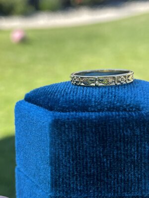
Omg so bees are my favorite to! It’s a special thing between my Son and I. I’m going to hook you up with some inspiration!!! Ok so first up is the honeycomb gallery- this ring is by Jill Vaccara. Also attaching a pic of one of my bands that has bees on it (it’s hard to see but it’s a bee over a holy leaf). It might be cute to include a bee at the very bottom of your shank. Also honeycomb would look killer with your split shank imo. F69E2388-1C39-4CAC-B6EE-2A368A382675.jpeg EEF5BA95-0560-4156-B848-D5E1C91165EA.jpeg
 
@Mjay I love both of those ideas SO MUCH. I thought about trying to get a subtle hexagonal shape, instead of soft square, on the vessel but couldn't quite get it not to look either accidental or very CvB, heh. The honeycomb gallery would look really cool, I think, bc the rest of the setting is fairly simple and a bit geometric. A secret bee on the shank, maybe even interior, would be so special. Thank you 8)
 
The transition between the split shank and the main shank isn't right but that's my PowerPoint skills' limitation!)

1) I think your PowerPoint skills are pretty darn good already!

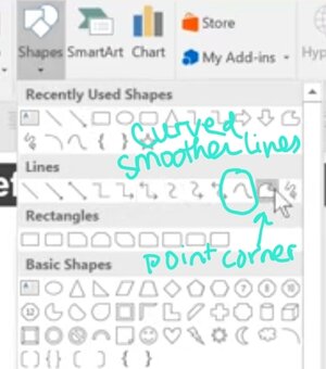
But if you want to level up your skills one more step, Youcan edit the points on the pre-set shapes to customize their angles and curves.... or use the Freeform shape tools (find them in the lines section) to create your own custom shapes.

This video will get you started with all the basics of the Freeform "Polygon" tool.

My favourite trick is to put the photo you're trying to copy on the slide then use the Polygon or curve tool (left of the one he picks) for the Freeform lines to "trace" the shape over the picture. You can get it usually 80-90 accurate with this, then go back and tweak the points after as needed.

Happy designing!

Screenshot_20221016-232034_YouTube.jpg
 
@emmy12 uh I make about 30 ppt talks per year and I never knew I could edit points on "stock" shapes?!!!!!?!!??!!! :-o and doing that simplified the crazy "tiny sliver of an arc" I was using for the cathedral struts. This is amazing. AMAZING. Thank you for upgrading my professional life as well as my jewelry design skills :lol::lol:
 
@emmy12 uh I make about 30 ppt talks per year and I never knew I could edit points on "stock" shapes?!!!!!?!!??!!! :-o and doing that simplified the crazy "tiny sliver of an arc" I was using for the cathedral struts. This is amazing. AMAZING. Thank you for upgrading my professional life as well as my jewelry design skills :lol::lol:
:dance: Yay! Glad that tip was useful! There's so much those programs can do if you take the time to muck around and play with them.
 
GET 3 FREE HCA RESULTS JOIN THE FORUM. ASK FOR HELP
Top