shape
carat
color
clarity

(Cartier inspired) Cuprian Ring

what do you think of something more like this


more pink towards the tops less toward the middle. My Microsoft paint rendition doesn't accurately reflect the organic chaos im trying to portray

chronoflower.png
 
Niel|1447086814|3947305 said:
what do you think of something more like this

more pink towards the tops less toward the middle. My Microsoft paint rendition doesn't accurately reflect the organic chaos im trying to portray

I was thinking of something similar, so I think this would be great. Let me try a slightly cleaner version. I don't promise a nice looking CAD but then again, the key word here is "try". :bigsmile:
 
All right, how about this?

floco.jpg
 
Chrono|1447092171|3947341 said:
All right, how about this?
I like it, what colors are you using? Pink, blue and what? Lighter pink?
 
Inner - light pink sapphire
middle - colourless diamond or even lighter pink sapphire
outer - cuprian tourmaline

I'm not sure what the middle should be because the diamond might outsparkle the CS and stick out like a sore thumb, but when set in 18K rose gold, it'll pick up the colour of the metal and will look tinted, which is the effect I want. If not, then it'll have to be super light pink sapphire.
 
Chrono|1447092726|3947346 said:
Inner - light pink sapphire
middle - colourless diamond or even lighter pink sapphire
outer - cuprian tourmaline

I'm not sure what the middle should be because the diamond might outsparkle the CS and stick out like a sore thumb, but when set in 18K rose gold, it'll pick up the colour of the metal and will look tinted, which is the effect I want. If not, then it'll have to be super light pink sapphire.

I have the same concern with the diamonds. I'm afraid they may look like a stark divider between the two colored melee rather than a graduation
 
To create the end result you have in mind, I think you could better use soft pink sapphires instead of bright white diamonds.
Looking forward seeing this ring come to life.
 
I'll throw another idea out there,too. what if you concentrated the pinkest sapphires down the centers of the petals, then light pinks, and final edging in the pariabas? Something like this Cartier?

116741815310814945_mb1lw2ou_0.jpg
 
How about the opposite direction - blue melee nearest the tourmaline, fading into pink melee and into the pink gold.
 
Lady_Disdain|1447105109|3947431 said:
How about the opposite direction - blue melee nearest the tourmaline, fading into pink melee and into the pink gold.

picsart_1447108669636.jpg
 
I am really loving the progression of this ring. :appl: I am glad you are entertaining the graduation melee concept. :) Will be awaiting to see your final results...which will be so amazing!!!
 
Tough decision. One design emphasizes the center stone whilst the other places emphasis on the flower design.

Which would you pick and why?

_35222.jpg
 
If you're doing it in rose gold I like the outer pink version. If you're doing a different color I would have chosen the outer blue. I love the first version, but I worry I love it becuase the cad makes the metal blur too, which won't happen irl
 
i may have missed it: what is the centre stone?

What is your intent for this ring- i know middle finger.. but was the intent to have a cocktail ring or to showcase the centre stone?

you have amazing pieces and i cant wait to see what becomes of this ring...
i was terrible with my input in the last project......but i will give you what i think and you can take it with a bag of salt :-p

From what I see.. i feel that this ring is more about the flower design. i do think that having the petals turned down or down and up as other designs that have been posted will give it more artistic flair/ organic look??
 
Niel|1447166171|3947718 said:
If you're doing it in rose gold I like the outer pink version. If you're doing a different color I would have chosen the outer blue. I love the first version, but I worry I love it because the cad makes the metal blur too, which won't happen irl

18K rose gold, so it will be a soft pinkish yellow metal. David is going to throw my project out the window with all these endless changes. :lol:
 
gregchang35|1447166458|3947722 said:
i may have missed it: what is the centre stone?

What is your intent for this ring- i know middle finger.. but was the intent to have a cocktail ring or to showcase the centre stone?

you have amazing pieces and i cant wait to see what becomes of this ring...
i was terrible with my input in the last project......but i will give you what i think and you can take it with a bag of salt :-p

From what I see.. i feel that this ring is more about the flower design. i do think that having the petals turned down or down and up as other designs that have been posted will give it more artistic flair/ organic look??

Greg,
There is no wrong answer here, in fact, there is never a wrong answer because it comes down to personal preference. Understanding why you prefer one over the other, will help me better decide which I would prefer as well. As of this point, I'm not sure whether I want to highlight the cuprian tourmaline or make it 100% cocktail.

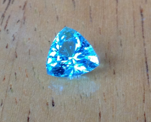
blue_t.png
 
WOW!!!! that stone is amazing!!!

now that i have seen the centre stone.. i feel that a design that will harmonise the colour with the flower concept is better than the flower itself... The centre stone looks like it will pack a punch and colours of melee will have to work/ blend in.

i cant tell too much from the CAD knowing that the centre is that cuprian tourmaline. can david make the centre stone on both CADs the same so that you can see the designs side by side?? well... it will help me at least!!!!


the left CAD works well with the colours and design.. but the colours on the right CAD - more about the flower than the centre stone work really well for my eyes....

anyways, bed time for me.... will catch up on this journey later on... hugs!!xxx
 
I made the metal the same color, in case that help

picsart_1447167666349.jpg
 
Niel|1447167786|3947736 said:
I made the metal the same color, in case that help
Niel, can I trouble you to change the inner melee from green to the same colour as the cuprian for the right side picture?
 
Chrono|1447168096|3947737 said:
Niel|1447167786|3947736 said:
I made the metal the same color, in case that help
Niel, can I trouble you to change the inner melee from green to the same colour as the cuprian for the right side picture?
Sure let me try one sec. It's all on an app on my phone, which is why its a tad low rent lol
 
I tried to match the melee color on the right and left together so the middle pink should match, too

picsart_1447168588214.jpg
 
Wow, that is a difficult choice. :shock:
I love both but I want to say I like the blue outer melee the best. I do have to say that I can't see a bad choice here. Either way, it's going to be stunning!
 
In CAD form I like the one on the left: however, I think IRL the one on the right will flow better and look more harmonious. It will still showcase that incredible tourmaline. I'm sure either will be lovely. If you went with the one on the left would you still do 2 rows of the Paraiba melee? Knowing how small they are I don't think it would edge the petals enough with one row-especially with the petals dipping downward.
 
Wow, thanks Neil for putting the center stone in there! I was thinking about how to help with input, but I wasn't sure since it was hard for me to picture the tourmaline in the center, so thanks for helping with the visualizing!

Chrono I love both, but I think with rose gold I prefer the pink melee on the outside, just because I think that would look the most organic and "flow". But again I love both and am so excited to watch this project come to life!
 
Thank you, Niel. :appl:
It's so strange how 2 rings with the same colouration can look so different when the graduation is reversed.

Elle,
I know what you mean. As soon as I think I prefer the one on the left, I change my mind and think the right side is nicer. :errrr:

Pinkjewel,
I, too, am drawn to the one on the left, and like you, I think the one on the right could end up looking better in reality. I will have 3 rows of melees max (as shown) because I do not have any more finger real estate to carry it off. :lol: It is interesting that on the left, the trillion shape is emphasized whereas on the right, the trilliant is morphed into a flower shape due to the illusion of the cuprian melees. Knowing that I cannot pull off more than 3 rows, how does this affect your choice?

Lovedogs,
Thank you. Any comments, even if it is just to say, right over left, is good enough!

Greg,
I hope you'll wake up to see Niel's colour corrected mock-up. Which would you choose? Da da da dum!
 
pinkjewel|1447170006|3947776 said:
In CAD form I like the one on the left: however, I think IRL the one on the right will flow better and look more harmonious. It will still showcase that incredible tourmaline. I'm sure either will be lovely. If you went with the one on the left would you still do 2 rows of the Paraiba melee? Knowing how small they are I don't think it would edge the petals enough with one row-especially with the petals dipping downward.

I agree the cad I like the outer blue, but I think it won't look better in the final version than the outer link would

Does the fact that the sapphire melee would be more durable, and probably better for the outer rows, make a difference?
 
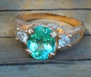
Pink on outside - the one on the right!!!! Please oh please, Chrono. If the cuprian is as vibrant as it is in the photo, then it will easily stand up to other color. Trust me on this. Nothing compares to the cuprian glow, not even diamonds. So even if you have pink sapphire on the outside, the glow of the cuprian will always be the first thing that draws your eye - and then secondarily, the cohesive flower. I have, and have sold enough cuprians to know that the glow is always present, even in the lightish, more greenish blue cuprian I have in my ring (sorry for spamming the pic, but it gives you and idea since its in 18k rose gold with diamonds in case that helps).

cuprian_ring_7-15_0.jpg
 
Lots of votes for an outer pink!

Minou,
My concern isn't that the cuprian center stone will be dimmed by the diamonds but that the sapphire and less glowy cuprian melees will be the ones affected. The white diamonds might become a borderline delineating the design, instead of being the glue that holds the graduation of colours together.
 
My vote goes to inner pink:
- makes the center stone pop
- creates a clear inner stone outline (vs a 'blur' with the center stone and cuprian melee)
- gives an 'calmer' and classic appearance that you will love for everyday wear. Even though this will not be a ring to wear every day.

Good luck with following your own heart and gut feeling
 
Chrono|1447178931|3947861 said:
Lots of votes for an outer pink!

Minou,
My concern isn't that the cuprian center stone will be dimmed by the diamonds but that the sapphire and less glowy cuprian melees will be the ones affected. The white diamonds might become a borderline delineating the design, instead of being the glue that holds the graduation of colours together.

I know what your concern is and I'm sorry I wasn't clearer. I understand your point and concede that it might be an issue with very small Paraiba melee vs diamonds (but then again, if it glows like its bigger relative, even then I can't see it as an issue). What I was responding to was the other concern of yours (I think it was a concern anyway! :lol: ) that the pink at the edge would draw the eye away from the cuprian.
 
GET 3 FREE HCA RESULTS JOIN THE FORUM. ASK FOR HELP

Featured Topics

Top