shape
carat
color
clarity

(Cartier inspired) Cuprian Ring

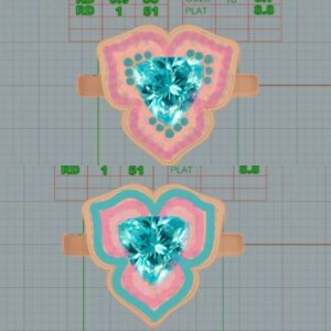
I love the blue on the outside and would pick that choice. To my eye it just ties it all together to have the border the same color as the outside. I asked my husband which one he likes, and he picked the one with the pink on the outside. He said he thinks it makes the center stone pop more. That's a good example of two people sitting next to each other having different preferences :).
Either way it is going to be gorgeous!
 
This just keeps getting better and better! Hurry up and choose so we can see the finished piece :naughty:
 
Wow-great work niel!!!


I quickly read some comments about the melee glow (diamond/sapphire/ cuprian) v the centre stone.

I must admit, I am not sure of how each of the melee stones will perform next to each other or how it would work with the centre stone as I am not a colored stone kinda person except for FCD!!!! And I am generally a solitaire kinda guy. :angel:

With the center that you have provided, the diamond melee will do quite well: the glow of cuprian and sparkle of the diamonds will match. . As for the pink sapphire I am not sure. I am also assuming that the cuprian melee will have the same glow as the centre stone.

That being the case, I still lean towards the right cad- my original choice. Even if the pink sapphires do not match with light performance, being at the edge of the petals will give a nice fade away from the centre. I am drawn more to the pink because flowers to me - pink works v blue. But that centre stone- OMG - smacked me between the eyes!!!! That pink on the outer just a lovely touch to finish the flower design.

Do you think you can get David ( or other PSer- Niel???) to put generic diamonds, sapphires, cuprian melee into the Cad?
It may help visualize the final product???
 
gregchang35|1447194302|3947964 said:
Wow-great work niel!!!


I quickly read some comments about the melee glow (diamond/sapphire/ cuprian) v the centre stone.

I must admit, I am not sure of how each of the melee stones will perform next to each other or how it would work with the centre stone as I am not a colored stone kinda person except for FCD!!!! And I am generally a solitaire kinda guy. :angel:

With the center that you have provided, the diamond melee will do quite well: the glow of cuprian and sparkle of the diamonds will match. . As for the pink sapphire I am not sure. I am also assuming that the cuprian melee will have the same glow as the centre stone.

That being the case, I still lean towards the right cad- my original choice. Even if the pink sapphires do not match with light performance, being at the edge of the petals will give a nice fade away from the centre. I am drawn more to the pink because flowers to me - pink works v blue. But that centre stone- OMG - smacked me between the eyes!!!! That pink on the outer just a lovely touch to finish the flower design.

Do you think you can get David ( or other PSer- Niel???) to put generic diamonds, sapphires, cuprian melee into the Cad?
It may help visualize the final product???

That'll take some doing. .......

But lete see what I can cook up
 
It's entirely too tedious to do the dots on my phone. Chrono,let me know if you want me to post the all rose goldy color image (before I hadded the colors) if you want to add the colors yourself as dots

img_20151110_182045.jpg
 
When the metal is pink, I actually think the pink outer pulls more attention to the center, and is more subtle than doing the outside blueb
 
Yup, totally agree that pink on the outside will be best overall. So excited for you! :appl:
 
Hi Chrono,

First, you will have a beautiful ring with either option. Second, I'm flattered if you are using my asscher and sapphire ring as inspiration for the under gallery. David made the suggestion and I took a leap of faith knowing that the pinks have a flowery feel. It was a perfect choice and will be even more perfect for a flower such as yours. Finally, I read this post front to back twice and went back and forth several times. I didn't realize Niel was so talented and her final CADS made it an easier choice for me to personally vote for the pink outer stones, however, I think either option will be stunning and one of a kind :love:
 
My first reaction was to choose the blue on the outside, I like flashy design though. Both look really good though just depends on your aesthetics. Excellent suggestions everyone especially Niel with your photoshopping skills.
 
Niel|1447197726|3947987 said:
It's entirely too tedious to do the dots on my phone. Chrono,let me know if you want me to post the all rose goldy color image (before I hadded the colors) if you want to add the colors yourself as dots

One talented laday!!!

My vote still goes the pink outer.

What else do you have in your collection? i know of your AVC, your emerald cut and the FCD..so perhaps a blue outer edge might give you a different ring to the collection???
 
Minou,
The melees do not glow as much as the trilliant, which is why I'm concerned the diamond melees might be more problematic in reality. Nah, no worries about the pink at the edge taking the focus away from the cuprian. It's just a different effect.

2Neezers,
Yup, no wrong and no right. It's all about how one "sees" each design.

Lady D,
How do I choose? :errrr: I'm trying, I really am!

Greg,
If it were only the cuprian and diamond, I have no concerns. The sapphires are the ones throwing a wrench in all this. :lol:

Niel,
Wow, you are amazing. The new "CAD"s are looking more like the real thing and helps all of us visualize it better. The outer pink seems more and more cohesive (single flower) whereas the outer blue places a lot of emphasis on the flower design (flower within a flower within a flower).

Lovedogs,
Good to know that you have cemented your decision. The outside pink is looking better as time goes on.
 
Gemajames,
The owner of the 3 stone ring has spoken! Thank you for chiming in and I hope you aren't offended that I'm ripping off the gallery design of your David Klass ring.

Greg,
I have lots of CS rings, but they all have a white diamond halo of sorts. They are quite traditional even with their various twists on the usual halo (split shank, traditional halo, underbasket halo, etc) with none being a coloured halo. This will be my first cocktail ring.
 
Chrono|1447247626|3948149 said:
Gemajames,
The owner of the 3 stone ring has spoken! Thank you for chiming in and I hope you aren't offended that I'm ripping off the gallery design of your David Klass ring.

Greg,
I have lots of CS rings, but they all have a white diamond halo of sorts. They are quite traditional even with their various twists on the usual halo (split shank, traditional halo, underbasket halo, etc) with none being a coloured halo. This will be my first cocktail ring.

Chrono, Quite the opposite, as I'm flattered that you would consider using it on your beautiful cuprian ring :appl:
 
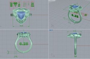
CAD update!

29695-7.jpg
 
Chrono|1447293330|3948537 said:
CAD update!


Ahhhh the flow is just AMAZING!! I love how the "petals" seem to curve in this version. It really is coming to life and starting to look 3D! :appl: :appl:
 
Chrono|1447293330|3948537 said:
CAD update!

Love the curves and love the change to the gallery.

It seems like a lot of metal in the profile view of the petal, no?
 
Niel,
I think the Cartier's orchid profile looks a bit thick too because that's the style of pave (smooth pave)?

I am blown away by what David has done. I expected only a slight downward tilt but instead he gave me the "wave", which I thought was not possible with only 3 rows of pave!
 
BEautiful work by david! Awesome...

now to decide on the melee!!!!
 
Now that is gorgeous!
 
Love it!!! So much more organic looking now!! :appl:
 
The latest CADs are amazing, love the curves on the petals, it'll be interesting to see the final result.
 
Chrono|1447298476|3948585 said:
Niel,
I think the Cartier's orchid profile looks a bit thick too because that's the style of pave (smooth pave)?

I am blown away by what David has done. I expected only a slight downward tilt but instead he gave me the "wave", which I thought was not possible with only 3 rows of pave!

If its going to stay that thick, I dont think it's a problem, but I'd ask him to send you a pic of it early to see if it needs something extra done tkxthe side, like a row or two of millgrain.

I expected it to have a ribon of metal, I just want expecting one as thick. That's my only thing I noticed about the design. I just wonder then how the pave will be. Had you discussed that with him?
 
Much better, more dimension to the piece. My only issue now are the prongs. I think single prongs on each of the pointed corners, puts more pressure on them. I would rather see a v-prong on the corners, or a double prong around each of the corners. It may affect the aesthetic of the design, but it is a tourmaline, and I rather be safe than sorry, especially when dealing with such a hard metal like platinum.
 
I'm loving the new CAD. There is so much more dimension to the ring now. :dance:

In a previous post I put my vote on the outer blue. Now, I'm thinking outer pink will look better (seriously, this ring keeps making me flip back and forth...what a difficult choice).
 
Niel|1447330729|3948702 said:
If its going to stay that thick, I don't think it's a problem, but I'd ask him to send you a pic of it early to see if it needs something extra done to the side, like a row or two of millgrain. I expected it to have a ribbon of metal, I just want expecting one as thick. That's my only thing I noticed about the design. I just wonder then how the pave will be. Had you discussed that with him?

I agree it looks a bit thick but then again, this is a BIG ring and it will need the structural strength to support all the melees within the flower. I'm not sure if I want to add millgrain because there's already so much going on design-wise. We'll see how it goes, and whether that thickness can be somehow "softened" in appearance.

What do you mean by "how the pave will be". Do you mean the colouration part? He said to approve the framework first, then we'll move on to the design colour placement.
 
TL|1447331017|3948703 said:
Much better, more dimension to the piece. My only issue now are the prongs. I think single prongs on each of the pointed corners, puts more pressure on them. I would rather see a v-prong on the corners, or a double prong around each of the corners. It may affect the aesthetic of the design, but it is a tourmaline, and I rather be safe than sorry, especially when dealing with such a hard metal like platinum.

I made a notation in the previous drawing and email for chevron prongs but I see that they are still single prongs. I will ask David to make this change. I don't feel comfortable with single prongs for the pointy corners either, especially for a tourmaline.
 
Lovedogs, Greg, Lady D (my supposed alter ego), PinkJewel, LovingGems, Elle, and others who are reading this thread,
Given the updated CADs, does this change your mind(s) as to pink melees outside or blue melees outside?
 
I was just saying I can't say its perfect becuase I'd I can't see what pattern he's putting the stones or how the graduation will look with the slight change in petal shape. But I figured you'd nail the shape down before the pave.

I'd still see if he can thin it out at all while still keeping the structural integrity, bit if he can't its not the end of the world.

Looking at it now I don't think millgrian is the best idea in its current state, but I'm just trying to think how you could break up such a large metal area.
 
My vote still goes to the pink melee on the outside. the reasoning is still that for me the pink will soften the edges from the sparkle point of view... the cuprian and diamonds will be the centre of attention and then pink sapphires fade out...

what does David say?
 
My vote is also still for pink melee on the outside, even with the new shape. I think especially now with the improved "flow", the pink will be gorgeous on the outside :)
 
GET 3 FREE HCA RESULTS JOIN THE FORUM. ASK FOR HELP

Featured Topics

Top