- Joined
- Apr 22, 2004
- Messages
- 38,363
Firstly, I'd like to thank LD again for helping me work around the picture attachment issue.
Upgradable and Deorwine,
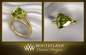
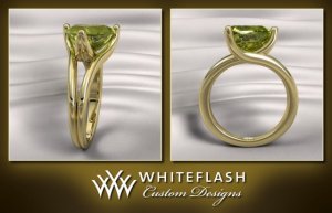
I am sorry to say I had the exact opposite reaction when I opened the CADs last night. My jaw dropped and I was rendered speechless but not in a good way. As it is, the final design could not be a further departure from my original inspiration. It now looks like a "regular" (if there is such a thing) split shank setting, merely altered for a trilliant.
LD and jstarfireb,
I'm with you on the feeling of the design. I much prefer version 2 even if the head is squat and the curvature isn't there. It no longer captures that slight edgy modern touch coupled with that timeless feel. I have requested WF to return to version 2 and see if there can be any further slight modification (keeping the main elements untouched) to raise the stone a little and curve it as much as structurally possible.
Aoife,
You are very tactful in expressing your opinion, and yes, I am definitely not liking this one at all as well.


300x240.png)