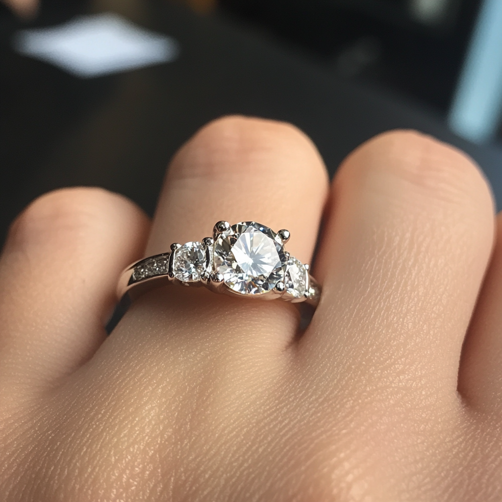
shape
carat
color
clarity

Color coordination

Thanks SarahHarris, I totally agree!

SpheneQueen, Zircon would be great if it was more durable. If I get this ring in the light blue stone that I'd like I can't post it on PS lol. Blue moissy, but SO is highly against it. So a lighter sapphire, I have Richard Homer looking out for a lighter but deep blue color.
I just am a lover of sparkle...
 
Hi there! I think this a brilliant "outside the box" match of a colored stone in this setting. The blue tone of the stone seems to fit in nicely with the coolness in the metals. In fact it made me poke around the WF website to consider it for a purple spinal I have. BUT back to you ;) I am questioning however how pink the rose gold is? In the photos on this thread, and on WF's site, they all seem a different on the lotus mounting. My preference with your stone is the one with the ring lying down that seems the pink-est. Some images the gold looks almost yellow (I even looked up the description to see if this was an alternate option as I was confused by what I was seeing.) This is obviously a personal preference, but I do think the pinker gold looks better color combo wise with the blue than the yellower gold in this particular setting.
 
wakingdreams53|1311906989|2979463 said:
Any opinions of this ring w/ 6 prongs?


How would you turn it into a 6prong?

I'm wondering if the obvious solution - adding an extra rose gold petal to both sides - wouldn't make the whole thing too busy, unless you're planning on a really giant sapphire. If you want more than 4 how about 8? I'm betting there's some elegant way to use those hollow white petal profiles, without making it look like webbing..
 
What about a low/mid saturation Montana sapphire? I think the slightly greenish color in them would look good against pink gold as long as they don't have too much grey.
 
pregcurious|1311815159|2978466 said:
I originally suggested yellow gold with the blue zircon, but I am having second thoughts now that I see it. I think yellow gold looks good with a more saturated blue, like a classic sapphire color. With this lighter blue color, I think the pink gold looks better, at least on Photoshop.

Me too. The slightly violetish blue that I see in your example stone actually seems to go better with rose gold, which is great, since that was your original choice. But I still think pure saturated blues (like the elusive "cornflower blue") look really good in yellow gold, and I'm not normally a yellow gold fan at all.
 
Mayachel, do it! That would be beyond gorgeous! :)) Yes, I agree. For some reason the lighter blue looks best with the rose gold. Of all combinations! Rose gold is terribly tricky though, everyone's is different, so there's a bit of a risk with online vendors in that sense.

Yssie, no giant sapphire. I didn't think it would look that busy. 12, 2, 4, 6, 8, 10 o'clock position, and petals in their relative positions beneath. With that much going on in the head, I'm a bit more reluctant to have pave sides.
I tried to do it in photoshop, it still works. Basically like the ERD Roya, but Lotus-y. If it's unrealistic let me know. I don't want to get my hopes up over some lines I drew :lol:.


Pregcurious, the greenish tint is what makes me sway away from irradiated diamonds. That blue/green-ness bugs me. I'm most attracted to true blues.

Jstarfireb, you're right. Though as the elusive cornflower is... well... elusive. I'm not getting my hopes up too high for it.

Then ALL of this aside, my darling mother keeps telling me that it won't work for daily wear because blue doesn't match everything. :rolleyes:

4 vs 6.jpg
 
GET 3 FREE HCA RESULTS JOIN THE FORUM. ASK FOR HELP

Featured Topics

Top