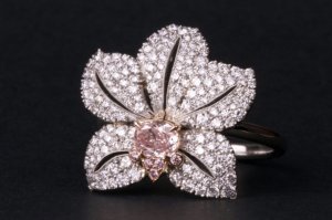
shape
carat
color
clarity

FCD CAD assistance request

All the Russian/belle epoque is YG/RG - can she do a yellow version for you to look at?
 
Chrono - i am new to the CS world but wanted to let you know i read your entire story on this ring yesterday and WOW what a journey! I think its great you have stuck with it and found something you wanted without giving up or compromising. I saw you mentioned early in your post that you werent interested in green gold, has your stance on that changed? I know you said you were concerned about how busy the 3 tone gold in the ring would be if you did the yellow pear in a YG basket, but by looking at the most recent CAD with colors loaded, the pear's basket appears to be mostly hidden. I still vote for doing the 3 tone - WG/Platinum main, with RG in the pink stones and YG with the pear. I think with the crown baskets and the pear's basket mostly hidden in the middle of the stone - the busy-ness of the multi-tone will be held to a minimum. Just my 2 cents! Best of luck - its coming along beautifully!
 
I think Starzin's "lemonade ring" example is a perfect depiction on how 3 tones of gold can be used without looking too busy at all. beautiful ring!
 
Starzin|1408710482|3737424 said:
:shock: :shock: :shock: Goodness that's a bit of a shock after all this time! I'm quite bowled over :lol: Ooooh... I'll have to think on this... I'm not really a WG/plat girl. I can remember the goldsmith where I took silver jewellery classes many moons ago saying "silver is white, everything else is silver" to which I would add - platinum is grey 8) But you already know that and still love it.

The rose gold looks a bit pink to me but I don't know what your 18k RG looks like over there (US). She's done a very good job though, I have to give her that.

I know the green gold is subtle, I just loike it.

Green gold does not look good on me; rather, it looks a bit sickly or pukey. :bigsmile: The 14K rose gold she used in the CAD is NOT what I requested. I asked for 18K which is a softer yellower hue, so I hope she can correct that. I am very much a platinum and high karat gold person and look good in both metals. I do not mind the light gray patina of platinum at all.
 
Starzin|1408710574|3737425 said:
All the Russian/belle epoque is YG/RG - can she do a yellow version for you to look at?

I was strongly dissuaded when I suggested a YG/RG combo. She said it isn't attractive. Yellow will be good for the pear but hideous for the pinks. Hence I suggested a YG and RG two toned ring and she said it's not nice looking.
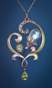
 
burntskye|1408710761|3737429 said:
I think Starzin's "lemonade ring" example is a perfect depiction on how 3 tones of gold can be used without looking too busy at all. beautiful ring!

The Lemonade works because it has a distinct border. Green inside, then rose, then white on the outside, with no mixing whatsoever. In my case, the white is the predominant colour, with pink and yellow inside, which is why it is very likely to look haphazard/busy.
 
Green gold does not look good on me; rather, it looks a bit sickly or pukey. :bigsmile: The 14K rose gold she used in the CAD is NOT what I requested. I asked for 18K which is a softer yellower hue, so I hope she can correct that. I am very much a platinum and high karat gold person and look good in both metals. I do not mind the light gray patina of platinum at all.

You really need to do something about your skin Chrono! Rose gold coloured skin that makes GG look pukey oh save me! I'm laughing my head off here :lol: :lol: :lol:

I was strongly dissuaded when I suggested a YG/RG combo. She said it isn't attractive. Yellow will be good for the pear but hideous for the pinks. Hence I suggested a YG and RG two toned ring and she said it's not nice looking.

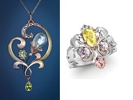
But, but, but see the first of the two pix you just posted and this...

an-pearl-flower-pendant.jpg
 
burntskye - the cads do show YG under the pear - it's just really hard to tell as you say.

I think we should bezel 'em!

I liked the original pear and that brooch TL posted looks good with bezels. It would also make the diamonds more prominent :twisted:
 
I surely have funny coloured skin. :tongue:

I so wish my FCDs were bigger, which is why I am going with prongs. Bezeling teeny tiny stones will only make them look smaller, not to mention less light coming in from the sides, difficulty in cleaning small stones and the like.

I really think that going with rose or a gold base will overpower the FCDs and lessen the contrast. If you look at the Russian rings, they used diamonds or very strongly coloured demantoids, so a yellow metal creates that strong contrast.

one_on_one.jpg
 
You sure do lady except all your rings look gooorjus on it!

Not sure what I'm supposed to see from that - it's very tiny Are you telling me I won't see the difference? Well not me personally I'm never likely to see it IRL.
 
Starzin|1408712261|3737444 said:
You sure do lady except all your rings look gooorjus on it!

Not sure what I'm supposed to see from that - it's very tiny Are you telling me I won't see the difference? Well not me personally I'm never likely to see it IRL.

Thank you. Yes, when shrunken down to size, the silver platinum doesn't look quite as stark, helps the FCDs pop and I think will look softer once the leaves are engraved. Also, in the pearl booch example, note that the stones are either white or very strongly coloured, so they don't get "lost" in the pink and yellow metal.
 
You're welcome.

Okay, okay... I give in :lol: Yes. pity the FCDs didn't grow a bit while we've been f*rting around for 9 months! This ring has had a true gestation period.

I just wanted to put all the options before these stones were set in gold as it were, but do remember that the designer's opinion is just that. You will be the one wearing it.
 
I didn't realize that the yellow would be bad for the pink diamonds.

I change my vote! If you are set on prongs, I would do the three metals. I thought previously that you were going to do bezels and one would be able to see the metal colors very easily.
 
Starzin|1408712584|3737449 said:
You're welcome.

Okay, okay... I give in :lol: Yes. pity the FCDs didn't grow a bit while we've been f*rting around for 9 months! This ring has had a true gestation period.

I just wanted to put all the options before these stones were set in gold as it were, but do remember that the designer's opinion is just that. You will be the one wearing it.

I surely wish the FCDs grew, even if a tiny little bit, in the meantime. :tongue: It struck me in the FCD links you posted, that all of them were surround by white halos or something very different in colour to create that contrast, which made them pop. As much as I like the soft look of high karat gold, it does not have sufficient contrast to make the FCDs pop. White metal or white diamonds are the only way, it seems.
 
pregcurious|1408712635|3737450 said:
I didn't realize that the yellow would be bad for the pink diamonds.

I change my vote! If you are set on prongs, I would do the three metals. I thought previously that you were going to do bezels and one would be able to see the metal colors very easily.

Your vote is noted! :wavey:
 
Preg you've really got to keep up you know ;)) But good that Chrono is getting consensus.

Ummmm... I saw yellow diamonds in YG and pink diamonds in RG and white diamonds in WG... didn't I :? Never mind... I'll get used to it and you already have :))
 
Starzin|1408713087|3737456 said:
Preg you've really got to keep up you know ;)) But good that Chrono is getting consensus.

Ummmm... I saw yellow diamonds in YG and pink diamonds in RG and white diamonds in WG... didn't I :? Never mind... I'll get used to it and you already have :))

Yup, noted too. :lol: But all in the same ring? If so, I must have missed it. Are there rings where there is yellow, pink and white diamonds in a yellow + rose gold combo?
 
Actually, getting the wax is going to be another head-bender because I truly do think the engraving is going to make a world of difference as well, particularly as light hits the highs and lows of it. I think you're right in that the shrinking does show the FCDs up more.

Every time I go to 'submit' it tells me someone else has do I want to change my mind :lol:
 
Yup, noted too. :lol: But all in the same ring? If so, I must have missed it. Are there rings where there is yellow, pink and white diamonds in a yellow + rose gold combo?

Eerrrm... pass :?

No I don't!! That's what the lemonade ring is. I know they're not FCDs individually set but still.
 
Starzin|1408713560|3737462 said:
Yup, noted too. :lol: But all in the same ring? If so, I must have missed it. Are there rings where there is yellow, pink and white diamonds in a yellow + rose gold combo?

Eerrrm... pass :?

No I don't!! That's what the lemonade ring is. I know they're not FCDs individually set but still.

I think Lemonade is very pretty and the reason why the combo works is because there are distinct borders. Yellow in the center, a thin border of rose and all the white stays on the outside. This gives it contrast and is a clean look. I think a mish-mash would not look as elegant. There is no yellow amongst the white, and at no time did any of the colours break the "borders".
 
Starzin|1408713457|3737461 said:
Actually, getting the wax is going to be another head-bender because I truly do think the engraving is going to make a world of difference as well, particularly as light hits the highs and lows of it. I think you're right in that the shrinking does show the FCDs up more.

Every time I go to 'submit' it tells me someone else has do I want to change my mind :lol:

I have a feeling the engraving is going to give it a whole different look. :think:
 
Lemonade - I'm not actually trying to change your mind, you're happy with the colours in the cads ('cept for 18K RG). You're happy = I'm happy. Truly. It's alright. What ever you prefer. You and your finicky skin.

I have a feeling the engraving is going to give it a whole different look. :think:

Yess'm. How long? Next week you said?
 
I think so. Gotta pay a deposit first which I'll do as soon as the shop opens.
 
I'm a little slow. I have been bad about keeping up with PS in the last year. I'm like, "wah"?

Where is this fab lemonade ring?
 
pregcurious|1408715365|3737473 said:
I'm a little slow. I have been bad about keeping up with PS in the last year. I'm like, "wah"?

Where is this fab lemonade ring?

screen_shot_2014-08-22_at_0.png
 
I'm thinking Saturday?? But of course it's Friday morning for you - which time zone are you in? Pacific, mountain etc

Ask for two waxes - one to paint silver so you can get it for real. It'll give you something to do :bigsmile:
 
I think it will be beautiful, Chrono. I think your skin tone must be similar to mine- and rose gold just fades into it. Sometimes I like it as a chain will kind of disappear around my neck- just leaving diamonds to see. But I totally understand where you're coming from. You need the white metal for the contrast and as you already know it won't look nearly as stark once the leaves are engraved. The yellow pear doesn't look that good with the coppery rose gold in the last CAD, but the softer 18kt rose gold should look much better, and the prongs and baskets won't be nearly as pronounced IRL as they are showing in that CAD, either. I think the best thing that happened is the jewelers got a new CAD designer who took this ring to a different level. Kudos to both you and the designer. I truly can't wait to see this ring finished. :appl:
 
The shop is the West Coast, I am on the East coast. I have to wait another 3 hours for them to open.
 
pinkjewel|1408715572|3737476 said:
I think it will be beautiful, Chrono. I think your skin tone must be similar to mine- and rose gold just fades into it. Sometimes I like it as a chain will kind of disappear around my neck- just leaving diamonds to see. But I totally understand where you're coming from. You need the white metal for the contrast and as you already know it won't look nearly as stark once the leaves are engraved. The yellow pear doesn't look that good with the coppery rose gold in the last CAD, but the softer 18kt rose gold should look much better, and the prongs and baskets won't be nearly as pronounced IRL as they are showing in that CAD, either. I think the best thing that happened is the jewelers got a new CAD designer who took this ring to a different level. Kudos to both you and the designer. I truly can't wait to see this ring finished. :appl:
PinkJewel,
Your shared insight is immeasurable; when you brought up the topic of creating contrast to help the FCDs pop, particularly in Orchid, it made so much sense and you even have first-hand experience with it. Add to the fact that we both have rose gold skin issues made it more applicable to my case. Thank you so much for your input.
 
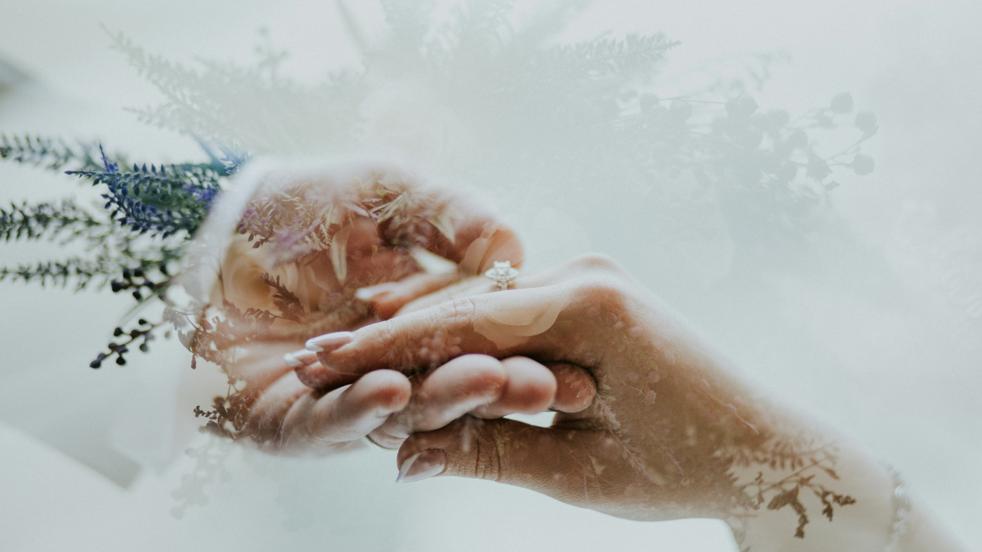
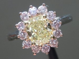
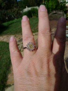
You're welcome, Chrono. I've played around so much with setting my pink heart to try to get it to show up on my rose gold colored skin, too!!! My DBL ring is 3 metals- 18kt yellow gold prongs around the center yellow diamond, rose gold around the pink diamonds and basket, and platinum band. I don't think it looks busy- and jewelers always compliment me about the use of metals. But, the outer halo of pink diamonds and rose gold get lost in my skintone. People never realize that the diamonds are pink. In the hand photo here you can see more pink in the sunlight than everyday. I've felt the ring needs more contrast for the pinks to pop. On the other spectrum is my RDG orchid ring- no question that the platinum and diamonds make the pink diamonds stand out.

r4028ja.jpg

_21570.jpg

_21571.jpg
 
GET 3 FREE HCA RESULTS JOIN THE FORUM. ASK FOR HELP

Featured Topics

Top