shape
carat
color
clarity

FCD CAD assistance request

Upgradable|1397073704|3650688 said:
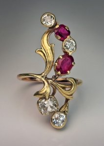
I'm glad your phone convo helped you feel better about the project. The look of the 2nd CADs had me going :confused: It seems maybe the focus is broken up by trying to highlight each stone individually. What about having the three small round stones bead and bright set into a leaf, something like the rose gold example you've just posted above. The the larger oval and pear shaped stones can be the bud and flower, but pulling the whole design together?

Uppy,
I love the idea but I don't think it is feasible based on the size of the FCDs. The 2 small rounds are actually almost the same size as the oval! It would be one huge leaf at close to 10 mm long. :bigsmile:
 
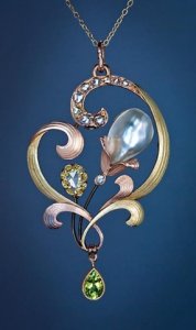
This made me think of your project Chrono.

10262254_285279278298770_6927195748008219841_n.jpg
 
That pendant is so pretty! Love the different golds. :love:
 
I'm excited to see the next CAD revision.
 
Nice pendant. I'm looking forward to the next chapter for Chrono too!
 
FrekeChild|1397837940|3655548 said:
This made me think of your project Chrono.

Freke,
We played around with this pendant design too! I love it but it's not right for a ring. It's definitely gorgeous though. :love:
 
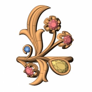
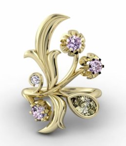
!!! UPDATE !!!

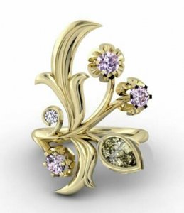
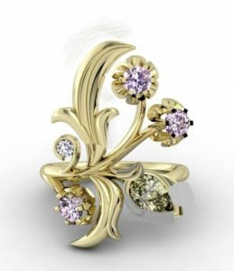
Changes made
Branches are tapered so that they appear very thin from the top.
Branches are also tapered them from wide to narrow as they approach each stone.
Pink diamonds in the buttercup style heads. The jeweller will refine and soften those and then attach them to the branches.
Leaves and layout from the original ring and sketch.
Yellow diamond in a bezel, like the stones in the original concept ring.
With the little white diamond, the jeweller will shape the end of the curl to more of a point to complement the shape of the leaves.

_17182.jpg

chronocad1.jpg

chronocad2.jpg
 
Please comment - good, bad and all in-between are welcome. Brutal honesty is especially appreciated.

chronorender.jpg
 
Wow, huge difference! That is starting to be really lovely! It would be good to know the parts you like about it so that I don't step on your toes; I think you have done a fantastic job in communicating your vision. Full disclosure: I always think CADs look chunky and am never truly in love with the CAD design because it makes everything look clunky and lacking delicacy and elegance, if you kwim.

But the leaves look like leaves! The stone settings are much, much more delicate, the arcs and curls are graceful, AND the aliens are gone!! :o :bigsmile: I am wondering if you can thin out the stem and buttercup baskets a bit and slenderize/perhaps slightly shorten the one leaf sticking up like a dolphin? I really don't mean that to sound as bad as it might, I'm just trying to make it clear what I mean. I don't know if its possible, without weakening the metal too much, and I also don't know if its a case of the CADs once again overemphasizing the thickness of everything? But those are what I would suggest. I am so impressed with how far its come - I hope you love it? I also absolutely adore the little diamond with the gold wrapped around, like a cat with his tail curled around him.
 
Also, I quite like it, but do you mind the big diamond being bezel set when the others (with the exception of the little cat ;)) ) are all prong set? The difference wouldn't bother me, but if I was OCD, after a while, I wouldn't be able to get my mind off it, I think! :lol:
 
The emphasis definitely seems to be on the design and not necessarily the stones...it's much better than it was though.
 
FrekeChild|1398190227|3657928 said:
The emphasis definitely seems to be on the design and not necessarily the stones...it's much better than it was though.

Good observation.
 
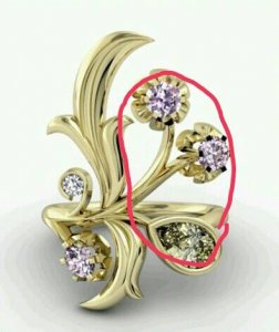
The only thing I thought was that this area was lacking a leaf motif.

uploadfromtaptalk1398193184927.jpg
 
On looking again (and again), what stands out now to me is the heaviness/amount of metal of the leaves (top and bottom) vs. the stems and flowers - so heavier feeling on one side than the other. Related to Niel's observation.
 
The more I look at it, the more I like it the way it is. Simple and elegant. I actually doodled some extra leaves and buds, but there is a point where it get's too busy or starts to resemble that 'L' shape and this is very classic IMO. The "weight" of the stems brings attention to the ring and I don't see them as being heavy but rather an icon of that style of jewelry.
 
minousbijoux|1398187477|3657885 said:
Wow, huge difference! That is starting to be really lovely! It would be good to know the parts you like about it so that I don't step on your toes; I think you have done a fantastic job in communicating your vision. Full disclosure: I always think CADs look chunky and am never truly in love with the CAD design because it makes everything look clunky and lacking delicacy and elegance, if you kwim.

But the leaves look like leaves! The stone settings are much, much more delicate, the arcs and curls are graceful, AND the aliens are gone!! :o :bigsmile: I am wondering if you can thin out the stem and buttercup baskets a bit and slenderize/perhaps slightly shorten the one leaf sticking up like a dolphin? I really don't mean that to sound as bad as it might, I'm just trying to make it clear what I mean. I don't know if its possible, without weakening the metal too much, and I also don't know if its a case of the CADs once again overemphasizing the thickness of everything? But those are what I would suggest. I am so impressed with how far its come - I hope you love it? I also absolutely adore the little diamond with the gold wrapped around, like a cat with his tail curled around him.

So many different thoughts are going through my head that I have to stop and think things through before replying. Minou, I agree that the difference is pronounced and in a good way too. I feel like we are finally starting to get somewhere and tweaks from now on will be just that, tweaks and a redesign. Don't worry about stepping on toes because I want ideas right now, even if they are different from what I have in mind. You never know what might strike the right look.

Yeah, the leaves look like leaves! :appl: The entire ring has that delicacy about it now too. I don't know how much more stem thinning can be done but I will ask. I like the buttercups but cannot tell how thick they are from the CADs. I will have to ask about them too. Is the top leaf the "dolphin" leaf? I did not see it until you mentioned it. Perhaps if it curled a little more? And yes, I absolutely love the little white diamond curl. It is so adorable yet elegant.
 
minousbijoux|1398187663|3657888 said:
Also, I quite like it, but do you mind the big diamond being bezel set when the others (with the exception of the little cat ;)) ) are all prong set? The difference wouldn't bother me, but if I was OCD, after a while, I wouldn't be able to get my mind off it, I think! :lol:

This one bothered me right off the bat. It looks out of place. I'm not sure if having milgrain will soften the look or I should go with buttercup prongs. It feels like the "guess which one is different" game.
 
FrekeChild|1398190227|3657928 said:
The emphasis definitely seems to be on the design and not necessarily the stones...it's much better than it was though.

Thanks Freke. Now, it feels closer to an entire package to me; the design and the stones are all emphasized equally. We are definitely getting there. Actually, I think it gets harder now because every little nuance can change the feel of the ring.
 
Niel|1398193188|3657964 said:
The only thing I thought was that this area was lacking a leaf motif.

Niel,
Something feels a bit off to me too but I'm not sure I want another leaf motif there; the last time a leaf was added in that vicinity, the ring ended up looking like the letter "L", which I definitely do not want. I thought about making the pear blend in more by making it flow out of a tiny bud, much the same way the pearl does in the pendant Freke posted above but wonder if that is too much for the design (takes the focus away from the rest of the stones and design). Perhaps if the dolphin leaf is shortened and curled downwards a bit more, the 2 pink flower stems shortened and curled a bit more, ....I really don't know and need more time to think this through.
 
minousbijoux|1398196961|3657989 said:
On looking again (and again), what stands out now to me is the heaviness/amount of metal of the leaves (top and bottom) vs. the stems and flowers - so heavier feeling on one side than the other. Related to Niel's observation.

Actually, I rather like the off-symmetry of the ring. It goes well with the unusual funky design. Perhaps the heaviness can be lessened if the stem for the pink round diamond flowers can be separated into 2 stems? Or at least have them branch off earlier?
 
digdeep|1398202826|3658062 said:
The more I look at it, the more I like it the way it is. Simple and elegant. I actually doodled some extra leaves and buds, but there is a point where it get's too busy or starts to resemble that 'L' shape and this is very classic IMO. The "weight" of the stems brings attention to the ring and I don't see them as being heavy but rather an icon of that style of jewelry.

Thank you! It is definitely a balancing act to try to achieve a look that is simple and elegant without looking too busy or drift into that "L" shape. :lol:
 
chrono said:
Niel|1398193188|3657964 said:
The only thing I thought was that this area was lacking a leaf motif.

Niel,
Something feels a bit off to me too but I'm not sure I want another leaf motif there; the last time a leaf was added in that vicinity, the ring ended up looking like the letter "L", which I definitely do not want. I thought about making the pear blend in more by making it flow out of a tiny bud, much the same way the pearl does in the pendant Freke posted above but wonder if that is too much for the design (takes the focus away from the rest of the stones and design). Perhaps if the dolphin leaf is shortened and curled downwards a bit more, the 2 pink flower stems shortened and curled a bit more, ....I really don't know and need more time to think this through.

I think you could add a leaf motif without effecting that design much by turning around the bezel pear and making the shape mimic a leaf

uploadfromtaptalk1398259718194.jpg
 
I've hesitated to post before since I have no experience with CADs, but I'll just post my observations from an aesthetic point of view. I'd like to see the top "dolphin" leaf shortened just a smidge and curved a little more as stated earlier. The pink diamond flowers split further down to create more stem for each. Leave the top pink diamond flower as is, but curl the one at the bottom of the pair just a little more. The bezel set pear bothers me a little-but I don't see it in a buttercup setting. Could it be done similar to the little white diamond? so that the stem curves into a partial bezel around the pear?
 
Wow! This has come a long way from the original cad on the first page! Not sure if I can add anything. But am blown away by how much better this looks!

I am not sure of the bezel around the pear. I like link jewels idea of only bezel a portion of it, assuming it has no effect on the diamond setting.
 
Chrono|1398258553|3658483 said:
Niel|1398193188|3657964 said:
The only thing I thought was that this area was lacking a leaf motif.

Something feels a bit off to me too but I'm not sure I want another leaf motif there; the last time a leaf was added in that vicinity, the ring ended up looking like the letter "L", which I definitely do not want. I thought about making the pear blend in more by making it flow out of a tiny bud, much the same way the pearl does in the pendant Freke posted above but wonder if that is too much for the design (takes the focus away from the rest of the stones and design). Perhaps if the dolphin leaf is shortened and curled downwards a bit more, the 2 pink flower stems shortened and curled a bit more, ....I really don't know and need more time to think this through.

I love this idea, and think if done delicately, it would solve the "problem" of balance (more solid leaves on the left and the delicacy on the right). It would also solve the Sesame Street problem of the pear bezel "not like the others."

And yes, the dolphin is the top leaf - like I say, it could be the CAD or a bit more tweaking might be needed to refine it a bit.
 
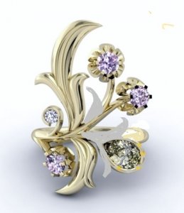
I lowered the dolphin a bit, tried to remove the bezel and leave it with where you'd have some at the bottom and a prong at the top and added a leaf at the base. This is my phone so forgive how bad it looks.

uploadfromtaptalk1398267733356.jpg
 
My middle name is stubborn........but I played with this again even though I like the framework. Here's what I did.....I returned the pear to it's original position and anchored it in two smaller and stockier leaves. Prong setting on the outside. One other shorter leaf on the existing 'butter cup'. I hope that's explained well enough since I'm not sure the photo is clear (a lot of erasing was done!!!) I think if the leaves are left smaller and stockier the 'L' effect will be minimal.

_17236.jpg
 
pinkjewel|1398260101|3658499 said:
I've hesitated to post before since I have no experience with CADs, but I'll just post my observations from an aesthetic point of view. I'd like to see the top "dolphin" leaf shortened just a smidge and curved a little more as stated earlier. The pink diamond flowers split further down to create more stem for each. Leave the top pink diamond flower as is, but curl the one at the bottom of the pair just a little more. The bezel set pear bothers me a little-but I don't see it in a buttercup setting. Could it be done similar to the little white diamond? so that the stem curves into a partial bezel around the pear?

I like your suggestions. I will bring this up with the CAD designer. Thanks.
 
gregchang35|1398260960|3658505 said:
Wow! This has come a long way from the original cad on the first page! Not sure if I can add anything. But am blown away by how much better this looks!

I am not sure of the bezel around the pear. I like link jewels idea of only bezel a portion of it, assuming it has no effect on the diamond setting.

Oh yeah, the difference is like night and day; a totally different ring, isn't it? :bigsmile:
 
minousbijoux|1398265704|3658541 said:
I love this idea, and think if done delicately, it would solve the "problem" of balance (more solid leaves on the left and the delicacy on the right). It would also solve the Sesame Street problem of the pear bezel "not like the others."

And yes, the dolphin is the top leaf - like I say, it could be the CAD or a bit more tweaking might be needed to refine it a bit.

I think I will ask the designer to refine the leaves too. They look fake in the render; overly rounded and smooth. I rather like the rustic and realistic 3D effect of the original leaves. You can see the "indentations" where there aren't just outward curves (hills) but also inward curves (valleys).
 
GET 3 FREE HCA RESULTS JOIN THE FORUM. ASK FOR HELP

Featured Topics

Top