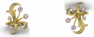
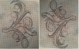
shape
carat
color
clarity

FCD CAD assistance request

OVincze,
I am sorry to read of the family emergency; I hope that whatever it is, that it isn't too serious and that you'll be back soon too.

PinkJewel,
I just talked to the jeweller a few moments ago and he said that setting the pale pink diamonds in a rose gold buttercup isn't a good idea because they will blend into my rose gold coloured skin. He thinks that 14k YG will show sufficient contrast. It will not pink them up further but I should be able to tell that they are coloured or blush.

I am thankful that the jeweller is so patient and easy to work with, although I probably think he cannot say the same of me. :lol:

So these are the changes I can expect to see in the next CAD:

1. No more buttercup baskets; they will be the crown style basket that are low set.
2. Top most leaf stays where it is but will be curved downward a little towards the top most round pink diamond.
3. There will be a bit more separation between the 2 round pinks allowing for longer split/stem. The top round will be moved upwards so the length or elegance of the piece will be unaffected.
4. No more bezeled yellow pear. It will also be a crown style basket and have a tiny leaf or two to balance out the look. In order to accommodate this, the lower current leaf will be moved a bit closer to the oval purplish pink diamond.
5. The finished leaves will be sculptured to look more realistic with a 3D effect (more grooves and natural dips). He did not draw them as such in the render.

He said he will also provide more renders with the next update because I found the renders more helpful to visualize the finished piece than the usual CAD. He will also create and send me the wax to approve before proceeding.
 
Pinkjewel and Chrono thank you so much for your kind words. It is a serious situation that is why I am leaving for a few days but hopefully everything will be ok. Have fun on the forum until then and I will try to check in sometimes. I will definitely miss it.:)))
 
Chrono|1398708702|3661993 said:
OVincze,
I am sorry to read of the family emergency; I hope that whatever it is, that it isn't too serious and that you'll be back soon too.

PinkJewel,
I just talked to the jeweller a few moments ago and he said that setting the pale pink diamonds in a rose gold buttercup isn't a good idea because they will blend into my rose gold coloured skin. He thinks that 14k YG will show sufficient contrast. It will not pink them up further but I should be able to tell that they are coloured or blush.

I am thankful that the jeweller is so patient and easy to work with, although I probably think he cannot say the same of me. :lol:

So these are the changes I can expect to see in the next CAD:

1. No more buttercup baskets; they will be the crown style basket that are low set.
2. Top most leaf stays where it is but will be curved downward a little towards the top most round pink diamond.
3. There will be a bit more separation between the 2 round pinks allowing for longer split/stem. The top round will be moved upwards so the length or elegance of the piece will be unaffected.
4. No more bezeled yellow pear. It will also be a crown style basket and have a tiny leaf or two to balance out the look. In order to accommodate this, the lower current leaf will be moved a bit closer to the oval purplish pink diamond.
5. The finished leaves will be sculptured to look more realistic with a 3D effect (more grooves and natural dips). He did not draw them as such in the render.

He said he will also provide more renders with the next update because I found the renders more helpful to visualize the finished piece than the usual CAD. He will also create and send me the wax to approve before proceeding.

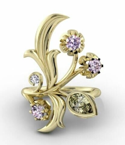
Chrono, it sounds like you got some great advice on further changes. I hope this ring turns out to be everything you expect it to be. :bigsmile:

The only thing I would add, and I'm not sure if others said this because I didn't read all the comments, but the top leaf reminds me of a fleur de lis, and I'm not sure if that's something you want.

uploadfromtaptalk1398259718194.jpg
 
Chrono|1398708702|3661993 said:
OVincze,

I just talked to the jeweller a few moments ago and he said that setting the pale pink diamonds in a rose gold buttercup isn't a good idea because they will blend into my rose gold coloured skin. He thinks that 14k YG will show sufficient contrast. It will not pink them up further but I should be able to tell that they are coloured or blush.

I am thankful that the jeweller is so patient and easy to work with, although I probably think he cannot say the same of me. :lol:

So these are the changes I can expect to see in the next CAD:

1. No more buttercup baskets; they will be the crown style basket that are low set.
2. Top most leaf stays where it is but will be curved downward a little towards the top most round pink diamond.
3. There will be a bit more separation between the 2 round pinks allowing for longer split/stem. The top round will be moved upwards so the length or elegance of the piece will be unaffected.
4. No more bezeled yellow pear. It will also be a crown style basket and have a tiny leaf or two to balance out the look. In order to accommodate this, the lower current leaf will be moved a bit closer to the oval purplish pink diamond.
5. The finished leaves will be sculptured to look more realistic with a 3D effect (more grooves and natural dips). He did not draw them as such in the render.

He said he will also provide more renders with the next update because I found the renders more helpful to visualize the finished piece than the usual CAD. He will also create and send me the wax to approve before proceeding.
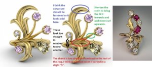
It sounds like you are just about there! This is one ring I really, really look forward to seeing! :appl:
 
We are getting so close that I can almost taste it. Perhaps only one more revision is needed? As always, comments both good and bad are appreciated.

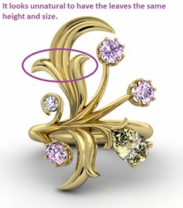
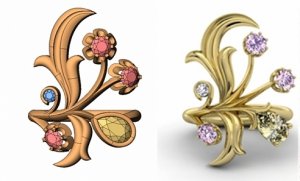
updated_cad_comparison.jpg

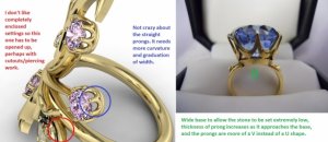
cad_profile_with_comments.jpg

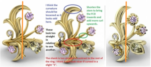
cad_addition.jpg
 
You have done an excellent job catching and summarizing the revisions; this will be a beautiful ring!
 
Here are my thoughts:

I'd shorten the top "leaf", make it less thick and bulky through the middle, it currently looks like a fang or a claw. Shorten and curl the right side a bit more. I think I'd also have it touching the top pink diamond, like the inspiration picture. It does not look delicate, and I don't think that extensive finishing work or carving will help.

Lower the white diamond a bit, so it's almost on the stem.

Angle the bottom half down slightly, so that that stem for the pear isn't straight.

I don't like the joint for the two stems of the pink diamonds, or really, the whole thing - the whole middle of it looks awkward and too clustery/busy. Plants don't look like that and neither do the inspiration pieces. My eye is drawn there, and it's not pleasing to the eye.

The emphasis is still on the metal work, and the overall composition is lacking. The stones still just look like add ons.
 
Hi Chrono,

Just wondering - are you happy with the style of each "flower" is - the base of where each colored diamond protrudes from? Ones has a curved, almost leafy design, while the others are purely basket?

Also, could you shrink down that tall gold leaf, curve it a bit backwards - to mirror it symmetrically with the other-side? Or perhaps make it closer to that one in proportion?

Awesome revisions!
 
minousbijoux|1399650471|3669064 said:
You have done an excellent job catching and summarizing the revisions; this will be a beautiful ring!

Thank you, Minou. You are always quick with encouraging words.
 
FrekeChild|1399659513|3669152 said:
Here are my thoughts:

I'd shorten the top "leaf", make it less thick and bulky through the middle, it currently looks like a fang or a claw. Shorten and curl the right side a bit more. I think I'd also have it touching the top pink diamond, like the inspiration picture. It does not look delicate, and I don't think that extensive finishing work or carving will help.

Lower the white diamond a bit, so it's almost on the stem.

Angle the bottom half down slightly, so that that stem for the pear isn't straight.

I don't like the joint for the two stems of the pink diamonds, or really, the whole thing - the whole middle of it looks awkward and too clustery/busy. Plants don't look like that and neither do the inspiration pieces. My eye is drawn there, and it's not pleasing to the eye.

The emphasis is still on the metal work, and the overall composition is lacking. The stones still just look like add ons.

Freke,
Let me make sure I understand your comments.

Top leaf
1. Thin out the leaf and have the tip touch the top most pink diamond
2. Shorten and curl out the right sub-leaf

Yes, the ring is still to symmetrical which contributes to the stiff feel. There is too much clustering going on in the middle. The inspiration ring works because of the sideways S shaped (joint) shank in the front, which is what I will request. The pink oval and round white are set too symmetrically to each other as well. They should be off-set from each other both height and width wise.
 
RTFrog|1399660333|3669154 said:
Hi Chrono,

Just wondering - are you happy with the style of each "flower" is - the base of where each colored diamond protrudes from? Ones has a curved, almost leafy design, while the others are purely basket?

Also, could you shrink down that tall gold leaf, curve it a bit backwards - to mirror it symmetrically with the other-side? Or perhaps make it closer to that one in proportion?

Awesome revisions!

Hi RT! Haven't seen you around in a while.

I'm not sure what you mean by the style of the flower being different. All of them are identical baskets. The pear FCD looks like a yellow gold cup which I absolutely do not want and will ask for a basket similar to the pinks.

Can you also elaborate on what you mean by curving the tall gold leaf backwards? Are you saying to have both leaves curl to the left?
 
Hi Chrono,

Thank you for decoding that comment - yup, the yellow gold cup with the pear. I thought maybe the other ones were different too, but am glad to see them standardized. It would drive me crazy having one stick out (unless it was intentional).

With the tall gold leaf - you could either curve it to the left, or perhaps give in an internal curve - such as downward and in towards your finger, to make it look smaller or different based on the wearer and any other viewer's perspective. Not sure if that comment is as clear as I would like it to be. If you curved it to the left, you could make it more symmetrical as well - not sure if that's the intended look. If going for symmetry, I would change the pear placement a bit as well.

Very cool project :appl:
 
Chrono|1399661418|3669170 said:
FrekeChild|1399659513|3669152 said:
Here are my thoughts:

I'd shorten the top "leaf", make it less thick and bulky through the middle, it currently looks like a fang or a claw. Shorten and curl the right side a bit more. I think I'd also have it touching the top pink diamond, like the inspiration picture. It does not look delicate, and I don't think that extensive finishing work or carving will help.

Lower the white diamond a bit, so it's almost on the stem.

Angle the bottom half down slightly, so that that stem for the pear isn't straight.

I don't like the joint for the two stems of the pink diamonds, or really, the whole thing - the whole middle of it looks awkward and too clustery/busy. Plants don't look like that and neither do the inspiration pieces. My eye is drawn there, and it's not pleasing to the eye.

The emphasis is still on the metal work, and the overall composition is lacking. The stones still just look like add ons.

Freke,
Let me make sure I understand your comments.

Top leaf
1. Thin out the leaf and have the tip touch the top most pink diamond
2. Shorten and curl out the right sub-leaf

Yes, the ring is still to symmetrical which contributes to the stiff feel. There is too much clustering going on in the middle. The inspiration ring works because of the sideways S shaped (joint) shank in the front, which is what I will request. The pink oval and round white are set too symmetrically to each other as well. They should be off-set from each other both height and width wise.
Are you happy with the general layout?

I might be able to try to do a rough sketch of what I'm saying.

Big leaf
1. Thin it out a bit.
2. Shorten it, and curl it more towards the shank.
3. Have it connect to the top pink diamond
4. Change the way it connects to the shank/cluster in the middle.

Right sub leaf
1. Shorten it
2. Curl it just a little bit more.

There are some more, but I think I'd be better explaining them via drawing rather than using words. Let me see if I can come up with anything.
 
Sometimes coming in at the end helps :) the final iteration looks great!

Everything I would have pointed out is already covered by your notations.

I would only add one view, which is that if you have two metals then the transition would be very obvious. For me that was the single hardest thing to get used to with the rose gold contrasting with the platinum on the pink FCD ring. If you like that transition then I would urge you to get whichever metal showcases the diamonds color better.

P.S. How cool is it to have rose gold skin?!
 
TristanC|1399774483|3670088 said:
Sometimes coming in at the end helps :) the final iteration looks great!

Everything I would have pointed out is already covered by your notations.

I would only add one view, which is that if you have two metals then the transition would be very obvious. For me that was the single hardest thing to get used to with the rose gold contrasting with the platinum on the pink FCD ring. If you like that transition then I would urge you to get whichever metal showcases the diamonds color better.

P.S. How cool is it to have rose gold skin?!

What a great perspective - and a very nice thing to point out. :))
 
RTFrog|1399661892|3669176 said:
With the tall gold leaf - you could either curve it to the left, or perhaps give in an internal curve - such as downward and in towards your finger, to make it look smaller or different based on the wearer and any other viewer's perspective. Not sure if that comment is as clear as I would like it to be. If you curved it to the left, you could make it more symmetrical as well - not sure if that's the intended look. If going for symmetry, I would change the pear placement a bit as well.

You have a very different and interesting perspective which I will bring up with the designer although I am unlikely to change the direction of curvature. I am going for an asymmetrical (yet balanced) look. I do agree that the large leaf might look better if made thinner and more sharply curved.
 
TristanC|1399774483|3670088 said:
Sometimes coming in at the end helps :) the final iteration looks great!

Everything I would have pointed out is already covered by your notations.

I would only add one view, which is that if you have two metals then the transition would be very obvious. For me that was the single hardest thing to get used to with the rose gold contrasting with the platinum on the pink FCD ring. If you like that transition then I would urge you to get whichever metal showcases the diamonds color better.

P.S. How cool is it to have rose gold skin?!

Tristan,
I have decided to only go with 1 metal colour for the entire ring, which is 14K yellow gold. I really loved 18K rose gold, which would be perfect for the pinks and yellow but it was invisible on me. 18K yellow did the pinks little justice so 14K yellow is my only option. A white metal would have killed the colour of all the FCDs. I could certainly go with a platinum base, rose gold and yellow gold baskets but I thought it would end up looking too busy with 3 colours going on all at once, not to mention it doesn't fit with the old Russian vibe.

I also wish I can agree with you that having rose gold skin is cool. It only means that pink diamonds might blend all too well into my skin! :eek: :bigsmile:
 
Chrono - I haven't read the whole thread (just this page) and I wanted to mention something in your CAD. You've got two stones bottom left. The top one is held by an incomplete circle - which looks lovely - but from a practical point of view, I suspect that will catch on things which in turn, over time, may affect the durability of the stone. Just wanted to throw it into the thinking pot. xxx
 
LD|1399906628|3670995 said:
Chrono - I haven't read the whole thread (just this page) and I wanted to mention something in your CAD. You've got two stones bottom left. The top one is held by an incomplete circle - which looks lovely - but from a practical point of view, I suspect that will catch on things which in turn, over time, may affect the durability of the stone. Just wanted to throw it into the thinking pot. xxx

LD,
Not to worry; the CAD is unfinished and the bezeled white diamond will be shaped appropriately (thinned out and tapered) so that it will not catch on clothes and other things. I also plan to shift it a little closer and lower to the shank for aesthetic reasons.
 
WOW!!! I haven't been getting the updates - forgot to tick the box and saw the beginning of this thread only. I have some input but have to go out.

I will be back :))
 
Starzin|1399959857|3671529 said:
I will be back :))

Good to see you back. I know you've been busy so I hope everything is well.

Had a short follow up telephone call with the designer and all is good. :)) At my request, he will play around with metal colours too, just to satisfy my curiousity (platinum with RG basket, YG with RG basket). He's such a pleasure to work with and I oftentimes feel that I am being too demanding. :oops:
 
I have very little design talent, which is why I haven't piped up more. On the top leaf, I'm wondering if the suggestions above, to have it thinned & touching or close to the pink diamond, would balance best if the leaf were given a slight S curve, with the point at the pink diamond?

Chrono, this is going to be a stunning ring. I'm really really impressed with your hard work on it -- I'm such a wuss, I'd get discouraged halfway through. Claps for your jeweler too. :appl:

--- Laurie
 
Chrono said:
Good to see you back. I know you've been busy so I hope everything is well.

Had a short follow up telephone call with the designer and all is good. :)) At my request, he will play around with metal colours too, just to satisfy my curiousity (platinum with RG basket, YG with RG basket). He's such a pleasure to work with and I oftentimes feel that I am being too demanding. :oops:
Thanks Chrono :)) I have been busy but all is good, I just haven't been able to spend any time on PS and it's not looking good for about another month but I WILL follow this now!

I must say I'm really impressed with how you've advanced this design, with jumpy claps for all the tweaks from everyone!

Aaaah... I was hoping to get back to put my 2 cents in before you spoke to the designer about the next round. Oh well, for what it's worth and for your consideration ;)) ...
  • I know I'm in the minority, but I really liked the bezeled pear because I feel it balances the leaf. However I really like the tiny new leaves there and they could work with the bezel too if you considered putting it back.

  • With 3 x claw set stones on the left the design is now split in half vertically - leaf on one side, 3 x claw stones on the other. This isn't helped by the fact that the leaf now bulges to the left quite a bit. If you draw a line down the leaves top to bottom, I think it shows that getting the leaf height, curve and slant right are central to it working well. It may be that the LH sub-leaf needs adjusting too. I would not like to see the top leaf shortened, or touching the top pink, but do think it needs to perhaps be tipped toward the right. In changing it, the designer seems to have accentuated the curves a lot and I don't know that this is necessary.

  • Yes to the RH sub-leaf (?) being lower down. This then gives room to tilt the long leaf if desired.

  • I agree the straight stalk of the second pink needs to echo the curve of the one above it. I don't know that it needs to be shorter if the curve is done right (the stone needs to be basically in the same space).

  • The white and oval pink may not need anything doing because the oval shape will offset the perceived line-up.

  • As to your comment in red about the shank being too straight - this appears to be because all the bits - stalks, stems - are coming from more-or-less the same place on the left. So I don't know that you're going to get an "S" shaped shank out of it but maybe the pear "stalk" could start closer to the bottom leaf on the bottom side of the band and the others juggled a bit. The trick is to have something separating the leaves so they don't meet on the band. The section in your red circle is definitely to long and I think it actually looked better in one of the first cads... I'll have to go and check.

  • I like the claws better than the buttercups too. Yes to your blue illustration above, that's more what I envisaged.

Hmmm... I think that's all that occurs to me at the moment FWIW.

chrono-cad-updtdx3.png
 
Posting pix first so hopefully you can see them together with the ones above for comparison.

Remember also that we removed a third leaf from the bottom and a "reverse" bend on the top of the big leaf.

I missed caysie's brilliant design!!! I would have dropped a few pointy bits and gone with that but you obviously considered it, just beautiful caysie - well done! It does demonstrate how to get the wavy band though i.e. leaves coming from different directions.

Perhaps another thing to consider is that if you wear the ring on your right hand, the majority of the stones are on what I call the "public" side - towards your pinky - where they are more easily seen by others. So it often helps to view it from that perspective. This is what they will see... are you happy with that?
You can see the difference in balance when compared with caysie's.

chrono-leaf-joinsx2.jpg

chrono-cad-2views.jpg

chrono-caysie-2views.png
 
JewelFreak|1399981193|3671581 said:
I have very little design talent, which is why I haven't piped up more. On the top leaf, I'm wondering if the suggestions above, to have it thinned & touching or close to the pink diamond, would balance best if the leaf were given a slight S curve, with the point at the pink diamond?

Chrono, this is going to be a stunning ring. I'm really really impressed with your hard work on it -- I'm such a wuss, I'd get discouraged halfway through. Claps for your jeweler too. :appl:

--- Laurie

JF,
All design comments and support are always welcome. Thank you! I was discouraged initially too but I really want to make this ring happen. It's been on the back burner for at least 5 to 6 years and I want to be able to enjoy wearing my FCDs for a few years before I kick the bucket. Who knows when my time will be up, you know? All my previous designs were so easy and straightforward compared to this. I think designs with halos and anything with diamond accents are much more forgiving than something that is all metal because every curve, corner, edge plays an important role with nothing else to hide behind or distract. After this one is done, I'll probably take a long hiatus from custom work and set a couple fun stones in simple ready-made settings. :tongue:
 
Chrono, I saw your comment about not wanting enclosed back for pear. Though the gallery is not visible, I suspect the bezeled white diamond has an enclosed back too.
 
Starzin|1399992324|3671677 said:
With 3 x claw set stones on the left the design is now split in half vertically - leaf on one side, 3 x claw stones on the other. This isn't helped by the fact that the leaf now bulges to the left quite a bit. If you draw a line down the leaves top to bottom, I think it shows that getting the leaf height, curve and slant right are central to it working well. It may be that the LH sub-leaf needs adjusting too. I would not like to see the top leaf shortened, or touching the top pink, but do think it needs to perhaps be tipped toward the right. In changing it, the designer seems to have accentuated the curves a lot and I don't know that this is necessary.

  • Yes to the RH sub-leaf (?) being lower down. This then gives room to tilt the long leaf if desired.

  • I agree the straight stalk of the second pink needs to echo the curve of the one above it. I don't know that it needs to be shorter if the curve is done right (the stone needs to be basically in the same space).

  • The white and oval pink may not need anything doing because the oval shape will offset the perceived line-up.

  • As to your comment in red about the shank being too straight - this appears to be because all the bits - stalks, stems - are coming from more-or-less the same place on the left. So I don't know that you're going to get an "S" shaped shank out of it but maybe the pear "stalk" could start closer to the bottom leaf on the bottom side of the band and the others juggled a bit. The trick is to have something separating the leaves so they don't meet on the band. The section in your red circle is definitely to long and I think it actually looked better in one of the first cads... I'll have to go and check.

I appreciate the time you spent analyzing the CADs/design in detail and the write up accompanying it. I wanted to do it service by reading through your post several times to make sure I fully understand what you are saying. It is never too late for comments because I expect another round or 2 of CADs before moving onto the production phase.

A definite YES to the bolded. In looking at your comparison picture, I can see that the leaf is no longer elongated in flow nor elegant. I would like to return closer to the original leaf design but have a more drastic curve down towards the pink diamond because I am concerned the point will catch onto cloth and other things. The designer agreed to have the LH and RH sub-leaves be of different heights.

The designer said he'll try to create as much of an S shape as possible. He did not want to separate out each component too much because that area will become a weak point that could potentially break or become distorted/warped/twisted.
 
thecat|1400075622|3672528 said:
Chrono, I saw your comment about not wanting enclosed back for pear. Though the gallery is not visible, I suspect the bezeled white diamond has an enclosed back too.

Great catch! :eek: I didn't even consider the little bezeled diamond. I will confirm with the designer whether it is a tube (open back) or totally enclosed. Thank you.
 
Chrono|1400075820|3672532 said:
thecat|1400075622|3672528 said:
Chrono, I saw your comment about not wanting enclosed back for pear. Though the gallery is not visible, I suspect the bezeled white diamond has an enclosed back too.

Great catch! :eek: I didn't even consider the little bezeled diamond. I will confirm with the designer whether it is a tube (open back) or totally enclosed. Thank you.

Glad to help. :)) Can't wait to see the next rendering.
 
I just noticed something else. In your inspiration photo, other than 2 tiny pointy leaves, the rest of the leaves are connected to the diamonds or metal. In your CAD, there's more open space; as in the metal isn't connection to metal or diamond. With more open space, it's easier to catch on clothes and hair. But open space makes the design more realistic since it's only normal for there to be space between flowers and leaves. We hardly ever see leaves and flowers all attached together irl.
 
GET 3 FREE HCA RESULTS JOIN THE FORUM. ASK FOR HELP

Featured Topics

Top