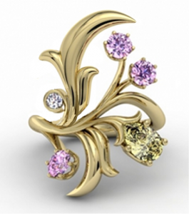
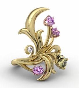
shape
carat
color
clarity

FCD CAD assistance request

Zen break time! :bigsmile:

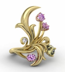
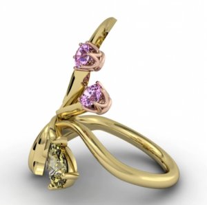
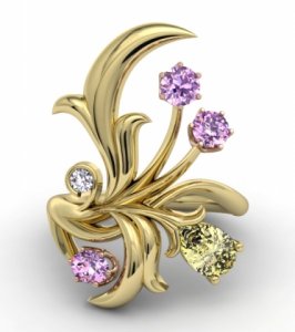
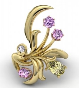
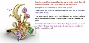
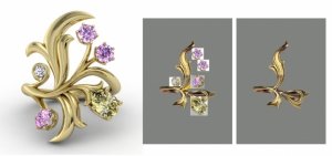
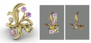
It looks like the 2 main issues still aren't quite right ; one is the basket for the pear, which I'd requested the same buttercup style with 2 additional prongs and that I don't want all the branches coming out from the same place, which creates that "cluster" look. As of now, the centre is too busy and cluttered. The main leaf still looks weird too. :?
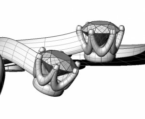
ccad128661_.jpg

ccad128662.jpg

ccad128663.jpg

ccad128664.jpg
 
I think the major leaves need to be thinner, and I made one modification by getting rid of some of the top leaf, and thinning it out in this new pic with my awful paintshop skills.

The leaves seem too bulky and thick.

chronofcdring.jpg
 
I agree that the leaves look too thick. The thickness of the leaves reminds me of the thickness of a some varieties of cactus or succulent (not the shape, but the thickness).

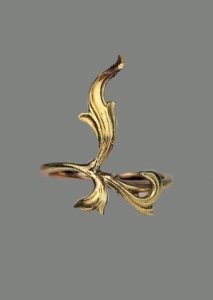
The rings that have previously been posted all have leaves that are thinner, and formed to show the veins and texture of real leaves. Here's one of the previous ring pictures

I'm not sure if the ring like this is best created by CAD. It may look more organic if made by lost wax casting, or hand forging.

_18947.jpg
 
Just as an FYI for those who do not have time to go through past pages, the final leaves be hand carved to show the detailed texture and veining, thus the leaves have to be thicker to start with to give the carver material to work with.

cad_comments.jpg
 
If the carver does a bang up job thinning out the leaves, and adding irregularities to the leaves, I think it will be perfect. It's hard to envision that with the CAD where there is excess metal (leaves and stems too thick), which will result in things looking stumpy and thick...basically too-much-metal look.

For the specific stumpy leaf, can you have it bend back the other way (and fold over a bit when carved), like in the example ring above?

Chrono, if you're happy with the results you saw in-store, then I think it will be okay. I remember when I creating my last ring, I had all these reservations, but I kept on reminding myself that I had chosen the vendor based on their proven track record of making that kind of ring. I think you've done your homework with the vendor. You are one of the most experienced here in custom work, and you are very good at articulating your desires into words. I will keep my fingers crossed for you!
 
Totally agree, those leaves are bulky and too rigid but part of it could be the CAD technology, part of it not. I think the leaves should be less cluttered, center less busy, leaves should have more natural and detailed curving with thinner lines, yeah the pear would be pretty with the same basket setting. Wow, this is a draining project.
 
Ugh.

I feel like it's getting worse rather than better. That big leaf is still a hot mess, the middle is still too busy, and the stones look like afterthoughts, which isn't how it should be.
 
I agree that the CAD reviews have been draining, which is why I did not push JJ to get them out sooner. I also admit that the only thing I love about this latest update are the basket and the S-shaped shank, and I was disappointed to see the clustered mess again. Nonetheless, I am happy to report that a conference call cleared everything up....(for now. Keeping my fingers crossed). The top leaf will come out from the shank on its own. He will also change the width to be wider at the bottom and a little thinner at the top, to hopefully help elongate the appearance into something more elegant looking. The 2 pink rounds will come off the main shank slightly to the right of the main leaf; they will no longer come off the same center cluster. No more cluster. :appl: In order to accommodate this, the yellow pear has to be moved so we'll have to wait to see how this turns out.

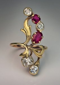
I brought up the topic of the leaf carving again and JJ assured me that it will be carved using the original ruby and diamond ring design as inspiration, to follow as closely as possible. It starts off at 2 mm thick but once completed, it will be around 1.5 mm thick at most, with other areas being thinner where it curves or has grooves.
 
pregcurious|1402064777|3687784 said:
I agree that the leaves look too thick. The thickness of the leaves reminds me of the thickness of a some varieties of cactus or succulent (not the shape, but the thickness).

The rings that have previously been posted all have leaves that are thinner, and formed to show the veins and texture of real leaves. Here's one of the previous ring pictures

I'm not sure if the ring like this is best created by CAD. It may look more organic if made by lost wax casting, or hand forging.

The main leaf in the vintage piece is more "S" shaped as well, and the CAD leaves remind me of a "J" shape, if that makes sense. The "S" ones look more organic.
 
TL|1402100962|3688198 said:
pregcurious|1402064777|3687784 said:
I agree that the leaves look too thick. The thickness of the leaves reminds me of the thickness of a some varieties of cactus or succulent (not the shape, but the thickness).

The rings that have previously been posted all have leaves that are thinner, and formed to show the veins and texture of real leaves. Here's one of the previous ring pictures

I'm not sure if the ring like this is best created by CAD. It may look more organic if made by lost wax casting, or hand forging.

The main leaf in the vintage piece is more "S" shaped as well, and the CAD leaves remind me of a "J" shape, if that makes sense. The "S" ones look more organic.
Yes! TL said it much better than I tried to.
 
I think in the next version the stones up the top on the right hand side are now too far apart from the sides of the other parts of the ring. And the top leaf, vine is going to act like a hook.... The bottom one won't be as bad because it will face towards your hand. Rings like this catch in everything and anything, particularly clothing like sweaters, jumpers, cardigans whatever you guys call them and pretty well everything else if you are going to wear it anywhere where you move your hands around. In genuine antique ones they are a bit catchy but all of the parts flow together better and I think to attempt to minimise this to a degree.
 
Hey Chrono,
I've been lurking along with the development of this thread.. as of right now, I just wanted to say how much this design has improved and literally flourished, since the earlier CADS - this is a kudos to both you for your tenacity, vision and great directions, and also your designer for his work & patience.

Perhaps you have mentioned previously, but are you able to surmise what it is about the current incarnation of the leaf looks or feels 'weird' to you? (taking into account its been discussed that thinning further isn't really an option, due to there being extra metal needed to carve).

Me personally, I really like the current version - however I do see your point about the cluster effect, and less so the leaves (I quite like how they are now) - I don't know when this rather subtle change occurred, but the 'turning' of the stems and the cups for the two top gems is a really great addition and somehow, to my eye, this relatively small change gets you quite a bit closer to your inspiration.
I'll read again the newest pages and see if I may have anything different or more specific to add, but just wanted to basically say "looking good, keep it up!" I know that pursuit of perfection can become tedious, but its definitely coming along ::)
 
Chrono|1402086581|3688065 said:
I agree that the CAD reviews have been draining, which is why I did not push JJ to get them out sooner. I also admit that the only thing I love about this latest update are the basket and the S-shaped shank, and I was disappointed to see the clustered mess again. Nonetheless, I am happy to report that a conference call cleared everything up....(for now. Keeping my fingers crossed). The top leaf will come out from the shank on its own. He will also change the width to be wider at the bottom and a little thinner at the top, to hopefully help elongate the appearance into something more elegant looking. The 2 pink rounds will come off the main shank slightly to the right of the main leaf; they will no longer come off the same center cluster. No more cluster. :appl: In order to accommodate this, the yellow pear has to be moved so we'll have to wait to see how this turns out.

I brought up the topic of the leaf carving again and JJ assured me that it will be carved using the original ruby and diamond ring design as inspiration, to follow as closely as possible. It starts off at 2 mm thick but once completed, it will be around 1.5 mm thick at most, with other areas being thinner where it curves or has grooves.

ah, great to read this update C! Sometimes, a good old fashioned phone call clears things up a lot quicker and well..cleaner, than many emails back & forth..Everything you've said here sounds very positive, I can imagine the changes and I think they will get you there, if not then very close..and yep, I have faith that the leaves will end up carved as you hope..It is much better they start with too much metal they can carve away, then end up with something potentially structurally too thin..Kudos on yours and your designers team work!
 
Will be looking forward to the newest update. Yes, organic is a really good word, if we are trying to somewhat stick to the inspiration piece, not sure how much we still want an Art Noveau feel, we would definitely want the lines more organic, naturally curved, thinner and less cluttered. Sometimes it is very difficult because designers and/or craftsman have their own ideas and interpretations and it does not always match what you want and sometimes what you want is not possible to execute in the exact way but I think this project for sure is definitely feasible. Best case scenario is when the jeweler comes up with a result that is much better than what was even expected, that happened to me with mine but now that I have participated in crafting I also understand design and what is possible and what is not feasible much better. Not an easy process but at the same time it is cool too. It should be much better after the next revision which I cannot wait to see, hope we get to see the end result pretty soon too.
 
allysssa|1403303723|3697534 said:
Hi Chrono,

I'm not sure where you are in the final round of this project, but this ring I just saw really reminded me of yours. Yours will be more spectacular though. One thing I liked about this was the overlap in the center and the sides being at different levels.


http://www.ebay.com/itm/1-70CT-ANTIQUE-VINTAGE-DIAMOND-SAPPHIRE-CLUSTER-ENGAGEMENT-WEDDING-RING-14K-ROSE-/380933469647?pt=US_Gemstone_Engagement_Rings&hash=item58b16775cf
Wow! This is gorgeous!
 
Hi Chrono!

Thank you so much for posting the whole process! I just read through all of the pages, totally fascinated by the iterations :)

The balance on the design and the negative space under the dolphin leaf and above the pear is bothersome. Instead of having the two stones each on their own stem like butterfly feelers, what if you nestled the top stone against the revised dolphin leaf? Those two stems don't look organic in the style-appropriate way to my (untrained) eye. So, remove the top stem entirely and put that gem instead in the crook of the dolphin leaf and the right branch off leaf. Then make the bottom (and now only) stem more stylistically relevant by curving it around in the negative space to match the cute little guy on the right and/or giving it a leaf motif of its own like the pear. That could alleviate some of the congestion right at the center band spot as well by dropping one element. I'm not quite sure what it would look like, but the leaf or curly tendril could start more to the right of that center spot, too. Even if you add another leafy bit, I don't think you'll have an "L" problem now.

I am an utter newbie to jewelry design, so my input might be implausible, but that's my two cents on this lovely project. I look forward to following along :D :appl:
 
Allysssa,
That ring is pretty...

Cupcake,
Thanks for chiming in. It's not quite what I have in mind but I still appreciate the time and though you put into it. :wavey:

Some days I wish the design moved along quicker but on other days, I'm enjoying the break from over-thinking. :lol:
 
This seems to be going nowhere. ;( The only positive thing of note is that the pear now has 4 prongs instead of 2 prongs. I hope that my picture shows the designer what I want in the leaf design. It still screams CLUSTER in the centre. Other than that, it has lost whatever hint of Romanov feel it got sort of close to at one point in the design.

I have to think up of ways to support the 2 pink rounds because it isn't structurally sound to have such long unsupported stems.

more_adjustments.jpg

ruby_diamond_1.jpg
 
After just a few minutes of mulling, I think the balance of this design is MUCH better and keeps the "L" look at bay. In addition, it is a realistic way to provide support to the pink diamonds.

possibly_better.jpg
 
They say third time's the charm, right? At least I hope so for this one. I rearranged the design again, this time taking colour coordination into account.

Top diamonds are given strength because they are attached to each other on the underside. There is a short unsupported stem joining it to the lower right leaf but hopefully because it is short, it will be fine.
Pear diamond has strength due to the leaf support structure.
Lowest pink round has support because it starts off as partially attached and following along the lower right leaf before branching off.

third_charm.jpg
 
I like the third iteration best so far :D

What I like about it - looks way more "natural" like nature would have designed it that way if it were a real plant. The flow works better.

This would be my suggestion.

I spread out the leaves a bit to accommodate the stone "flowers" better. This way makes sense to me in my brain as to which way the stones should be positioned, but it may not in yours and I totally get that.

_19577.jpg
 
Davi,
That's a very different vision! It is very modern compared to mine but still pretty. Will the stem(s) be strong enough to support all the stones? You have a single piece of very thin metal holding 4 diamonds.
 
Hi again - the decks have finally cleared a bit (for the next few weeks at least) and I should be able to spend a bit more time following this.

I haven't had a chance to compare the last two cads but I still see a change which might help and will try and mock it up over the weekend, unfortunately because I'm not good with graphics, it takes me ages and I do have a couple of tasks this morning.

I think your disappointment is larger because you expected to see more marked changes, in fact I still think it's tweaking. The "leaf's a mess"? :) No, hardly changed in structure but I see a few things that might be finessed.

The changes I will try and show are to move the bottom of the dolphin leaf closer to the white and also tilt it off the vertical. It should also be a seamless continuation of the shank from the left, instead of looking stuck on as it does now.This will also take it away from directly opposing the bottom leaf, which would be the next bit of the shank before the pinks and green take over. Maybe the white could actually come from the LHS of the leaf rather than being one more stalk from the shank where it too forms an opposition to the oval. Perhaps the designer sees all this in the carving, it's just difficult to imagine as he does.

In addition I think the pear stalk should come from the RH side of the bottom leaf rather than the same place as the pink's stalks.

I still personally prefer this to the diamonds all on one side but that's just me and I was never overly fond of the inspiration photo. Pick up your lip girl (don't know if that's a saying you know), we can do this! I know you had higher hopes this time around but if it takes one or two more edits it will be worth it in the end. Just slow down the turnaround (feedback) this time, since the designer took his time you should also.

It's almost there, honestly! :)) Chin up.
 
I feel like a ring in this type of design could get caught on things really easily.
 
Chrono|1403872112|3701983 said:
They say third time's the charm, right? At least I hope so for this one. I rearranged the design again, this time taking colour coordination into account.

Top diamonds are given strength because they are attached to each other on the underside. There is a short unsupported stem joining it to the lower right leaf but hopefully because it is short, it will be fine.
Pear diamond has strength due to the leaf support structure.
Lowest pink round has support because it starts off as partially attached and following along the lower right leaf before branching off.

Actually, I like the placement of the stones in the CAD better. You now have them all lined up, and in the CAD, they're more balanced looking, at least to me. I think the CAD is very pretty, and will look better with the engraving. My only issue is the thickness of the top leaf, and it's too bulky and not very elegantly curved, as in the vintage piece. The clustering in the middle doesn't bother me as much, it adds to the organic feel I think.
 
TL - I agree and I'm trying to do something now.

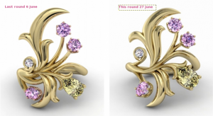
I think it helps to see the last two cads side by side - he has done considerable work to separate the clutter by taking the pink stalks over and accentuating the "S" shank. The ring shank has now definitely got more of a sweep and is simpler and more Romanesque to me :). It's also better for the pear and bottom leaves.

However - and it may be the skew of the photo but the top leaf looks to have reverted to an earlier version. I think all that needs tweaking is the left side now. I'll be back with changes to that but here's the comparison.

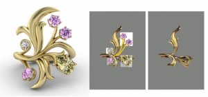
2cads-comparison.png
 
Does this help??

All points of top leaf rounded. The designer may well be aware that they will end up a little more rounded - at some stage you have to trust the carver will take away the right bits.

White dia and top leaf moved together. Revamped-1 has top and bottom leaf offset. Revamped-2 brings them back in line.


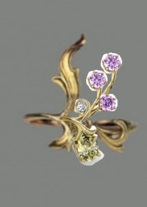
I would also want to see this view of the pink with new improved "S" band

27jun-cad-revamped-1.png

27jun-cad-revamped-2.png

cad-changes-6jun-pink.jpg
 
Bother!! I was hoping they would all end up on the same page - here's the comparison again for ease of viewing.

_376.png
 
Wow- Chrono, this is not an easy journey, is it? I'm sorry I don't have any suggestions for the CAD, but there is one issue that I'm wondering about. On the CAD images all the pinks are coloured the same-so it is hard to visualize. But in reality the intense pink and the intense yellow are both on the bottom part of the ring- whereas the light pinks (and without rose gold around them not sure how pink they will look-right?), are on the top section along with the colourless diamond. It seems that it might be "bottom" heavy with most of the color concentrated there. Just something I wanted to bring up for consideration.
 
GET 3 FREE HCA RESULTS JOIN THE FORUM. ASK FOR HELP

Featured Topics

Top