shape
carat
color
clarity

FCD CAD assistance request

Okay... one more.

Think slim acanthus leaves embracing the pear ( )

c-pear-arm-1.jpg
 
Ah, I didn't think of turning the ring around! It changes the entire look with more emphasis on the pinks now.

Yesss!

Is the design on the left side too cluttered?
I don't know - I can't tell what's happening in there :bigsmile: Pinks should be level with the teensy leaves methinks.
 
The leaf halo isn't true to the period?

_20079.jpg
 
Back to being deceptively simple and clean.

simple_belle_epoch.jpg
 
Chrono|1405004614|3710472 said:
Back to being deceptively simple and clean.

LOVE this, Chrono!!!!!! :appl: :appl: I think you may have found the perfect inspiration pic now!!
 
Chrono|1405003964|3710467 said:
The leaf halo isn't true to the period?

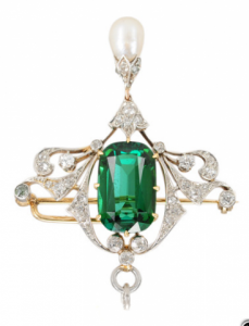
That turquoise necklace is exquisite! But the halo is true because it's a diamond then a leaf pair, a diamond then a leaf pair with little stalks in between.

What I was talking about is that I don't think the gold flower ring translated to a loop would be true. Apart from which the flowers would have to be minute in order to get a halo of them around the pear on your finger.

ETA: Ah! The light goes on. Now I see what you did with the pic above that - little pairs of leaves. I thought you were still on the garden ;))
 
So this is my first clumsy attempt -
on the coloured one, the pink stalk is obviously too long so I squished it a bit by resting the pinks on the band and bringing the leaves closer to the oval. This might also give it a bit more stability (less hooky/sticky-out bits too).

c-getting-there-1.png
 
Chrono, I think the size of your oval competes with the pear. Would you consider not using your oval?
 
pregcurious|1405046589|3711057 said:
Chrono, I think the size of your oval competes with the pear. Would you consider not using your oval?
what about setting it east west?
 
Starzin,
I sketched out the design with the acanthus leaves last night but didn't like it. It makes the ring resemble an arachnid. :bigsmile:

I tweaked everything again and based on the latest revision, I really like Buttercup Pear.

belle_epoch_3.jpg
 
Hi Chrono
I'm with you. I tried it and didn't like it much either. I've only got a few minutes just now but I found the one below as part of something else and I've trimmed it further. I've spent a while today looking at images and finding elements . I'll pop in in a couple of hours, I know your time is taken with family at the weekend but pop by when you can.

I quite like the buttercup.

c-pear-dia-outline-idea.png
 
Okay... here's the first round. Mainly "toppers" :))

A couple of things I've discovered-
1) the first two toppers look pale and perhaps a little unbalanced because my Gimp skills are not up to turning platinum bits into YG bits. If anyone can tell me, or point me to a tutorial, that would be great (not Gimp help, it's far too tedious to find what you want).

2) I like the loop design but this particular rendition is .... ummm... clunky. No polite way to say it. IF - big if - you went with the loop idea how would you see it set? Claw, bead, shared prong? I notice you cunningly left the loop out of your mockups. :roll:

Okay. Have at it (everyone) and I'll go try some "bottoms" though I may not get them up for a day or two.

c-loop-v1-v2-v3.png
 
Starzin|1405178294|3712005 said:
Okay... here's the first round. Mainly "toppers" :))

A couple of things I've discovered-
1) the first two toppers look pale and perhaps a little unbalanced because my Gimp skills are not up to turning platinum bits into YG bits. If anyone can tell me, or point me to a tutorial, that would be great (not Gimp help, it's far too tedious to find what you want).

2) I like the loop design but this particular rendition is .... ummm... clunky. No polite way to say it. IF - big if - you went with the loop idea how would you see it set? Claw, bead, shared prong? I notice you cunningly left the loop out of your mockups. :roll:

Okay. Have at it (everyone) and I'll go try some "bottoms" though I may not get them up for a day or two.

So, this is what "I" see. I like the flow of V2.......and I tried to copy and edit but wasn't successful. So my thoughts are:
1.) keep the flow and structural placement of the ring in V2.
2.) Vary the width of the ribbon that goes around the pear.....I would also take some of the diamonds out so that it isn't all along that line. Perhaps leaving the bottom of the loop as gold (with engraving?) and then putting some diamonds where the ribbon crosses over itself.....and in proportion to the smaller diamond flowers.
3.) I would take the diamond leaves out and replace with gold and engraving.
4.) The purpose would be to find a way to connect the upper and lower parts of the ring with proportional balance in the gold work.
5.) I tried to create something I could post but my computer is claiming it has time off on the weekends--so my words are the only way to try and share the design ideas!
 
Great Mockups Starzin!

I like V1 and V3 - kinda less is more in V1, and a sprouting flower in V3. This project has taken some more unique twists Chrono, and I really enjoy the process, feedback, and overall development of it. Such a beautiful selection of stones in a delicate, yet fantastically unique and ultimately gorgeous ring. The involvement from the community has been stunning as well, and upon completion this should be nominated as Pricescope's jewelry piece of the month, if not year. :appl:
 
Compliments to Chrono and Starzin for your due diligence. You have left me back in the confused detritus of discarded ideas! This is why I never get anything done - just don't have the required level of perseverance. :boohoo:

But you go, ladies! I know you can do it!
 
It's good to see this project looking up.
 
Starzin, you are amazing. Do you do graphic design for a living?
 
Wow! :)) Thanks for the responses everyone. Helps a gal to keep going ;))

Digdeep - thank you very much for the comments.
2) I can't vary the width of the diamond shank/loop but am now working with a new ring base which is finer. Unfortunately it's also yellower.
3) Have to leave the leaf design to Chrono however you may well be right ;))
5) This comes back to what I said above about the ring shank and loop being very heavy and somewhat clumsy.
6) I could definitely use some help with the infinite iterations this ring is capable of! Not to mention a more skilled use of Gimp *sigh* This is all cut, new layer, paste and rotate.

Minou - so pleased to have you in the cheer squad - very important. It's actually quite zen if you have the time!

Preg! - Nooooo :lol: :lol: :lol: Far from it! *ROFL* I still don't know how to use Gimp properly (or any graphics package for that matter), however I'm no stranger to software so I'm quite happy to dive in, undo, try, undo... and so it goes :bigsmile:
 
RTfrog - thank you :)) I must admit, as I play with the bits I get more and more confused!

LoversKites - pleased you're enjoying the journey :))
 
A couple more bottoms to go on with and new "base" ring.

V4 is the pear and bud from the cads
The turquoise neclace upthread is the V5 outline
The aqua upthread is the V6 outline
The close-up of V7 is the morganite below - sorry, forgot to put the number on.
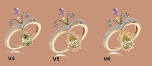
c-newbase-v4-v5-v6.png

c-pear-dia-scalloped-closeup.png

c-dialoop-v7.png
 
Starzin|1405231559|3712365 said:
A couple more bottoms to go on with and new "base" ring.

V4 is the pear and bud from the cads
The turquoise neclace upthread is the V5 outline
The aqua upthread is the V6 outline
The close-up of V7 is the morganite below - sorry, forgot to put the number on.

ooo... I like V6
 
Starzin-- you do an awesome job of sparking creativity with your artistic creations! :appl:
 
susiegrneyes - good to know you are able to zero in on one :wavey:

Digdeep - thank you, you are very kind.
 
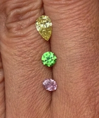
Okay, so I was mulling the latest set of three and realised that they didn't really have the same impact because of the white background. It's your "rose gold coloured skin" that will also help these designs stand out.

Soooo... :))


Your "rose gold" skin


I won't have much time to play with piccies for the next couple of days, so I decided to give you two more "bottoms" that you can mix 'n'match. The amount of bits you now have should keep you busy til I get time to finesse whatever you come up with :shock: :bigsmile: I'll have time to check posts though - so talk out loud! (nicely)

_389.png

fcd_hand-sm.jpg

c-yg-chevron-v8-v9.png

c-element-dia-pear-surround-good.png
 
I forgot to say that in the latest couple of sets the oval pink somehow got smaller so bear in mind its size relative to the pear. Sorry about that, I'll do better 8)
 
I love V4. The simplicity appeals to me and makes the FCDs stand out. And at the same time I feel it keeps the Romanov feel which I know Chrono wanted.
 
Starzin,
I cannot thank you enough for the time and effort you have shared out of the goodness of your heart. Your assistance has been instrumental in my project; getting it going and now, bringing it back from the brink of death. This is indeed a Pricescope (dare I say, Coloured Stone) collaboration project with Starzin at the helm.

I am very drawn to the V3 topper; it is sort of a mishmash between Belle Epoch and Romanov. I am also stubborn about going with more metal work (flower and engraving) over diamond melees this time around as well. I'm sorry I did not mention this prior to the start of the weekend but I was thinking of leaving the pear loop out completely; it just seemed too large, unbalancing the delicate look. Call me cunning, if you like, as an excuse to mask my lacking Paint skills. :lol:
 
digdeep|1405179670|3712018 said:
So, this is what "I" see. I like the flow of V2.......and I tried to copy and edit but wasn't successful. So my thoughts are:
1.) keep the flow and structural placement of the ring in V2.
2.) Vary the width of the ribbon that goes around the pear.....I would also take some of the diamonds out so that it isn't all along that line. Perhaps leaving the bottom of the loop as gold (with engraving?) and then putting some diamonds where the ribbon crosses over itself.....and in proportion to the smaller diamond flowers.
3.) I would take the diamond leaves out and replace with gold and engraving.
4.) The purpose would be to find a way to connect the upper and lower parts of the ring with proportional balance in the gold work.
5.) I tried to create something I could post but my computer is claiming it has time off on the weekends--so my words are the only way to try and share the design ideas!
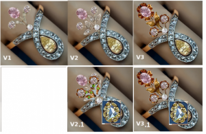
I tried to Paint what you described (with horrible job on trying to angle the buttercup pear) but I like the effect. The shank needs some work though as it looks rather out of place.

v21_v31.png
 
RTFrog, Minou, LK and Pregcurious,
You all are part of the design team as well; please do not discount the importance of your encouragement to persevere when things started to look as though it was at a standstill or headed toward the path of an epic failure. :appl:
 
Starzin|1405223918|3712314 said:
I can't vary the width of the diamond shank/loop but am now working with a new ring base which is finer. Unfortunately it's also yellower.

A yellow base is not a problem since the ring will be made in a mix of 14K YG and 14K RG. I might change my mind and go with 18K RG even though it's my skin tone because it is so complementary to the FCDs. Although I love the fact that the shank is finer, it looks out of place. I will look around to see what else I can cut/paste for the shank.
 
GET 3 FREE HCA RESULTS JOIN THE FORUM. ASK FOR HELP

Featured Topics

Top