shape
carat
color
clarity

FCD CAD assistance request

JF,
You are right; less certainly looks nicer than more. I kept the simpler pear design and I think it helps the FCDs stand out better.

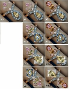
v22_v32.jpg
 
Hi Chrono,

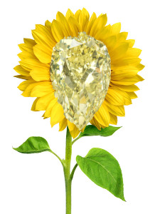
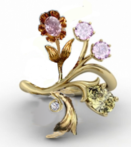
After seeing the most recent mockups, and the possible inclusion of green gold - have you thought perhaps of making it a reversible ring? I'm envisioning flowers sprouting from both ends, such as a rose/dahlia type from the top and a sunflower with the yellow diamond at the bottom. This could possibly lead to wearing the ring with either orientation. The green gold stems, flowery leaves, would provide a nice contrast for the colors - like a subtle hint of free flowing colorful contribution.

Here's a quick example of the sunflower bottom with your yellow pear (and possible green gold here too):

Sun-Yellow%20Diamond%20Reversable%20Ring.jpg
 
The inclusion of the green spots are from my pathetic attempts at cut/paste where the leaves had tiny demantoids in the original that I could not remove. I dislike green gold because the green colour is extremely muted, only looking sort of green if there is another metal colour contrast. Given that I am going with yellow for the yellow pear and pink for the pink rounds and oval, I am concerned that adding a third metal colour might cheapen the look into a Black Hills piece. :tongue:
 
Whoops, sorry Chrono.

Ok, scrap that then. I like V3 and V3.2. If the demantoids work, and they very well could look nice, would you have them sit flush into the leafy stems? I would be afraid that they would add to much bulk to set around them to disturb the sleekness of the lines.

I understand what you meant by the Black Hills pieces. Though I think you would have to add some green enamel to accomplish that... :think:

Any thoughts on a mirrored design?
 
Tried to make it a little bit bigger plus add some different lighting conditions.

Made%20Larger%20.jpg

Incandescent%201.jpg

NIght%20One.jpg

Latest%20Underspotlight%201.jpg
 
Hooray! This is going to be an epic ring!!! I'm watching a beautiful piece of collaborative artwork be created :D

I adore the buttercup setting for one, not both, of the big stones. For some reason having a buttercup on both ends looks like a floral dumbbell to me :oops: But using it for one and having the ring be asymmetrical is so charming.

FWIW, I like the V3.2 or V2.1. If you twisted my arm and made me choose one right this second I would pick V2.1. I like how the big buttercup is toward the hand, but is still balanced by the two little buttercups on the other side of the band.
 
Soooo... I see peeps have been busy :))

I don't know that I'll have much time today and definitely not tomorrow and Thursday, so you might not get the revamped versions until Thursday night your time.

I will work on a bottom buttercup, and an engraved version of V8 (I think the shape goes quite well) and the original loop. Actually, if you look at the leaves on the demantoid stuff at RR, none of them are particularly well done. But we will do our best ;))

And you are entirely welcome to my input (over done at times though it may be), as I said above to Minou above, when I have the time I do find mucking around with this stuff very zen - having to focus to the exclusion of all else - I just wish I was more skilled at it.

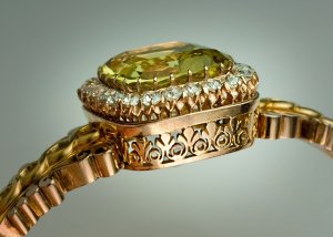
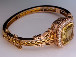
I do like the pear loop with the top buttercup spray, particularly if the melee band and loop were this delicious and exquisite buttercup melee setting. :twisted: Do you link JJ are up to this? http://romanovrussia.com/Antique_Gold_Diamond_Heliodor_Bracelet.html


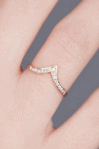
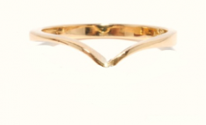
But I need a new base ring with a diamond V, very fine like this. I'll work with these two in the meantime-

buttercup-melee.jpg

buttercup-melee-2.jpg

c-yg-dia-base-finger.gif

c-vring-base-blank-sm.png
 
Just saw this and am only stopping by once in awhile but what fun to play with these shapes! I like the "imagine buttercups" band and in that position I see this option......

1.) to set the small white diamond below the ^ and then the pear drop below that diamond. The pinks would sprout from the top of the ^.

I'm really curious what the scale and balance will look like with the new band.......good job (again) Starzin, and good luck (again) Chrono! Sorry if I'm repeating myself or someone else............long day! :wall:
 
RTFrog|1405358905|3713115 said:
Ok, scrap that then. I like V3 and V3.2. If the demantoids work, and they very well could look nice, would you have them sit flush into the leafy stems? I would be afraid that they would add to much bulk to set around them to disturb the sleekness of the lines. I understand what you meant by the Black Hills pieces. Though I think you would have to add some green enamel to accomplish that... :think: Any thoughts on a mirrored design?

The demantoids would have to be 0.5 mm in order to fit the tiny size of the leaves and I think that would be impractical. To make them any larger to be noticeable would mean increasing the size of the leaves, and as you wrote, end up being too bulky for the overall design.

I think I don't want a ring that is perfectly symmetrical; going with a mirrored design runs the risk of the ring looking like the number "8". It also ends up too modern/contemporary whereas I am striking for an antique feel.
 
Cupcake_Panda|1405367292|3713163 said:
I adore the buttercup setting for one, not both, of the big stones. For some reason having a buttercup on both ends looks like a floral dumbbell to me :oops: But using it for one and having the ring be asymmetrical is so charming. FWIW, I like the V3.2 or V2.1. If you twisted my arm and made me choose one right this second I would pick V2.1. I like how the big buttercup is toward the hand, but is still balanced by the two little buttercups on the other side of the band.

I agree; having a floral motive at both the top and bottom end is overdone. I am also leaning between V3.2 and V2.1
 
Starzin,
This is all voluntary so please do not put out too much on my account if you cannot spare the time. You are my overworked and unpaid consultant. :bigsmile: Which is version 8? I think we are only up to V7 aka V3.2 unless you mean the new one with a pear buttercup to be V8. I know my leaves for the 2 round pinks are fugly but yes, the original that I cut/paste weren't nice to begin with.

I am going to add another element to the challenge (as though this isn't challenging enough) but I do not plan to add more diamonds. :Up_to_something: I'm not sure if a pierced band will be strong enough but perhaps an elongated engraved acanthus leaf might be a good stand-in for the shank. Yes, please bear with me as I try my best to insist on a leaf in the design. :cheeky: Given that the stone on that bracelet is fairly large and the melees in your example might be 1 pointers, I don't think it will translate well for a 6 x 4 mm pear.

The first new base looks good and I like it. Not having the point taper into thinness will provide sufficient strength to attach the pear to it. The second new base may not be a good candidate to provide support to the FCDs.
 
digdeep|1405392037|3713422 said:
Just saw this and am only stopping by once in awhile but what fun to play with these shapes! I like the "imagine buttercups" band and in that position I see this option......
1.) to set the small white diamond below the ^ and then the pear drop below that diamond. The pinks would sprout from the top of the ^.
I'm really curious what the scale and balance will look like with the new band.......good job (again) Starzin, and good luck (again) Chrono! Sorry if I'm repeating myself or someone else............long day! :wall:

Please stop by more often. I feel very encouraged to continue and I think Starzin feels the same. Are you saying to reverse the layout?

v23_v33.jpg
 
Chrono|1405430981|3713590 said:
Cupcake_Panda|1405367292|3713163 said:
I adore the buttercup setting for one, not both, of the big stones. For some reason having a buttercup on both ends looks like a floral dumbbell to me :oops: But using it for one and having the ring be asymmetrical is so charming. FWIW, I like the V3.2 or V2.1. If you twisted my arm and made me choose one right this second I would pick V2.1. I like how the big buttercup is toward the hand, but is still balanced by the two little buttercups on the other side of the band.

I agree; having a floral motive at both the top and bottom end is overdone. I am also leaning between V3.2 and V2.1

to me V2.1 looks better balanced whereas V3.2 might be a little top heavy. Although the yellow pear isn't to scale, is it? That would make a difference. It would be good to see both drawn to scale. How long would this ring end up being and how would it sit on your finger? I remember you saying your fingers are not long.
 
The pear is 6 x 4 mm
The oval is 4 x 3 mm

Not sure if these are to scale. Let me try to use the original CAD stones because I know those are to scale. The ring is to be for the middle finger so I have 20 mm to spare from the base to the knuckle (but not over). 25 mm if I really push it. :bigsmile:

ETA
The pear and oval are to scale but the pair of pale pinks aren't. They are a tad small in our mockups.
 
Given that the pair of pinks are 3 mm, they will be clearly too large for Design V2 and its iterations. They are only ever so slightly smaller than the oval (see V3.3 which is to scale).

v23_0.jpg
 
I haven't really had time to mull the latest posts and no time until much later today but here's a quick and dirty mockup of an idea that just flashed into mind.

Or you could put your V3.3 on top and scrap the bottom leaf and curl.

The merit in this is getting the bases, of both the oval stalk and the yellow one, more closely aligned horizontally and thus gain the overall ring length you need in order to put a pair of leaves on a flower stalk.

You can angle the pear any way you want. In fact you can reverse it to come from the RHS of the band if you wish. Just trying to expand thinking from the symmetrical Vring-loop idea.

The problem is - as you have grasped - if you want engraved leaves you have to create room for them.

cad-halfnhalf.png
 
Starzin,
Which is version 8? I think we are only up to V7 aka V3.2 unless you mean the new one with a pear buttercup to be V8.

V8 & V9 (double buttercup Stuller setting for pear) are on Page 9. V7 is above that but is the only picture that doesn't have a number on it.

I am going to add another element to the challenge (as though this isn't challenging enough) but I do not plan to add more diamonds. :Up_to_something: I'm not sure if a pierced band will be strong enough but perhaps an elongated engraved acanthus leaf might be a good stand-in for the shank. Yes, please bear with me as I try my best to insist on a leaf in the design. :cheeky:

I had always imagined - but didn't explain :bigsmile: - that in all the versions where you've used the cad pear, I have seen a gold engraved shank becoming the pear leaves. No diamonds, just the shank sweeping into the leaf bud. No piercing!
 
Starzin|1405563241|3714778 said:
The merit in this is getting the bases, of both the oval stalk and the yellow one, more closely aligned horizontally and thus gain the overall ring length you need in order to put a pair of leaves on a flower stalk.

Quoting myself here... Just to spell it out - you can do this with the cad "wave" shank but it would be much harder to achieve with the V shank.
 
I like the way this ring is evolving, but I confess I am having a hard time keeping up. Still, I can at least give positive thoughts your way!
 
Starzin,
I'm not sure whether the dark pink oval flower will have sufficient support being a single stem coming off the shank. Need to think about this some more... :read:
 
I don't want to make this process more complicated, but I found this exquisite Romanov ring. (It reminds me of a Victorian ring.)

Would you consider using a mix of silver and gold? I love the way that the silver has aged on this piece.

romanov.jpg
 
Chrono|1405601092|3714978 said:
Starzin,
I'm not sure whether the dark pink oval flower will have sufficient support being a single stem coming off the shank. Need to think about this some more... :read:

There shouldn't be a problem - these "tiara" rings were very popular and employed the stalk concept.

dia-pearl-tiara-ring.jpg
 
I am not daring enough to risk silver holding up expensive coloured diamonds. :errrr:
 
Starzin|1405603439|3714996 said:
Chrono|1405601092|3714978 said:
Starzin,
I'm not sure whether the dark pink oval flower will have sufficient support being a single stem coming off the shank. Need to think about this some more... :read:
There shouldn't be a problem - these "tiara" rings were very popular and employed the stalk concept.

That's what I thought too but the designer seemed to balk at it. I am rather liking the tiara look. Gears are spinning at high speed in my head. :rolleyes: :naughty:
 
So my flower is a-drooping but with the additional of another tiny diamond melee and viola! :tongue: Simple prongs for the pear, no other embellishments. No fancy leaves because sadly, it does not fit with the design.

no_pearl-tiara-ring.jpg
 
Because I am a nut case, I just HAD to try out the acanthus leaves to see the effect. :lol:

crazy_tiara.jpg
 
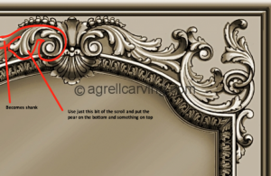
You're on the right track with the acanthus... It could be worked into the shank. Just a slightly different shape to what you're using. I've got something in my bonnet about those too based on the design below. The pear on the bottom from between the scrolls.

I've outlined the bit to be used on the LHS but left the RHS clear of markings so you could see it.

c-acan-shank.png
 
Like this?

fish_tail_tiara.jpg
 
That would work but not quite what I had in mind. Yes, the pear and it's leaves go in between the scroll bits. That way you get a bit more engraving. Hang on a bit.
 
Here you go... the scroll/shank is too big but I'm about to go to bed :))

Is the guy/girl doing the cads actually a jeweller, or a cad designer who translates the designs into cads?

c-acan-ring.png
 
GET 3 FREE HCA RESULTS JOIN THE FORUM. ASK FOR HELP

Featured Topics

Top