shape
carat
color
clarity

Help setting an O colored 1.59ct AVC diamond

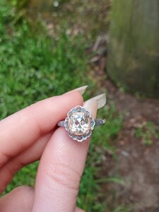
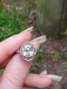
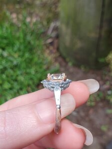
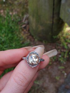
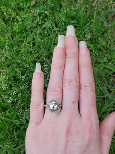
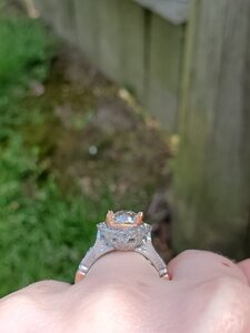
I received my plastic mold from DK on Saturday. I tried painting it...which (as you can see from some pics) didn’t work out too well for me. It probably didn’t help that I was too impatient to let it dry all the way and shoved it on my finger. Oops. :lol: Also, the plastic doesn’t show the little details well from the gallery and me adding nail polish to the mix didn’t do it any favors.
4854D656-1920-4E5B-9E22-10F9BAB667C1.jpeg A1BE8B4F-A162-4109-8A28-33C6E6BE17D0.jpeg
6DC3E446-65D5-431B-9EDA-E7A410A1B4AA.jpeg 185E72C0-F01D-4E6D-BA4F-1F6954E4B03F.jpeg3F770F62-C57E-49D7-8F87-B12BFCAA607B.jpeg 4FFCF395-90B4-4F45-88E6-63A3E7E01AFB.jpeg

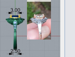
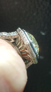
Thoughts: I love the top view of the halo. I think I got that just right. But...I don’t like the gallery right now. It looks kind of bottom heavy to me. Also, the hearts were more narrow & long which I don’t love (I did see it in the CADs but didn’t interpret well). I also noticed the gallery attaches to the top of the halo weirdly. I know the sides of the halo will have to be filed down but I don’t like that at all.

So the question is how to fix the gallery / undercarriage. Any ideas?
 
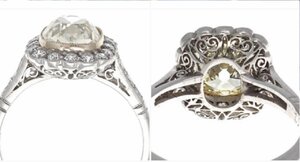
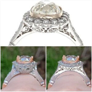
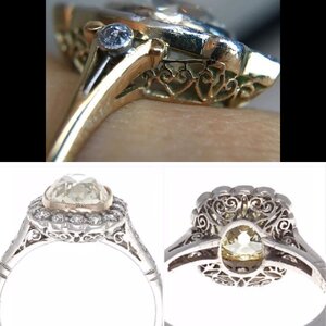
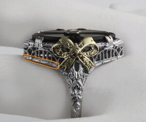
I‘m going to ask if they can make the hearts more “plump” (for lack of a better term). Just like this one in my inspo folder (courtesy of @CHRISTY-DANIELLE ).


813FD3EF-545C-4D56-B4ED-19FB9A832A16.jpeg

I’m thinking I may need to open the donut up a little bit. I may also tuck the gallery in (thanks @Rfisher for that idea).
 
1770E18B-541F-472E-8E91-90A678524D0B.jpeg
Dying here.
This is everything - and more.
5204DBAB-6F76-4F99-B4DD-559E0AE5B326.gif

On the side view and that flared flange or whatever it is - and how it attaches to the gallery -
I wouldn’t adjust the cad on that by the way the wax looks, just yet.
I have no proof, other than looking at previous posters waxes vs CADs, and something is definitely unique with this one.
56E434ED-CD96-4A20-B281-7CABDCADADC0.jpeg
I’d ask for clarification on what it was (and why?), first.
I wonder if they are using not their typical resources, ones that are available now and their usual ones aren’t? I don’t know?
 
Last edited:
The filigree in the basket won't be cast, they do that by hand, so I don't think the final result would look like you see it in the plastic. ( But definetly clarify, point out what you don't like. )

But that top down view is to die for! And I love the metal color layout. Looks great on your hand!
 
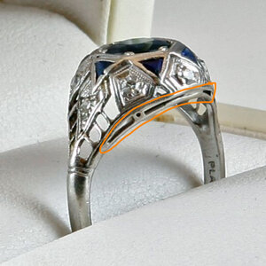
I went back to look at the inspo basket. I did a quick mock up, if they debulked the gallery and maybe had it slant in (under) more, you might like it better.20200519_061127.jpg
 
1770E18B-541F-472E-8E91-90A678524D0B.jpeg
Dying here.
This is everything - and more.
5204DBAB-6F76-4F99-B4DD-559E0AE5B326.gif

On the side view and that flared flange or whatever it is - and how it attaches to the gallery -
I wouldn’t adjust the cad on that by the way the wax looks, just yet.
I have no proof, other than looking at previous posters waxes vs CADs, and something is definitely unique with this one.
56E434ED-CD96-4A20-B281-7CABDCADADC0.jpeg
I’d ask for clarification on what it was (and why?), first.
I wonder if they are using not their typical resources, ones that are available now and their usual ones aren’t? I don’t know?

Thanks Rfisher. I love the top view too and I can't wait to see how it looks with all those little emeralds in there. *sigh* :love:

I sent DK an email last night to go over the basket / gallery. I'll see what he says about the way it attaches.

The filigree in the basket won't be cast, they do that by hand, so I don't think the final result would look like you see it in the plastic. ( But definetly clarify, point out what you don't like. )

But that top down view is to die for! And I love the metal color layout. Looks great on your hand!

Thank you! I didn't realize the filigree was done by hand. Wow! That takes some real skills. :-o

I went back to look at the inspo basket. I did a quick mock up, if they debulked the gallery and maybe had it slant in (under) more, you might like it better.20200519_061127.jpg

What a great mock up! You're so good at that. :mrgreen:I emailed him last night because I'm not loving how the basket looks so bulky. It doesn't look crazy bulky from a distance but I'm pretty particular about the close up view. I sent him the original antique ring (the one you posted here) and asked if it could be shaped more like that.
 
The filigree in the basket won't be cast, they do that by hand, so I don't think the final result would look like you see it in the plastic. ( But definetly clarify, point out what you don't like. )

But that top down view is to die for! And I love the metal color layout. Looks great on your hand!

You’re saying the basket filigree is hand forged? And that’s standard for DK?
Is that something you asked for, or had a specific bench of DK’s do your ring?
I’m positive my filigree basket from him was cast along with the rest of the ring, but that was a few years ago.
I’m very curious about this for multiple reasons. Have tried asking about different benches and their capabilities, different options, and strengths - multiple times - but get nowhere.

So far, I believe all my baskets have been cast but I've never had filigree in one before so I'd be interested in knowing this too.
 
@elle_71125
Do you have another DK ring that’s similar to this one, basket wise, that you can take a pic next to the model
Sideways view?

Clarification - Just looking at depth of basket and shape of basket for this comparison
 
Last edited:
@elle_71125
Do you have another DK ring that’s similar to this one, basket wise, that you can take a pic next to the model
Sideways view?

Clarification - Just looking at depth of basket and shape of basket for this comparison

I'll check when I get back home.
 
You’re saying the basket filigree is hand forged? And that’s standard for DK?
Is that something you asked for, or had a specific bench of DK’s do your ring?
I’m positive my filigree basket from him was cast along with the rest of the ring, but that was a few years ago.
I’m very curious about this for multiple reasons. Have tried asking about different benches and their capabilities, different options, and strengths - multiple times - but get nowhere.

My DKs always have filigree baskets, and Amy alwsys tells me they are done by hand. Heres a quick close up of my most recent DK ring. You can tell they did it by hand.

20200519_104506.jpg
 
@CHRISTY-DANIELLE
Very interesting.
Do you request a certain bench for your projects?

Maybe that’s a perk of working with Amy? I’m just trying to align my multiple experiences of working with David and what’s done/said, and now just recently having something going thru with Amy/ and what you have experienced.

Sorry for derail @elle_71125
 
Last edited:
@CHRISTY-DANIELLE
Very interesting.
Do you request a certain bench for your projects?

Maybe that’s a perk of working with Amy? I’m just trying to align my multiple experiences of working with David and what’s done/said, and now just recently having something going thru with Amy/ and what you have experienced.

Sorry for derail @elle_71125

Derail away. I think this is an interesting topic.

@CHRISTY-DANIELLE they did a beautiful job with your basket / gallery. I’m shocked that was done by hand. How can you tell? It looks perfect to me. :love:
 
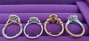
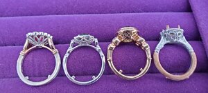
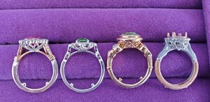
Perhaps I went a little overkill on these photos but I’m trying to catch all the angles. Here’s the closest rings I have to the new one.


484E4CBF-4636-421C-A9F3-188770D1DC28.jpeg3EC7225B-B3D9-407D-B191-475514FAAEB4.jpegBA38A8A9-321B-46F4-BB60-0E17EC513D95.jpeg

C51B1FA9-D0E4-440D-BFE7-674B5DBE526D.jpeg
880773AD-B9E1-4FB3-A054-EF5E5405C9D2.jpeg

E9487C1D-6832-44A9-A135-32A731BE9562.jpeg
 
You already know the bulk factor has to be taken into account on that model, but at looking at your other lovelies, does that help in looking at their basket height/angles they are at in comparison to the halo and shanks? And what you might like for this one?
I still think I’d ask Amy what’s up with the connection of the halo and basket on that wax model and that halo flare or whatever it is.
 
Something I noticed is that all of your baskets/galleries are at a more inverted angle, and a bit shallower than your cast because of it.
I add another vote to:
This is the profile that you naturally prefer-I would modify it.
 
@CHRISTY-DANIELLE
Very interesting.
Do you request a certain bench for your projects?

Maybe that’s a perk of working with Amy? I’m just trying to align my multiple experiences of working with David and what’s done/said, and now just recently having something going thru with Amy/ and what you have experienced.

Sorry for derail @elle_71125

Not really, but A) Amy knows I'm super picky (I hate being that person but appears I am) B) I ask for their best benches.
Now between us, I'll share a little secret. I compare DK to the great and powerful Oz from the Wizard of Oz. He's the name, he is who people think is making their design changes, answering their emails. But, in reality, behind that curtain, it's actually Amy. She is more likely the one you deal with no matter who is named in the email. This came to light the first time I went to LA to pick up something they made for me, in a conversation with Amy. David knows the jewelry craft, & the man is a diamond genius. But its Amy that handles a lot of the custom design business. After realizing that, when I'm wanting something done, I send my emails directly to her attention. If I call, I talk with her. But they are both super nice in person and I think they both sincerely care that their customers are happy. It's why I may seem like a superfan, but my experiences have been fantastic.

I can totally see that (and I admit that I do the same thing where I work). :shhh:
 
Something I noticed is that all of your baskets/galleries are at a more inverted angle, and a bit shallower than your cast because of it.
I add another vote to:
This is the profile that you naturally prefer-I would modify it.

Thank you. I noticed that too (after getting them all together anyway :roll:). Guess I have a type. :lol:
 
Just wanted to say that the top view is to die for! Beautiful!
 
Just wanted to say that the top view is to die for! Beautiful!

Thank you so much! I can't wait to see it with the emeralds. :mrgreen:
 
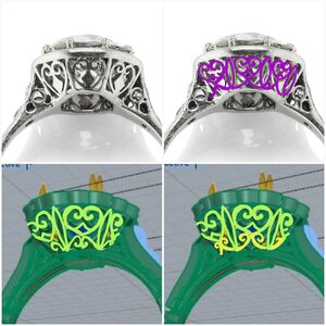
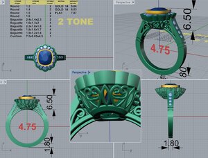
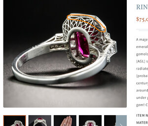
I could use some help with the gallery. I was aiming for something close to the inspo pic below (bottom ring) but the hearts in my gallery turned out to be too elongated for my tastes.

7DA04DAF-DA58-4AD5-BD4C-5AFF103D5640.jpeg

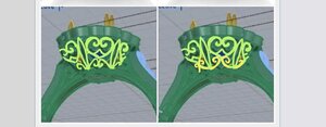
The original gallery version. the hearts look too long. I would like them to be a bit plump / wider.
517513B6-65B3-41F0-955F-9055AE290AFC.jpeg

Revised gallery. Not a fan of this gallery revision.
BABB5ED8-F4F2-4225-BF96-E3868054B571.jpeg

Latest Cad. The hearts look better but now the other shape is gone.
9115CB29-8151-4021-85EA-631703ECCFB7.jpeg

Any ideas on how to get the best of both worlds? Also, with the hearts in the third CAD, do you think I should re-add in that little filigree element inside the hearts? (Like in the inspo pic above).
 
i think it would look great.
Maybe add the filigree back (from the first cad) into the heart shape or you could incorporate the marquise shape into the center of the heart shape? Either of those elements alone would be a call back to the inspo. without overwhelming/altering the heart shape of your newest cad.

*I can't wait to see it in person. The suspense! Emeralds, torture!
 
I see a trimmed down basket shape in the last cad? Are you liking that angle better?
Your first cad for this, with the thicker/wider side view of the metal on the halo before it got slimmed down - did you like the way the filigree ratio of the hearts and navette shape look? Make that side metal of the halo thicker again to once again return to that ratio?
Or, enlarge the donut which I think shortens the vertical area for the filigree to get back to what you want, but that then creates more issues to deal with I think?
Or, instead of back to widening the side view of the metal halo, Take up that space with an additional line of very plain generic filigree? Plain boxes or circles or a swag.. sounds awful, but I think I remember seeing examples on some antiques that did this and didn’t look awful. I’ll see if I can find those again.
 
i think it would look great.
Maybe add the filigree back (from the first cad) into the heart shape or you could incorporate the marquise shape into the center of the heart shape? Either of those elements alone would be a call back to the inspo. without overwhelming/altering the heart shape of your newest cad.

*I can't wait to see it in person. The suspense! Emeralds, torture!

Thank you. The basket is the last thing I have to nail down before I can get the ball rolling on this project. I like the shape of the hearts on the new cad but I miss the marquise shape. I’m trying to get the best of both worlds over here. :mrgreen:

I see a trimmed down basket shape in the last cad? Are you liking that angle better?
Your first cad for this, with the thicker/wider side view of the metal on the halo before it got slimmed down - did you like the way the filigree ratio of the hearts and navette shape look? Make that side metal of the halo thicker again to once again return to that ratio?
Or, enlarge the donut which I think shortens the vertical area for the filigree to get back to what you want, but that then creates more issues to deal with I think?
Or, instead of back to widening the side view of the metal halo, Take up that space with an additional line of very plain generic filigree? Plain boxes or circles or a swag.. sounds awful, but I think I remember seeing examples on some antiques that did this and didn’t look awful. I’ll see if I can find those again.

I‘m going to be honest...I don’t think I understand everything you’re saying. I was ready to blame it on my foggy morning brain but I still don’t get it so I guess I’m out of excuses. :oops: Can you tell me which section you mean by this? “Your first cad for this, with the thicker/wider side view of the metal on the halo before it got slimmed down.”

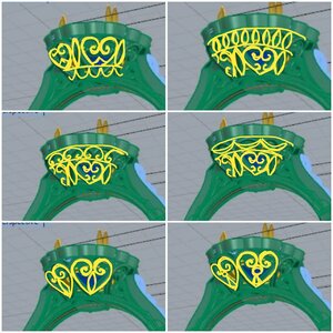
Cad 1, I asked her to take away the lip under the halo and to make the basket less bowl shaped. I also asked if she could make the heart shapes puffier.

Cad 2, I told her I didn’t care for this gallery look. The hearts just looked weird to me now. I asked for something closer to my inspo pics, while keeping the hearts wider.

Cad 3. This is my newest one. I like how the hearts are wider but I don’t like how the marquise shape is gone (and how the extra filigree in the heart is missing).

I‘m trying to figure out a way to set the gallery design closer to my inspo pics (with hearts and marquise shapes) while fitting within the parameters I have.
 
Oh !!! I hate for you to give up on the gallery you love!
First thought, does this ring have to be 6.4 mm high? How deep is the stone? The higher setting is elongating the basket, causing the difference I think.
But @Rfisher is on to something, maybe some minor manipulation could help retain the elements and feel of the inspo.
I did some quick playing around with it, maybe it will help get your ideas going. As always, sorry for not so perfect "art" ;-)
20200603_162041.jpg20200603_161939.jpg

**I had a different heart basket , taller, in my inspo file, used it to draw from on some of these
 
Oops! I wasn’t that clear :blush:
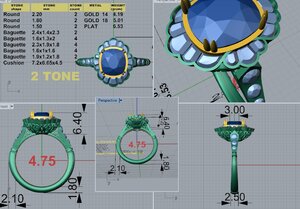
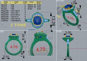
David sent me the first CADs today. I’ve already requested a few changes.
1. The halo is definitely not what I have in mind. Also, the overall look is bulky.
2. I asked for him to thin the shoulders down and taper them more.
3. I asked him to tuck the gallery in more.

F6BAD48F-A78E-4988-9E36-76408FF71ECF.jpeg

Does anyone have experience with the semi cup (semi bezel). I can see a lot of it under the gallery. Is that normal?

Should I try a different shoulder look or a different gallery? I’m open to options. :mrgreen:

This first cad is the one I was referencing. If you like the proportions of the hearts/Navettes here,
Once the top rim metal of the side view got thinned out, it stretched out the filigree pattern to fill the space.
Is it In consideration to go back to this proportion if you like the filigree look better?

But it doesn’t sound like it,

Maybe fill in the extra space with a very plain filigree ‘filler’ to keep the proportions of the hearts /navettes how you like it?
 
The last two pics that @CHRISTY-DANIELLE mocked up were what I was envisioning exactly when I *tried* to explain before! These are great CHRISTY-D :))

I really like the relative simplicity of those last two in particular.
 
Oh !!! I hate for you to give up on the gallery you love!
First thought, does this ring have to be 6.4 mm high? How deep is the stone? The higher setting is elongating the basket, causing the difference I think.
But @Rfisher is on to something, maybe some minor manipulation could help retain the elements and feel of the inspo.
I did some quick playing around with it, maybe it will help get your ideas going. As always, sorry for not so perfect "art" ;-)
20200603_162041.jpg20200603_161939.jpg

**I had a different heart basket , taller, in my inspo file, used it to draw from on some of these

Thank you so much. As always, you are amazing. I love the mock ups you did. Especially these two.
6D35B25B-0ED8-4F91-8D8C-5C56C62E87F7.jpeg

I’ve been considering shortening the setting a little but I didn’t want to lose the little swirls under the shoulders. I’ve also considered opening up the donut a bit more so that the hearts fit better, if that makes sense.

Oops! I wasn’t that clear :blush:

This first cad is the one I was referencing. If you like the proportions of the hearts/Navettes here,
Once the top rim metal of the side view got thinned out, it stretched out the filigree pattern to fill the space.
Is it In consideration to go back to this proportion if you like the filigree look better?

But it doesn’t sound like it,

Maybe fill in the extra space with a very plain filigree ‘filler’ to keep the proportions of the hearts /navettes how you like it?

Oh no, it wasn’t you. I was just having a hard time understanding what you meant. Thank you for clarifying. :D I wasn’t a fan of the thicker edge on the halo so I don’t want to go back to that. Honestly, I had forgotten it ever looked that way (this has been a long journey). :lol:

The last two pics that @CHRISTY-DANIELLE mocked up were what I was envisioning exactly when I *tried* to explain before! These are great CHRISTY-D :))

I really like the relative simplicity of those last two in particular.

@CHRISTY-DANIELLE is the mock up queen! I appreciate your input on this one too. It’s such a special project to me.
 
Totally get not wanting that wide area!
I originally was thinking of taking the space from the wide area and instead of adding it to your original heart/navette design and stretching it out-
Use that space differently to keep the correct proportions.
It could be a milgrained or simply engraved line
A9E3A96B-DB77-41E2-B3AB-CDB4E226A2DB.jpeg
Or it can be a very plain filigree pattern ( like this but obviously new and neat/precise)
53B2D7F4-ABCA-43EB-92B3-D6D5F5582639.jpeg
Or the added in element to take up the space like @CHRISTY-DANIELLE sketched out
700106B8-83D2-49D2-98F6-D1D6B3F0F145.jpeg

I know all these sound much simpler than actually executing them!
 
GET 3 FREE HCA RESULTS JOIN THE FORUM. ASK FOR HELP
Top