shape
carat
color
clarity

How small is too small for super ideal?

As per FP/KK posts - everything works in tandem.

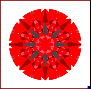
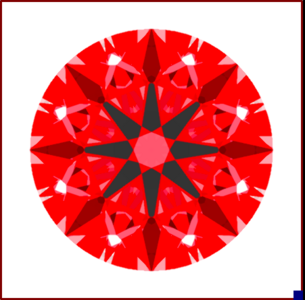
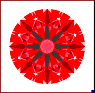
All these CGI use 77% lower halves.


...as in a bright 60-60: 77% LH @ T 60 PA 41.2 CA 32.0

1626717266528.png

...as in a firey Ideal: 77% LH @ T 55 PA 40.6 CA 46.0

1626717273793.png

In-between: 77% LH @ T 57 PA 40.75 CA 34.5

1626717281879.png

FYI, all have 50% star facets. Technically, shorter stars could reduce table reflection a bit in the first example above, but not by much.

I think this is the single best visual of this holding lower halves steady that I’ve seen here on PS. Something we know but struggle to explicate by example... Thank you for taking the time to share it! ❤️
 
As per FP/KK posts - everything works in tandem.

All these CGI use 77% lower halves.


...as in a bright 60-60: 77% LH @ T 60 PA 41.2 CA 32.0

1626717266528.png

...as in a firey Ideal: 77% LH @ T 55 PA 40.6 CA 46.0

1626717273793.png

In-between: 77% LH @ T 57 PA 40.75 CA 34.5

1626717281879.png

FYI, all have 50% star facets. Technically, shorter stars could reduce table reflection a bit in the first example above, but not by much.

Unsurprisingly, the middle image jumped out as my favorite :) I really appreciate the visual !
 
Great question.

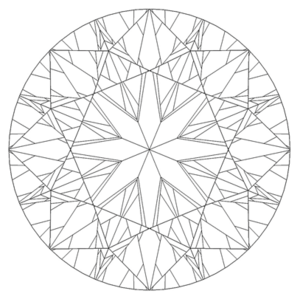
Basis: The benefits of super ideal cut quality are (1) proportions which promote robust light return, coupled with (2) additional fine-tuning of facet groups to achieve 3D optical precision.

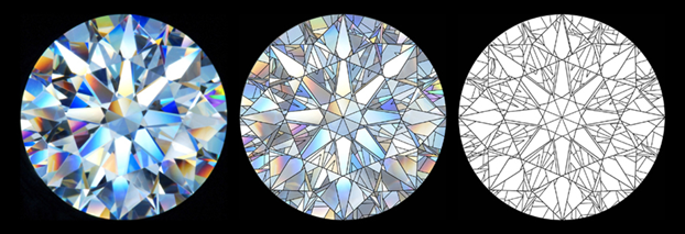
To elaborate on #2: A diamond is composed of mirrors which reflect parts of each other. Those reflections of reflections are called compound mirrors.

1626648315833.png
AGS graphic above, used with permission.

When well-executed, a high level of 3D optical precision causes the reflections to overlap precisely, keeping more of the compound mirrors intact.
1626647807569.png

As diamonds get smaller, a diamond's compound mirror integrity can be connected to our human perception of dispersion-as-fire and brightness/contrast in general.

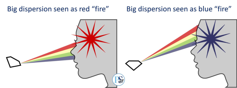
Perception of Fire: If a dispersive fan arrives to your eye and it's large enough that only red enters your pupil, your brain sees a RED FLASH of diamond fire. If only the blue component enters you see a BLUE FLASH of diamond fire.
1626648047914.png


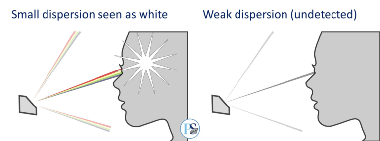
Perception of Brightness: Small dispersive fans can also be seen as white. When a dispersive fan is smaller than the size of your pupil and all component colors enter at once, your brain recombines them and sees a flash of white light. If the dispersive fan is tiny or weak you may not see anything.
1626648228953.png

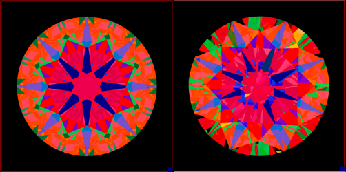
If you placed the theoretical examples below, side by side, in ever-shrinking carat weights (given illumination scenarios conducive to brightness, contrast and dispersion) you'd have a better chance of perceiving dispersion as fire, and balanced brightness/contrast overall in the one with higher order of 3D optical precision.

1626648646816.png

At what carat weight does it stop making a difference? That's debatable. Fans of single cuts might also have an opinion about internal reflections. At any weight however, you can rely on this:

"The higher the order of precision, the larger the compound mirrors." - Pete Yanzter.

Related pages, for anyone interested:
- Guess what? Dispersion and fire aren't the same thing
- Diamond Performance Explained

@John Pollard This is an amazing description and explanation. Until I saw the illustrations above (wouldn't the middle image in the AGS illustration make an amazing stained glass piece?), I didn't realize that the piece I've been looking for - without even knowing it - was an understanding of the more orderly compound mirror layout. Game changer for me - especially when out looking without any fun tools and in thinking about my next project..... Thank you for posting this!
 
@yssie and @lovedogs - Cheers, and thank you.

@John Pollard This is an amazing description and explanation. Until I saw the illustrations above (wouldn't the middle image in the AGS illustration make an amazing stained glass piece?), I didn't realize that the piece I've been looking for - without even knowing it - was an understanding of the more orderly compound mirror layout. Game changer for me - especially when out looking without any fun tools and in thinking about my next project..... Thank you for posting this!
@bright&shiny - When I was arranging for diamonds to be recut I used to examine intake candidates in various structured light environments. It wasn't needed for recut calculation, I'm just a nerd. While they were often chaotic, I used to think some of the older cuts looked like pieces of stained glass art in my backlit ASET.
 
I do definitely think that - well, humans aren’t microscopes, there is a practical lower size bound below which exceptional optical symmetry makes no appreciable difference over “yup, that’s pretty good”. At some small facet size individual primary refractions fail to be resolvable and individual dispersions mostly combine - that’s why so rarely see coloured light in infant melee (for lack of a better word :bigsmile:) and why some people prefer single cuts in the really small sizes... FWIW I’ve never actually taken a H&A scope to the underside of melee from any vendor but I have my doubts most vendors’ stuff is actually truly H&A, just judging by what I see face-up. For sure it’s all a LOT better than “the generic stuff” though!

I’m really short-sighted - useless without my contacts sort of short-sighted. So I can appreciate differences in really small stones, and upgrading melee in anything 0.15ish or larger would be worth it to me. My other half has excellent distance vision but his close-up is starting to fade, and he often can’t see the differences that I can. Lots of reasons for that (the fact that he doesn’t particularly care is one of them :lol:) but I think he genuinely can’t see everything I do, physiologically.

Well that was a bit of a ramble. Ultimately I’m 100% on board with what @michkal said earlier - few people ever regret going with the “best” they can do ::)

@yssie - me, too:geek::wavey:. I'm -10.5 diopters of sphere plus irregular cyl, so without my contacts, I see better than a 10X loupe but can't see clearly more than an inch or two past my nose. (I have been known to take out a contact to examine a stone more clearly when DH and I are out shopping.) - and I appreciate your comment about appreciating the differences in really small stones because they are so visible to those of us who can see them (but perhaps not see the car, tree, or other large thing) so clearly. It could absolutely explain the differences I see, as compared to DH who's vision sounds similar to your other half's vision. Food for thought - thank you!
 
Well, I decided that it was worth going for something ideal. Spoke with Wink via phone and explained what I wanted. Have this one on hold while I sleep on it. Its lovely IMHO.


so excited for you!!! :appl::appl::appl:
 
Well, I decided that it was worth going for something ideal. Spoke with Wink via phone and explained what I wanted. Have this one on hold while I sleep on it. Its lovely IMHO.


Oh, that is beautiful! Love the proportions.
 
so excited for you!!! :appl::appl::appl:

Thanks! Wink was super helpful in looking through options given my preference for "fat " arrows and colorless.
 
Ugh, making me want a little one too!!
 
I have a 0.44 ct D VVS1 ACA that I bought as an upgrade. (I don’t have a large jewelry fund and I go for color and clarity over size.) I love it and I can definitely see the difference in cut quality compared to my original diamond.

Wow, thanks for sharing. I love it so much!
 
Well, I decided that it was worth going for something ideal. Spoke with Wink via phone and explained what I wanted. Have this one on hold while I sleep on it. Its lovely IMHO.


Beautiful stone. The fire performance is sublime!
 
While on the topic of ideal cuts, wondering if @Karl_K Or @John Pollard or @flyingpig or anyone else could explain how lower %/table/ other measures interact to make the effect of "fat arrows "? I usually look for both small table and 75% lower. But I just realized that a stone I'm looking at with 56% table and 76% lowers has arrows that look equally or even more "fat" then a stone with 54% table and 78% lower. I guess my question is: do these measures work in tandem to create the effect of arrows being "fat"?

You already got some great answers, but I am reminded of two VC stones that came up awhile back (2019). Both stones had 77 LGF's, yet the smaller 1.558 stone on the left had a larger 56.7 table, whereas the 1.702 stone on the right had a smaller 54.8 table.

https://victorcanera.com/diamonds/2hprtj-1.558-g-vs2-hearts-arrows-round
https://victorcanera.com/diamonds/ags104087777011-1.702-g-vs2-hearts-arrows-round

The links are dead and go to a 404 page, but using the AGS number on the 1.702 we know it has a 40.8 PA. Based on the table reflection of the 1.558 I'm guessing a similar PA for it.

While LGF's are the same, notice the difference in the perceived fatness of arrows with the smaller table? Similar point that @John Pollard was highlighting with the CGI's -- I just liked seeing an actual stone instead.

Also, @John Pollard, I assume stone #2 was 36/40.6 with a 55 table. A 46 crown would be just a smidge steep. :lol: Darn typos, they get me all the time. :cool2:

1-558-1-702.jpeg
 
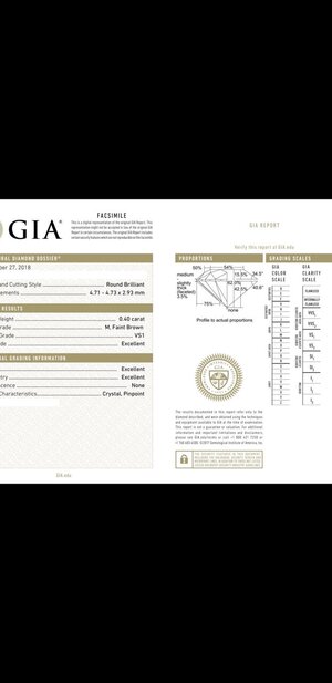
@John Pollard or @Karl_K , and idea why the arrows on this stone look so "crowded". The top 3 look somehow smashed together a bit. Purposefully cropping out vendor so hopefully you can answer. Cert pic also attached.


Screenshot_20210720-075250_Gmail.jpg20210720_075210.jpg

Thanks!!!

Ps. Yes, I'm that weirdo who has a D CBI on hold and is still contemplating M colored stones.
 
@John Pollard or @Karl_K , and idea why the arrows on this stone look so "crowded". The top 3 look somehow smashed together a bit. Purposefully cropping out vendor so hopefully you can answer. Cert pic also attached.


Screenshot_20210720-075250_Gmail.jpg20210720_075210.jpg
wonky environment or wonky pavilion
not enough info to call it but im leaning towards wonky environment.
 
nothing wonky about that.

Thanks :) I may order both and choose with my own eyes. I've never seen a D colored diamond before, muchless a super ideal, so I may become a convert. But for me, the call of brownish stones still runs deep :)
 
@John Pollard or @Karl_K , and idea why the arrows on this stone look so "crowded". The top 3 look somehow smashed together a bit. Purposefully cropping out vendor so hopefully you can answer. Cert pic also attached.


Screenshot_20210720-075250_Gmail.jpg20210720_075210.jpg

Thanks!!!

Ps. Yes, I'm that weirdo who has a D CBI on hold and is still contemplating M colored stones.

You mentioned you liked 77% LH @ T 57 PA 40.75 CA 34.5 from John's examples.

Now you have 54 TB 40.6 PA( potentially 40.5 with GIA rounding) and 75% LGH.
The table reflection is getting smaller and now the arrows start to overwhelm the table and look crowded. Also, the arrows are more persistent because of 40.5~40.6 PA. At certain point, you need to find balance. Cannot get too greedy with fat arrows. :)
 
fat arrows can mean worse obstruction issues with shallow pavilions and more under table leakage with steep pavilions so not always a good idea.
 
Also, the arrows are more persistent because of 40.5~40.6 PA. At certain point, you need to find balance. Cannot get too greedy with fat arrows. :)
This is exactly right. I've spent much of my career studying ways to maximize compound mirror integrity with optical precision (of course), but also these p-main, l-half relationships across a range of parameters. The trick is doing it with no loss of light return intensity. Balance is precisely the right word.
 
@lovedogs don’t forget GIA reported LGF’s are rounded to the nearest 5%. So although reported as 75, the actuals can vary from 73-77.

So you could have multiple elements with the 40.6 pavilion (likely 40.5 given 42.5 depth, as opposed to 43), smaller 54 table and LGF actuals hitting the lower side of the range.

I might even toss a fourth element out there. All the above is working to create very fat arrows with lots of contrast. Some is personal preference but also the warmer tint doesn’t provide enough white balance to offset the arrows. I wish I was a photoshop nerd and could take that same stone and remove the tint to make it a D/E color with same deep black levels currently shown in the tinted photo above. It may still be too much for your tastes but I think our eyes would play a visual trick of sorts and find it more acceptable as the brighter white will look more balanced than the tinted stone does.

None of this to knock tinted stones. Just saying I think the white balance (not sure this is the proper term) will change as tint increases.

I would examine with your eyes in person. My own thoughts are you are concerned now in static photos. I think that “40.6” is actually less given the depth and will obstruct and cause you some heartache. As you know obstruction increases at 40.45 and less.
 
I have a 0.44 ct D VVS1 ACA that I bought as an upgrade. (I don’t have a large jewelry fund and I go for color and clarity over size.) I love it and I can definitely see the difference in cut quality compared to my original diamond.

So so elegant <3
 
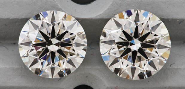
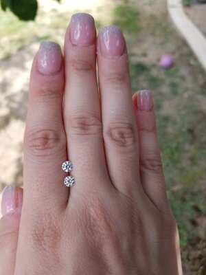
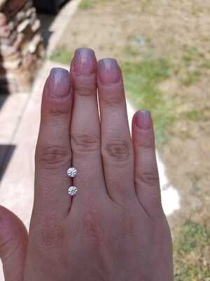
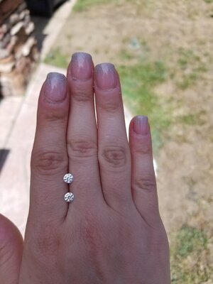
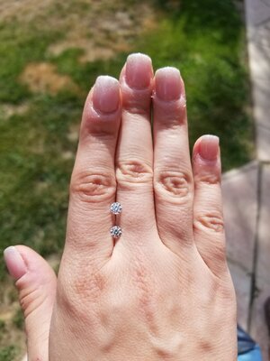
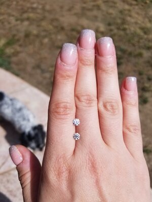
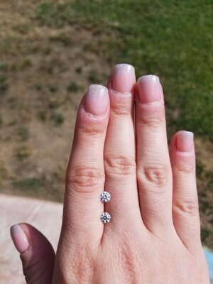
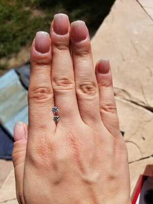
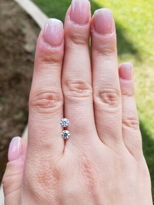
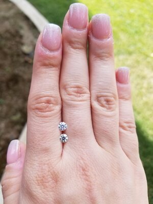
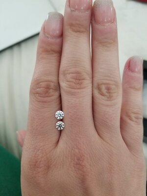
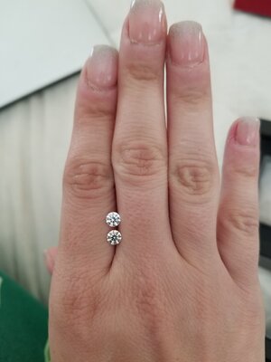
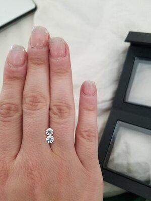
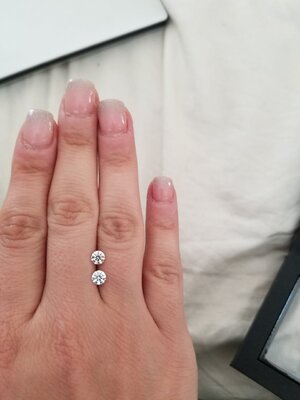
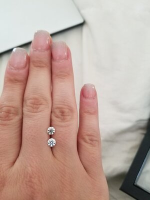
The JA stone came today and I admit to being underwhelmed. It isnt tinted enough for me, and the cut is just embarrassing when put next to the CBI. Its honestly mind boggling. Obviously keep in mind that the JA is an M and the CBI is a D, but the cut is what stands out to me far beyond the color.

Outdoors, CBI on top.
20210729_155447.jpg20210729_155215.jpg20210729_155214.jpg20210729_155207.jpg20210729_155204.jpg20210729_155202.jpg20210729_155545.jpg20210729_155513(0).jpg20210729_155513.jpg

Outdoor videos, CBI on top

 
GET 3 FREE HCA RESULTS JOIN THE FORUM. ASK FOR HELP
Top